
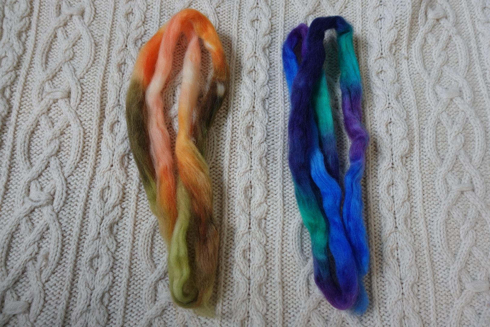
Blue is a huge corner of this blanket. According to Goethe, blue is the colour you need the least of for it to balance other colours, which is a little counterintuitive to me since it’s so ubiquitous in my wardrobe that it’s more of a background colour, a neutral. But perhaps that’s why blue came out on top in so many of these blends. Again, the unlabeled hexies are single colour samples, and 6b is in yesterday’s Green section. Many of these colourways had enough yarn for two hexies, so despite the large area, we’ll still just be covering 11 colourways today.

Exercise #: 7b.a
Exercise name: Low Value Contrast
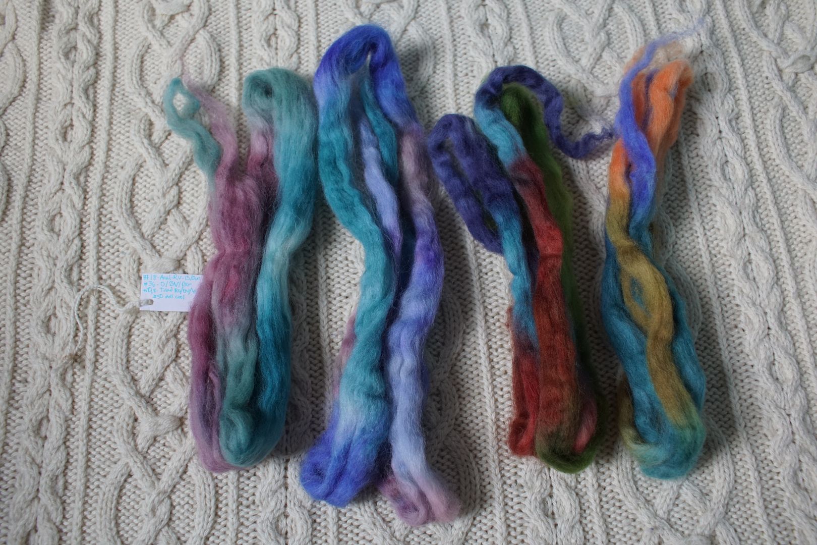
Strip 1: 18 – Analogous Dull Red-Violet to Blue
Strip 2: 36 – Split Complement Orange/Blue-Violet,Blue-Green
Strip 3: 48 – Triad:Red-Orange/Blue-Violet/Yellow-Green
Strip 4: 50 – Cools:Dull
Prep method: Drum Carder – Pulled – Colour order maintained
Spinning tool: Support
Wool breed: Cor1+Pol3
Contrast of hue: Low
Contrast of value: Low minor
Cold-Warm Contrast: Dominated by cools – only warm in dull/dark pops
Complementary Contrast: Not present
Simultaneous Contrast: Evident, slightly, in orange flecks
Contrast of Saturation: Fairly evenly desaturated in different ways
Contrast of Proportion: Domination of cools, blue colours, desaturation. Odd hues add complexity
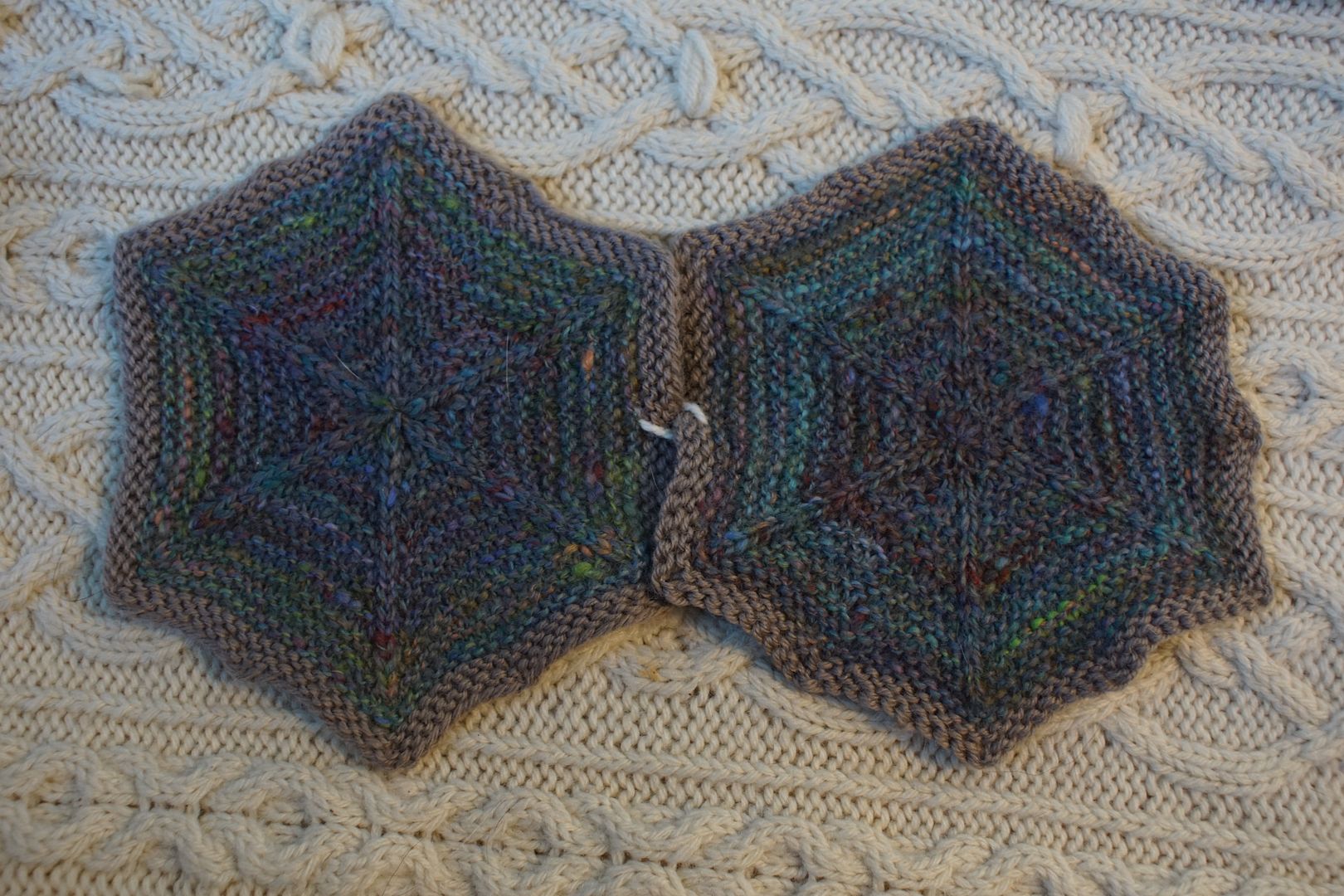
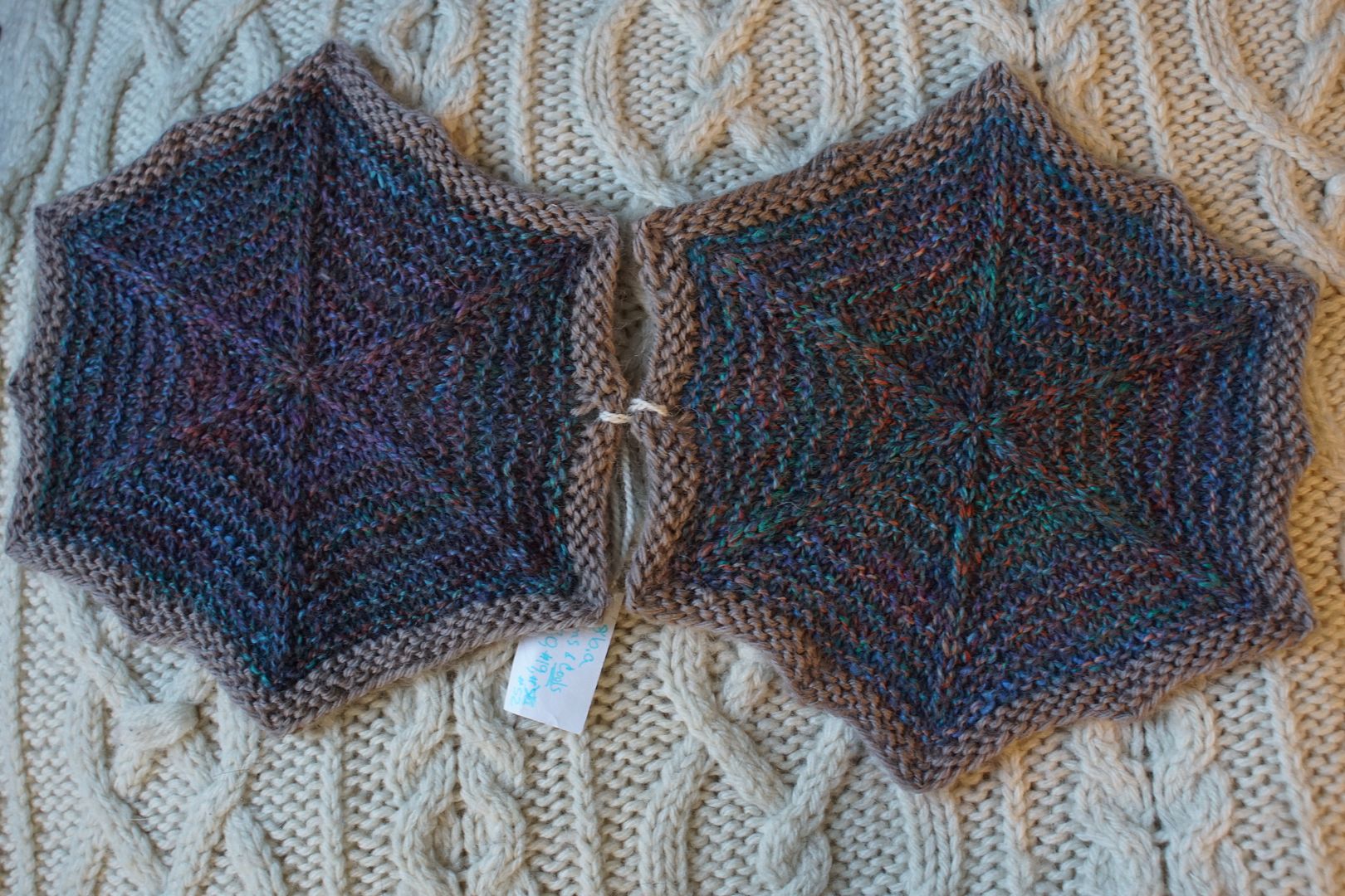
This was one where I forgot to take a picture of the yarn before it was knit up. The aim with this exercise was low value complexity. It also ended up being fairly uniform in low saturation. Reaching for dull colours, I reached for a lot of blues unintentionally. They blended together very well into one of many “blue jean” desaturated blends.
Exercise #: 8b.a
Exercise name: 3 Cools + 1 Warm
Strip 1: 4 – Monochromatic Red-Orange
Strip 2: 19 – Analogous Intense Violet to Blue-Green
Strip 3: 20 – Analogous Dark Blue-Violet to Green
Strip 4: 25 – Analogous Blue to Violet
Prep method: Blending board – dizzed strips
Spinning tool: EEW6
Wool breed: Cor3+Pol1
Contrast of hue: Moderate-High
Contrast of value: Low Minor
Cold-Warm Contrast: Cool is very cleanly cool, warm has cool elements
Complementary Contrast: Present (Tertiary:R-O/B-G)
Simultaneous Contrast: More on the right, with how the R-O and B-G intensify each other, not evident on left
Contrast of Saturation: More saturation percentage in the cools than warms
Contrast of Proportion: Cools overwhelm, not much saturation in warms means they pop just a little but more add complexity, blues win supported by greens and purples but overall blue-jean, desaturated
This is one of the three “3-cools, 1 warm” exercises you’ll see today. I wasn’t sure that the finished look would be blue. But again: when you put three analogous colours together, they will gather around the center member on the colour wheel. In this case, the purple and blue-green supported blue. Complementary contrast means that the red-orange is most visible when it’s up next to the blue-green, in the hexie on the right. Interesting that the whole came out so dark; I can’t account for that!
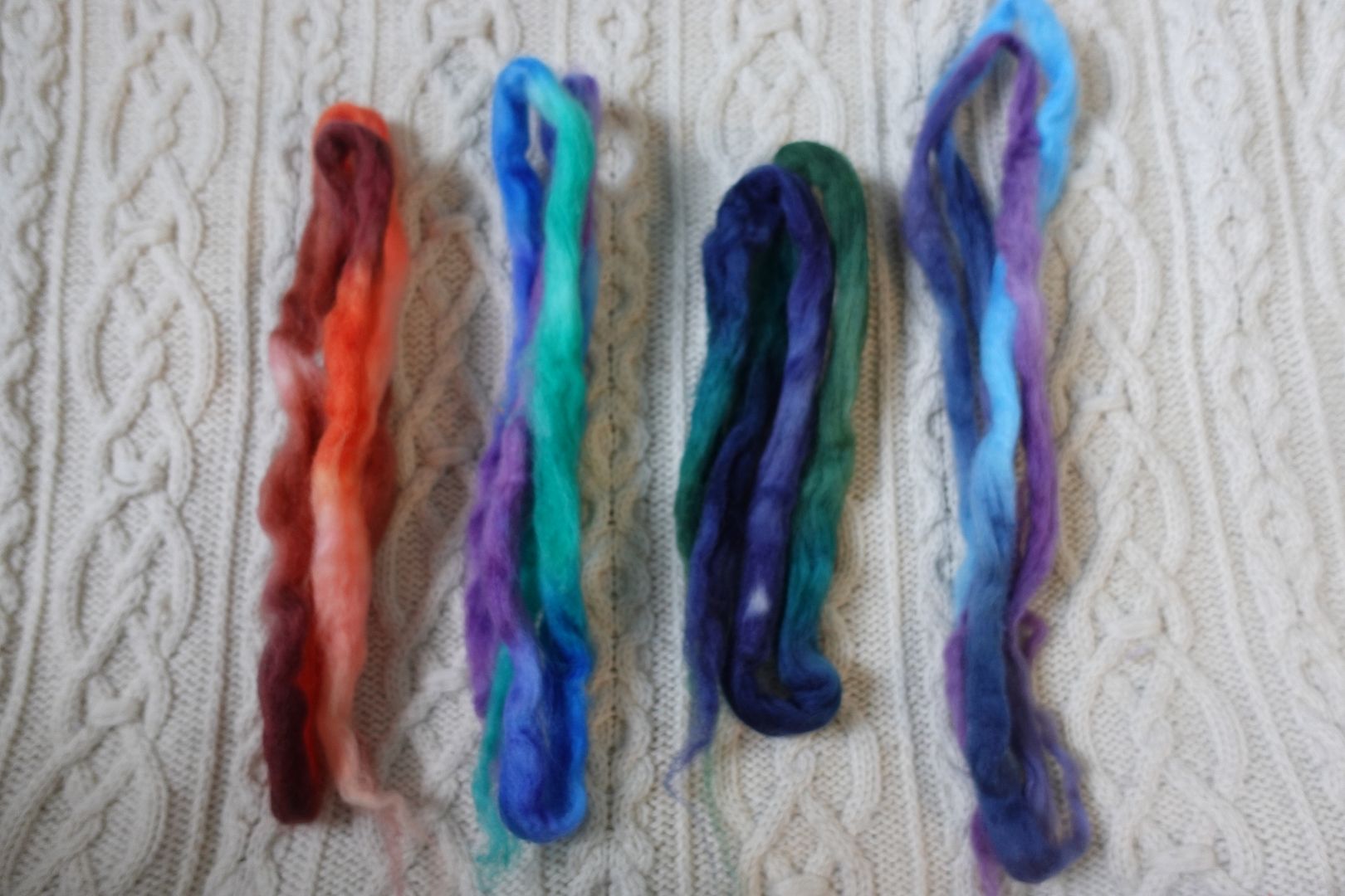
Exercise #: 8b.b
Exercise name: 3 Cools + 1 Warm
Strip 1: 6 – Monochromatic Red-Violet
Strip 2: 31 – Complement Red-Orange/Blue-Green
Strip 3: 35 – Split Complement Yellow-Orange/Violet,Blue
Strip 4: 50 – Cools:Dull
Prep method: Blending board – rolags
Spinning tool: EEW6
Wool breed: Cor1+Pol3
Contrast of hue: High
Contrast of value: Middle minor-ish
Cold-Warm Contrast: Warms split over two colourways, very bright. Cools all over the place, many desaturated
Complementary Contrast: Present
Simultaneous Contrast: On right in flecks of orange, on left in flecks of yellow?
Contrast of Saturation: Warms mostly more saturated than cools, except that loud blue-green!
Contrast of Proportion: So much going on, but blues mostly win out, that saturated blue-green glows through an otherwise desaturated mix
A different take on 3-cools-1-warm, here I spread the warms across two different complementary colourways for about the same overall proportions. The odd thing about it is the almost iridescent quality of the blue-green in the knitted fabric. It really does look like the blue-green is glowing through the other colours. Is it because that blue-green is more saturated than the other blues and violets? Is it the play it’s getting off red-orange? And the two hexies are so different – the one on the left, where more of these desaturated violets came together and bounced off the yellow, took quite a different direction.
Exercise #: 8b.c
Exercise name: 3 Cools + 1 Warm
Strip 1: 9 – Monochromatic Blue
Strip 2: 17 – Analogous Pale Red to Blue-Violet
Strip 3: 20 – Analogous Dark Blue-Violet to Green
Strip 4: 21 – Analogous Pale Blue to Yellow-Green
Prep method: Blending board – dizzed strips
Spinning tool: EEW6
Wool breed: Corriedale

Contrast of hue: Moderate
Contrast of value: Middle minor-ish
Cold-Warm Contrast: Even “warms” are quite cool
Complementary Contrast: Not really
Simultaneous Contrast: Don’t think so, pink doesn’t really pop or shift red
Contrast of Saturation: Lots of pales and darks, but not really dulls.
Contrast of Proportion: Moderate hue contrast and fairly low value contrast, and moderate saturation make for a saturated, intense final mix, more analogous than expected. Pink adds gorgeous complexity but doesn’t pop aggressively

The final of these 3-cool-1-warm combos today, this one is in my top five! We again see that glowing blue-green, but not because there was much solidly dyed that colour – this time, analogous cools were blue, green, and blue-green, and they united around the blue-green. There’s just enough pink present to add a floral complexity to it. This one just makes me swoon, and I can’t explain it really, so I should stop trying – I just enjoy it!

Exercise #: 9a.b
Exercise name: Complementary
Strip 1: 3 – Monochromatic Orange
Strip 2: 51 – Cools:Intense
Prep method: Dizzed through hand card
Spinning tool: EEW6
Wool breed: Corriedale
Contrast of hue: High
Contrast of value: Middle major
Cold-Warm Contrast: Even between blues and oranges
Complementary Contrast: Present
Simultaneous Contrast: Maybe evident in that the complements swallowed up most of the green and violet, but not really
Contrast of Saturation: Cools MUCH more intense than desaturated oranges!
Contrast of Proportion: Intensity of blue/cool colourway meant that it totally dominated, also confirms Goethe
Exercise #: 9b.b
Exercise name: Complementary
Strip 1: 36 – Split Complement Orange/Blue-Violet,Blue-Green
Strip 2: 38 – Split Complement Red/Blue-Green,Yellow-Green
Strip 3: 50 – Cools:Dull
Prep method: Dizzed through hand card
Spinning tool: EEW6
Wool breed: Polwarth
Contrast of hue: High
Contrast of value: Middle major-ish
Cold-Warm Contrast: About 2/3 definitely cool, 1/6 middling, 1/6 warm
Complementary Contrast: Present-ish, Blue-orange but orange very weak, Red-green but values throw it off
Simultaneous Contrast: Not really. There are pops, but other reasons
Contrast of Saturation: Everything dark, pale, or dull, with lots of dull
Contrast of Proportion: Weirdly the periwinkle came through in aggressive pops, maybe ¼ of total but lined up in plying. Nothing else dominated, other areas desaturated. Odd mix.
I was supposed to put complementary colours together here, but I don’t really know what I was thinking. There are complementary lime green and dark red paired together, which I baldly hate, and the peachy orange with the periwinkle blue. Mark this under “you win some, you lose some.” For my taste, there is such a thing as too much variety.

Exercise #: 10c.a
Exercise name: Add dark value
Strip 1: 29 – Complement Yellow-Orange/Blue-Violet
Strip 2: 37 – Split Complement Red-Orange/Blue,Green
Strip 3: eggplant
Prep method: Dizzed through hand card
Spinning tool: EEW6
Wool breed: Pol2+Merino1

Contrast of hue: High
Contrast of value: Low major
Cold-Warm Contrast: Dominated by cool, but significant warm elements in pale yellow and intense orange
Complementary Contrast: Present
Simultaneous Contrast: Quite evident. Presence of orange intensifies the whole reading as blue.
Contrast of Saturation: Complement fairly dull by comparison to others
Contrast of Proportion: Eggplant and blue support each other, yellow and green add complexity

I put this solid eggplant colour in two different colourways, the other of which you will see tomorrow. Both are great examples of how a colour can shift dramatically based on what it is paired with. This was put with lots of blue, which scooped it under its influence, and I believe it is by simultaneous contrast that the bright pops of orange make the whole thing read more blue. Tomorrow compare that with the other!

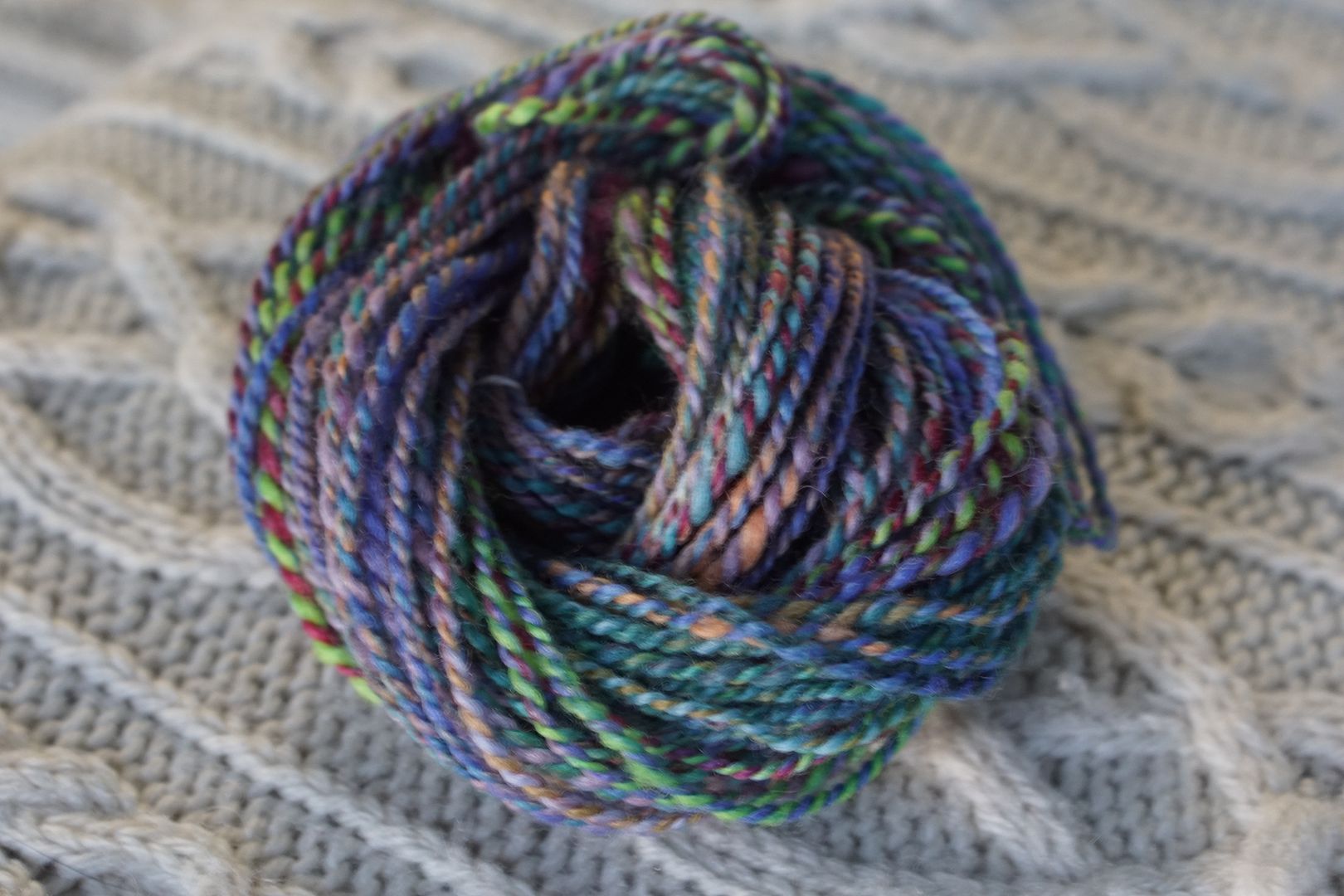
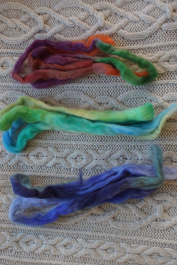
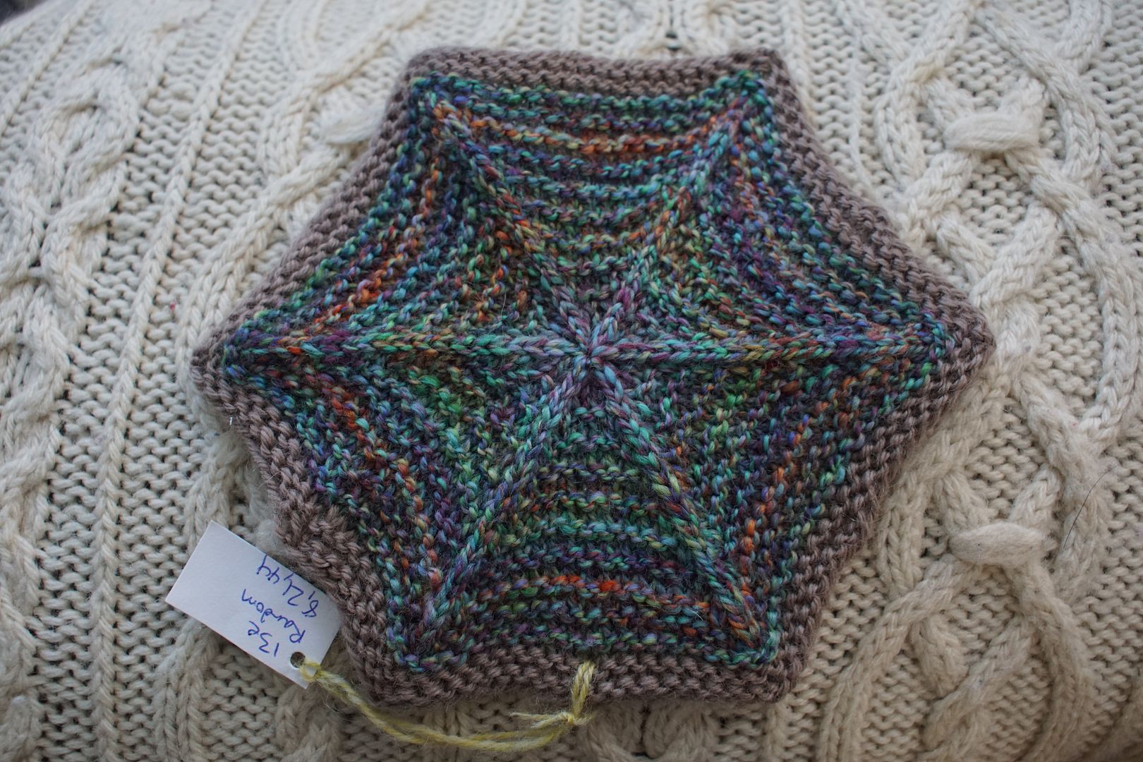
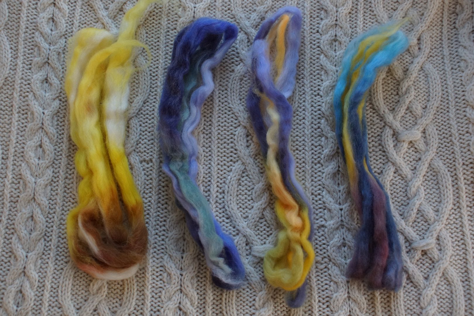
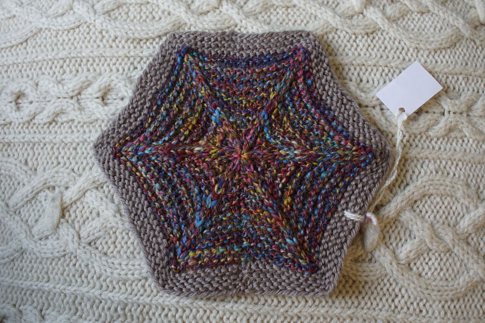
Exercise #: 13e
Exercise name: Random
Strip 1: 8 – Monochromatic Blue-Violet
Strip 2: 21 – Analogous Pale Blue to Yellow-Green
Strip 3: 44 – Split Complement Green/Red-Violet,Red-Orange
Prep method: Stripped and held together
Spinning tool: EEW6
Wool breed: Cor2+Pol1
Contrast of hue: High
Contrast of value: Middle major
Cold-Warm Contrast: About ¾ cools, but some warm undertones in all but blue
Complementary Contrast: Present (B/O)
Simultaneous Contrast: Evident: blue-green and red-orange pop each other
Contrast of Saturation: Fairly dull/pale/dark except that orange and blue
Contrast of Proportion: Cools dominate with ¾, warms ad pops and complexity; red and green recede but red-orange pops
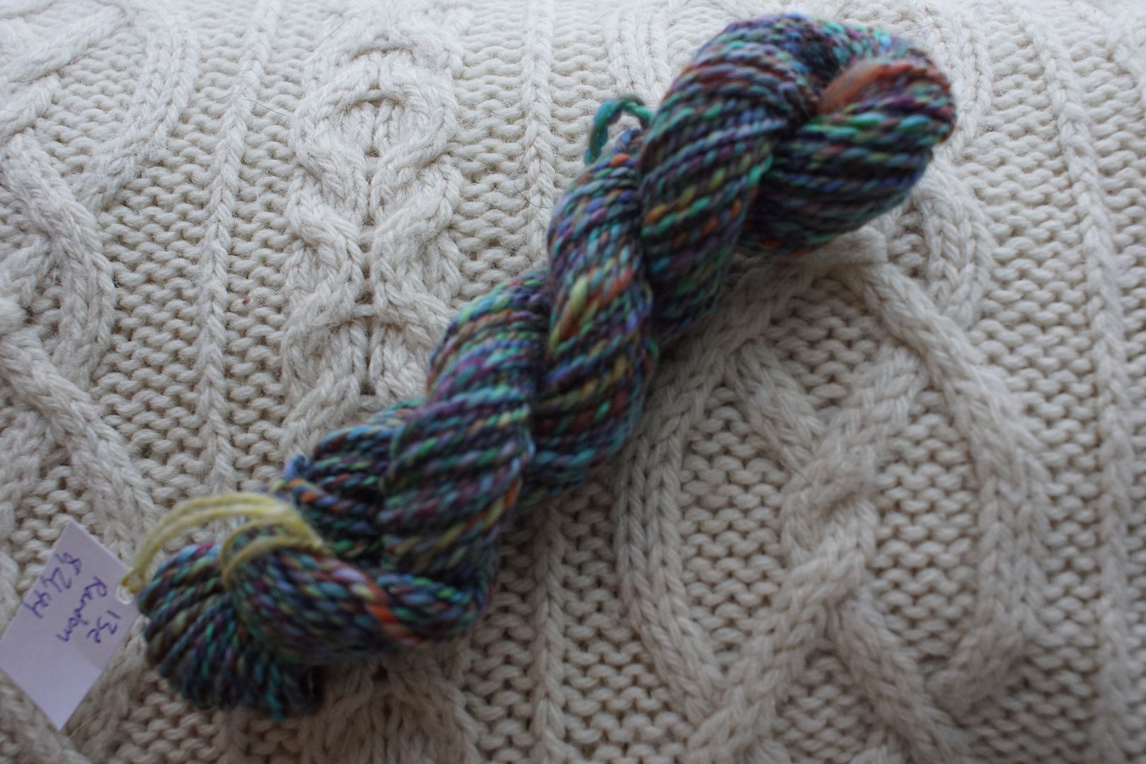
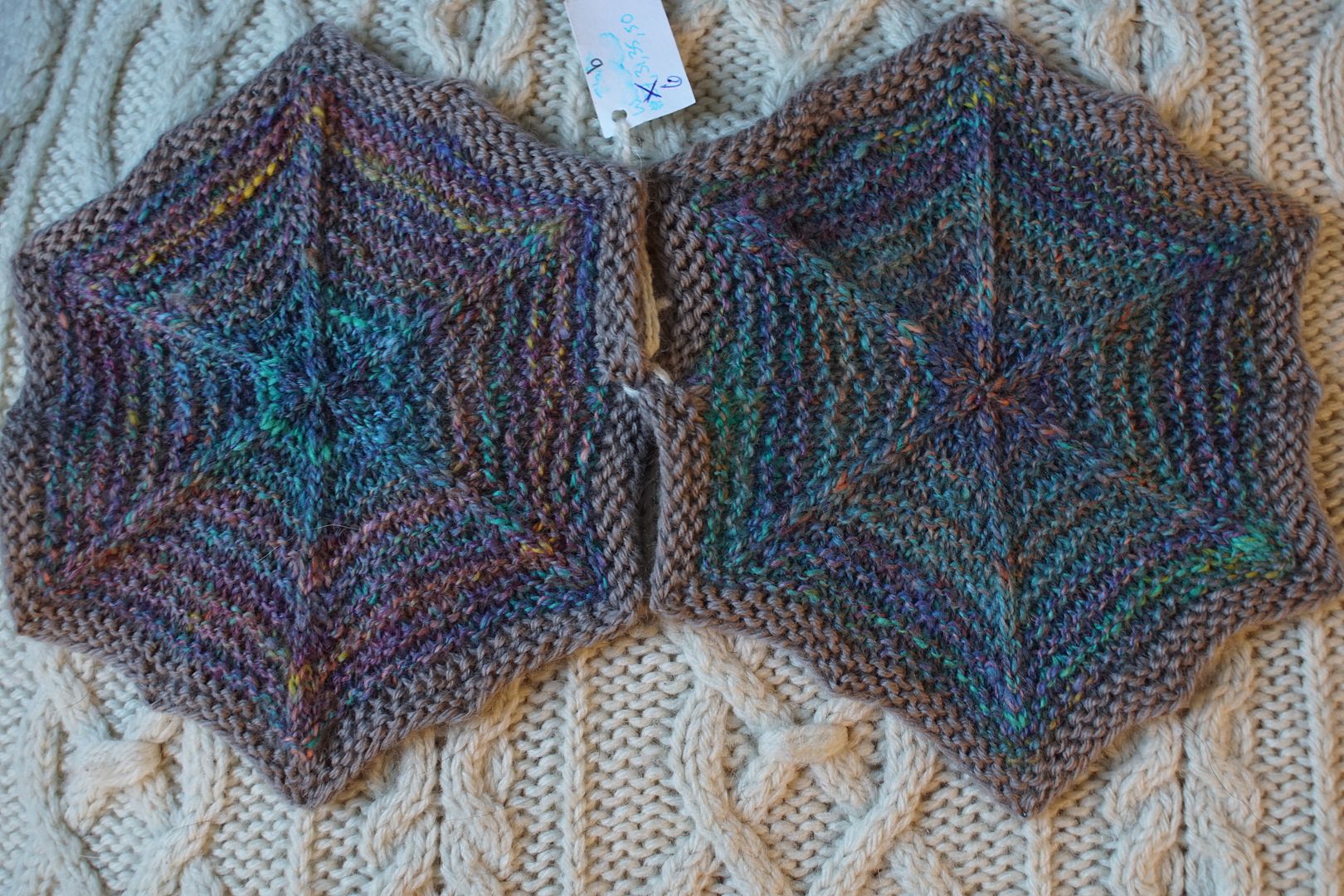
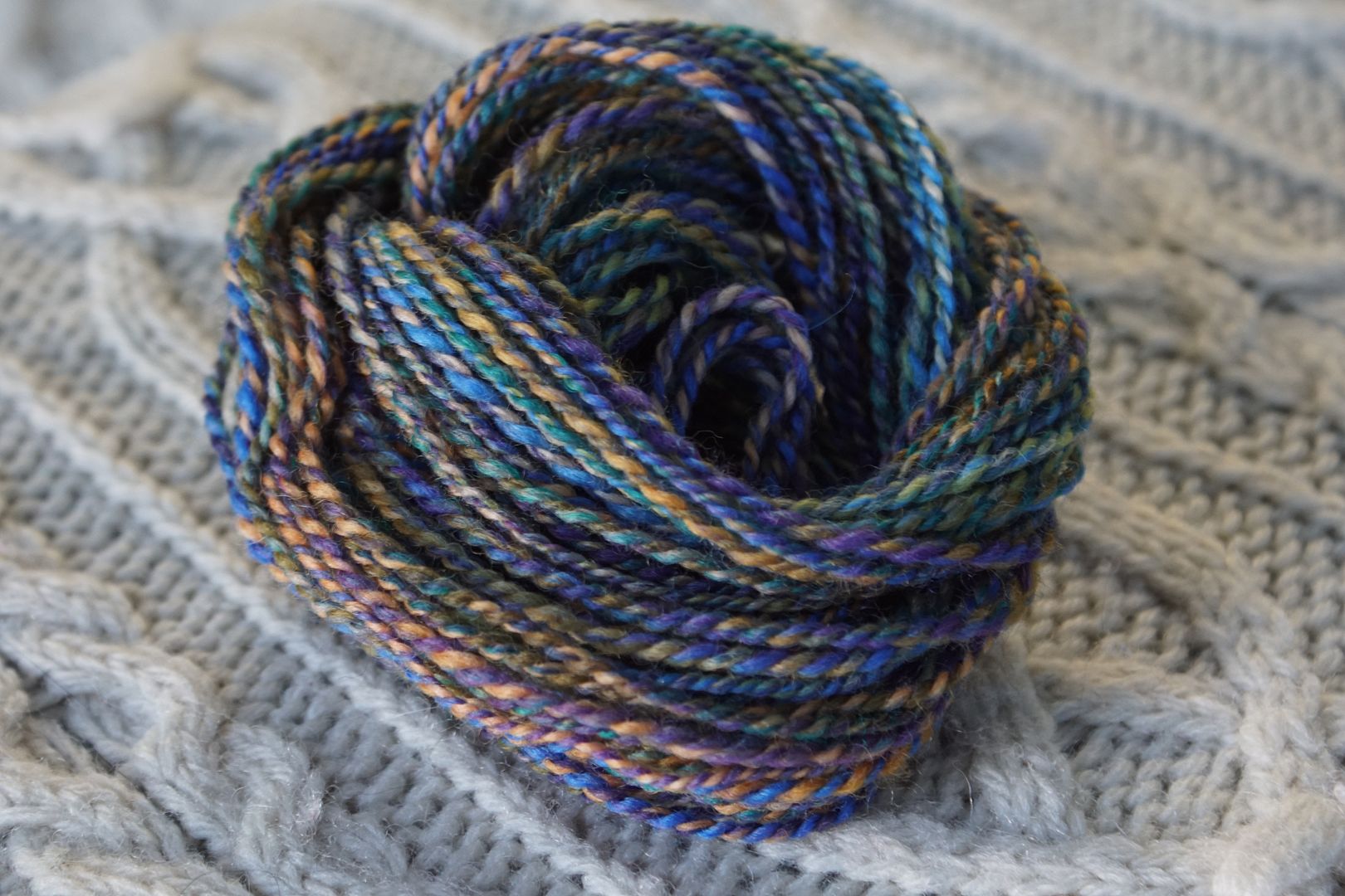
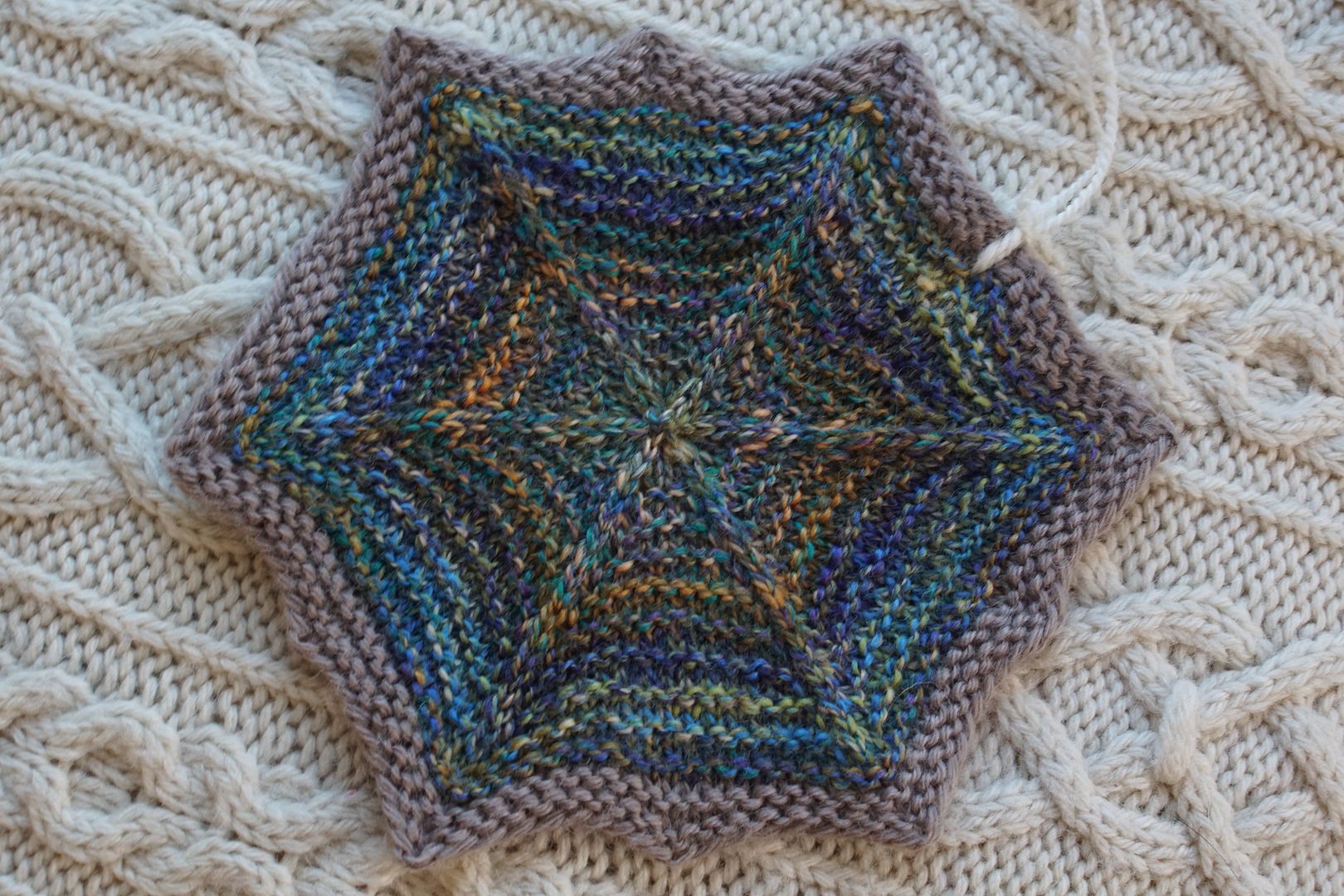
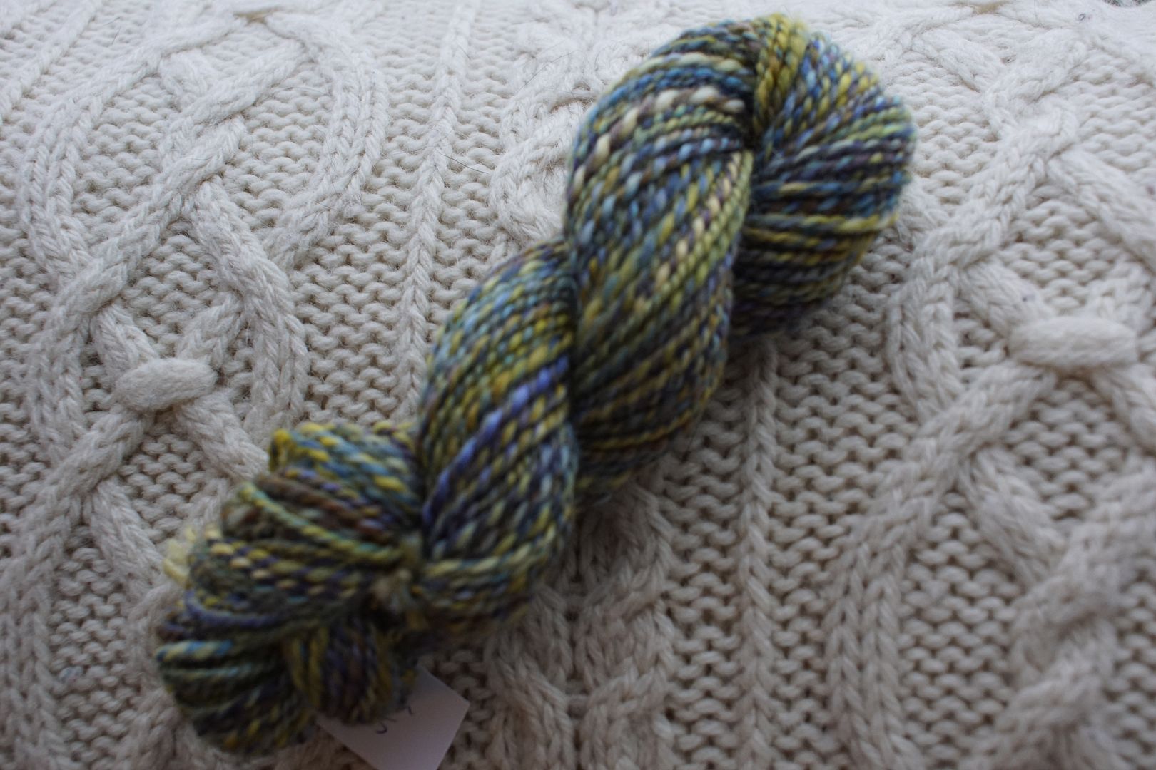
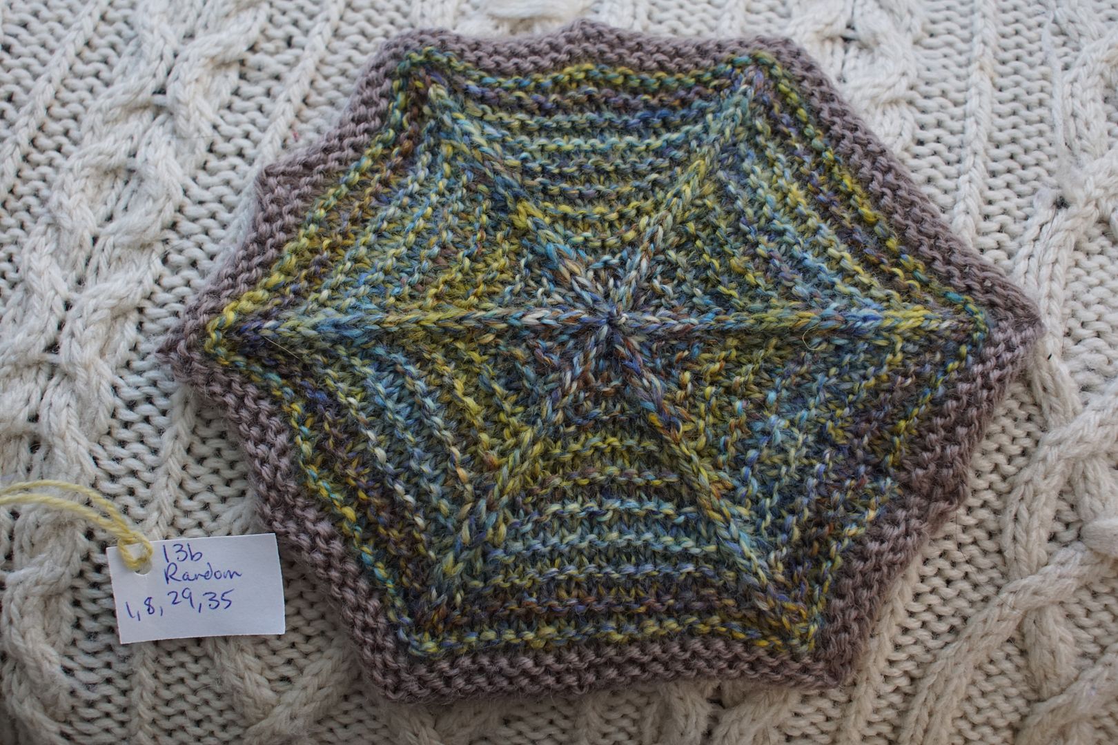
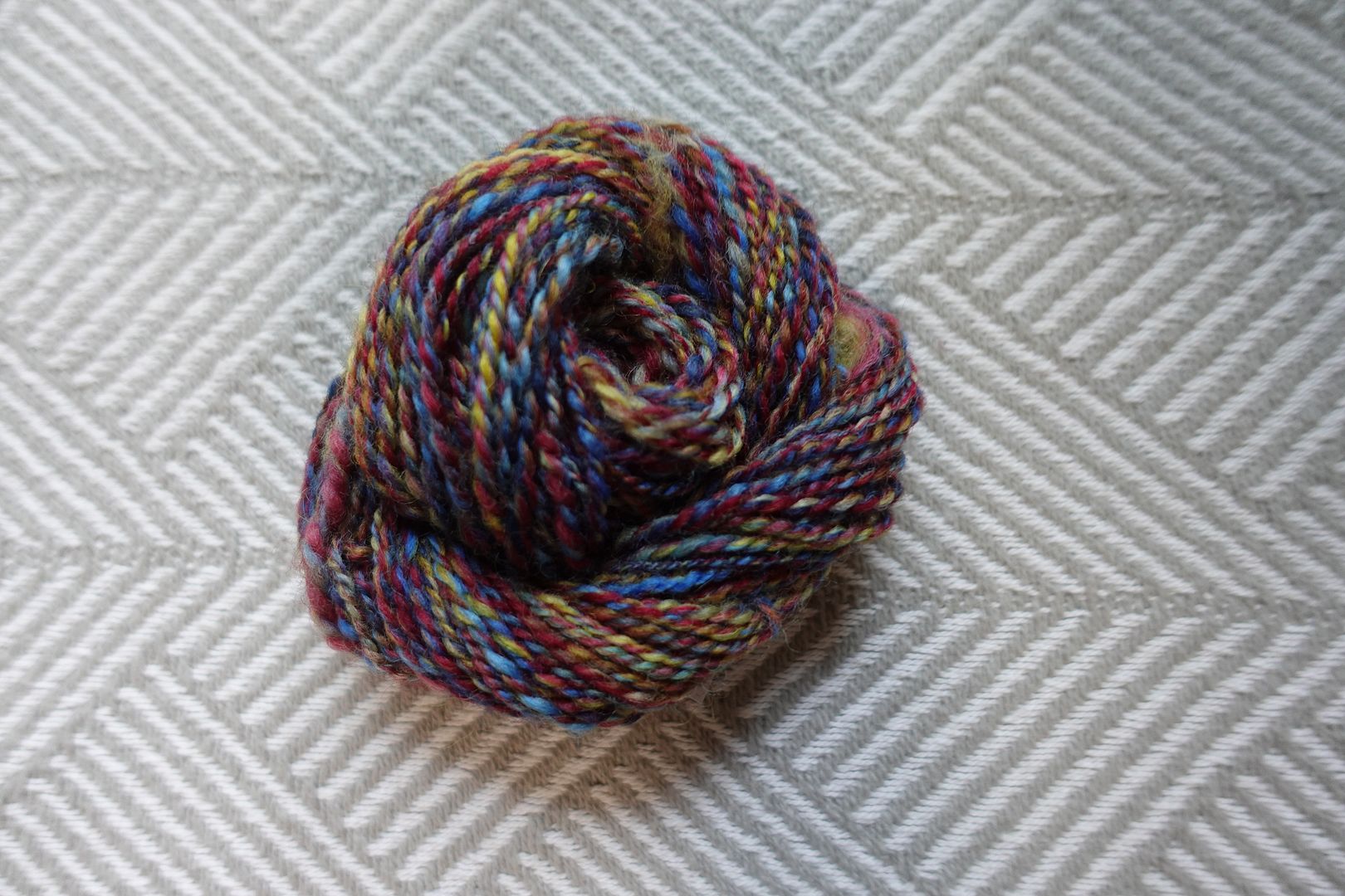
This was the very last hexie I spun and knit. The fiber picture is sideways! The yarn picture is blurry! At least the hexie picture came out right. These were literally the last three chunks of fiber available to me, and they happened to make this pleasing combination. The complementarity of the blue-greens and the little bit of red-orange sets the framework, and the other greens, blues, and reds fall into place around them.
Exercise #: 13b
Exercise name: Random
Strip 1: 1 – Monochromatic Yellow
Strip 2: 8 – Monochromatic Blue-Violet
Strip 3: 29 – Complement Yellow-Orange/Blue-Violet
Strip 4: 35 – Split Complement Yellow-Orange/Violet,Blue
Prep method: Stripped and held together
Spinning tool: EEW6
Wool breed: Corrie+Polwarth
Contrast of hue: Moderate-High
Contrast of value: High middle major
Cold-Warm Contrast: Warm yellows, cool blue-violets
Complementary Contrast: Present (B-V/YO)
Simultaneous Contrast: Not evident to me, primaries (blue and yellow) dominate
Contrast of Saturation: Everything about equally desaturated between pale, dull, and a little dark and brown. Yellow most intense.
Contrast of Proportion: Being about equal yellow and blue, surprising that yellow puts up so much of a fight – probably because the blues are rather more desaturated than the yellows.
I think I could have put this hexie in the yellow or the blue section. Here the blues and yellows are in about equal amounts, but they look balanced because the yellow is more saturated than the blue. It’s a more complex, balanced version of the split complement fiber on the right above. I like how the dull red-violet calms everything down and desaturates it further.
Exercise #: 2a.b
Exercise name: High Value Contrast
Strip 1: 46 – Triad:Primaries
Strip 2: 49 – Triad:Red-Violet/Blue-Green/Yellow-Orange
Prep method: Predrafted together
Spinning tool: Blondie
Wool breed: Polwarth
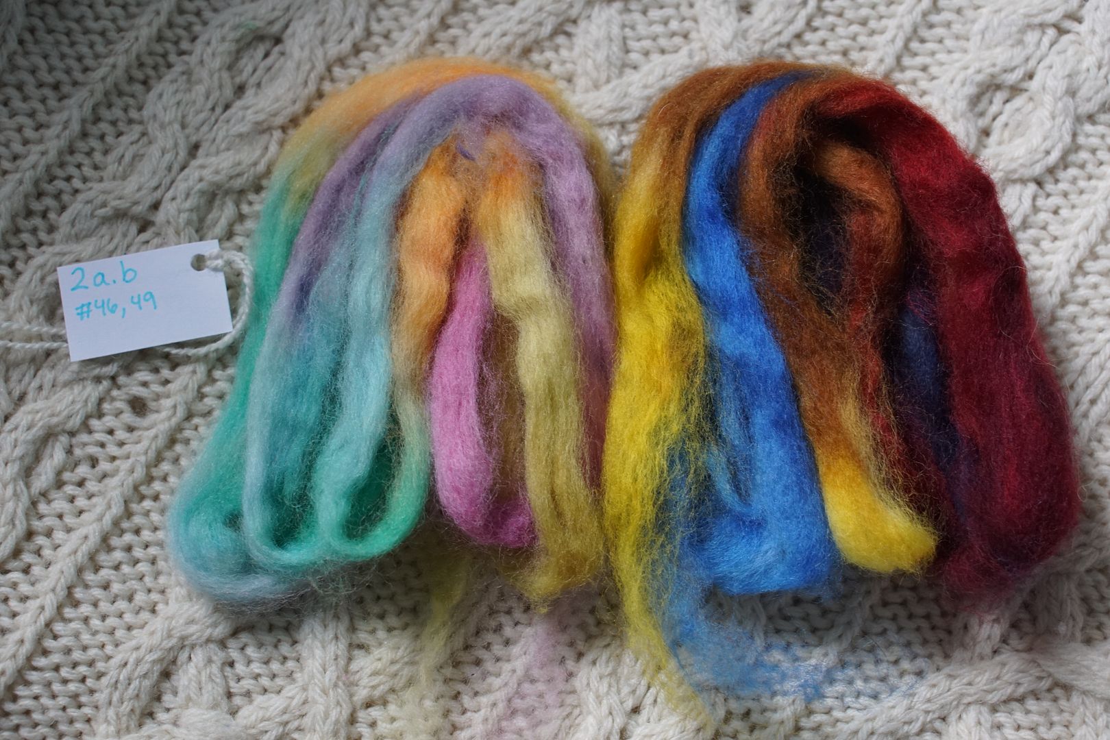
Contrast of hue: Extreme
Contrast of value: Middle Major
Cold-Warm Contrast: Mixed, more cool than warm
Complementary Contrast: Present, ish
Simultaneous Contrast: Evident (Red/Green)
Contrast of Saturation: All mixed up
Contrast of Proportion: Less dark/Intense, making even weight; extra yellow
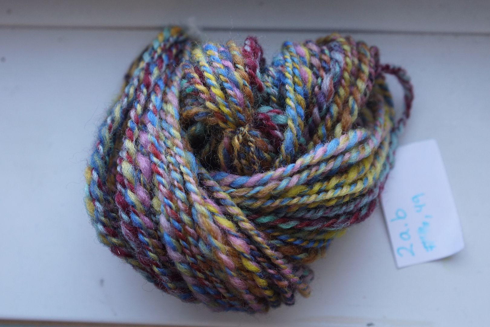
These last few hexies are wild blends that just ended up at the edges of the blue section because I didn’t know where else to put them! This was one of my first blends, and was a really wild combination that for some reason I really liked. Is there a slightly cool undertone throughout? I could not tell you. Our likes and dislikes are worth reflecting on, but sometimes allowing to remain mysterious.
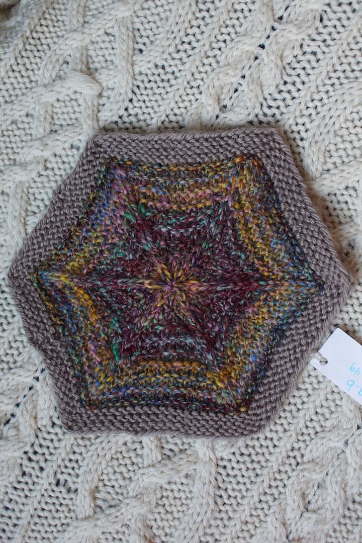
Exercise #: 6.a
Exercise name: Triads
Strip 1: 1 – Monochromatic Yellow
Strip 2: 5 – Monochromatic Red
Strip 3: 9 – Monochromatic Blue
Prep method: Narrow strips + predraft
Spinning tool: EEW6
Wool breed: Corriedale

Contrast of hue: Extreme
Contrast of value: Middle major
Cold-Warm Contrast: Red has cool undertone so cools take over
Complementary Contrast: Not really present
Simultaneous Contrast: Not really evident
Contrast of Saturation: Very even except for the yellow being weird, spots of white and brown
Contrast of Proportion: More even than Goethe would suggest. Yellow recedes, blue almost takes over.
For this first of the triadic experiments, I went for blunt force, putting the three monochromatic parimaries together. Blue and red dominate here, though I go back and forth about which one of them I think is on top. The two of them are pretty darn well balanced.
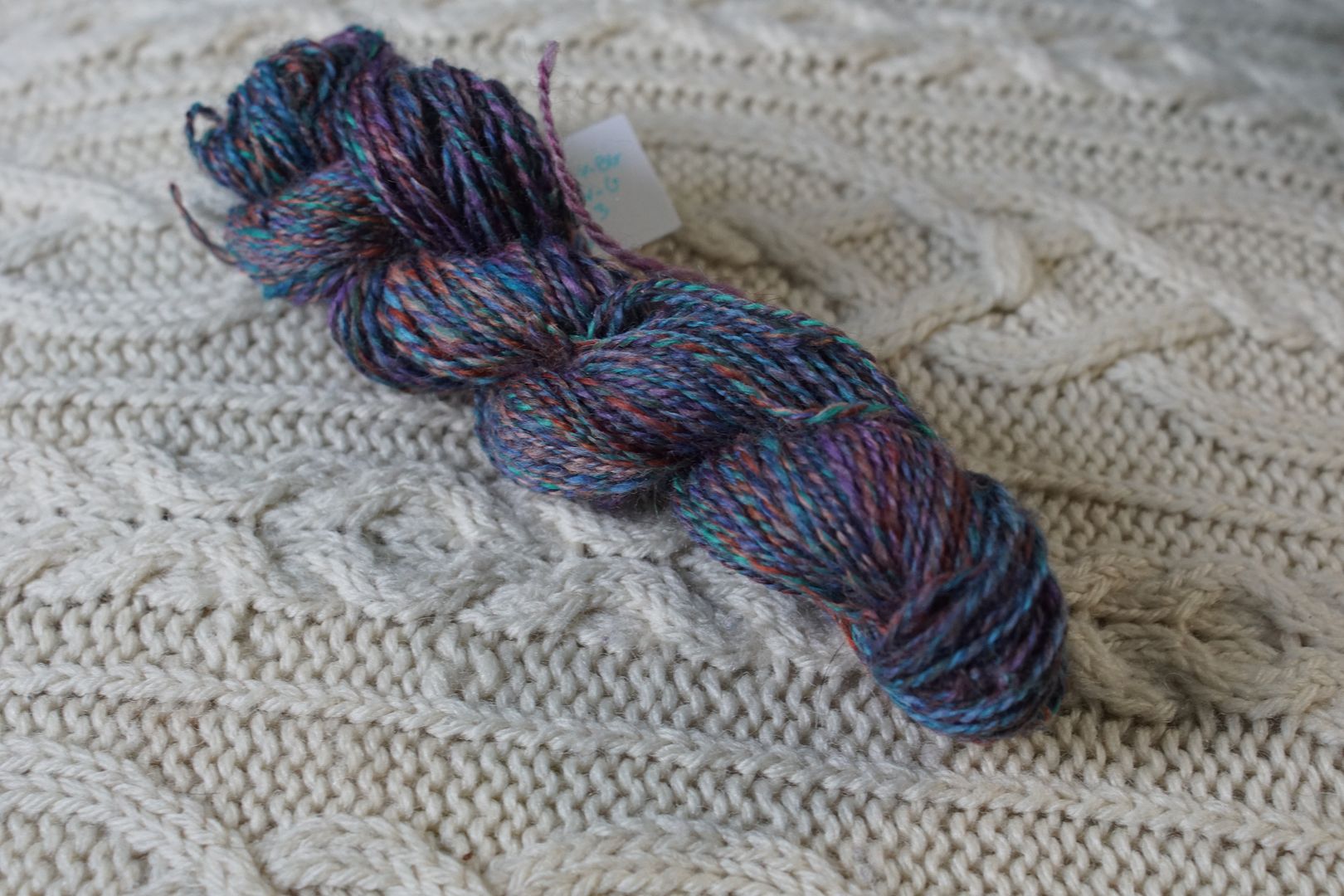
It’s worth comparing this with the straight triadic-dyed colourway, which has most of the same exact colours in it, but was spun at a smaller scale. Half was spun combo-drafted with itself; the other half was blended completely on combs. There’s more blending with the smaller scale, but the colour balance is surprisingly similar.


Where do you stand on blue? It’s a favourite colour in our household, and many of these blends landed in the blue-jean land that is a neutral in my wardrobe. It’s very safe, and sometimes hard to escape! Did any of these blues surprise or challenge you?
