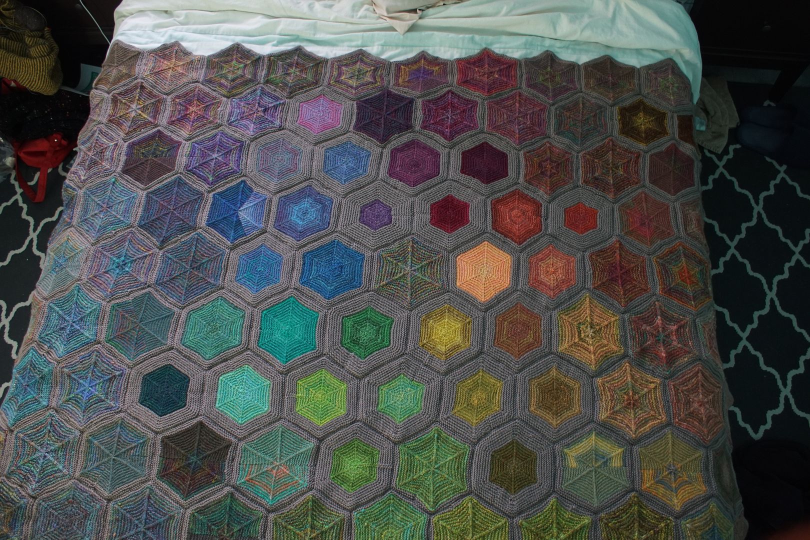
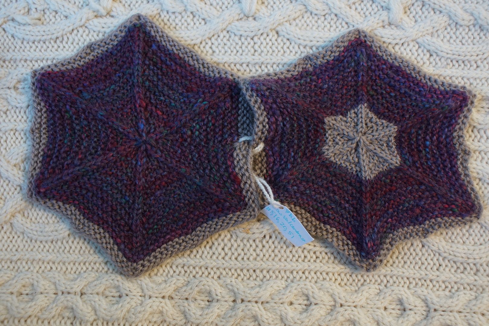
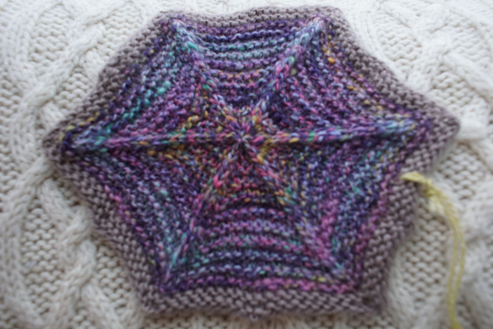
We’ve made it to the final section of the Skep blanket, and it’s a big one! Pinks and purples take up a corner and most of a side of this blanket, and we’ll be covering twelve colourways today, from most saturated and minor-key to most wild. Again, unlabeled hexies below are single colourway samples.

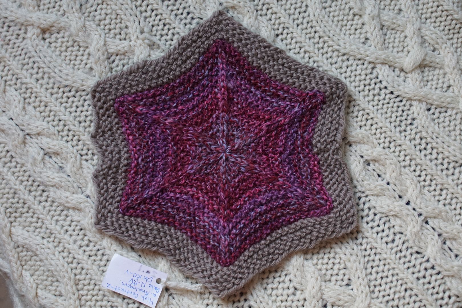
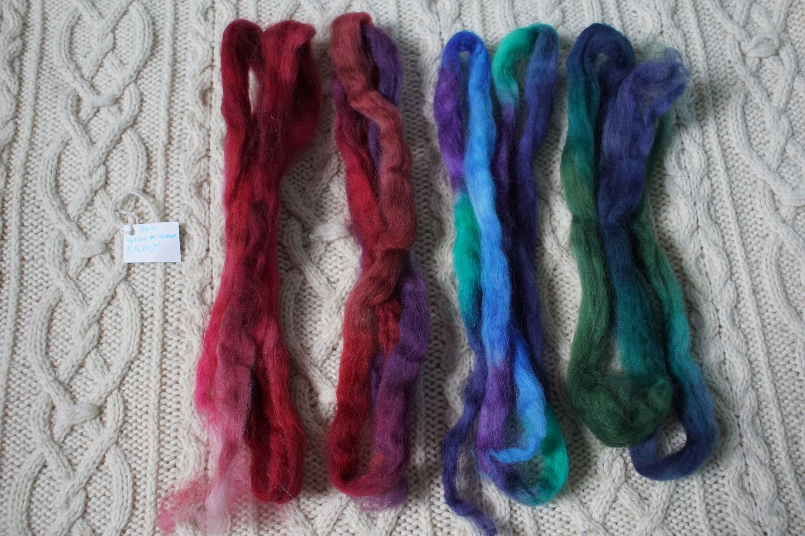
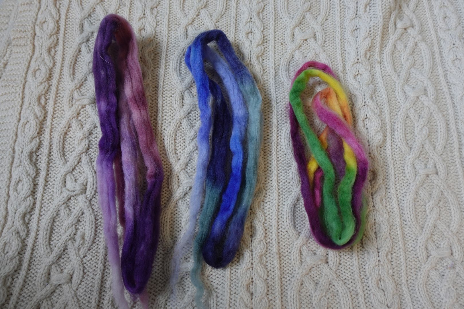
Exercise #: 2a.a
Exercise name: High Value Contrast
Strip 1: 16 – Analogous Dark Red-Orange to Violet
Strip 2: 17 – Analogous Pale Red to Blue-Violet
Prep method: Narrow strips held
Spinning tool: Blondie
Wool breed: Corriedale
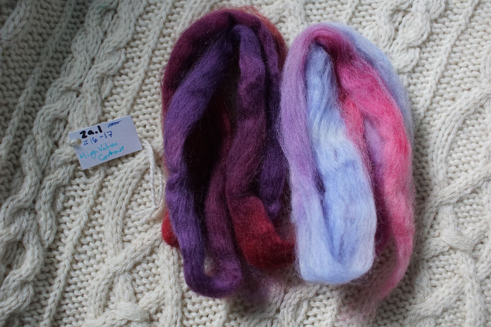
Contrast of hue: Low
Contrast of value: Middle Minor-ish
Cold-Warm Contrast: Cool-ish
Complementary Contrast: Not present
Simultaneous Contrast: Not evident
Contrast of Saturation: Darks more saturated, pales less
Contrast of Proportion: Even, dark has more weight
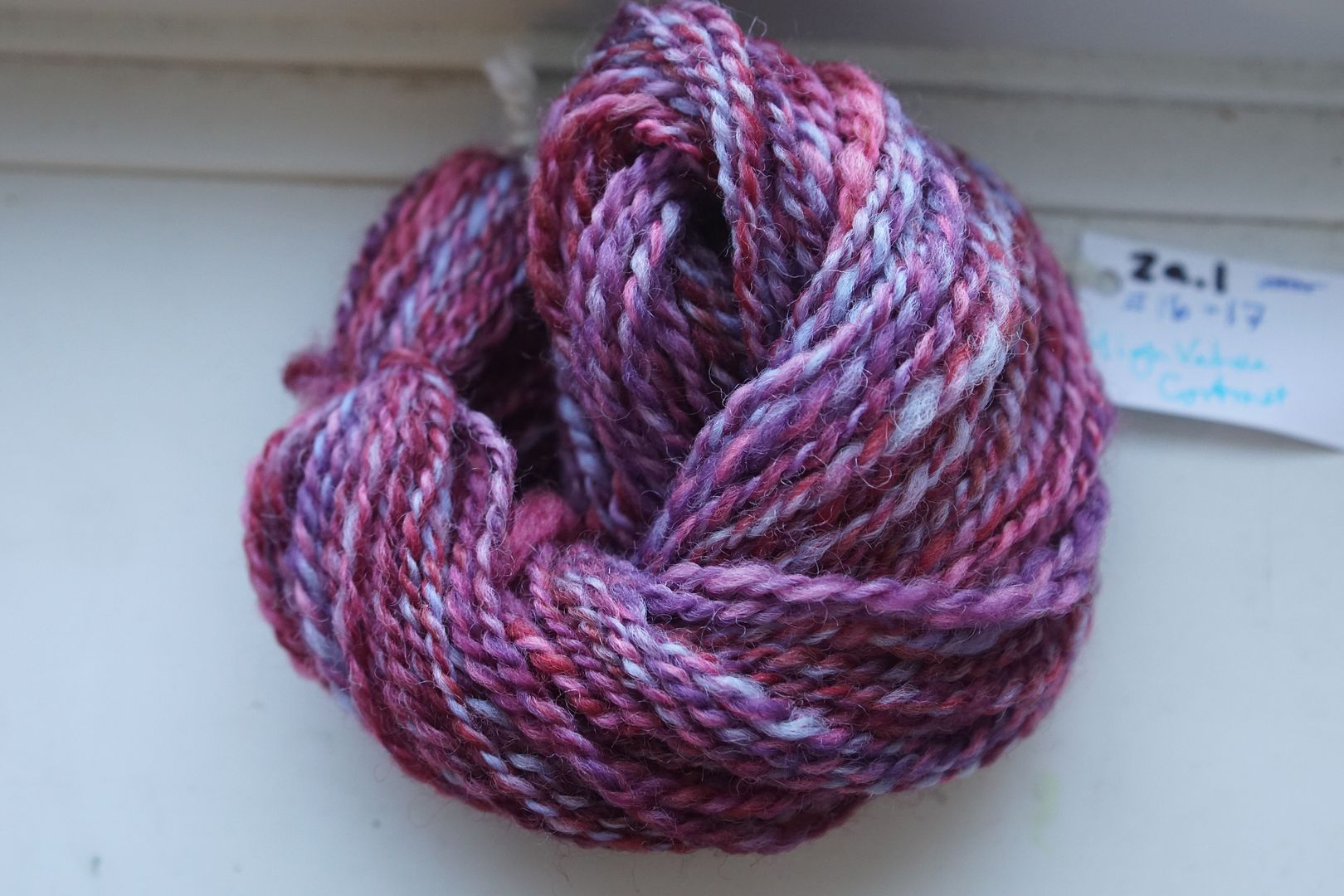
This was the very first hexie I made! I went for high value contrast and low hue contrast, and the result was complex – not as blended as similar yarns on the green side of things. The pale blue-violet really stands out, making it hard to call this a minor-key colourway.
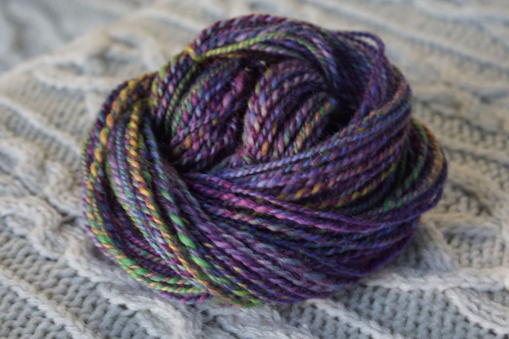
Exercise #: 7b.b
Exercise name: Low Value Contrast
Strip 1: 5 – Monochromatic Red
Strip 2: 16 – Analogous Dark Red-Orange to Violet
Strip 3: 20 – Analogous Dark Blue-Violet to Green
Strip 4: 51 – Cools:Intense
Prep method: Drum Carder – Batts – Lined up
Spinning tool: Support
Wool breed: Cor3+Pol1
Contrast of hue: High
Contrast of value: Low minor
Cold-Warm Contrast: Very cool. Even reds and greens more cool than warm
Complementary Contrast: Present (red-green)
Simultaneous Contrast: Not evident – too well blended
Contrast of Saturation: Fairly evenly dark/dull, with some intensity
Contrast of Proportion: Overall very purple. Proportionately very little purple, lots of red, but blended together to definite purple. Green adds complexity, beautifully subtle detail
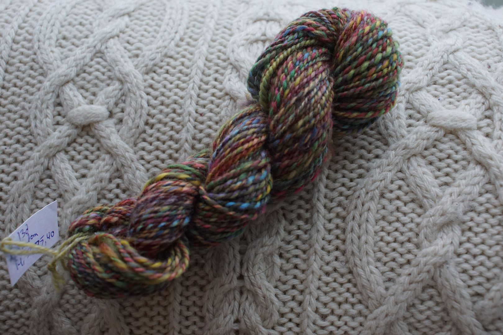
This was another where the yarn pic got missed. A great illustration of how when you put analogous colours together, they lock arms around the middle member on the colour wheel – even if there isn’t much of it! Red and blue are the most by quantity, so of course they come together to make purple. I love how dark this is – another version of the famous Arctic Berries!
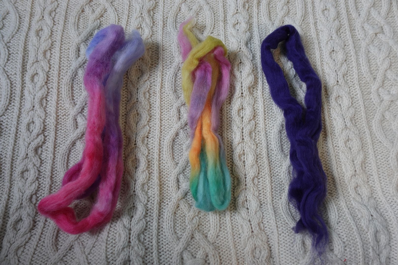
Exercise #: 8b.d
Exercise name: 4 Cools
Strip 1: 5 – Monochromatic Red
Strip 2: 27 – Analogous Red to Orange
Strip 3: 7 – Monochromatic Violet
Strip 4: 17 – Analogous Pale Red to Blue-Violet
Prep method: Blending board-batt
Spinning tool: EEW6
Wool breed: Cor3+Pol1
Contrast of hue: Low
Contrast of value: Middle minor
Cold-Warm Contrast: Warm and cool evident in all of these colourways, cool more evident but possibly irrelevant
Complementary Contrast: Not present
Simultaneous Contrast: Evident in that gentle golden yellow that shifts and pops bright.
Contrast of Saturation: Lots of everything here, pale dull dark, not much intense, so slightly desaturated all over
Contrast of Proportion: Close values make a cohesive mix. Despite lots of red, pink and purple balanced is the overall feel.
I find it interesting that the big chunk of red almost totally disappeared. This is definitely not just “cools,” whatever I thought when I was putting these colours together. The pops of orange and yellow really set this colourway off deliciously. I didn’t intend it this way, but it’s a version of the great violet-through-reds-to-yellow gradation that I associate strongly with Felicia Lo.

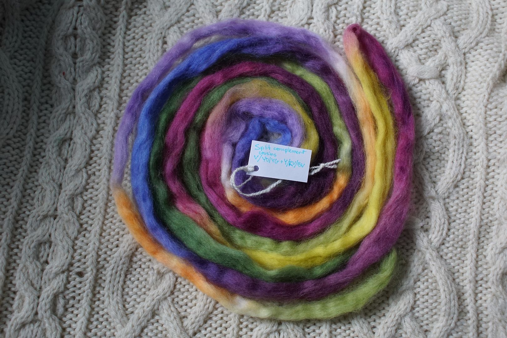
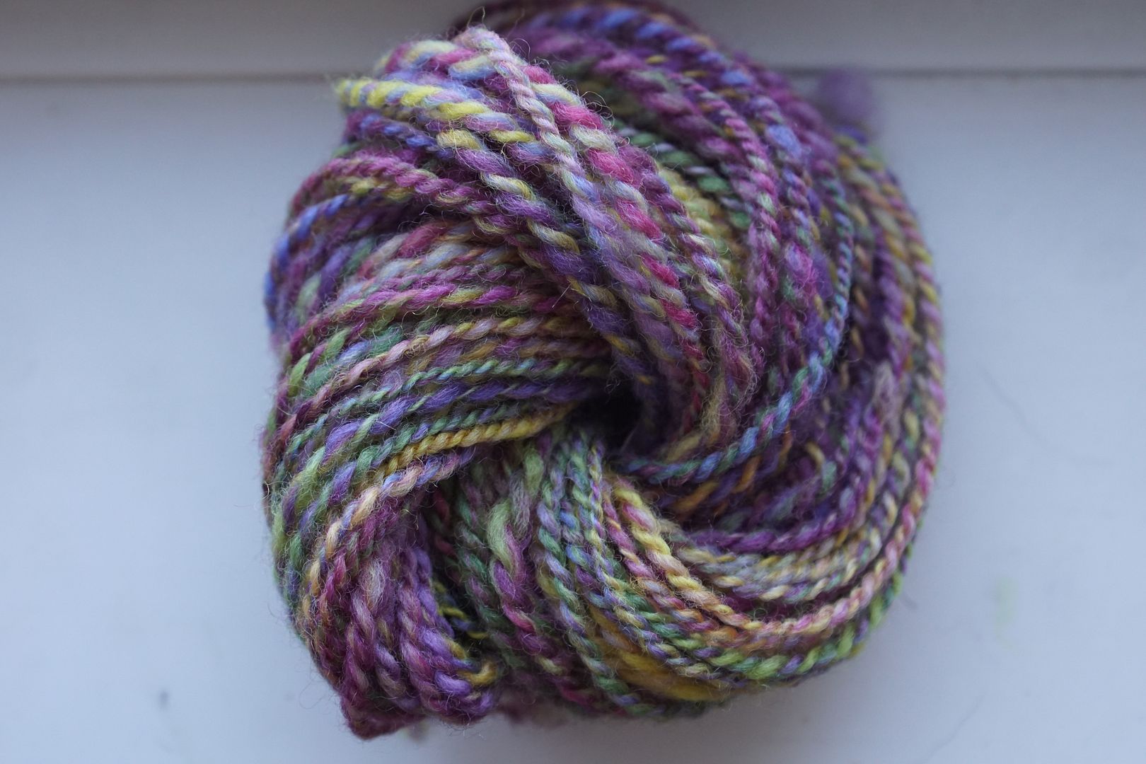
Exercise #: 9b.a
Exercise name: Complementary
Strip 1: 7 – Monochromatic Violet
Strip 2: 8 – Monochromatic Blue-Violet
Strip 3: 39 – Split Complement Red-Violet/Yellow,Green
Prep method: Dizzed through hand card
Spinning tool: EEW6
Wool breed: Cor2+Pol1
Contrast of hue: High
Contrast of value: Middle minor
Cold-Warm Contrast: 5/6 cools, just that pop of yellow and warm undertones in red-violet and green
Complementary Contrast: Present (V/Y)
Simultaneous Contrast: Not evident, yellow almost disappeared
Contrast of Saturation: Even balance over all, though the small warm amounts are most saturated
Contrast of Proportion: Blue-violet overall, surprisingly supported by blue. Green and yellow just add complexity; really nice.
I was again surprised at how much the blue disappeared. This is a blue-violet that looks violet, as opposed to other blue-violets that read more blue to me. The odd flecks of bright primaries and secondaries have an interesting effect here.

Exercise #: 10c.b
Exercise name: Add dark value
Strip 1: 17 – Analogous Pale Red to Blue-Violet
Strip 2: 49 – Triad:Red-Violet/Blue-Green/Yellow-Orange
Strip 3: eggplant
Prep method: Dizzed through hand card
Spinning tool: EEW6
Wool breed: Cor+Pol+Merino
Contrast of hue: Moderate
Contrast of value: Middle major
Cold-Warm Contrast: Mostly cools, but ambivalent ones
Complementary Contrast: Not really present
Simultaneous Contrast: Evident in the pop of yellow, which in fiber is pale yellow and orange
Contrast of Saturation: Two handpaints quite pale, solid is dark
Contrast of Proportion: This was an argument between pale and dark; having 2/3 pale made a really nice value balance.
This is the other use of that eggplant that I mentioned yesterday. Do you even remember what I’m talking about? Can you even believe it’s the same eggplant anchoring this colourway and the very blue colourway from yesterday? I love this huge difference! Here, with the added handpaints being so light in value, they make a wild major key where all the light hues are visible. But the purple and pinks use the support of the eggplant to give an overall violet feel.
Exercise #: 2b.d
Exercise name: High Hue Contrast
Strip 1: 34 – Split Complement Yellow/Red-Violet,Blue-Violet
Strip 2: 40 – Split Complement Violet/Yellow-Orange,Yellow-Green
Prep method: Hand Cards-Dizzed
Spinning tool: Blondie
Wool breed: Polwarth
Contrast of hue: Extreme
Contrast of value: Middle major
Cold-Warm Contrast:Warm yellows, cool purples, coolish greens
Complementary Contrast: Present
Simultaneous Contrast: Evident – red violets shifted violet
Contrast of Saturation: Fairly middling mix, nothing too bright, some dulls
Contrast of Proportion: small amount of yellow, large amount of blue and violet, fairly even look
When you put purples and greens together, they have a certain energy. The red-violet, yellow, and green split-complement group really stands out to me here, although there’s more going on than that. Fortunately or not, these areas came together in very complementary-looking stripes!

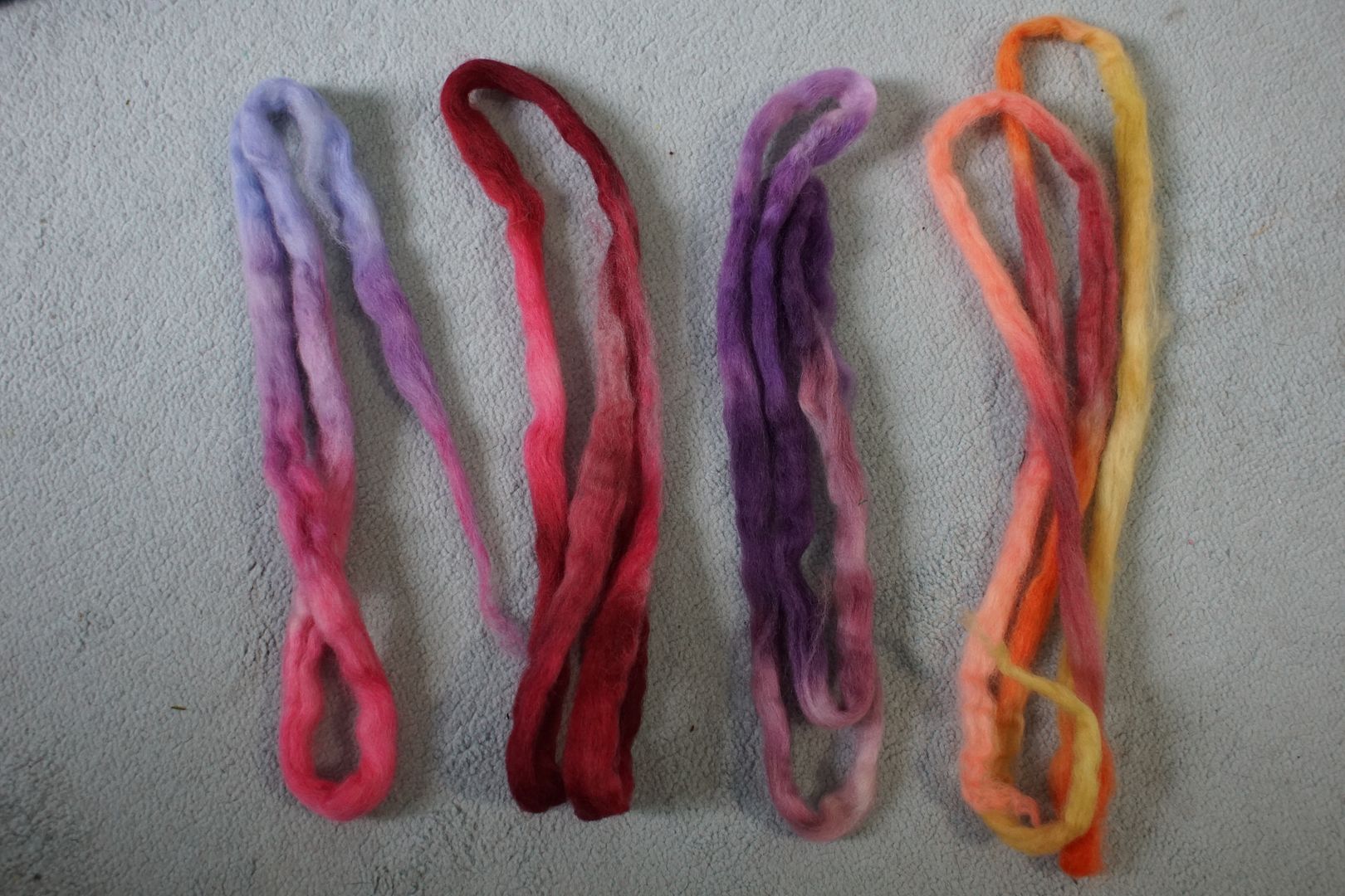
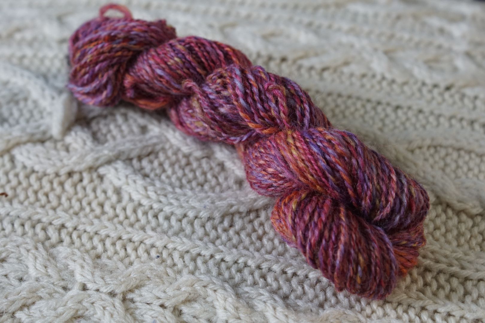
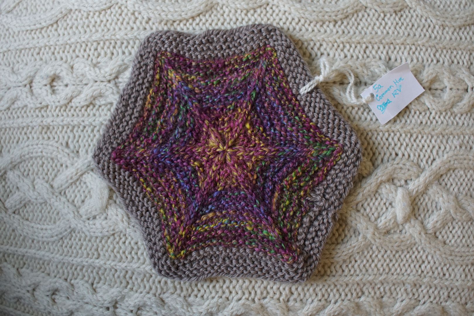
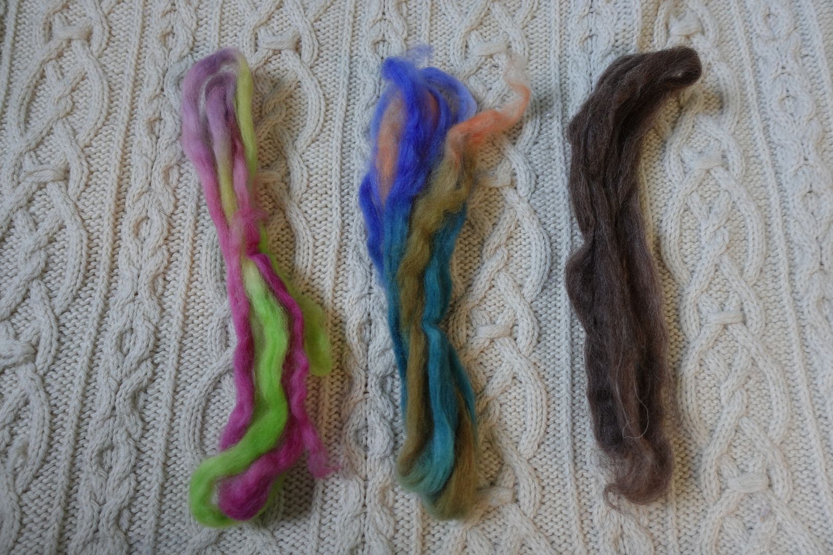
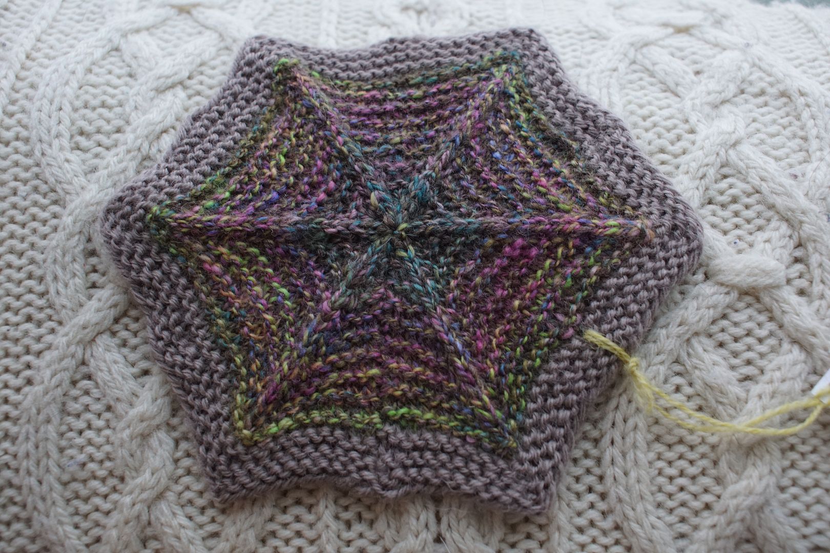
Exercise #: 5.a
Exercise name: Common Hue
Strip 1: 6 – Monochromatic Red-Violet
Strip 2: 34 – Split Complement Yellow/Red-Violet,Blue-Violet
Strip 3: 39 – Split Complement Red-Violet/Yellow,Green
Prep method: Narrow strips + predraft
Spinning tool: EEW6
Wool breed: Cor1+Pol2
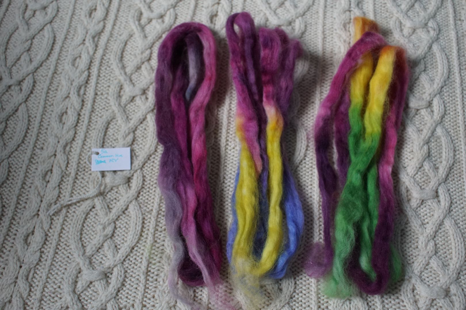
Contrast of hue: High
Contrast of value: Middle major
Cold-Warm Contrast: Lots of cool red-violet but warm undertones there. Everything has warm aspects except that ice blue bit
Complementary Contrast: Present
Simultaneous Contrast: Evident – that ice blue shifts purple and pops loud
Contrast of Saturation: all very saturated
Contrast of Proportion: More than half red-violet, thought it would take over more but everything else is loud too
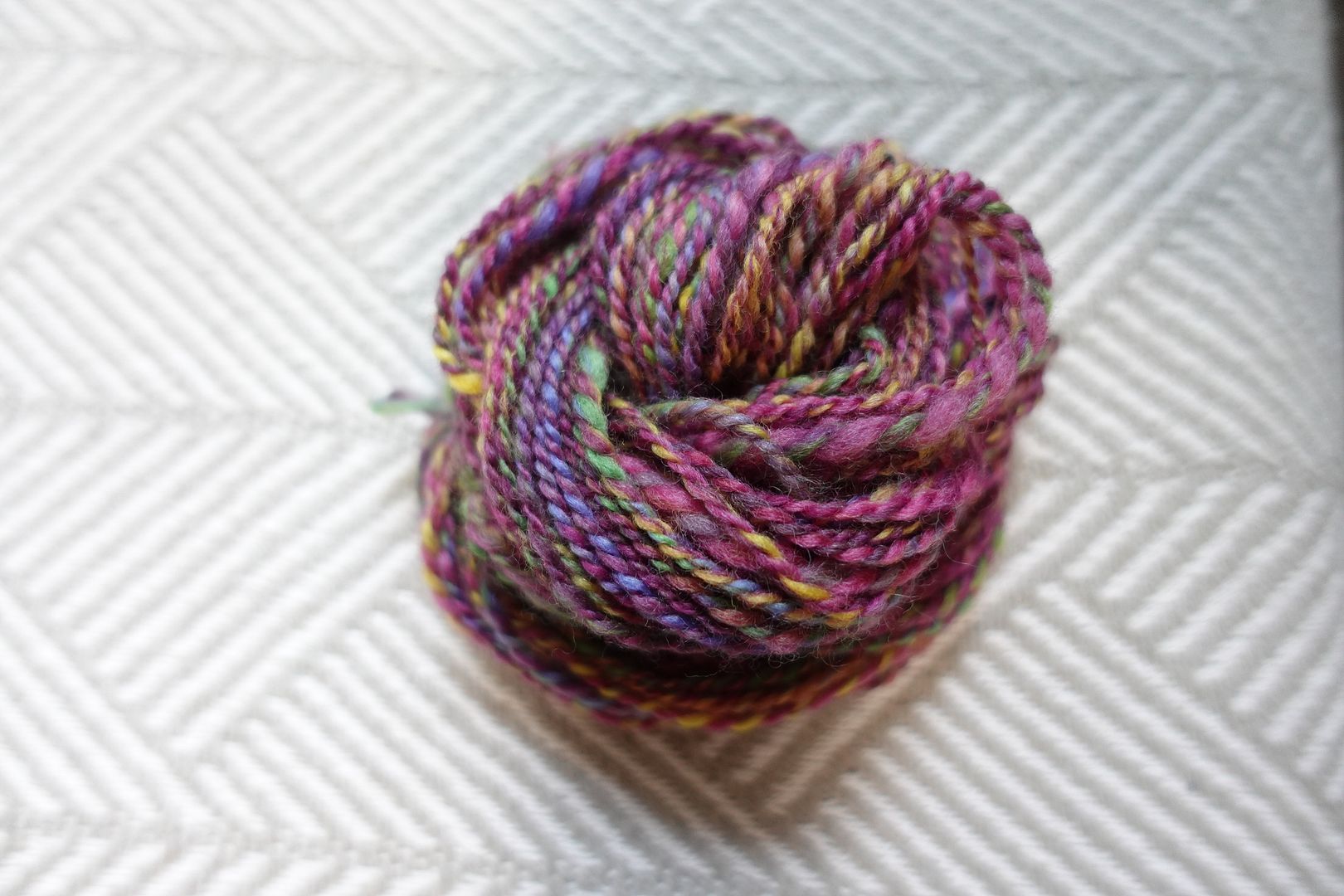
This was a “common hue” experiment, and I consciously wanted red-violet to dominate being common among the handpainted colourways. Again, the red-violet/Yellow/Green split complement set stands out to me here, with that periwinkle popping similarly to the previous sample. This is perhaps less subtle, but blended quite differently.
Exercise #: 7a.a
Exercise name: High Value Contrast
Strip 1: 3 – Monochromatic Orange
Strip 2: 7 – Monochromatic Violet
Strip 3: 11 – Monochromatic Green
Strip 4: 47 – Triad:Secondaries
Prep method: Handcards-Punis
Spinning tool: Support
Wool breed: Cor3+Pol1

Contrast of hue: Moderate
Contrast of value: Medium Low Minor
Cold-Warm Contrast: Very cool, even greens and oranges have cool undertones
Complementary Contrast: Not present
Simultaneous Contrast: Not evident
Contrast of Saturation: Everything medium-to-low saturation
Contrast of Proportion: Very even across secondaries; high value variation prevents mud, low saturation variation makes very gentle

I specifically went for a triadic blend here, bringing the secondary colours together, and I got it! I could have put this on the green side, as it seems pretty balanced with the purplel to me. As the yellow in the primary triad, the orange can’t quite keep up. But that’s OK. I’ve heard various people say they don’t like orange and green together. I’ve just always liked them, and the orange in there adds so much I think.

I’m running out of words in these posts! Can you tell? How’s your attention span doing? Wave if you’ve made it this far! It’s a good thing this isn’t actually a dissertation, I don’t need anyone’s approval, and I can say whatever I jolly well please. Anyway, I’ll try to keep it together for you.
Exercise #: 10a.a
Exercise name: Add neutral
Strip 1: 33 – Complement Red-Violet/Yellow-Green
Strip 2: 36 – Split Complement Orange/Blue-Violet,Blue-Green
Strip 3: “moorit”
Prep method: Dizzed through hand card
Spinning tool: EEW6
Wool breed: Pol2+unknown1
Contrast of hue: high
Contrast of value: Middle major-ish
Cold-Warm Contrast: more cools than warms, though fairly irrelevant here
Complementary Contrast: Present
Simultaneous Contrast: Hard to say, R-V and Y-G pop most so maybe, or maybe they were just brightest
Contrast of Saturation: Colours already pale and dull for the most part, moorit of course quite desaturated.
Contrast of Proportion: by weight moorit was probably half of total, definitely dominates but almost all the hues pop forward

We’re at the edge of the purple section, and these next few hexies could have gone anywhere, but I stuck them onto the purple corner because of a vague sense of fitting. This and the next one saw two colourways each blended with a natural brown I’m calling “moorit” for no officially sanctioned reason. It’s a colour I got in a de-stashed grab-bag, and it’s a slightly dark-valued natural colour. Put with this pair of fairly desaturated oddball handpaints, the complementary lime green and fuscia stand out, and the periwinkle, peach, and teal recede. I find it odd that they striped as much as they did; more mixing may have led to slightly different results.
Exercise #: 10a.b
Exercise name: Add neutral
Strip 1: 34 – Split Complement Yellow/Red-Violet,Blue-Violet
Strip 2: 41 – Split Complement Blue-Violet/Orange,Yellow
Strip 3: “moorit”
Prep method: Dizzed through hand card
Spinning tool: EEW6
Wool breed: Pol2+unknown1

Contrast of hue: High
Contrast of value: Low major-ish
Cold-Warm Contrast: About equal qty of yellows,oranges and blues,violets
Complementary Contrast: Present
Simultaneous Contrast: Maybe with that blue, not strong
Contrast of Saturation: Colours quite saturated, moorit of course quite desaturated
Contrast of Proportion: As previous, by weight moorit was probably half of total, definitely dominates but almost all the hues pop forward, esp those of highest value, far from darkish moorit

I put a different pair of handpaints with the moorit, and this time the split complement of yellow/red-violet/blue-violet is what stands out to me here. Thanks to the red-violet being a little darker in value itself, it all blends a bit better with the brown.
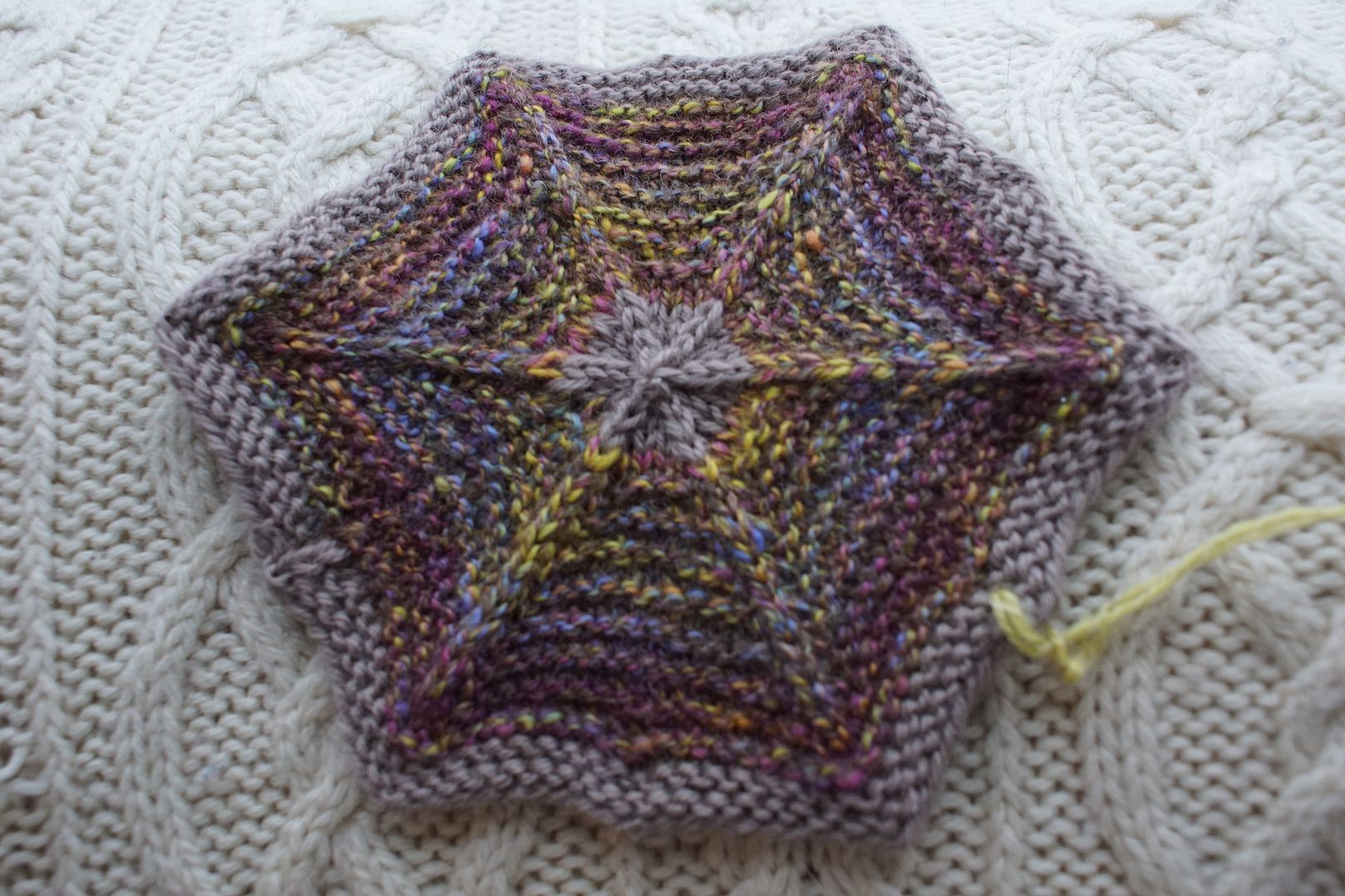
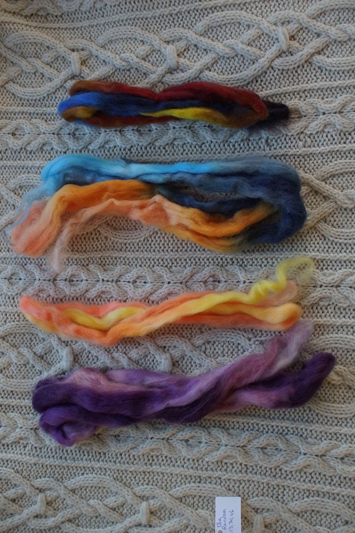
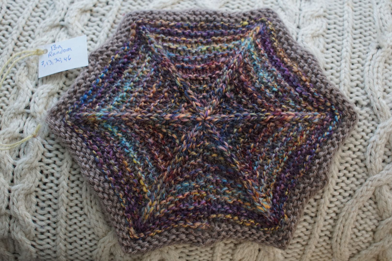
Exercise #: 13a
Exercise name: Random
Strip 1: 7 – Monochromatic Violet
Strip 2: 13 – Analogous Pale Yellow to Red-Orange
Strip 3: 30 – Complement Orange/Blue
Strip 4: 46 – Triad:Primaries
Prep method: Stripped and held together
Spinning tool: EEW6
Wool breed: Corrie+Polwarth
Contrast of hue: High
Contrast of value: Middle supermajor
Cold-Warm Contrast: About even between blues,purples and yellows,oranges
Complementary Contrast: Present
Simultaneous Contrast: Perhaps evident in flecks of yellow against purple and peach against blue, but value difference might be most of that
Contrast of Saturation: Mostly pale, dull, dark
Contrast of Proportion: Again light vs. dark found a nice balance, being about 2/3 dark. Quite speckled. Looks like a triad plus purple; purple and red combine to balance the blue and yellow

I made up the word “supermajor” here, though I may have used it already, to describe an EXTREME sense of all the light and dark values being included. To me, this looks like a more and even more complex sister to the primary triad hexie I wrote about yesterday. The purple and peach are different, the light and dark blue, and the absence of intense red. Just like you took a simple triad and started fiddling with the dials.
Exercise #: 13d
Exercise name: Random
Strip 1: 14 – Analogous Dull Yellow-Orange to Red
Strip 2: 32 – Complement Red/Green
Strip 3: 35 – Split Complement Yellow-Orange/Violet,Blue
Strip 4: 40 – Split Complement Violet/Yellow-Orange,Yellow-Green
Prep method: Stripped and held together
Spinning tool: EEW6
Wool breed: Cor1+Pol3
Contrast of hue: High
Contrast of value: High middle major
Cold-Warm Contrast: About equal, a bit more warms maybe
Complementary Contrast: Present
Simultaneous Contrast: Unable to evaluate do to mistake regarding singles
Contrast of Saturation: Everything about equally dull or pale
Contrast of Proportion: Unable to evaluate due to mistake regarding singles
I hate to end on a fart, but this was the one colourway where I got singles mixed up from different planned combinations. I think the one on the right has most of the right colours in there. You know what, with all this organization, one mix-up is pretty darn good!

We’ve made it to the end of this journey through Skep. I can’t believe how big of a project it was. If I’d realized what a large thing I was making at the beginning, I don’t think I could have done it. But it just seemed like one little project at a time. Having to finish and photograph them for episodes of the Wool Circle really helped – nothing like chunking a big project in the sharing to make it approachable, and to encourage reflection along the way.
I’m really proud of what I’ve accomplished and learned in this Year of Colour project, both in knowledge gained and ideas thrown away! This was a wonderful opportunity to play, gain lots of new insights, and try a variety of techniques. I have a few favourites that I’ve earmarked to come back to for a larger project one day, and some ideas to watch out for in future. I think a bigger combo spin is in the cards during the next couple of years. Thanks so much for reading along!

Wow! This is such an amazing project, it’s been so cool to read your in-depth analyses of each colour. I don’t know how to spin so the technical stuff is beyond me, but it’s so interesting to see how colour theory applies in this medium. And what a lovely blanket you’ve created as well – thanks for sharing this project!
LikeLike
Thanks for reading all that! Your kind words mean a lot!
LikeLike