
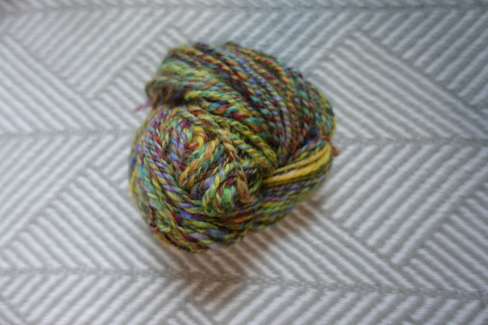
There ended up being so many green-dominated hexies that they took up a whole side of the blanket. I wonder why this is – were the green dyes I used particularly potent on balance? Is it the amount of neon green I allowed into the mix? Is it my own subconscious love of green coming out? I don’t expect to find out, but I like asking the questions!
Again, the unlabeled hexies below are the single dye sample hexies, and we’ll be covering these six colourways today.
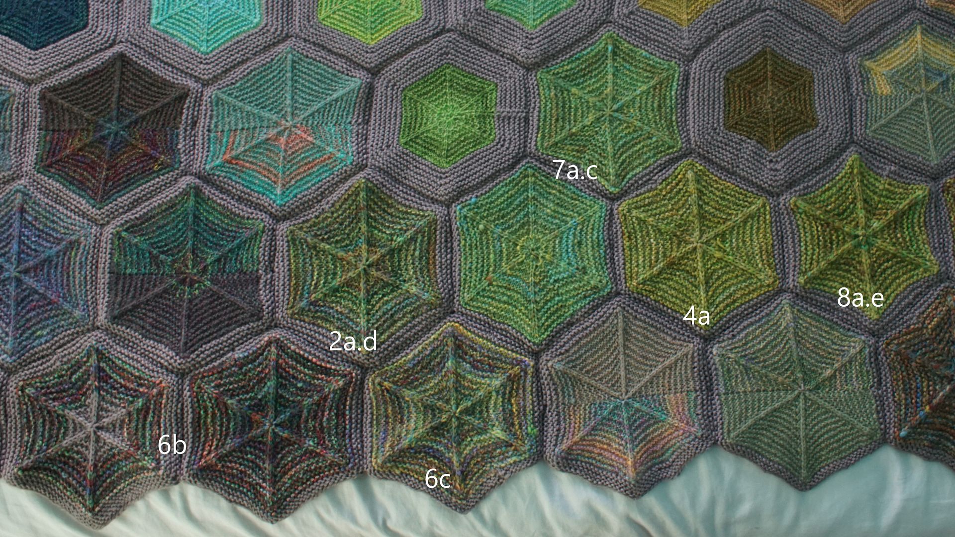
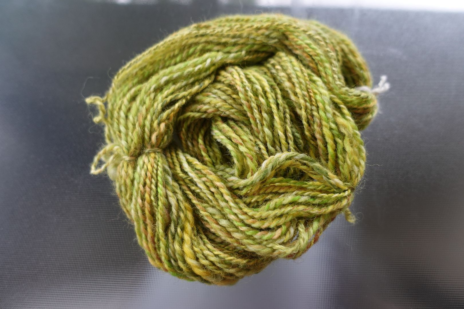
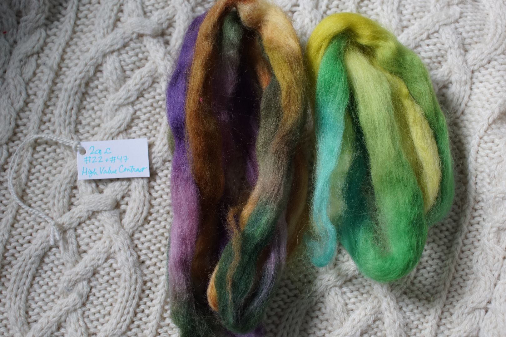
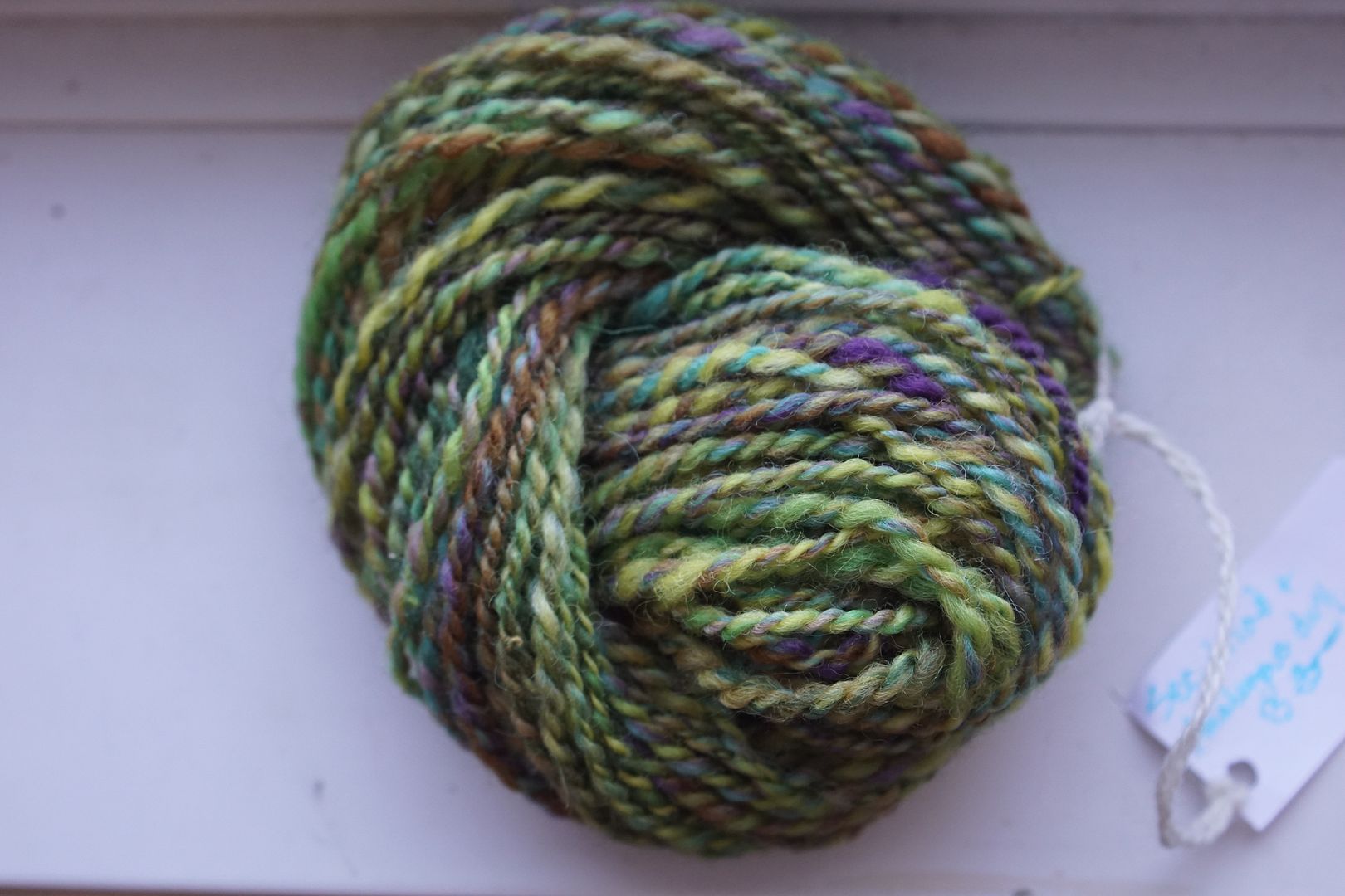
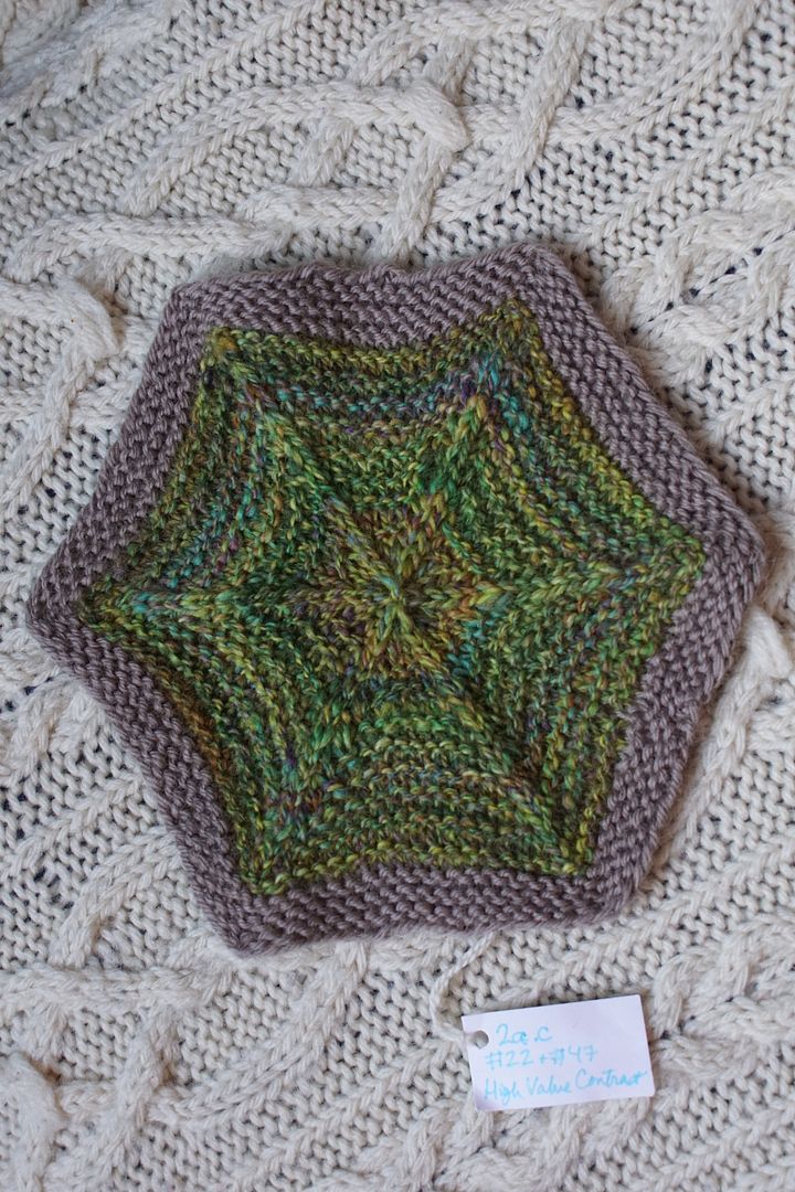
Exercise #: 7a.c
Exercise name: High Value Contrast
Strip 1: 21 – Analogous Pale Blue to Yellow-Green
Strip 2: 22 – Analogous Dull Blue-Green to Yellow
Strip 3: 23 – Analogous Intense Green to Yellow-Orange
Strip 4: 24 – Analogous Dark Yellow-Green to Orange
Prep method: Hand-carded mess punis, went through drum carder (high blending)
Spinning tool: Support
Wool breed: Corriedale

Contrast of hue: Low
Contrast of value: Middle minor
Cold-Warm Contrast: Mostly warm, but plenty of cool undertones in dull and pale
Complementary Contrast: Not present
Simultaneous Contrast: Evident – blue-green shifted blue
Contrast of Saturation: More darks, dulls, and pales than intense hues
Contrast of Proportion: Close hues made more blending, different values and pop of blue add complexity
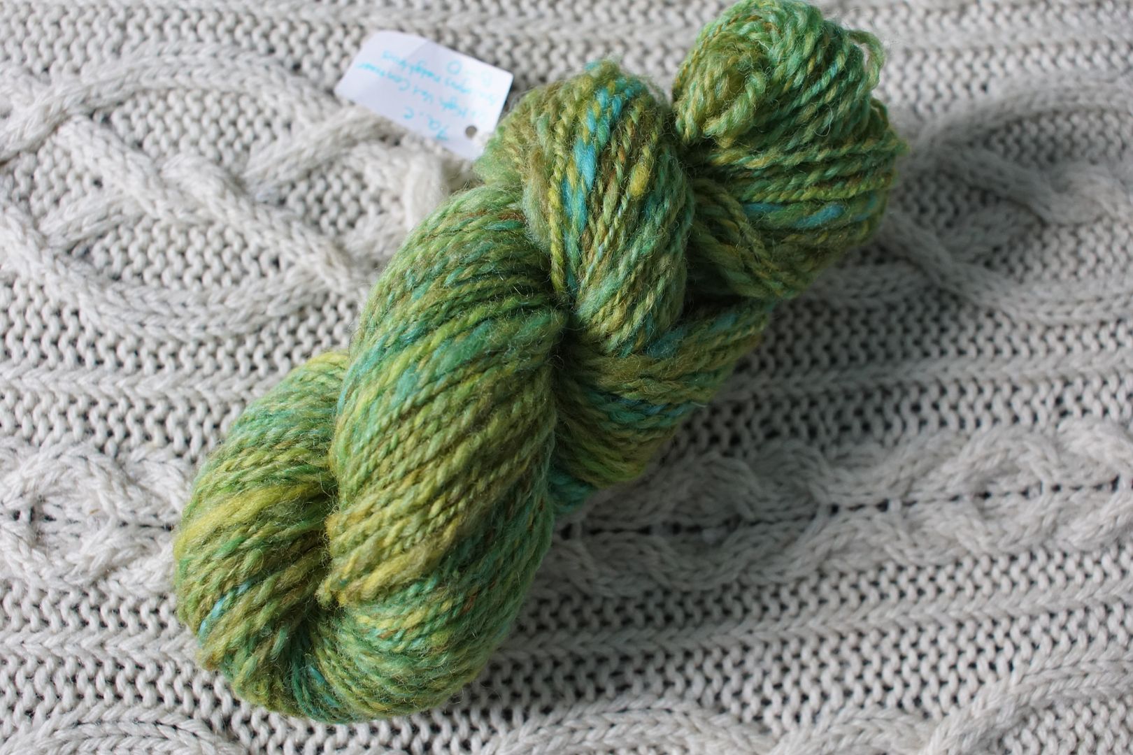
This was a “high value contrast” exercise, and I wanted to try it with low hue contrast. The result was very well blended. When the hues are close together, they blend into more saturated versions of themselves. When saturation or value are close together, even if the hues are quite different, they blend more – that’s when you get mud. This was one of the most important lessons from these experiments! I love the subtle, tweedy complexity of this one.

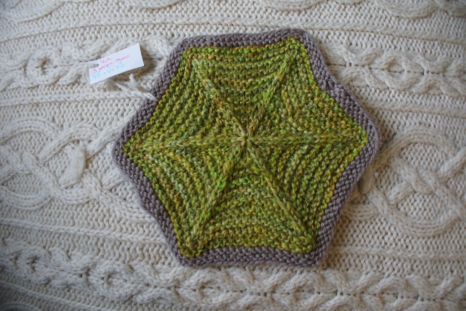
Exercise #: 4.a
Exercise name: Any 3 strips
Strip 1: 1 – Monochromatic Yellow
Strip 2: 2 – Monochromatic Yellow-Orange
Strip 3: 12 – Monochromatic Yellow-Green
Prep method: Narrow strips held
Spinning tool: EEW6
Wool breed: Corriedale

Contrast of hue: Low
Contrast of value: Middle minor
Cold-Warm Contrast: Mostly warm, cool undertones in peach
Complementary Contrast: Not present
Simultaneous Contrast: Not evident
Contrast of Saturation: Nothing too strong, some brown as well
Contrast of Proportion: Low hue contrast + high value contrast makes relatively solid appearing, complex yarn
The last blend put analogous colourways together; this one put similar monochrome colourways together. This one centered around yellow rather than green, and doesn’t include any stand-alone blue, so it blends together even more.
Exercise #: 8a.e
Exercise name: 4 Warms
Strip 1: 2 – Monochromatic Yellow-Orange
Strip 2: 11 – Monochromatic Green
Strip 3: 23 – Analogous Intense Green to Yellow-Orange
Strip 4: 24 – Analogous Dark Yellow-Green to Orange
Prep method: Blending board-stripped
Spinning tool: EEW6
Wool breed: Corriedale
Contrast of hue: Low
Contrast of value: Middle minor
Cold-Warm Contrast: Warm dominates all, but cool undertones in peach and some greens
Complementary Contrast: Not present
Simultaneous Contrast: Not evident
Contrast of Saturation: Maybe 1/4 intense colours, rest mostly dull or pale
Contrast of Proportion: Desaturation dominates, but because hues close together, final blend is still quite bright. Close hues support each other.

This puts some of those same colourways together, this time in the name of warmth. It is very similar to the one previous – if I didn’t label well, I’m not sure I wouldn’t get them mixed up? The intense greens add a bit more vivacity to this one, but otherwise they are very similar.

Exercise #: 2a.d
Exercise name: High Value Contrast
Strip 1: 22 – Analogous Dull Blue-Green to Yellow
Strip 2: 47 – Triad:Secondaries
Prep method: Blending Board-Lifted
Spinning tool: Blondie
Wool breed: Corrie+Polwarth
Contrast of hue: High
Contrast of value: Middle Minor
Cold-Warm Contrast: Mostly warm, triad has cools
Complementary Contrast: Present
Simultaneous Contrast: Perhaps evident – Yellows and Purples, subtle
Contrast of Saturation: All dull, quite balanced
Contrast of Proportion: Greens and yellows in even amounts, but greens took over. Others are highlights/undertones
Here is a mix in which I was genuinely surprised that greens took over. The analogous partners of blue, green, and yellow locked arms around their middle member, green, and the purple, though it stands out in the fiber, took a back seat. This is a particularly delicious, complex green. Put this one in my top ten, please!
Exercise #: 6.c
Exercise name: Triads
Strip 1: 38 – Split Complement Red/Blue-Green,Yellow-Green
Strip 2: 40 – Split Complement Violet/Yellow-Orange,Yellow-Green
Strip 3: 41 – Split Complement Blue-Violet/Orange,Yellow
Prep method: VERY narrow strips held together
Spinning tool: EEW6
Wool breed: Polwarth
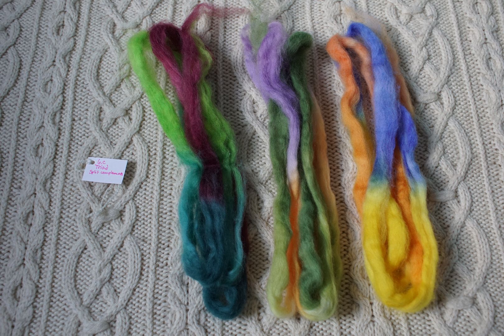
Contrast of hue: Extreme
Contrast of value: Middle major
Cold-Warm Contrast: More cools than warms, but the warms are light and bright
Complementary Contrast: Present
Simultaneous Contrast: Evident in those loud dark reds, enhanced by value contrast
Contrast of Saturation: Extreme between bright yellow several pales/dulls
Contrast of Proportion: Lots of green, green still wins, supported by blues, yellow is very speckly
This was a fairly haphazard, nominally triadic experiment that I was surprised came out green, but looking at the fiber again, there was more green present than I realized. There was just as much yellow and orange, but Goethe’s numbers were right again – green came out on top. Still, yellow and orange lift the value, make the whole thing complex, and give that little bit of periwinkle something to bounce off of. This is way more fun of a blend than I thought it would be!
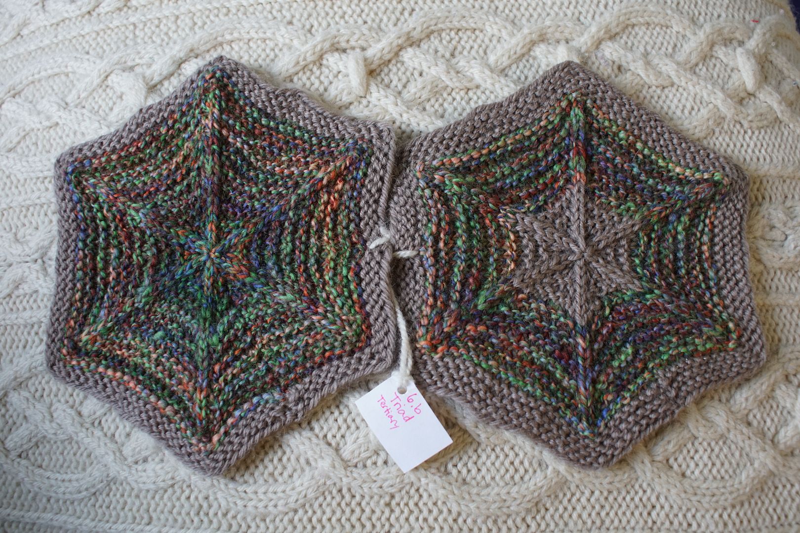
Exercise #: 6.b
Exercise name: Triads
Strip 1: 4 – Monochromatic Red-Orange
Strip 2: 8 – Monochromatic Blue-Violet
Strip 3: 12 – Monochromatic Yellow-Green 11 – Monochromatic Green
Prep method: Narrow strips held
Spinning tool: EEW6
Wool breed: Corriedale
Contrast of hue: High
Contrast of value: High middle major
Cold-Warm Contrast: Cools in Green and blue take over strongly
Complementary Contrast: Not officially present
Simultaneous Contrast: Quite evident – whole thing shifts into more of a split complement
Contrast of Saturation: Fairly even across
Contrast of Proportion: Twice as much cools as warms, green wins surprisingly but beautifully complex with orange

This was another triad experiment, this one more controlled. Here I put tertiaries together – Blue-Violet, Yellow-Green, and Red-Orange. Looking at it more closely, all these months later, I’m not sure I didn’t make a boo-boo and use secondary Green instead of Yellow-Green. Yeah, I think I did. That would explain why green won out more than I expected! It made the whole thing into a split complement, the red-orange bouncing off a united front of blue-green. The result is vivacious.
My kids all know that green is my favourite colour. Whenever we play board games, I have to have the green meeple, or there’s no hope of me remembering which one I am. Green is the defining colour of the land of my birth, where I feel most attached to the trees. I can’t help but wonder if that comes through in my dyeing, without me ever meaning it to! Regardless, I won’t complain that green has a special emphasis in this blanket project.
