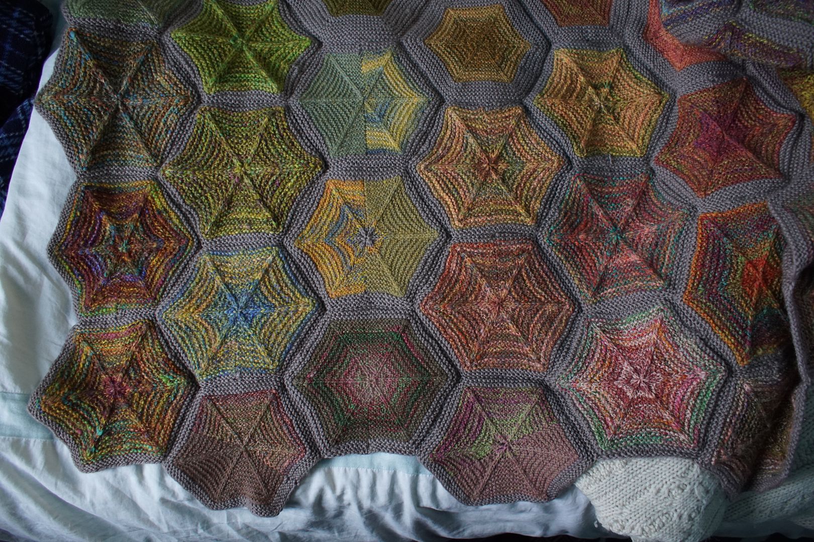
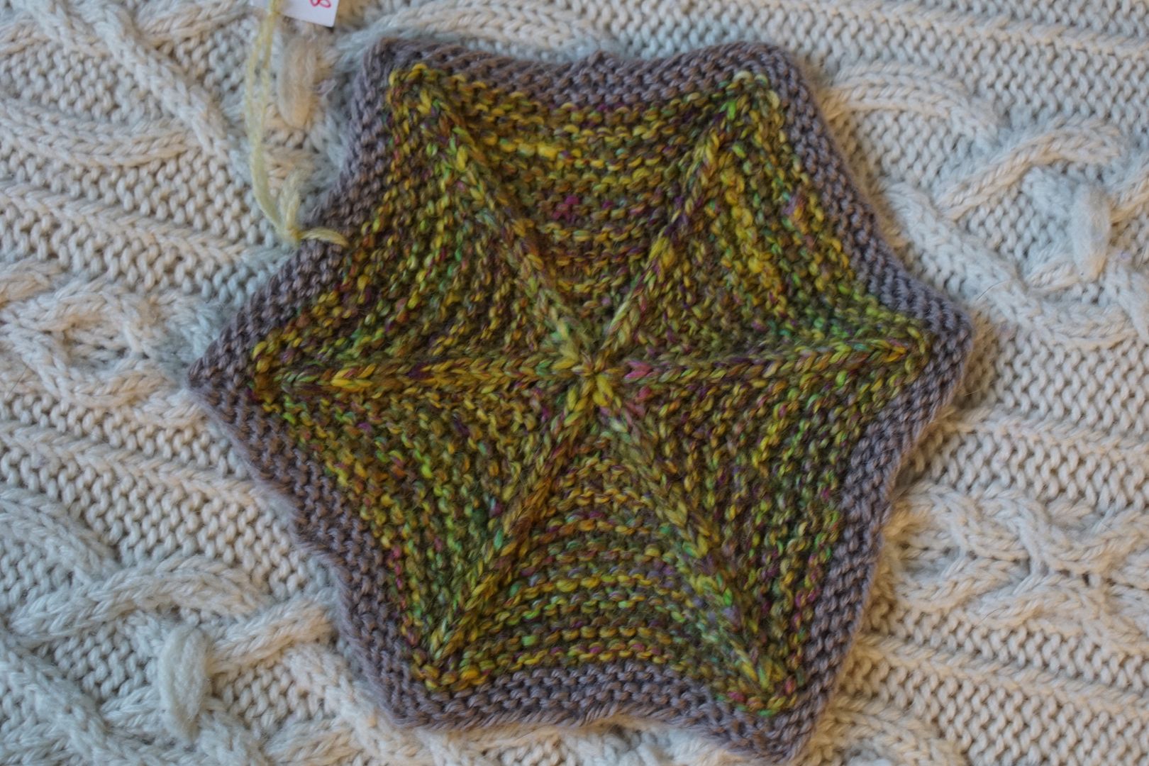
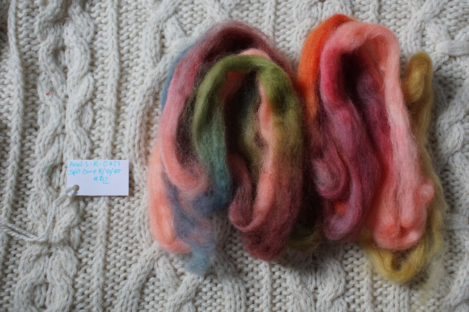
This is a smaller corner – not a lot of blends really came through as yellow or orange. This is perhaps attributable to Goethe’s proportion theory – it takes a lot more yellow to really take over a colourway than the other two primaries, as loud as it can be as a pop colour. But here they are below. Note again that unlabeled hexies are from single colourway samples. I’ve also labeled three hexies in the neighboring red section that I covered yesterday (5c, 8a.c, and 10b.b), and one of the greens we’ll look at tomorrow (8a.e). We’ll cover seven blends today.

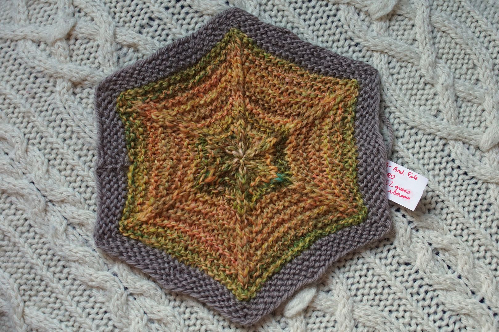
Exercise #: 2a.c
Exercise name: High Value Contrast
Strip 1: 13 – Analogous Pale Yellow to Red-Orange
Strip 2: 52 – Warms:Yellows+Greens
Prep method: Blending Board-Dizzed
Spinning tool: Blondie
Wool breed: Corriedale

Contrast of hue: Low-to-Moderate
Contrast of value: High Major
Cold-Warm Contrast: Mostly warm, Green and peach both have cool undertones
Complementary Contrast: not present
Simultaneous Contrast: Perhaps, between peach and green
Contrast of Saturation: Saturated for pales, plus middling for mid-values, evens out
Contrast of Proportion: Lots of warms and yellows, less greens/peaches/cool undertones
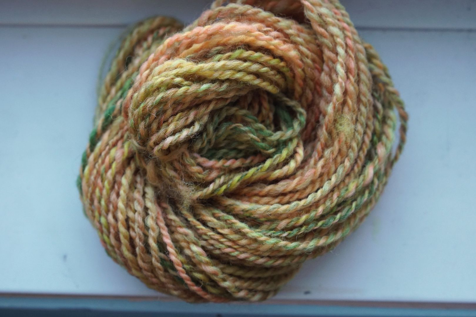
That neon-glowing pale analogous colourway is one of the most arresting colourways I dyed. It definitely takes over this blend, wrenching everything in a very high value direction, but that glowing millenial pink doesn’t come through in the final blend. Cool undertones make this a very complex yellow-orange. And forest green as a pop colour – I like it! But then I like almost anything green.
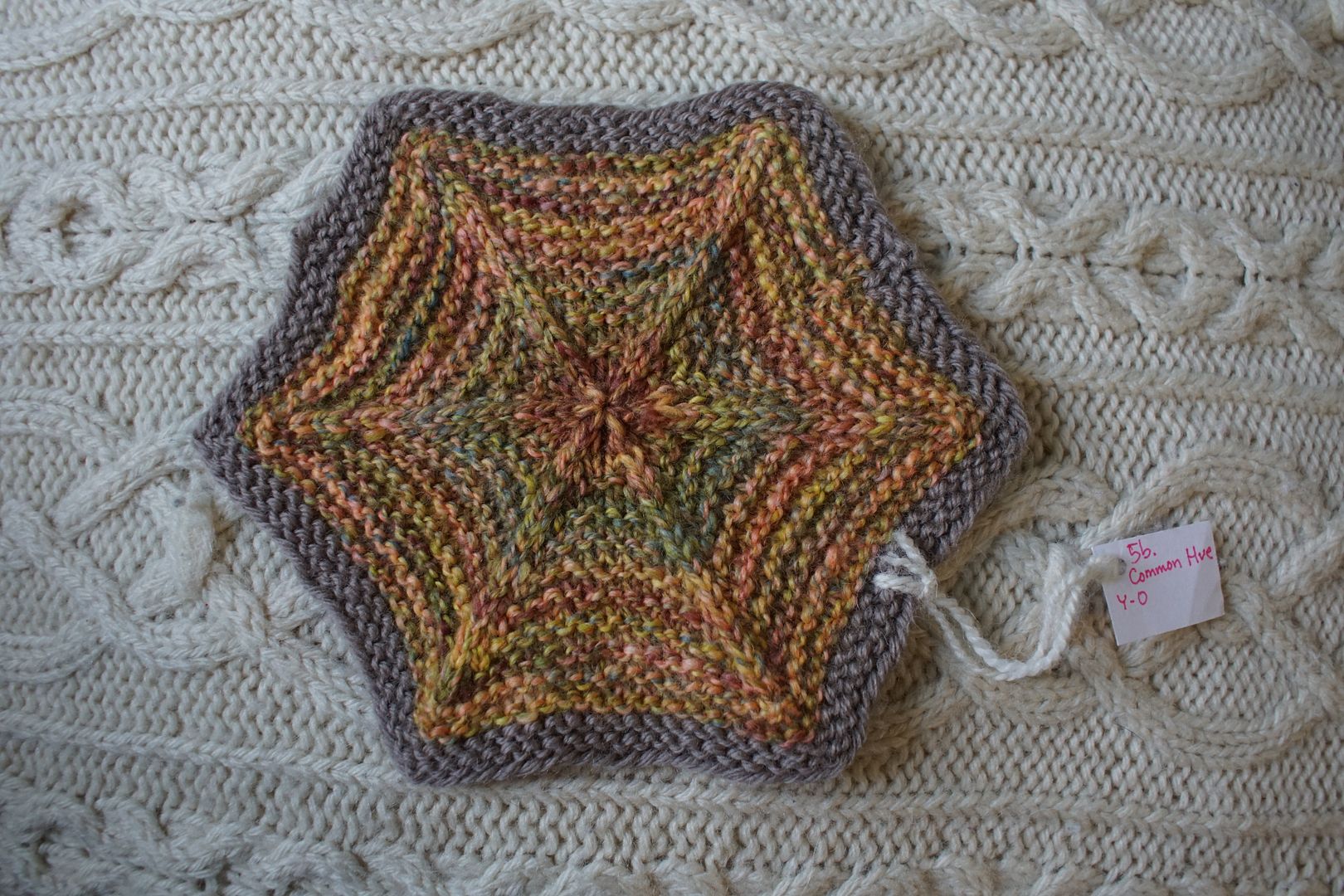
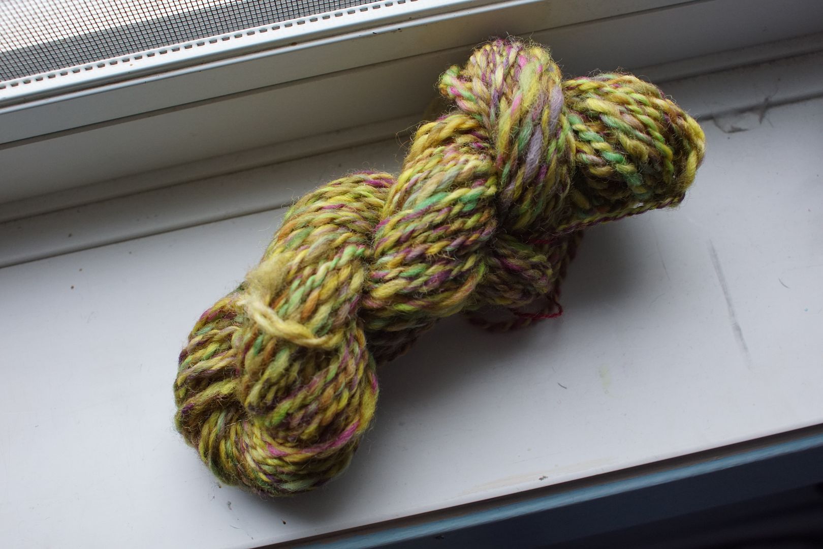
Exercise #: 5.b
Exercise name: Common Hue
Strip 1: 2 – Monochromatic Yellow-Orange
Strip 2: 13 – Analogous Pale Yellow to Red-Orange
Strip 3: 42 – Split Complement Blue/Yellow-Orange,Red-Orange
Prep method: Narrow strips held
Spinning tool: EEW6
Wool breed: Cor2+Pol1

Contrast of hue: Moderate
Contrast of value: High middle minor
Cold-Warm Contrast: Mostly warm, with a tiny bit of blue-grey, red has cool undertones
Complementary Contrast: Not present
Simultaneous Contrast: Not evident, thought blue would pop but doesn’t, too desaturated
Contrast of Saturation: About 2/3 pale, bright oranges and yellows, and 1/3 dull dark various
Contrast of Proportion: Common hue of peach frames the whole thing and the dulls desaturate it, nice balance
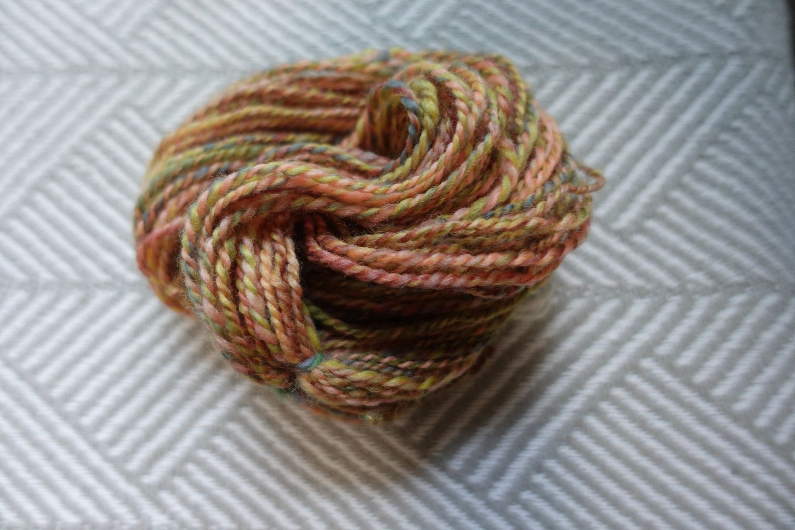
Here the same neon-bright analogous colourway has a different set of partners, and goes in a different direction. I just love what that little bit of blue-grey does in there. The whole assemblage is cooler, more desaturated, and jives nicely with the Latte border.
Exercise #: 4.c
Exercise name: Any 3 strips
Strip 1: 29 – Complement Yellow-Orange/Blue-Violet
Strip 2: 35 – Split Complement Yellow-Orange/Violet,Blue
Strip 3: 41 – Split Complement Blue-Violet/Orange,Yellow
Prep method: Narrow strips held
Spinning tool: EEW6
Wool breed: Polwarth
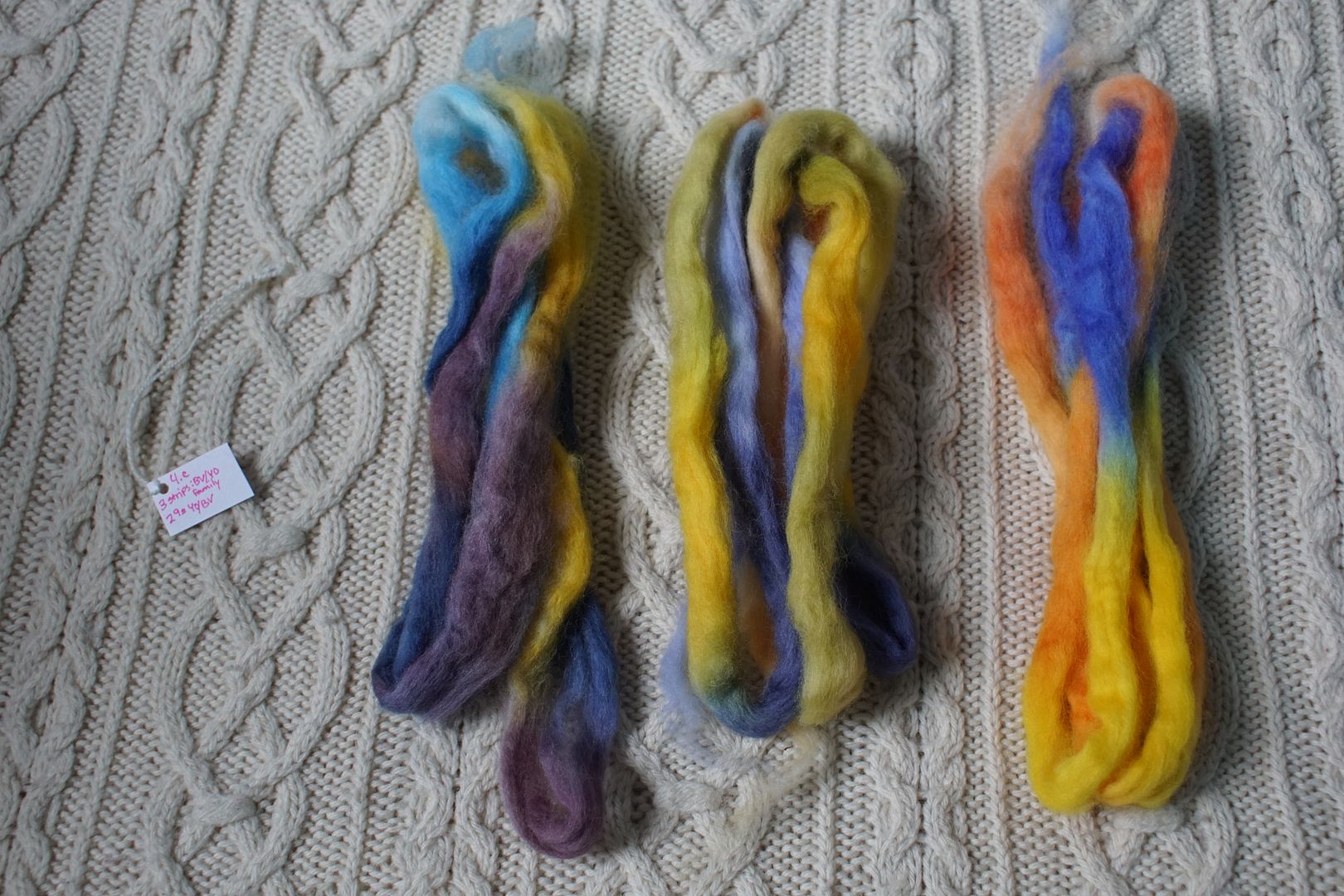
Contrast of hue: Extreme
Contrast of value: High major
Cold-Warm Contrast: Extreme – blues and yellow-oranges!
Complementary Contrast: Present
Simultaneous Contrast: Evident – orange aspects of yellow pop
Contrast of Saturation: Both saturated and desaturated of blue, mostly saturated yellow and orange
Contrast of Proportion: Even amount of yellow and blue, yellow took over. Goethe wins this one

If you look at each of these individual colourways spun and knit up, this final blend is very similar to all of them, but a more balanced and complex version. It also appears more saturated than any of the colourways looks on its own. Despite yellow and blue not being my favorites, all that complexity makes them more inviting.

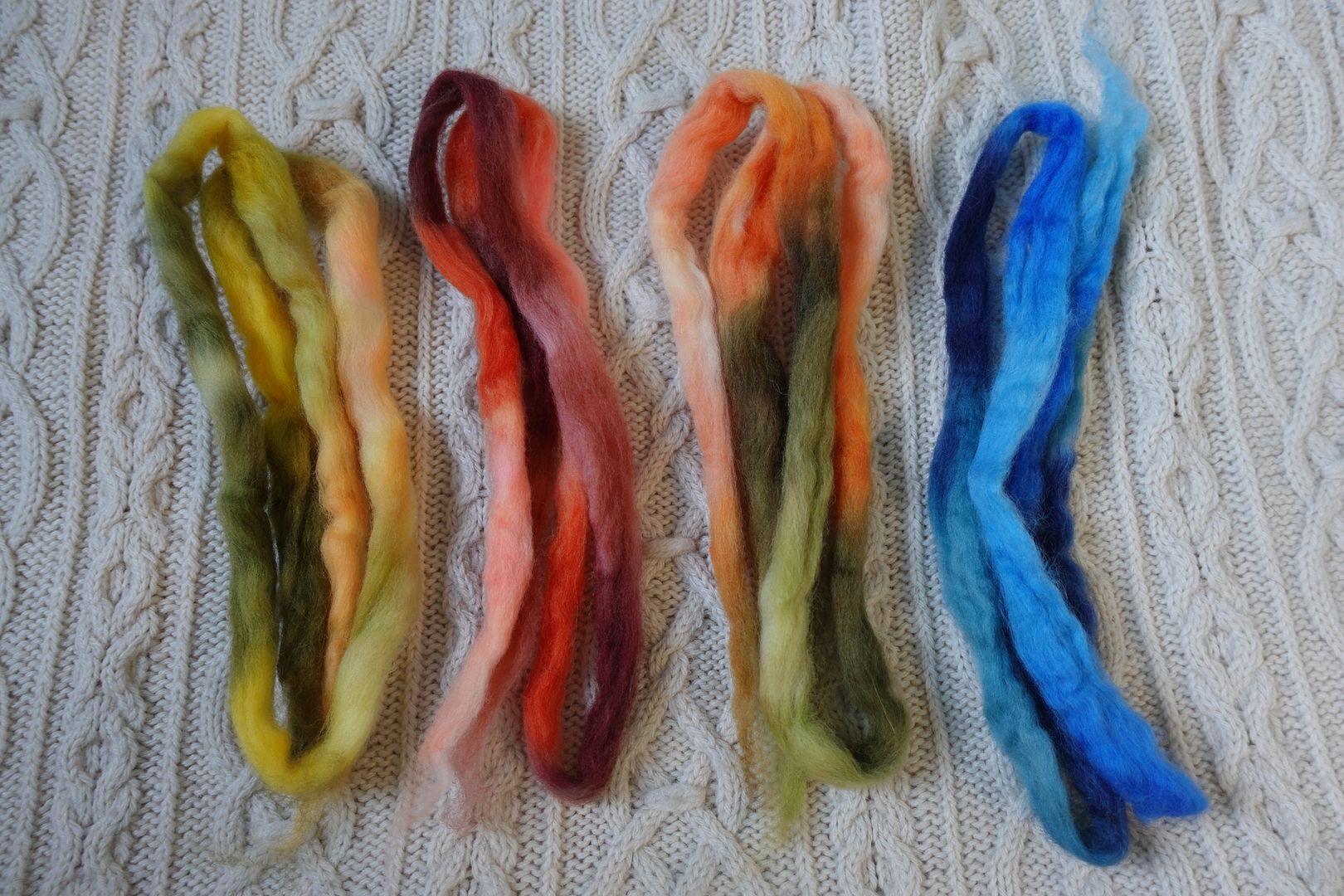
Exercise #: 8a.d
Exercise name: 3 Warms + 1 Cool
Strip 1: 1 – Monochromatic Yellow
Strip 2: 6 – Monochromatic Red-Violet
Strip 3: 23 – Analogous Intense Green to Yellow-Orange
Strip 4: 24 – Analogous Dark Yellow-Green to Orange
Prep method: Blending board
Spinning tool: EEW6
Wool breed: Corriedale

Contrast of hue: High
Contrast of value: High Middle Major
Cold-Warm Contrast: Warms have some cool undertones, Cool has a little warm undertone
Complementary Contrast: Present (Y/V)
Simultaneous Contrast: Not evident – purple blends, does not pop or shift
Contrast of Saturation: Warms about half saturated half less so; cool mostly desaturated
Contrast of Proportion: Saturation mix allows purples to blend more, whole thing warm but desaturated. Yellow sets tone but smaller colours mostly visible
Here’s an example of mixing in a little bit of a complement to make a blend richer. It worked out well having so much going on on the warm side of things – not just yellows, but greens and browns – and the purple was on the desaturated side. This brownish, earthy, desaturated yellow is probably not for everyone, but I like it.
Exercise #: 3.b
Exercise name: Colour effects
Strip 1: 27 – Analogous Red to Orange
Strip 2: 42 – Split Complement Blue/Yellow-Orange,Red-Orange
Prep method: Narrow strips held
Spinning tool: EEW6
Wool breed: Corrie+Polwarth
Contrast of hue: Moderate
Contrast of value: High middle minor
Cold-Warm Contrast: Mostly warms, cool undertones in reds, spot of blue-grey
Complementary Contrast: Not present
Simultaneous Contrast: Evident – blue-grey shifts and pops, red-orange shifts orange
Contrast of Saturation: Mostly desaturated, pop of orange
Contrast of Proportion: Orange and red takes over, maybe ¾. Peach and terra cotta make odd allies

Here we have that same hit of blue-grey that I love so much, but some odd allies set the tone for the rest. Similar hues, despite differences of saturation and value, tend to come together in the battle of proportions. Here an intense red-orange, a dull red, and a pale orange set the tone of complex earthy colours. The blue-grey and green come through as pops. More well-blended than other “terra cotta” colourways in the red corner, I love this dearly. Perhaps it helps that there are no real darks.

Exercise #: 8a.b
Exercise name: 3 Warms + 1 Cool
Strip 1: 2 – Monochromatic Yellow-Orange
Strip 2: 3 – Monochromatic Orange
Strip 3: 4 – Monochromatic Red-Orange
Strip 4: 9 – Monochromatic Blue
Prep method: Blending board -stripped
Spinning tool: EEW6
Wool breed: Corriedale
Contrast of hue: High
Contrast of value: Middle minor-ish
Cold-Warm Contrast: Warm dominates, but cools are saturated
Complementary Contrast: Present
Simultaneous Contrast: Not sure – complements are blunt, not shifted
Contrast of Saturation: Cools most saturated, warms more desaturated
Contrast of Proportion: Blue puts up a good fight thanks to its saturation; whole thing desaturates and turns greenish; very natural and surprisingly pleasing
Here I went simple. This was one of the assignments that had me put three warms together with one cool, and I picked all monochromatic colourways. Here Goethe’s numbers come in – according to his theory, blue is more heavily weighted, so putting this balance of red/orange/yellow against blue came out fairly balanced, meaning in this case desaturated. Yum yum complex brown, and bits of blue popping out!
Exercise #: 7a.b
Exercise name: High Value Contrast
Strip 1: 41 – Split Complement Blue-Violet/Orange,Yellow
Strip 2: 43 – Split Complement Blue-Green/Red,Orange
Strip 3: 45 – Split Complement Yellow-Green/Red,Violet
Strip 4: 53 – Warms:Yellows+Reds
Prep method: Hand-carded messy punis (low blending)
Spinning tool: Support
Wool breed: Polwarth

Contrast of hue: Extreme
Contrast of value: Middle Super-Major
Cold-Warm Contrast: Mostly warms, some dark reds have cool undertones, few cools are very cool
Complementary Contrast: Present (orange-blue, red-green)
Simultaneous Contrast: Evident – those greens and blues pop!
Contrast of Saturation: Lots of saturation, but some pales, some darks – all over the place
Contrast of Proportion: Warms dominate, values all over the place!
This was an outlier, and one of the few where I didn’t take a photo of the yarn before knitting it up. I blame vacation. Anyways, the assignment was high value contrast, and I think I succeeded. High value contrast, plus high hue contrast, plus very little desaturated stuff, made a fireworks show!

Which of these colourways appeals to you? Which one surprised you?
