On the day that I wrapped Jared’s nearly finished nasaq:

I cast on a heid for myself.
Kate Davies has taken to calling a hat a “Heid”, which is in fact Scots for head. This is from her early patterns which had graphic representations of things on them: “dollheid” has paper dolls; “neepheid” has turnips; “snawheid” has snowflakes. It sort of stuck, and now all hats are heids.
I did a quick Goog to figure out what the actual Scots word is for hat, and wasn’t quite sure. The tam o’ shanter is a particular Scottish style that has a history all its own, but has broadened somewhat, such that now men and women both wear a “tam” or “tammy.” All hats are not tams, though. It appears the more universal colloquial term would be “bonnet.” That might cause confusion, but my hat turned out so darn cute that I don’t mind calling it a bonnet.

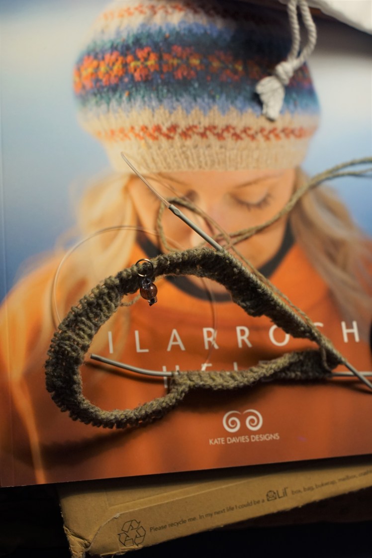
I chose to cast on Breiwick, the heid on the cover. Breiwick was designed by Ella Gordon, who lives on Shetland, works for Jamieson and Smith, and is a bit of an expert on Shetland textiles. (Oh dear, I turned a bit green just typing that.) Breiwick is the name of a bay near her home.
What makes the design so striking, in my opinion, is the gradient of blue diamonds with which Ella transitions from light to dark before placing a row of flowers. Then the brightest color in the flowers frames the main chunk of pattern with a little row of bright feathers. Getting that gradient right would be key.

I used seven colors out of the above leftovers in Brooklyn Tweed Loft: five from my Zimmerzog sweater, and two passed on by my friend Gayle when she heard I liked the stuff. I used the three greens for a gradient, and the red, orange, and yellow for the flowers.
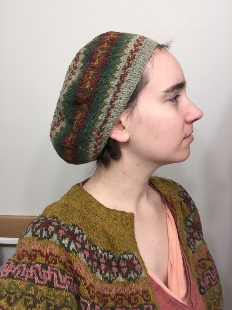

The gradient caught exactly the effect I wanted, just in green. Unfortunately, the red I used is just too close in value to the dark green, so there’s just not enough contrast to make the flowers pop.
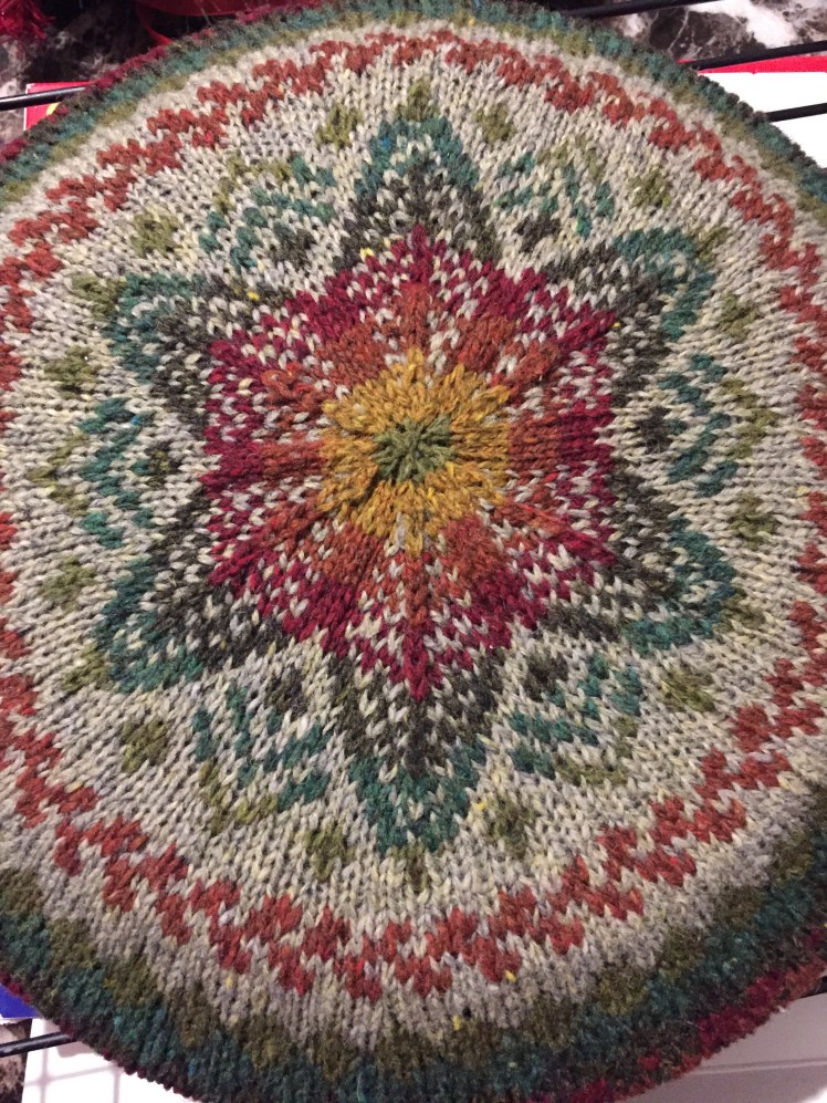
There’s an upside, though: the crown of the hat uses all the colors again, the blues into the pink and orange. On the original, there’s a bit of contrast in the jump from blue to pink, but on mine, the green flows right into the red. I think it looks super amazing this way.

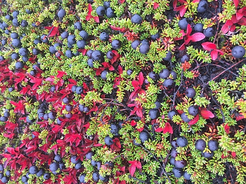
I live beside a northern bay, like Ella does. (She’s about four degrees south of me, but what’s that between knitters?) My colors, though, don’t remind me of the water; they remind me precisely of the land in fall. My main color is just what I would pick to represent the light-colored, slow-growing lichen that the caribou eat, and the many greens and reds are just like the fall colors that light up the land for a few weeks in late August and early September.

So, from my bay to yours, Ella, thank you for the beautiful pattern! Happy Epiphany everyone.
(Ps I apologize for the awful lighting. Getting good natural light this time of year is a matter of luck and timing, even if you have a lot more patience and camera skill than I have right now.)

One thought on “A Bonnet for my Heid”