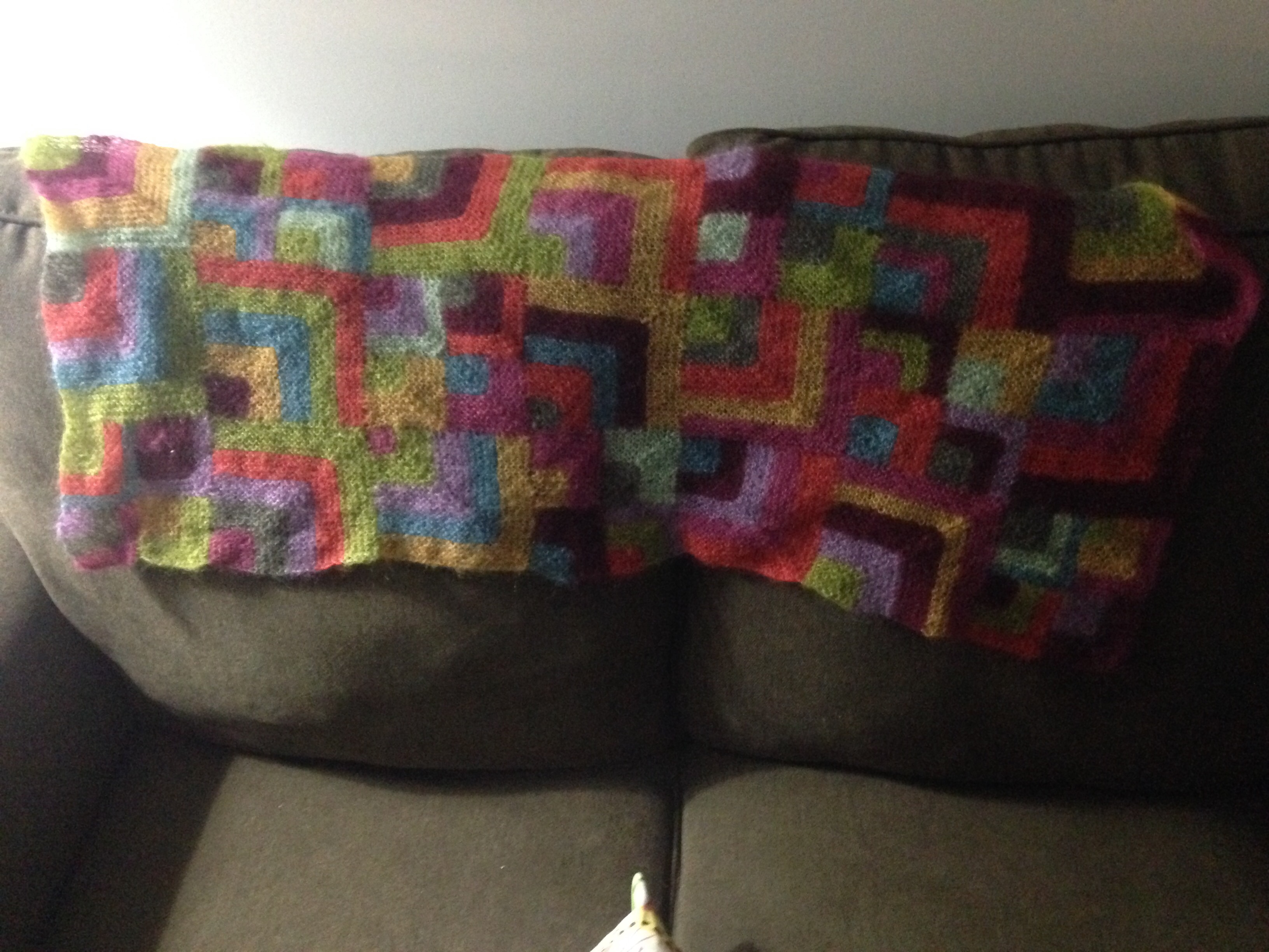
In the background, quietly, while all this spinning and blah blah has been going on, the Mitered Magnificence has continued to grow. Quietly, humbly, though it is not a pattern suited to being quiet and humble, it has submitted itself to that status.
Seven rows of squares…

Eight rows…
Ten rows…

By eleven rows, you could really see the cool colors starting to balance all the warm ones.
I completed the last square just before dinner last night, and sewed in the last of the ends.

I have learned a lot about color theory since first sketching a plan for this stole, and if I were doing this again, I would do a few things differently. Primarily, I learned that colors do not balance by having equal amounts of each color; they are balanced proportionately. Some colors are stronger and louder than others, and you don’t need as much of them to look balanced with the others.
Here’s so much more to color than just hue family, and my sketch with Crayola markers didn’t tell me anything about how my palette would mix, with the dark red, the pale lavender, and the very light real, just to mention a few outliers. The rainbow effect is there, but it’s even more subtle than I expected.
The warm colors, orange and red and yellow, are always loudest, and the orange in this set of colors is especially bright and loud. That’s why, to my eye, it seems to take over, even though there’s pretty much an identical amount of all the colors.
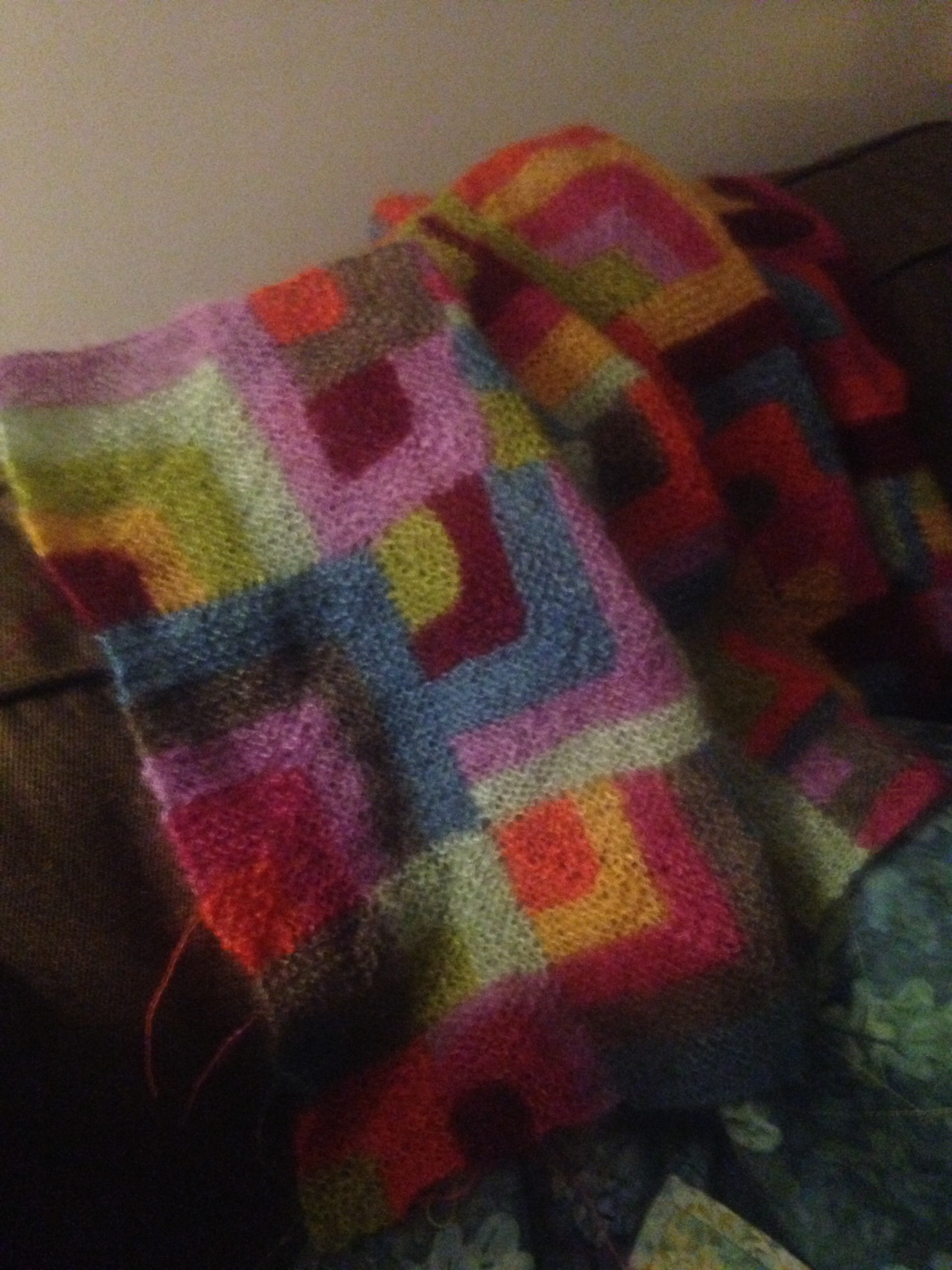
The squares are all finished, and the ends are all woven in, but I am still trying to decide whether I am finished or not. The question is, whether to put on a border. Mum is probably going to sew it into a poncho shape and add a small border; I am considering putting a border of some kind around the whole thing. I resisted this idea at first because I thought it would look like a picture in a frame, which didn’t make sense to me. However:
- The stole is not as wide as I thought it would be – a border could add some width
- I was not very consistent with my edges (sometimes I slipped the edge stitches but sometimes I forgot, so it’s kinda messy looking) – a border would fix this
- If I did the border in cooler colors, it could balance out the extra-powerful orange. I’m thinking teal and blue and grey, maybe a little bit of some black I have.
So I don’t know. I don’t know how much balance matters since I’m probably going to be wrapping it around my shoulders, not hanging it on the wall (though Jared has threatened to make it a wall hanging if it just sits in my drawer). I kind of want to just be done with it, but that little bit of extra love might make it more useful and wonderful.

I wore it to teach last night, and it was fabulously bright and warm. It stretches a lot, so I don’t know that the messy border is noticeable. I wonder if a border would break up the impressionistic effect of all those dots and squares.
Any opinions?
