Previous posts in this series:
Part 1: DOS Testing
Part 2: Carded Approximations of Dye Formulas
What follows is my record of the initial results of my 48 dye formulas, as first mixed. Notes as you read this list:
- Each has short reflections, written down soon after I did these experiments in January.
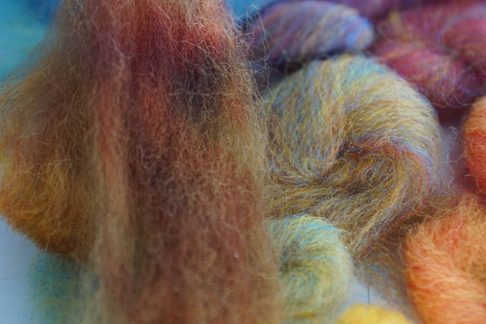
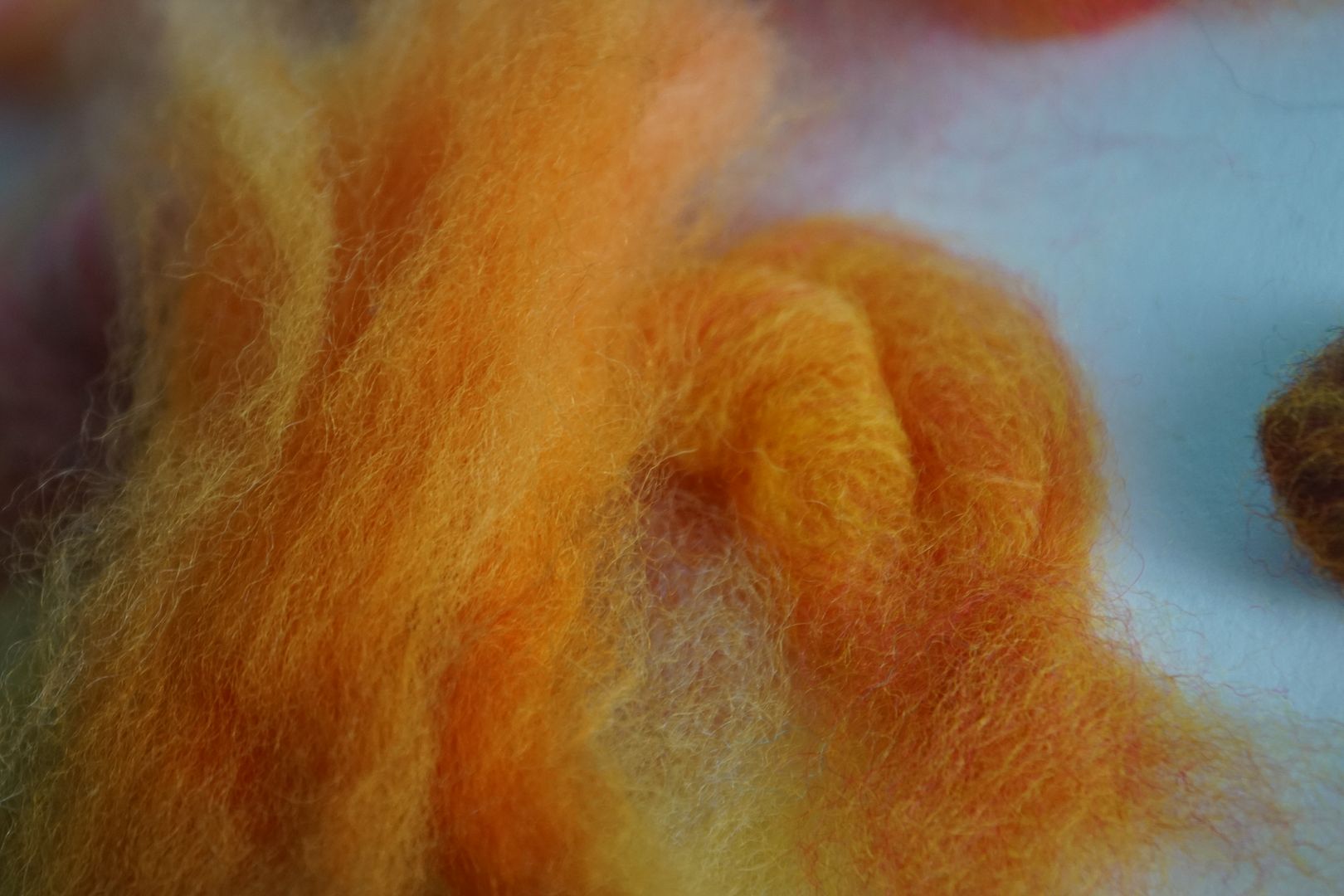
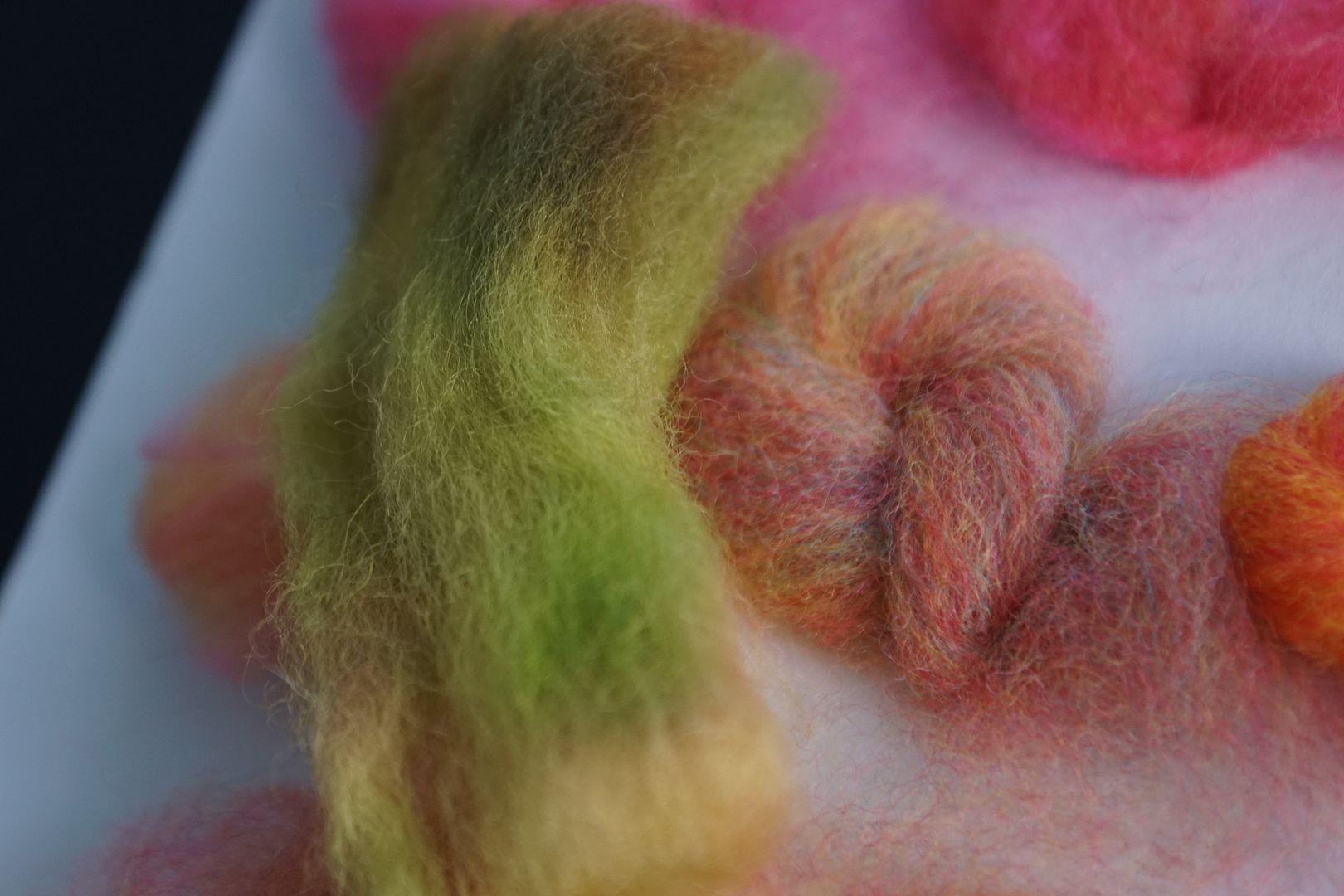
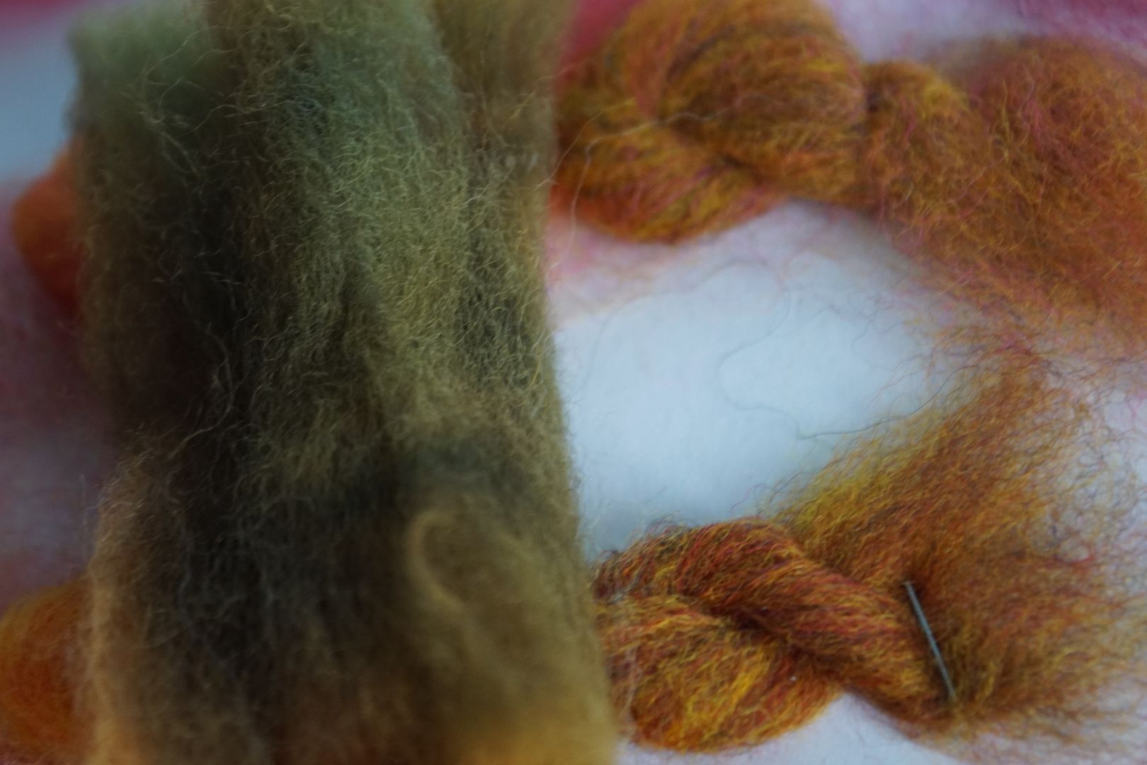
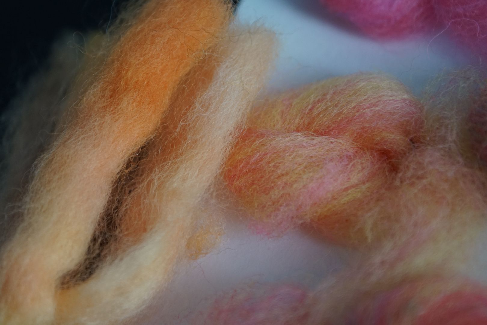
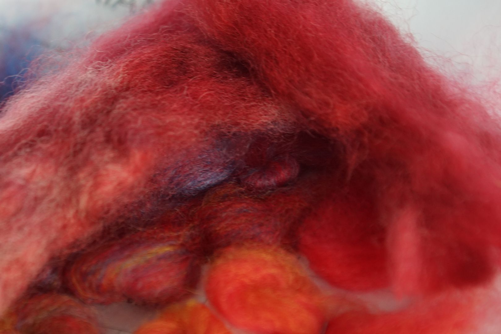
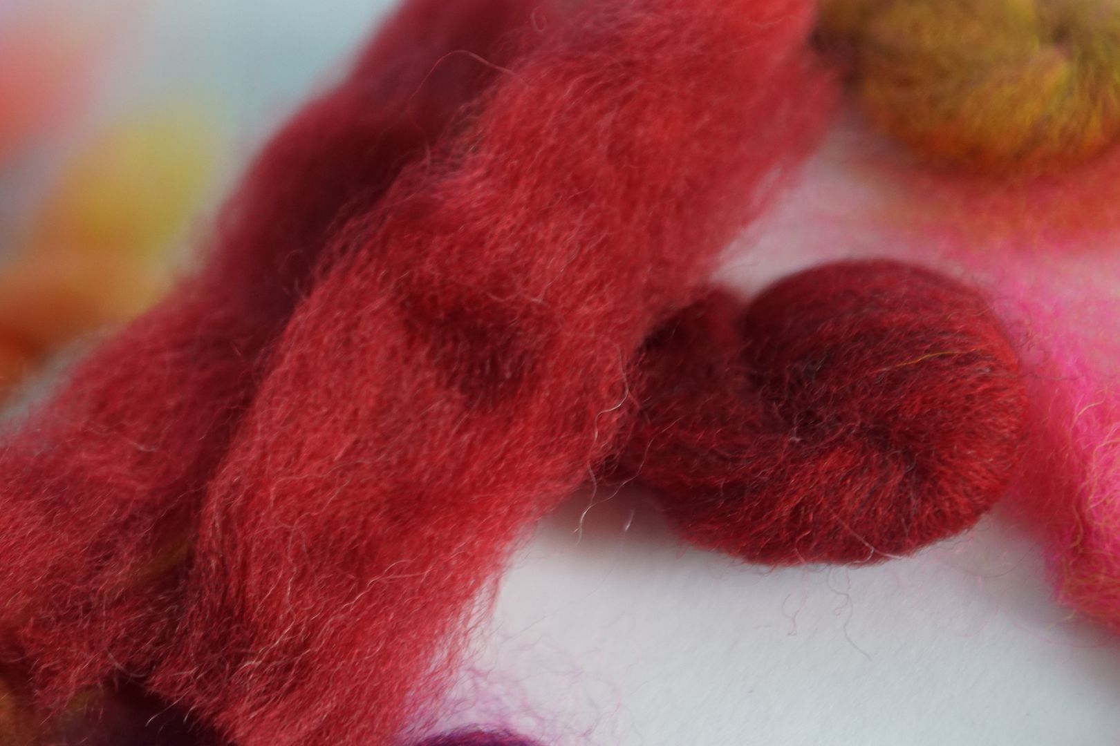
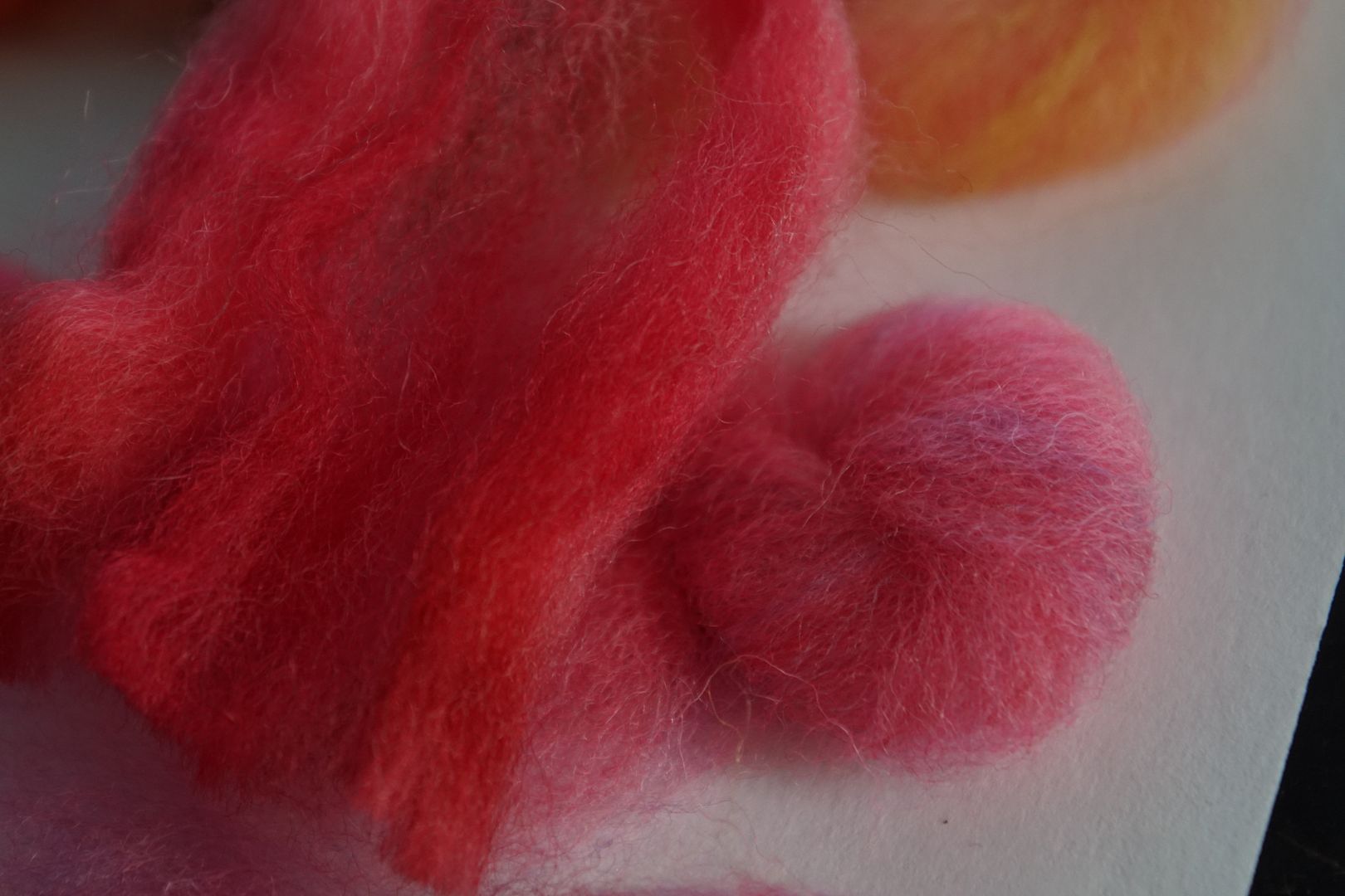
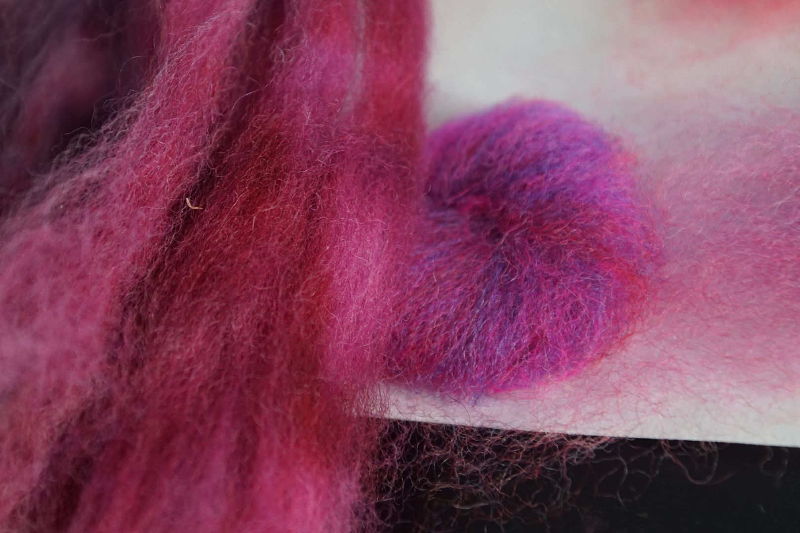
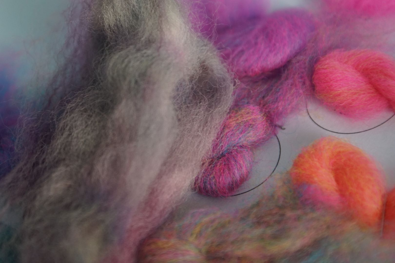
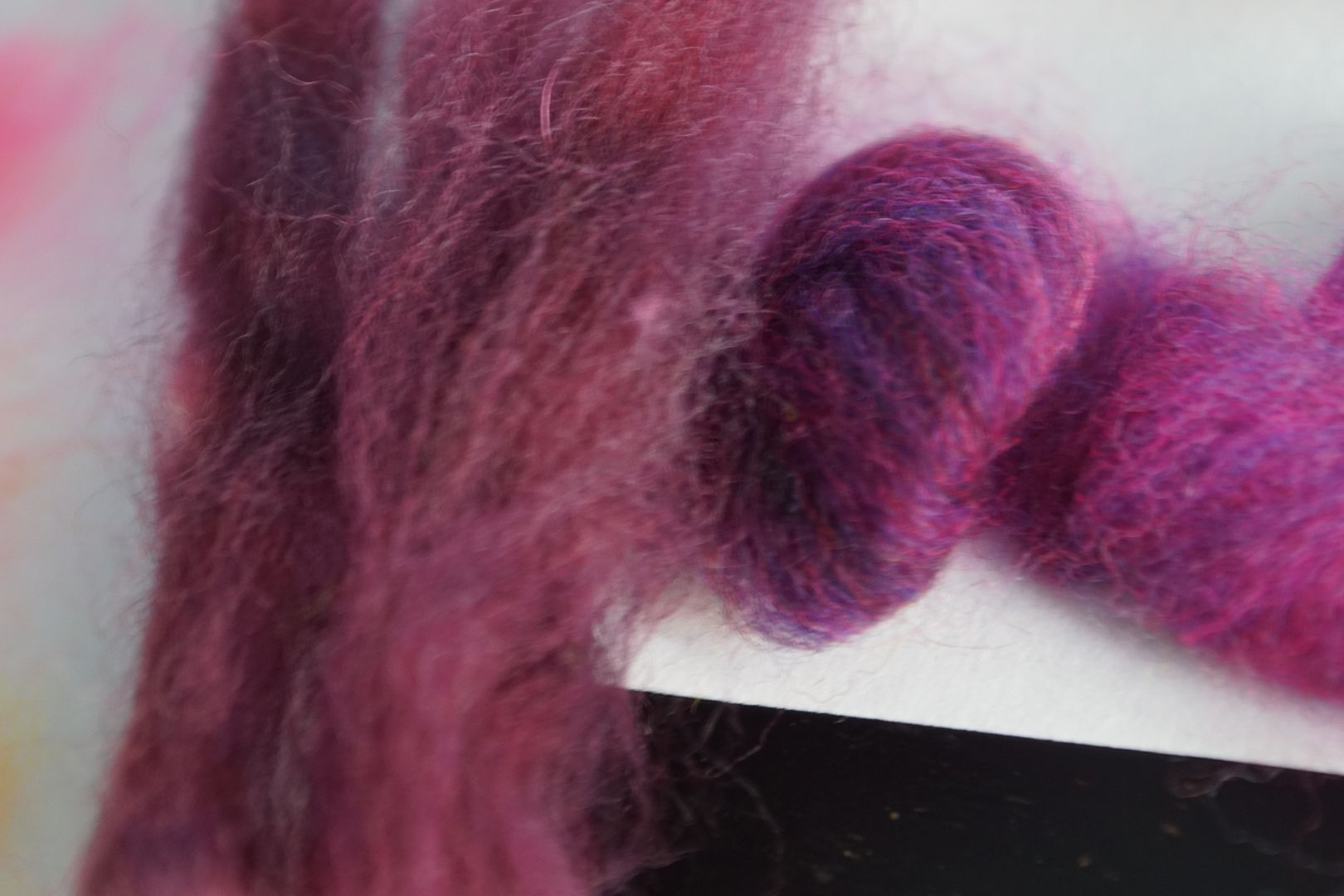
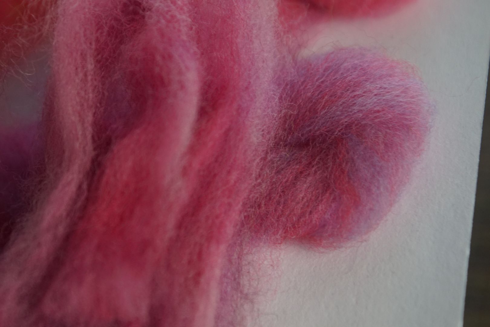
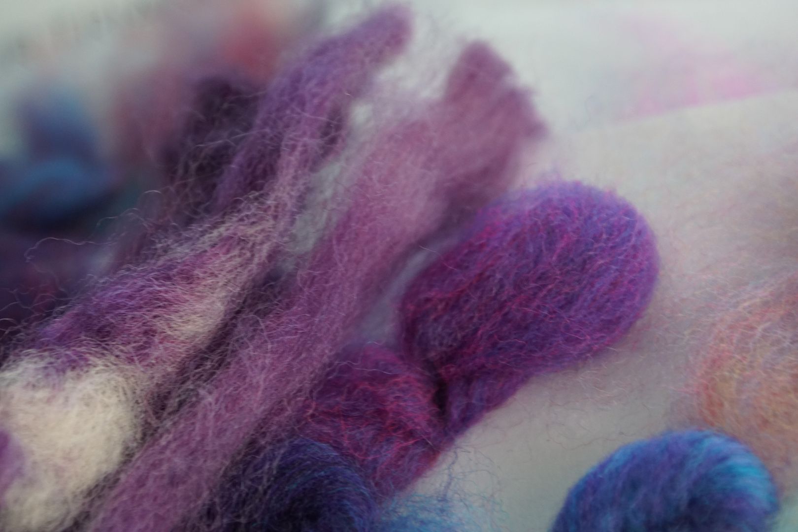
- Each is pictured next to the carded approximations used to choose the recipe, as a reflection aid. The carded samples are stapled to a page; the dyed samples are loose fiber. This is instructional alone, simply as an illustration of the difference between optical and chemical mixing.
- I will not go into my dye process except to say that the colors were hand-painted using syringes, and I was still very much getting the hang of distributing the colour evenly, especially in the first colours you’ll see below.
- Some of the recipes I rejiggered and re-tested before the next round of experiments.
- No star indicates a recipe adapted directly from Color in Spinning by Deb Menz, pp. 84-85. There are 38 of these adaptations.
- * Indicates a recipe adapted from the colour triangle from the “Dyeing Intentional Colour” class on School of Sweet Georgia by Felicia Lo. Nine of the recipes below are adapted from these experiments.
- ** Indicates the one original recipe I made myself.
- *** Indicates that the recipe was meant to be from Color in Spinning, but I had to adapt because I was running out of dyestock.
- You will see that I maintained Deb Menz’s basic framework of four colours of each hue: an intense, bright colour dyed at 2 DOS, a dark colour (usually with a little black) dyed at 3% DOS, a pale colour dyed at .5% DOS, and a dull colour (usually with a little complement) dyed at 1% DOS.
- Any deficiencies in these recipes are my own, and could as easily be from mistakes in my dye mixing as anything else. Anything beautiful in the recipes I credit to Deb, and anything questionable I credit to myself!
Yellow
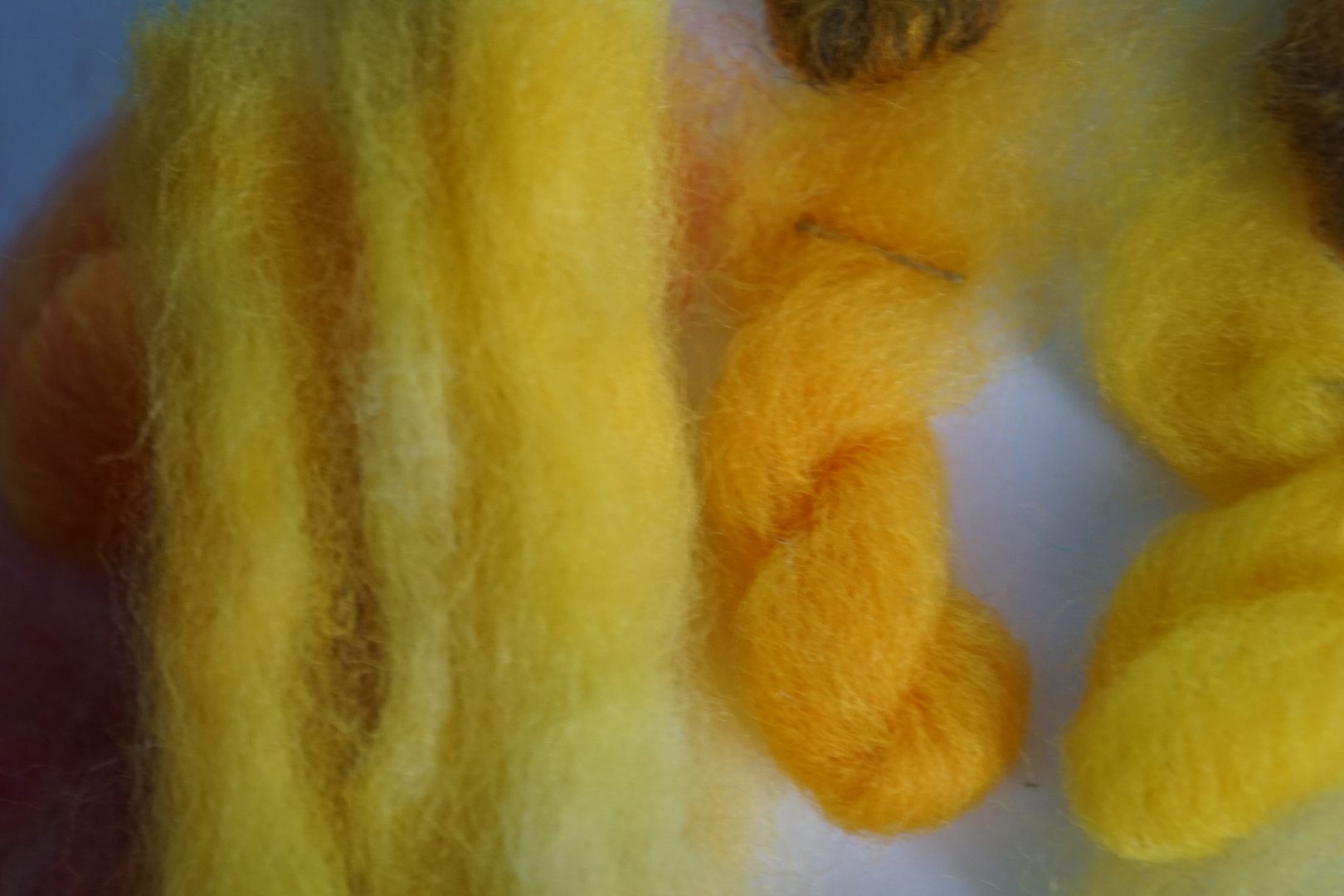
The yellows – particularly the dull and dark yellows – were some of the most difficult colours, and I was also still messing about with the handpainting technique on these first braids. It gets better as we go on.
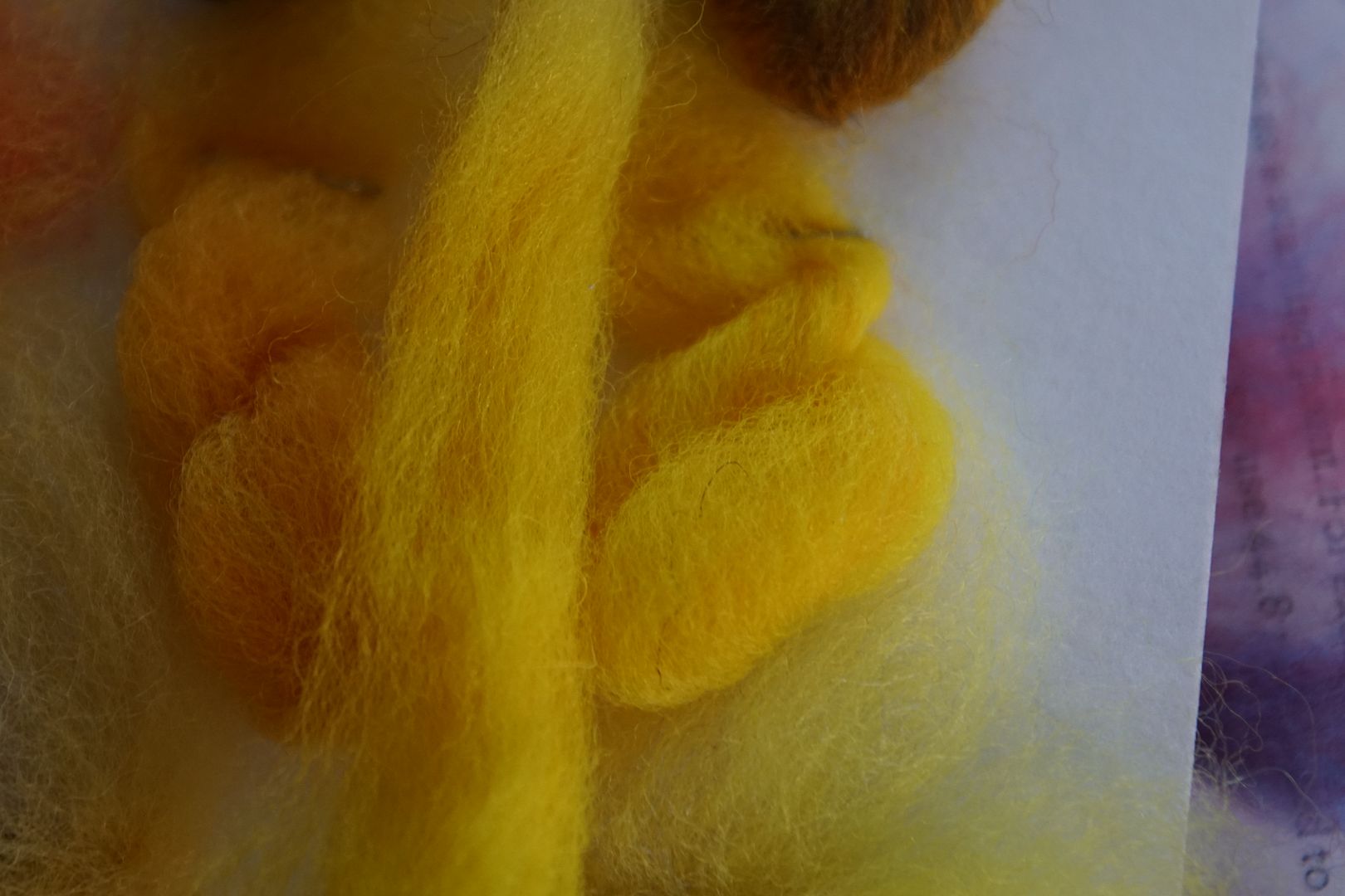
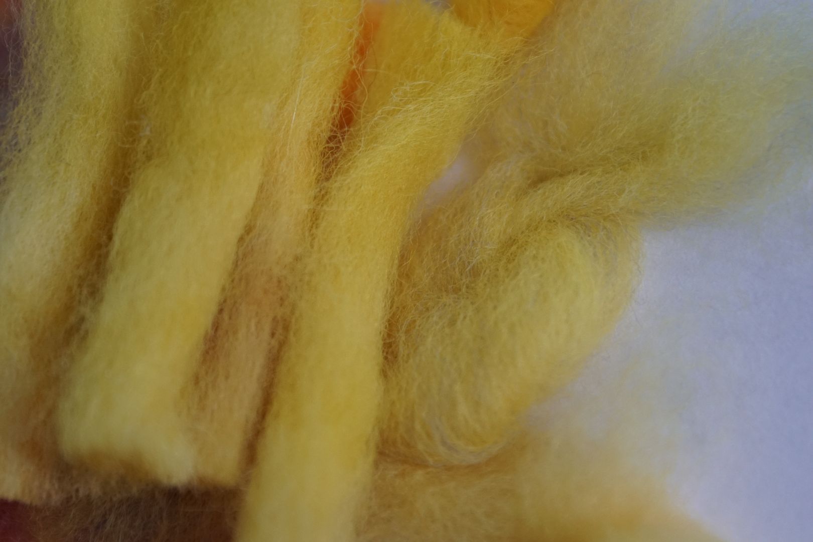
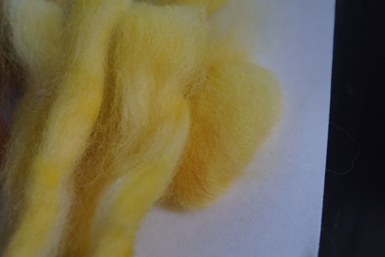
Intense Yellow: DOS 2: 95% sun yellow, 5% golden yellow. Seeing as it’s almost straight from the pure dye, this is unsurprisingly a good match between carded and dyed.
Dull Yellow: DOS 1: 95% sun yellow, 5% violet. This one is very close to the pale yellow, not very dull. I’m tempted to try to adapt it with more violet, but decided it wasn’t problematic enough to fix it at present.
Dark Yellow: DOS 3: 80% golden yellow, 10% fire red, 10% brilliant blue.* This looks quite brown, which is fine; I don’t know what else you’d expect yellow to do when you add black. I amended this colour by adding more yellow, which makes it look more of a brown orange. Both are nice. It doesn’t look much like the carded sample, but that’s OK.
Pale Yellow: DOS .5: 55% sun yellow, 45% golden yellow. Simple and pleasant, in between the two yellows.
Yellow-Orange
Intense Yellow-Orange: DOS 2: 90% golden yellow, 10% sun yellow. This came out rather yellower than I wanted. Further testing revealed that I had made an error when mixing the dyes, and swapped the yellows. I remixed to correct.
Dull Yellow-Orange: DOS 1: 85% golden yellow, 10% cherry red, 5% turquoise. I was surprised at what a good match this was for the carded approximation. It’s a little greeny, but good for what it’s supposed to be.
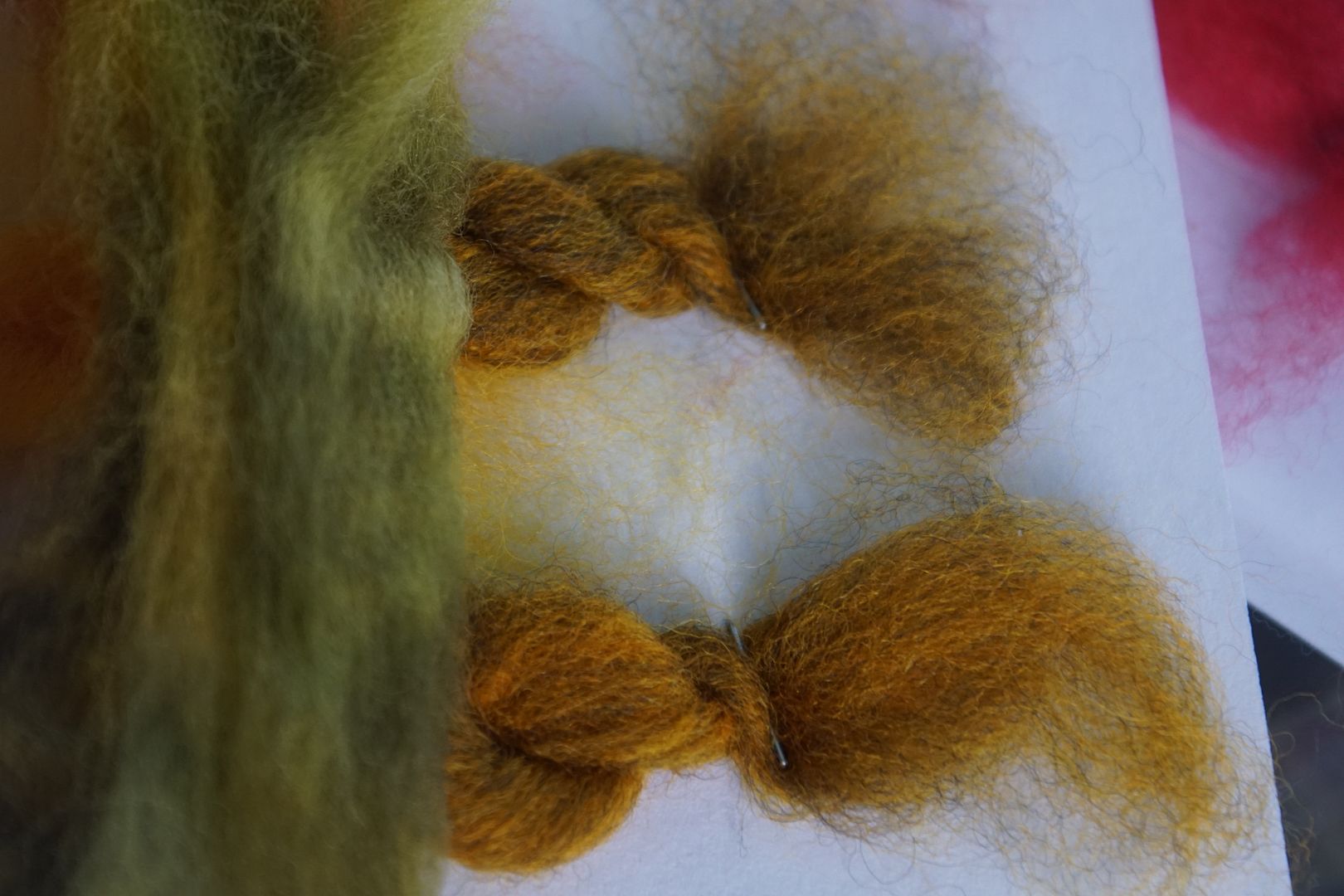
Dark Yellow-Orange: DOS 3: 85% golden yellow, 15% jet black. This looks very green, which the carded samples could not anticipate. There are interesting things that happen when you add black to yellow. I don’t love how it could be confused with green, but it’s a wonderful drab olive.
Pale Yellow-Orange: DOS .5: 80% sun yellow, 20% hot fuscia.* Came out as a great peachy yellow-orange. Paler than the carded approximation because that was done with a 1% DOS, and the fiber was dyed at .5%.
Orange
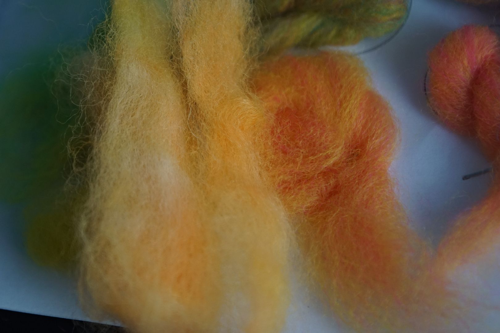
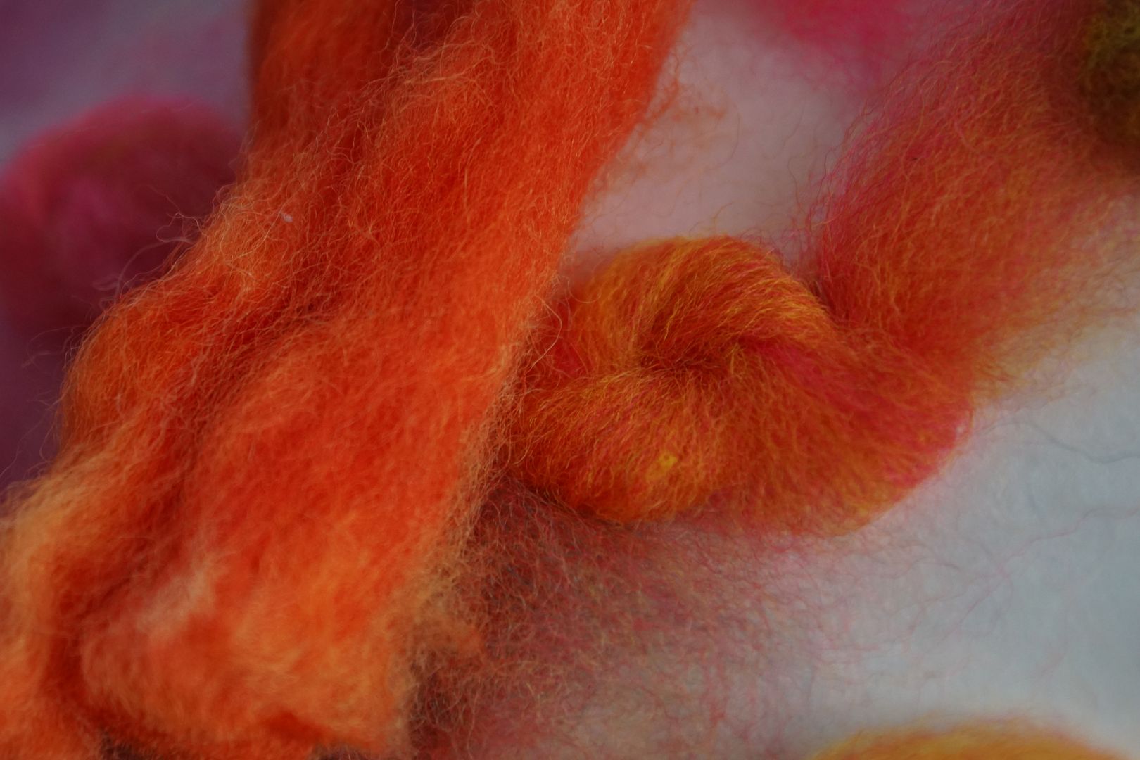
Intense Orange: DOS 2: 45% sun yellow, 40% golden yellow, 15% cherry red. This is a really nice orange. It’s a little on the peachy side, not slap-you-in-the-face. It matched the carded sample nicely.
Dull Orange: DOS 1: 40% sun yellow, 35% golden yellow, 15% hot fuschia, 5% turquoise, 5% brilliant blue. This one came out VERY green. I made an amended version, adding more of everything except the blues, and it was more successfully dull-orange, less obviously green.
Dark Orange: DOS 3: 10% sun yellow, 60% golden yellow, 10% hot fuschia, 20% jet black. Also very green. I made another version with more yellow, still very green. It’s less green than this pic, more brown. Again, the carding can’t anticipate the blending that happens in the dye mixing.
Pale Orange: DOS .5: 40% golden yellow, 20% sun yellow, 30% cherry red, 10% hot fuschia. A very nice peachy colour, successfully redder than the yellow-orange.
Red-Orange
Intense Red-Orange: DOS 2: 50% sun yellow, 20% golden yellow, 15% fire red, 15% hot fuschia. This came out as a nice tomato-soup colour. A warm red, warmer than in this photo.
Dull Red-Orange: DOS 1: 35% sun yellow, 15% golden yellow, 25% cherry red, 20% fire red, 10% turquoise. This is browner than the picture looks; it’s not so purple. I’d describe it as terra-cotta.
Dark Red-Orange: DOS 3: 40% fire red, 40% mustard, 20% brilliant blue.* I took this from the middle of the RYB colour triangle, because the carded samples looks so similar to the dark orange. This is more of a deep burgundy than a red-orange. Should maybe try this again, adding black instead of blue.
Pale Red-Orange: DOS .5: 40% sun yellow, 60% hot fuschia.* Such a cheerful colour! Quite close to the colour triangle sample approximation.
Red
These colours were heavily adapted, because my carded approximations of Menz’s recipes came out very pink. This is not her fault; the reds I had from Jacquard were more different from the Sabracon dyes Menz used than the yellows and blues.
Intense Red: DOS 2: 80% fire red, 10% golden yellow, 10% brilliant blue.*
Dull Red: DOS 1: 60% fire red, 20% golden yellow, 20% brilliant blue.* These were also adapted from the colour triangle. Both were adapted from the same sample, but for the intense red sample, I used a larger proportion of the red to the other primaries. It worked nicely, I think, though the straight up 100% fire red out of the jar is quite nice too.
Dark Red: DOS 3: 90% fire red, 10% jet black.** Not very dark. Would like to try again with 20% jet black, but ran out of jet black mix.
Pale Red: DOS .5: 10% cherry red, 45% fire red, 40% hot fuschia, 5% violet. Not very pale! But a nice colour, more pinkish than the other reds.
Red-Violet
The violets and blues were really excellent! I’m so glad I followed Menz’s guidance to use pre-mixed violet. They don’t have the same complex glow as the carded samples, because dye mixing and optical mixing just aren’t the same. But even where they are different, I really really love them both.
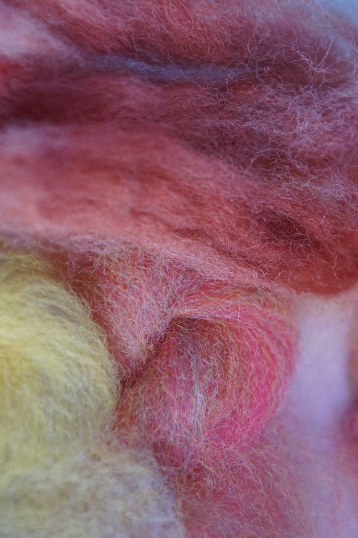
Intense Red-Violet: DOS 2: 15% cherry red, 10% fire red, 25% hot fuschia, 50% violet. A deep plummy maroon. Darker than it appears here. One of my favorite colours of all time, though I don’t wear it much.
Dull Red-Violet: DOS 1: 60% hot fuschia, 20% turquoise, 20% sun yellow.*
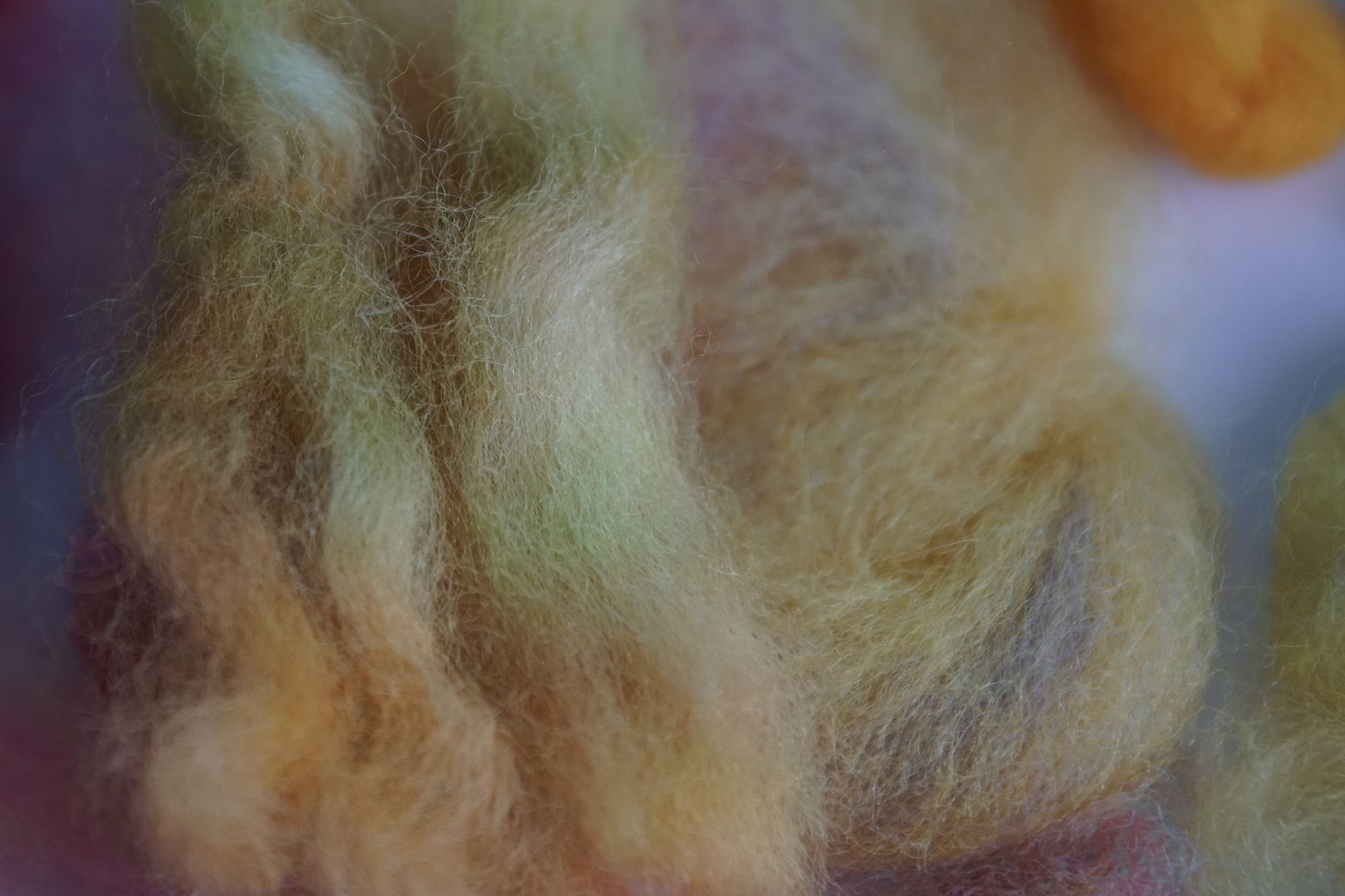
This one is interesting! It doesn’t look much like the sample that inspired it, but it does look a lot like the grey you see in the bottom of the frame. It’s a sort of steely green-grey. I tried adding more fuschia, but it didn’t change much. Would have to start from scratch to get an actual dull red-violet. Menz’s recipe didn’t involve any complements, and I’m wondering if this is why.
Dark Red-Violet: DOS 3: 25% fire red, 10% hot fuschia, 50% violet, 15% jet black. Again, darker than it looks here. A really deep, dark maroon.
Pale Red-Violet: DOS .5: 30% fire red, 20% hot fuschia, 50% violet. A complex, pale red-violet that defies description. Not pink, not purple, not maroon… you could call it a rosy purple. It’s very nice.
Violet
From here on out, I mostly used Menz’s recipes, because the carded approximations came out so nice.
Intense Violet: DOS 2: 10% fire red, 5% hot fuschia, 80% violet, 5% turquoise. A nice cool purple, the colour of violets.
Dull Violet: DOS 1: 10% fire red, 5% magenta, 65% violet, 20% golden yellow. This one eerily matched the carded sample! It’s a dull rosy pink, and I just love it.
Dark Violet: DOS 3: 10% fire red, 5% hot fuschia, 70% violet, 5% turquoise. A darker version of the intense violet.
Pale Violet: DOS .5: 10% fire red, 5% hot fuschia, 80% violet, 5% turquoise. A lighter version of the intense violet, successfully lavender.
Blue-Violet
These really read as blue to me, and it’s only next to the blues that you can see how much ooler they are.
Intense Blue-Violet: DOS 2: 85% violet, 10% turquoise, 5% brilliant blue. Much darker than pictured, it’s a nice middling, cool, royal blue.
Dull Blue-Violet: DOS 1: 20% golden yellow, 70% violet, 5% turquoise, 5% brilliant blue. Another eerie match to the carded sample. It looks more like a dull teal than anything else. Muddy seafoam.
Dark Blue-Violet: DOS 3: 70% violet, 5% turquoise, 10% navy, 15% jet black. Very navy-blue looking.
Pale Blue-Violet: DOS .5: 80% violet, 20% brilliant blue. A very cool, even icy, blue.
Blue
Intense Blue: DOS 2: 10% violet, 10% turquoise, 80% brilliant blue. A good bit warmer and brighter than the blue-violet, sort of a cheerful racecar blue.
Dull Blue: DOS 1: 15% sun yellow, 5% hot fuschia, 10% violet, 5% turquoise, 65% brilliant blue. Just a bit green, less green in fact than the dull blue-violet. Another good teal.
Dark Blue: DOS 3: 10% violet, 10% turquoise, 35% brilliant blue, 30% navy***. Another navy blue, darker and more intense than the dark blue-violet.
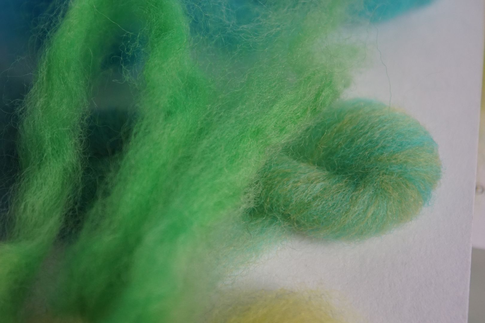
Pale Blue: DOS .5: 10% violet, 30% turquoise, 60% brilliant blue. A rather aqua-ish blue, still quite bright.
Blue-Green
The blue-greens were all very similar to each other, despite the carded samples looking quite different, and the dye recipes looking quite different.
Intense Blue-Green: DOS 2: 20% golden yellow, 5% hot fuschia***, 15% turquoise, 60% brilliant blue. Something very odd happened here. The “Intense” blue-green looks darker than the “dark” blue-green, which looks quite bright. I just switched them!
Dull Blue-Green: DOS 1: 60% turquoise, 20% sun yellow, 20% hot fuschia.* This looks like a slightly lighter version of the “intense” blue-green (which I re-branded ask “dark”). I tried adding more sun yellow and hot fuschia, and it looked practically the same! I guess that turquoise dye is really strong?
Dark Blue-Green: DOS 3: 20% sun yellow, 70% turquoise, 10% brilliant blue. You can see in the picture how bright it is! As you can see, there was no black or navy in the recipe. I rebranded this as “intense” and called it a day.
Pale Blue-Green: DOS .5: 20% golden yellow, 60% turquoise, 20% brilliant blue.* This is successfully a little paler, but could be dyed at an even lighter DOS to make it look like a pale colour.
Green
Green is my favourite colour, and I am SO pleased with these! Especially considering that the carded samples did not blend very well, and no amount of squinting helped me understand what the colours would do, so I’m glad I used the recipes anyway.
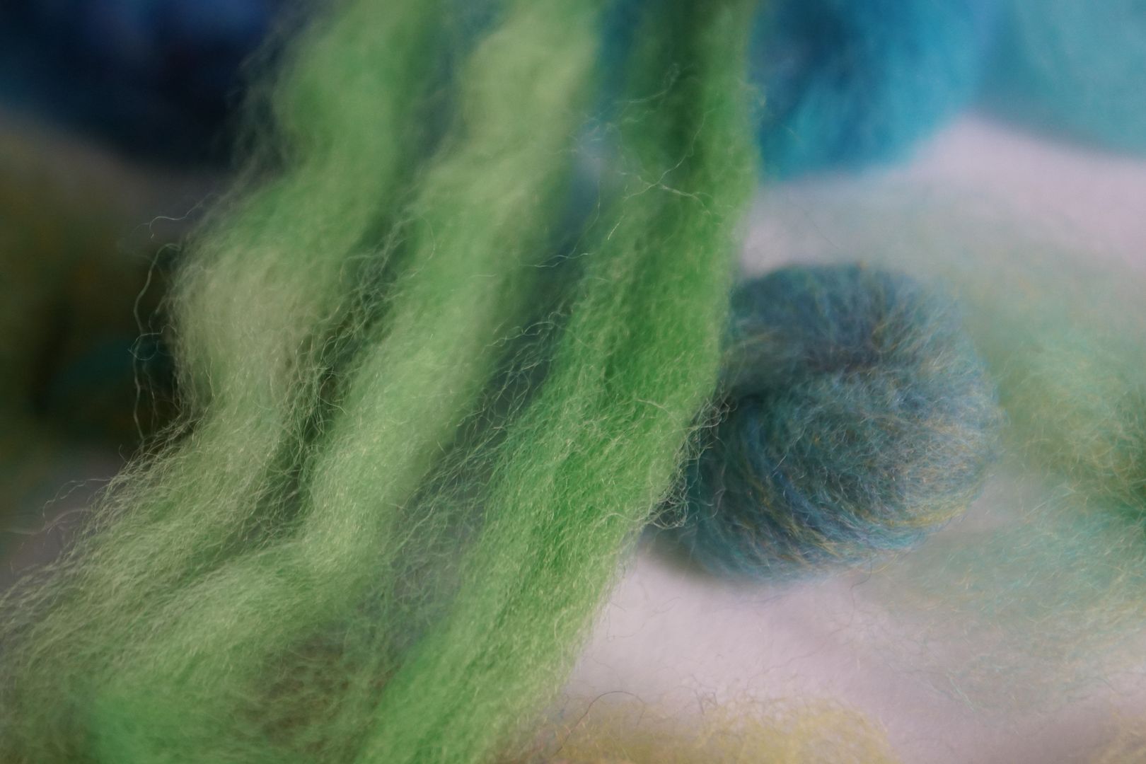
Intense Green: DOS 2: 65% sun yellow, 25% turquoise, 10% navy. A natural, grassy green.
Dull Green: DOS 1: 45% sun yellow, 15% golden yellow, 10% turquoise, 30% brilliant blue. Very similar to the intense green, really, just a little paler. I could add a bit of red to it. EDIT: I believe I made an error in copying the recipes, and should have added 15% fire red instead of golden yellow. Adding 15% fire red to the final mix created a greenish beige.
Dark Green: DOS 3: 55% sun yellow, 15% turquoise, 30% navy***. Darker than pictured. A deep forest green.
Pale Green: DOS .5: 70% golden yellow, 30% turquoise. Bright skittley-green.
Yellow-Green
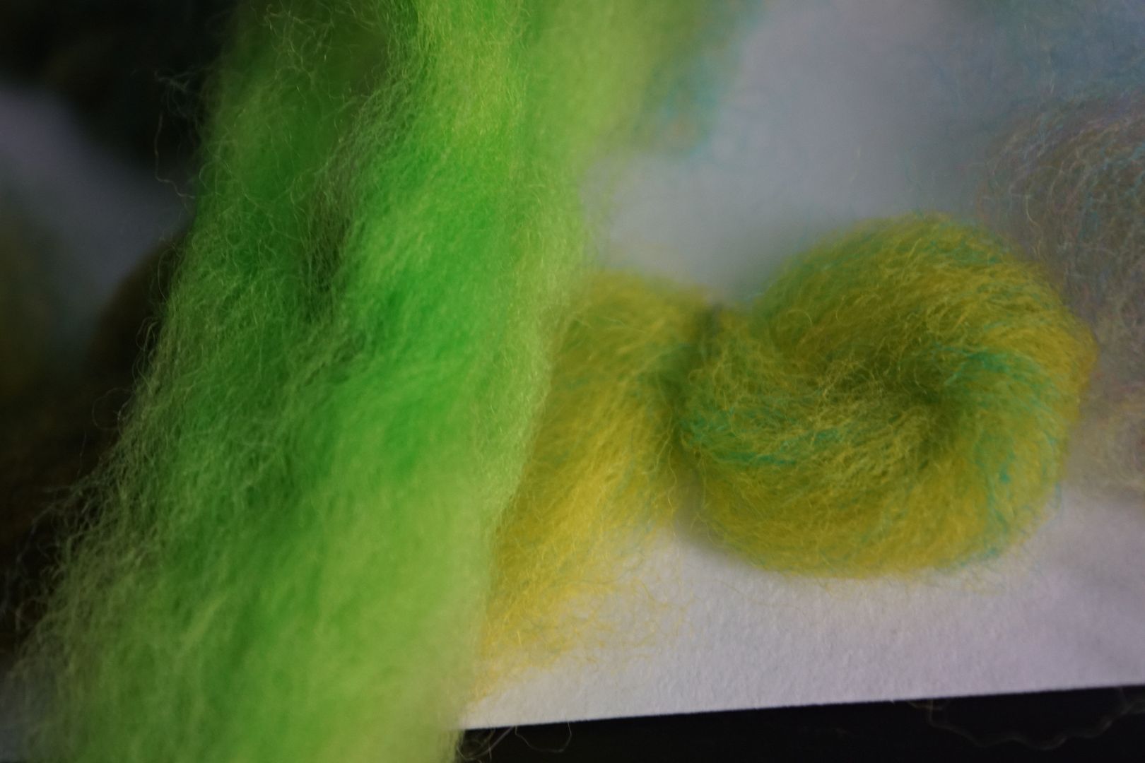
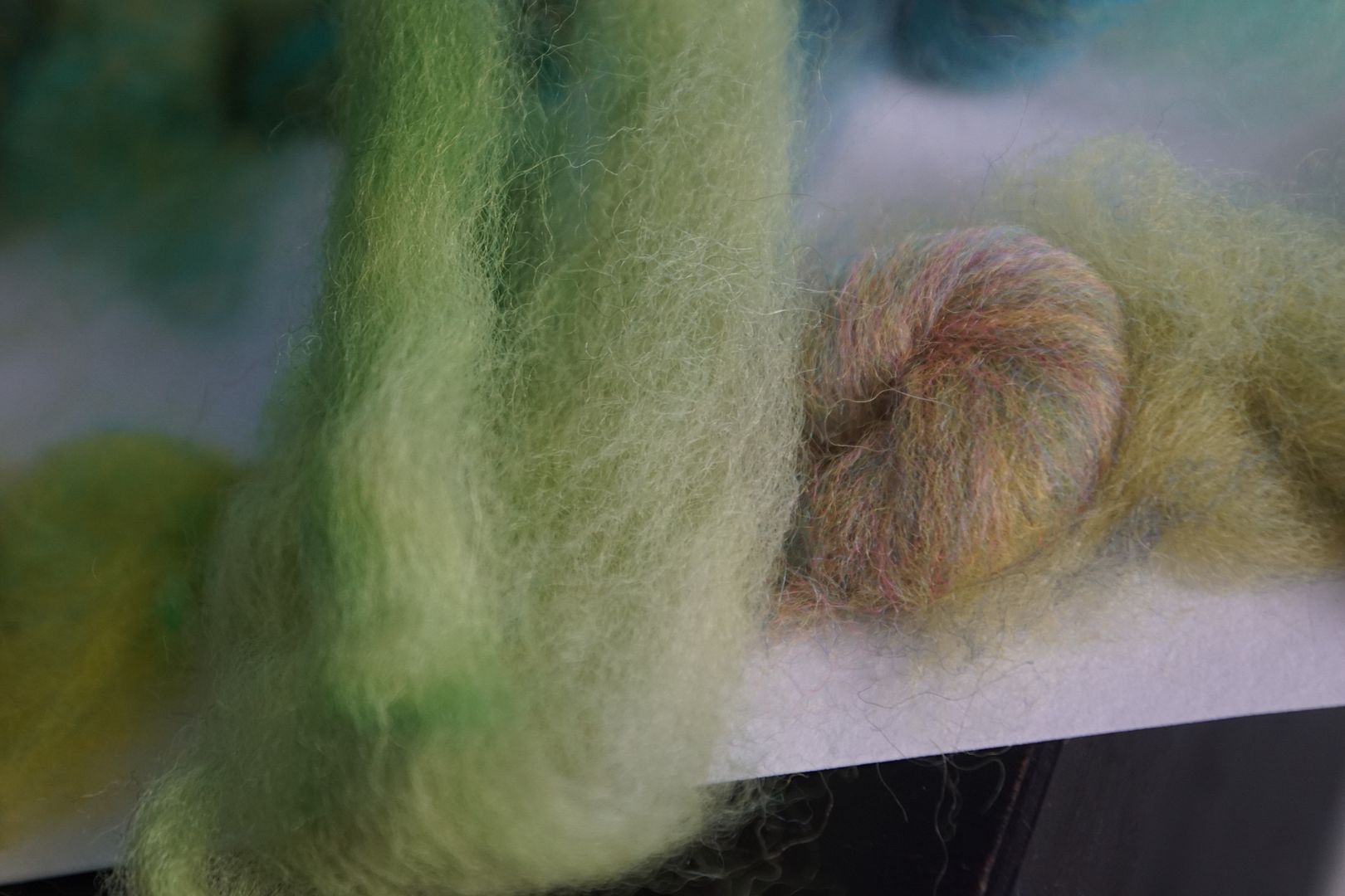
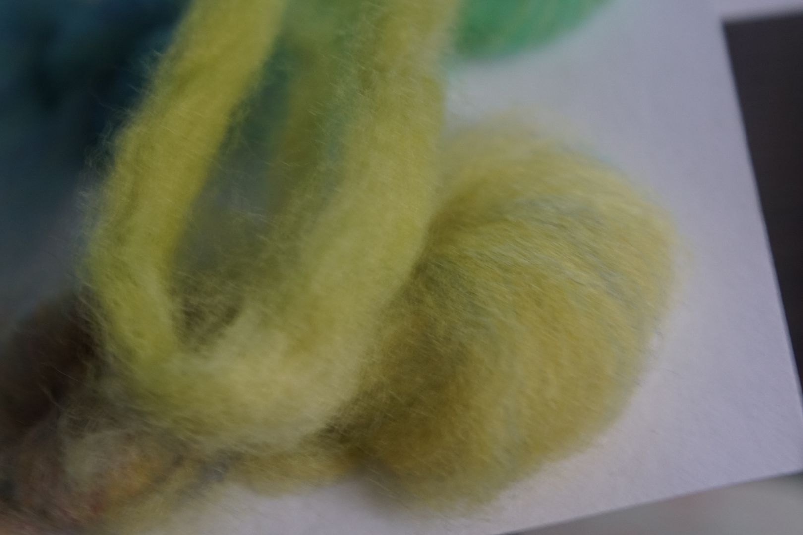
Intense Yellow-Green: DOS 2: 90% sun yellow, 10% turquoise. My camera does not always pick this colour up, but it sure did this day! It’s a super-bright highlighter green.
Dull Yellow-Green: DOS 1: 70% sun yellow, 15% hot fuschia***, 15% turquoise***. Not much to do with the carded sample; not as dull as pictured. Just a lot calmer than the flourescent green above.
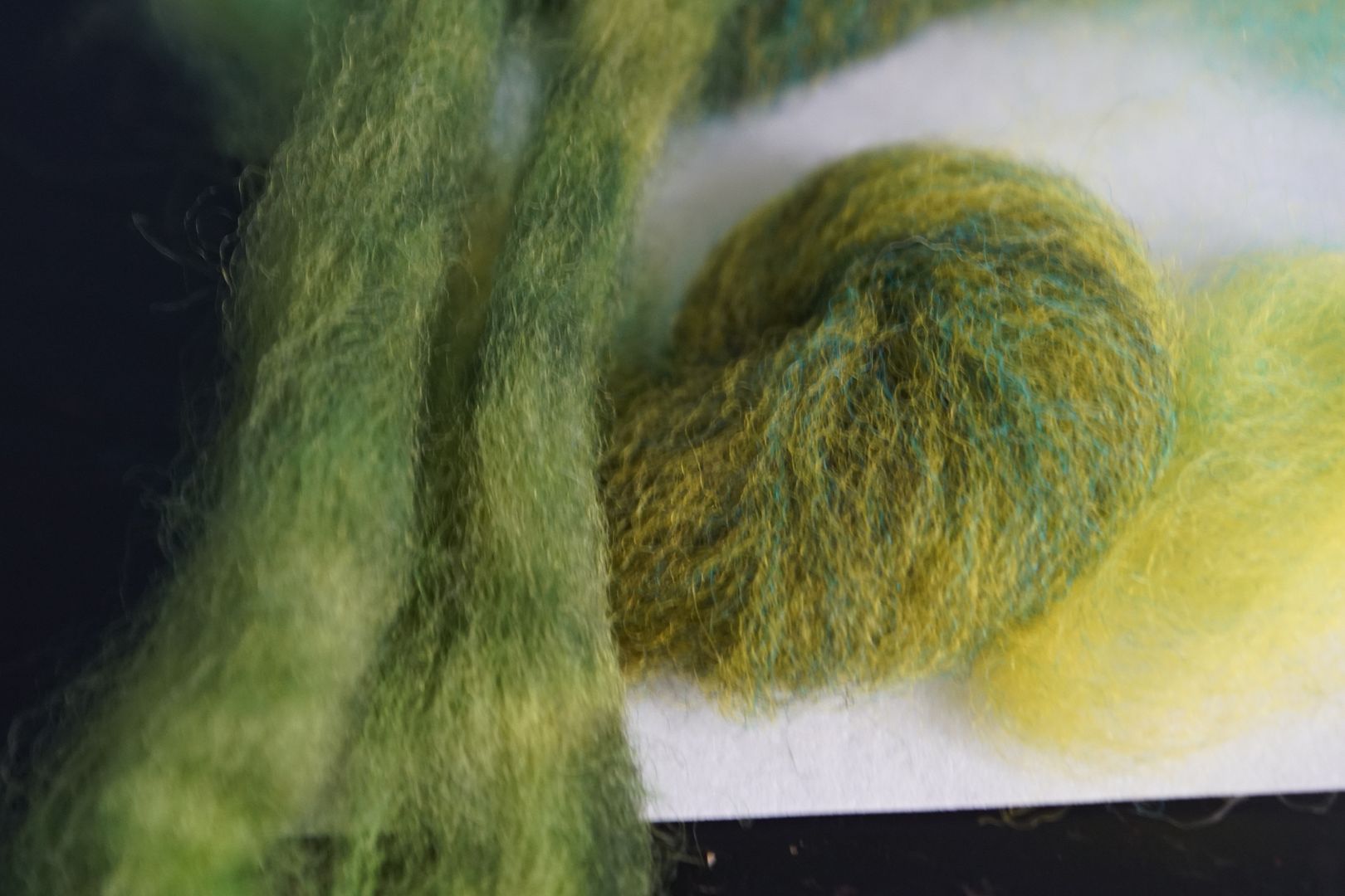
Dark Yellow-Green: DOS 3: 70% sun yellow, 10% turquoise, 20% navy***. Dark olive green. Hunter green maybe?
Pale Yellow-Green: DOS .5: 80% sun yellow, 10% brilliant blue, 10% navy. It really is that chartreuse colour you see. Such a hard colour to photograph, but this one matched the carded sample really well.
In Four Colour Wheels
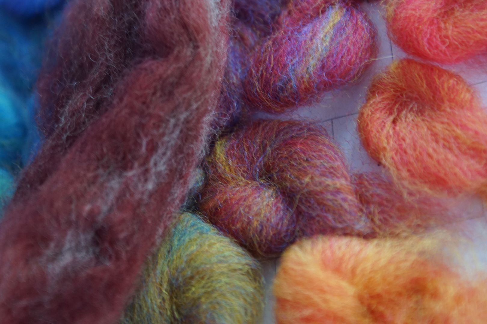
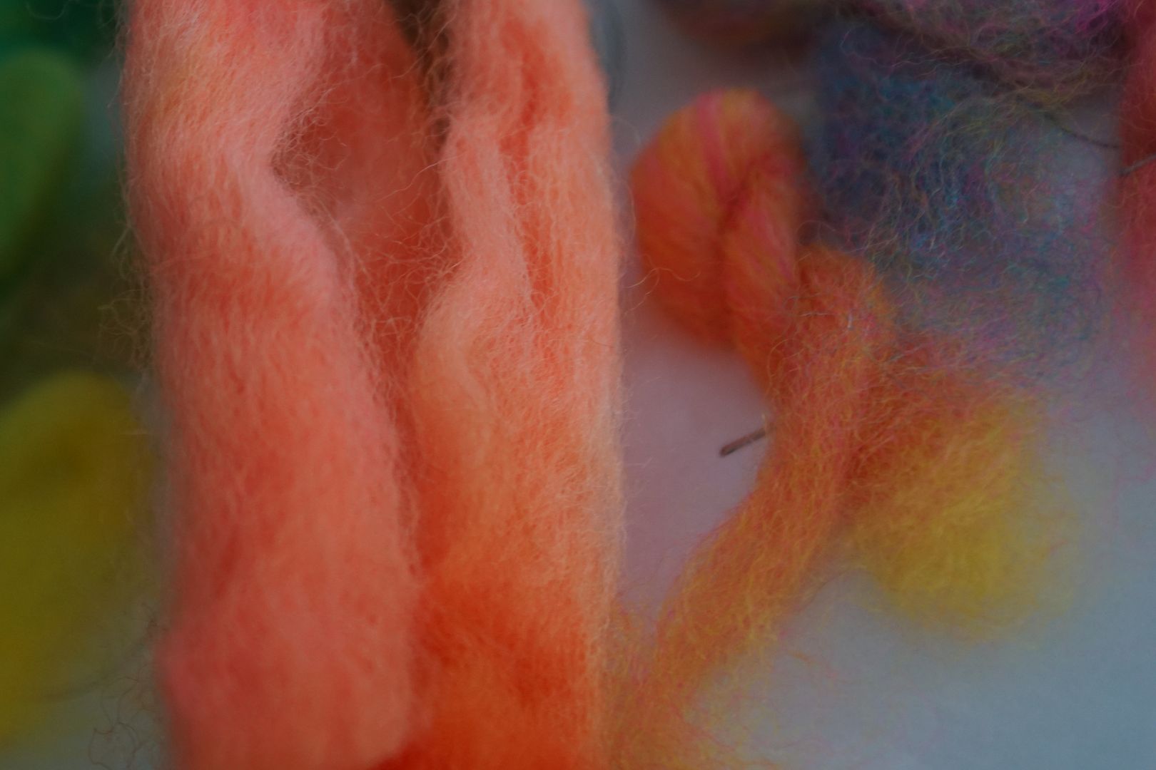
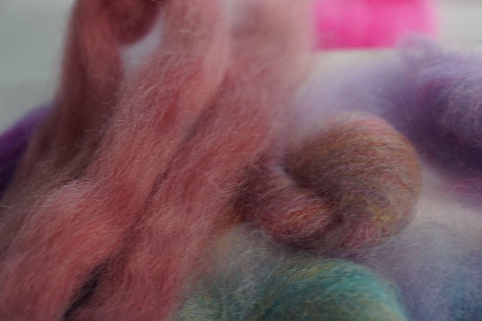
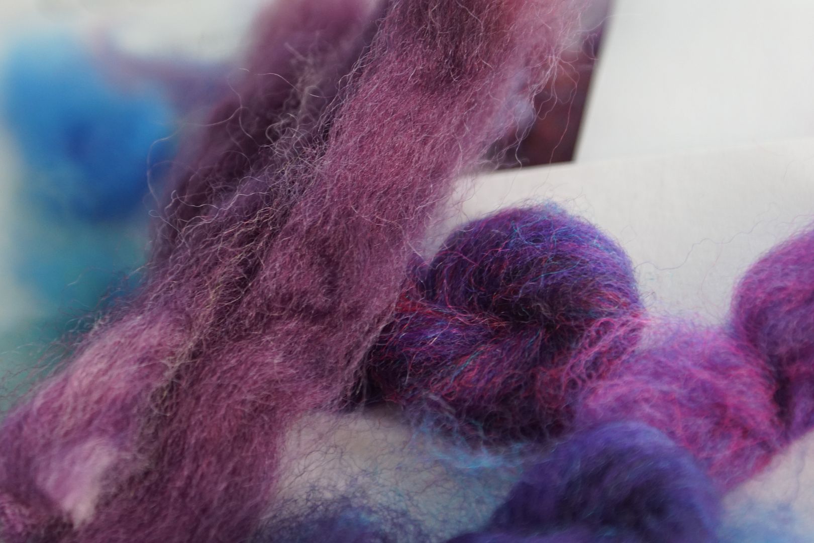
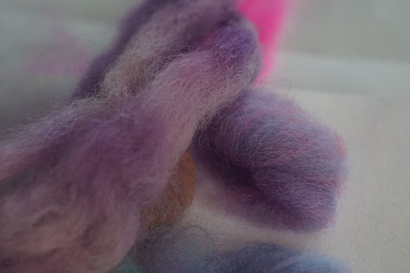
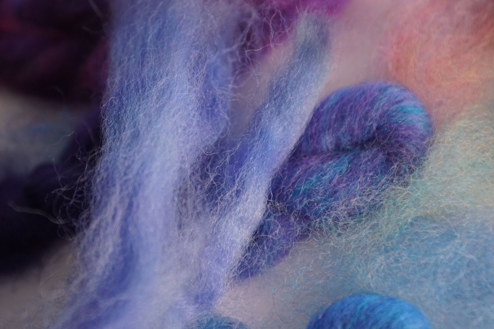
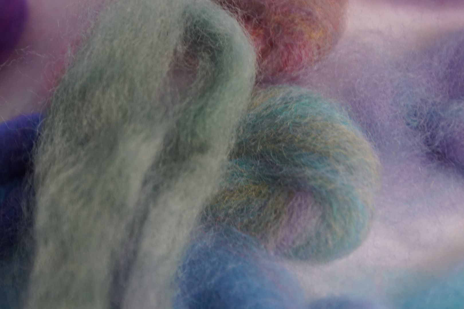
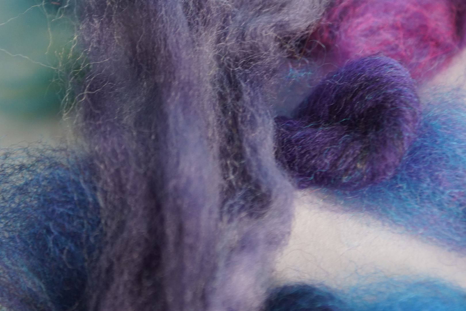
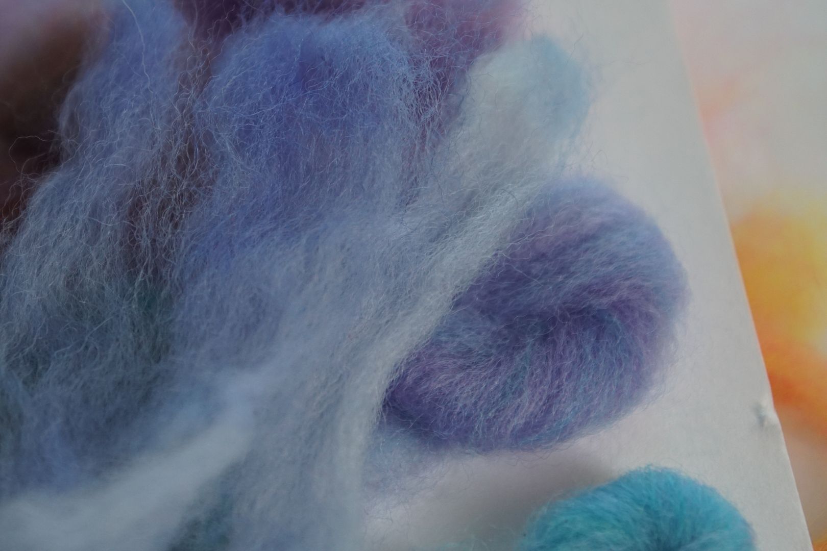
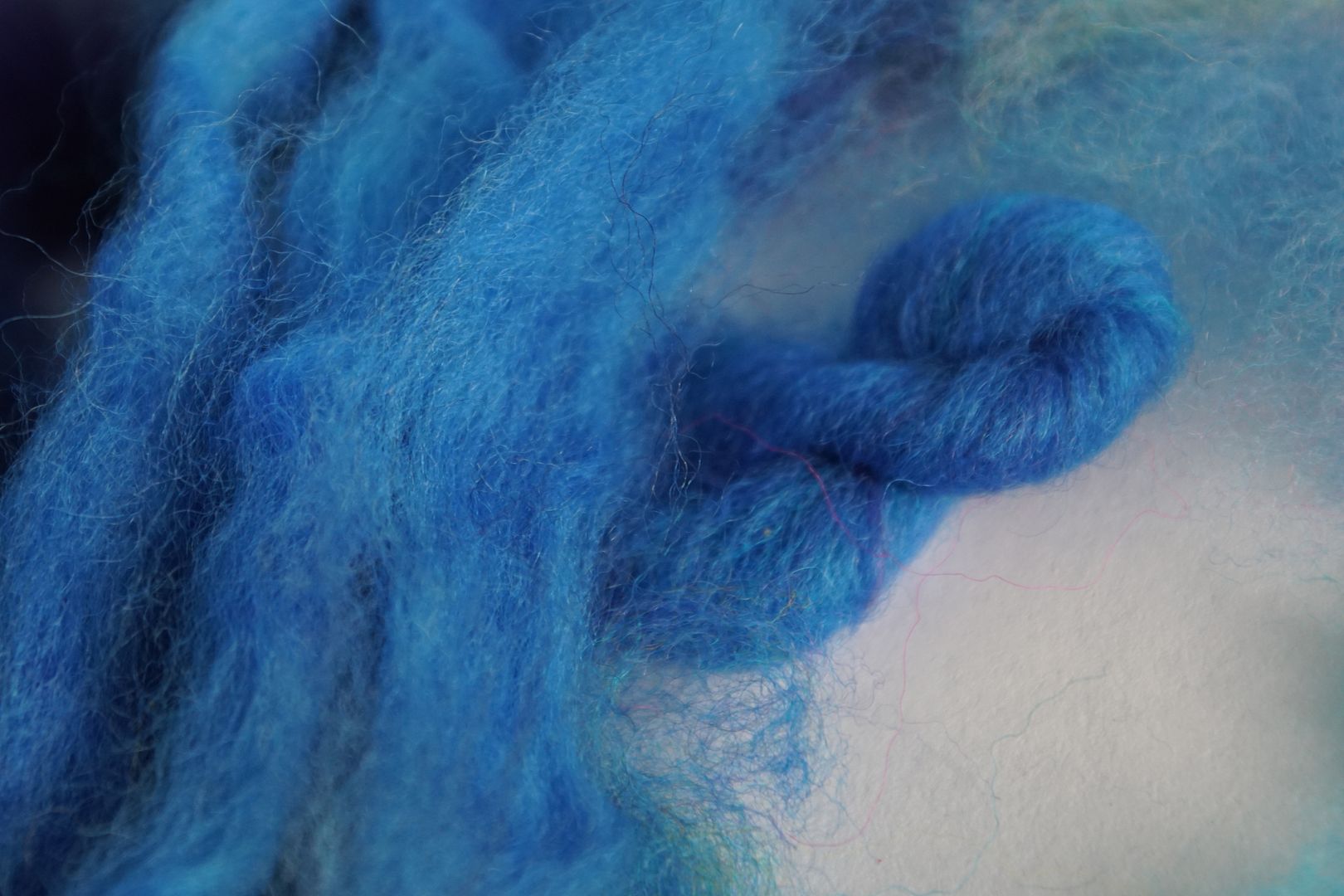
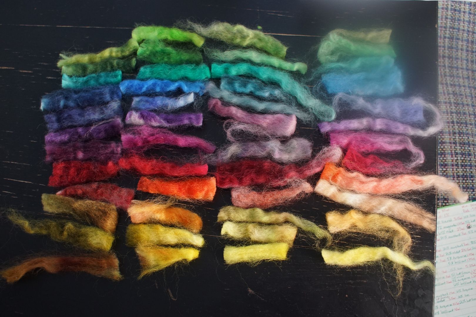
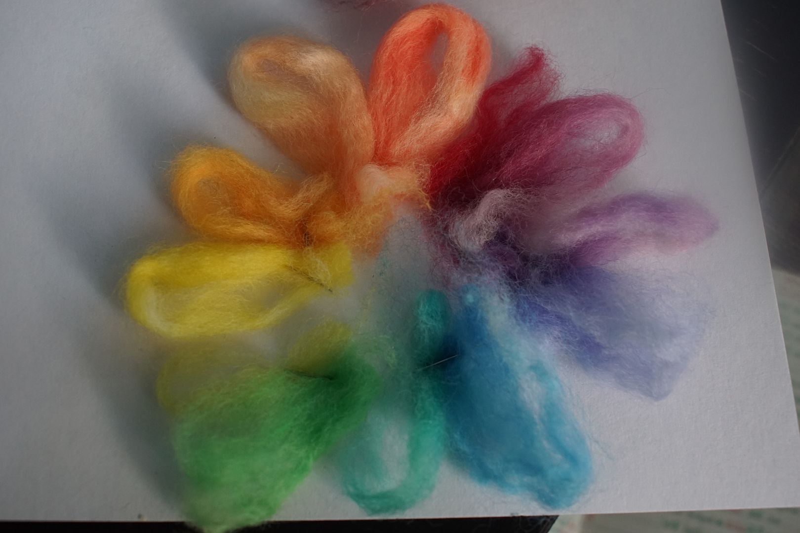
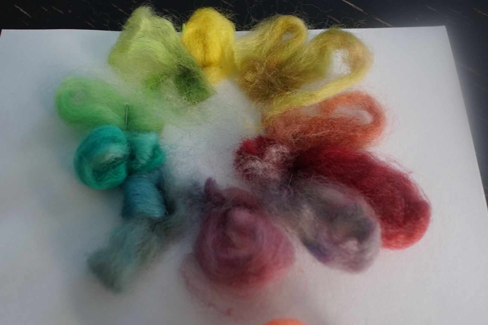
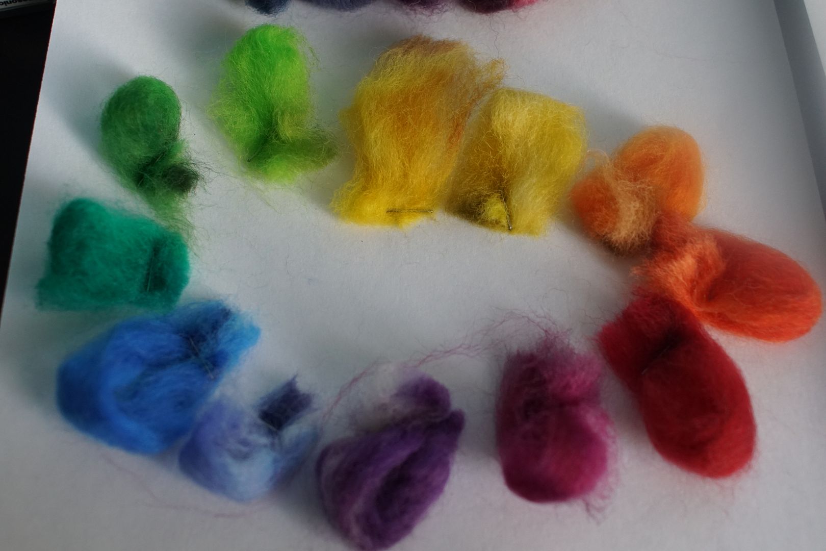
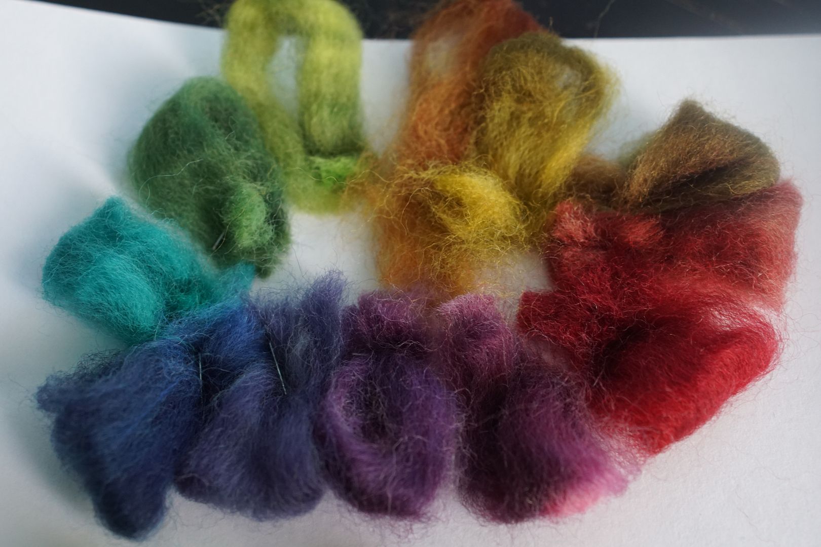
I got the tufts you see above when I made the monochromatic colourways I’ll show you in the next essay, coming to you in August. I took a narrow strip off each colourway and cut it up. Because of how I dyed it, cutting up the braid left me with three pieces of each. I put two into a dye journal, which left me with one. What to do except put them into colour wheels, of course!
This was an interesting exercise. Even though not all of these colours came out the way I had hoped, when you put them into a colour wheel format or a rainbow format, your eye sort of finishes the work for you. If there’s one colour that doesn’t quite fit, it really just draws you in. So even though some of the oranges look green, and some of the pale colours are more bright, it looks amazing like this. At the same time, if I pay attention, the colour wheel format helps me see what is missing, what is mixed-up in my palette, and where I’d like things to shift. They are a tool of appreciation and criticism, depending on what I’m trying to do at the moment.
Pale colour wheel above. I love how the pale colours did not, for the most part, come out looking pastel. They’re too interesting to look babyish. Many of them are still quite bright.
Dull colour wheel below. The dull one really highlights the effect I described, of your eye finishing an incomplete colour wheel. There’s functionally no orange here, but your brain kind of makes up for it. I will try adding a little more red to that dull orange. The dull red-violet is pretty odd, but I still like it.
The intense colour wheel came out very cleanly. The only issue I see here is that the yellow-orange needs a touch more red, as I noted above.
The dark colour wheel looks best on the cool side, like most of what I’ve done here. The dark yellow and dark yellow-orange recipes could just be switched, honestly.
And there you have it! While I did fiddle with some of these formulations for the remaining dye exercises, I left most of them the same. I made these notes back in January, and I will keep them here as a record. Hopefully, when I come back to dyeing in future, I can look before I leap. As I said, these bits of fiber are all from strips of the monochrome colourways which I will show you next month!
