Hang on to your skeins, folks. If you thought the last few posts were long, this one is a doozie! So if you’d like to pour yourself a cup of tea and settle in for some deep colour analysis, here we go.
Part 1: DOS Testing
Part 2: Carded Approximations of Dye Formulas
Part 3: Dye Formulas
Part 4: Monochrome colourways
Part 5: Analogous colourways
Part 6: Warms, Cools, & Narrower Analogous colourways
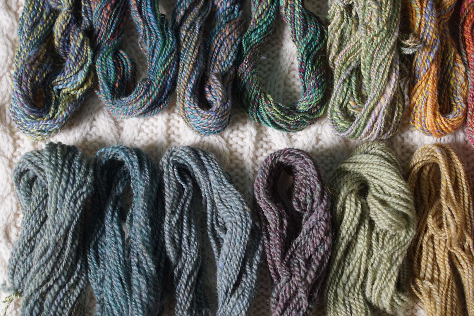
Addendum: Knitted samples
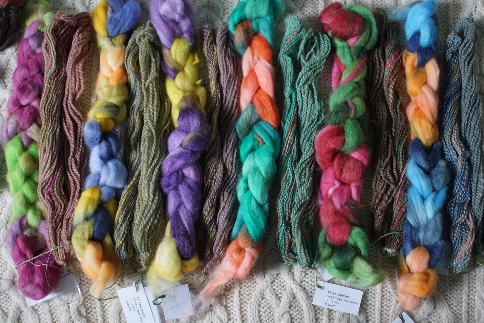
Exercise 3 in chapter 3 of Colour in Spinning by Deb Menz was to dye six samples covering the pairs of complements.
These are colourways created by pairing colours from across the colour wheel, and are therefore most likely to create grey or brown.
However, the exercise was intentionally imbalanced: from these pairs of colour families, we were to pick five colours. This meant that one of the pair would dominate. I let my kiddos pick the colours, and you can see how the balances worked themselves out.
I will analyze each colourway in detail, but hang on a minute. The next exercise, number 4, was to create twelve colourways that are all split complements. Meaning one hue is represented from one side of the colour wheel, then on the other side, hues are selected from the neighbors adjacent to the actual complement. Again, this was intentionally imbalanced: Deb instructed me to select four colours from the three colour families involved.
I let kids do all the colour selection for both of these series. My kids picked the complements, mostly Dooner. On the day I dyed split complements, it was a -40 day where a -60 windchill had closed the schools, and two of my kids’ friends were spending the day with us. I showed them my dye atlas, and they got to pick from three columns which four colours went in each braid.
What they chose was super interesting, especially for the split complements. With only a few exceptions, they chose one colour from the solo side of the trio, and three colours from the analogous couple on the other side of the colour wheel. This made for some very pleasing colourways which are 3/4 analogous, with one hit of complement. Perhaps unsurprisingly, they chose lots of brights, and very few of the “dull” options, so I think there’s lots of points of connection within this group of colourways.
But my goodness, this is a lot to analyze and look at. So I thought I’d break it down into six sections by analyzing each complementary colourway with the two split complements adjacent to it. So for example, I’ll compare the Blue + Orange complement with the Blue + Yellow-orange + Red-orange split complement and the Orange + Blue-violet + Blue-green split complement. Make sense? Oh dear, I hope so, because it’s about to be a lot of typing.
I should also say – I’m not worrying that much if the colourways below fall into any strict definition of complement or split complement. As I’ve learned from Katrina, these colour schemes came from a world of design that expects these colours to stay separate, and when you are attenuating and blending colour on combed top, something quite different is happening. I used the exercises because I was really curious about what will happen. And I’m still curious; I won’t really know until I’ve started spinning these guys. But all that to say, if one colourway or another doesn’t happen to fall exactly in its definition, I don’t care at all. It’s all just to help me pay attention and learn.
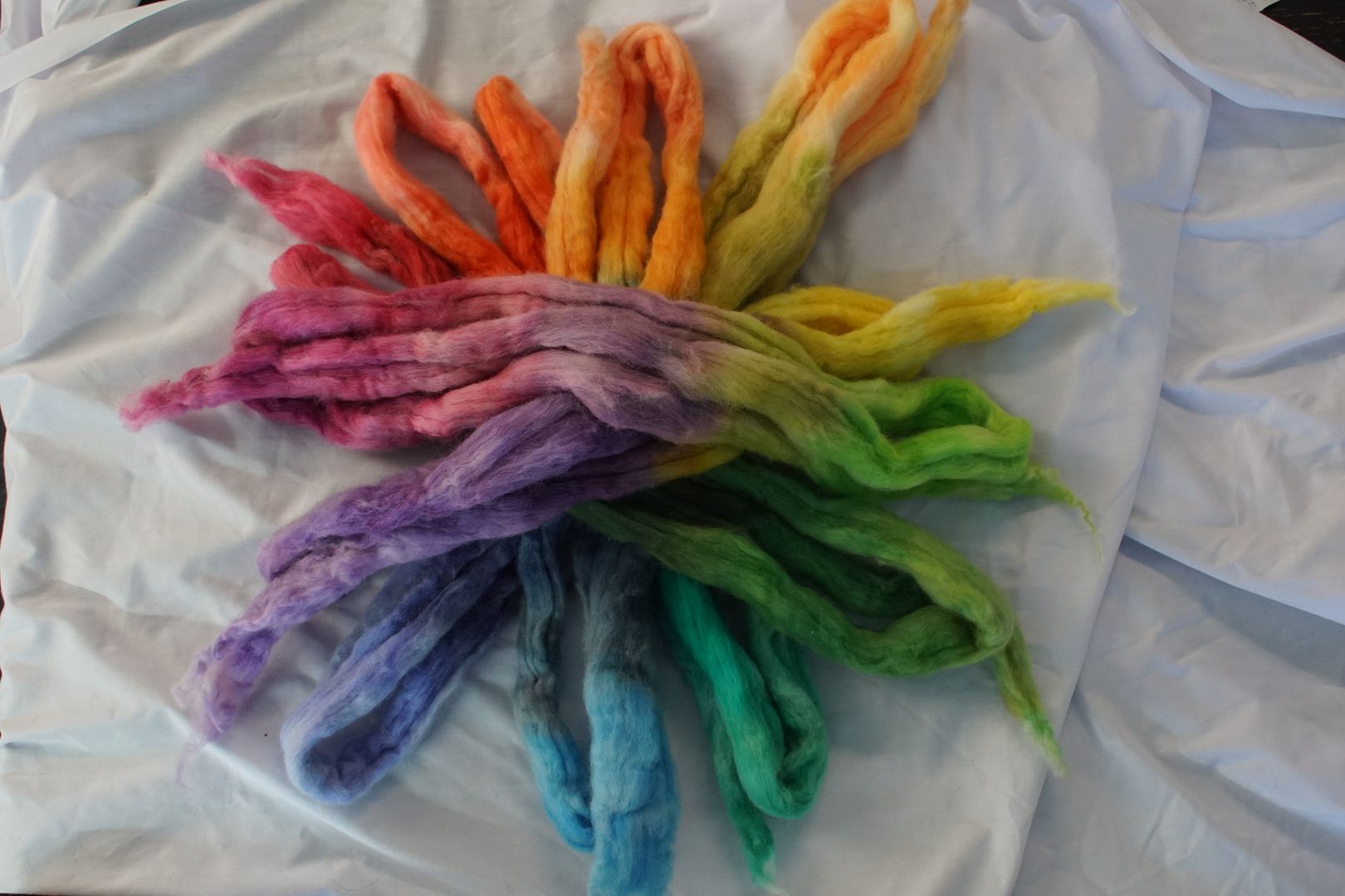
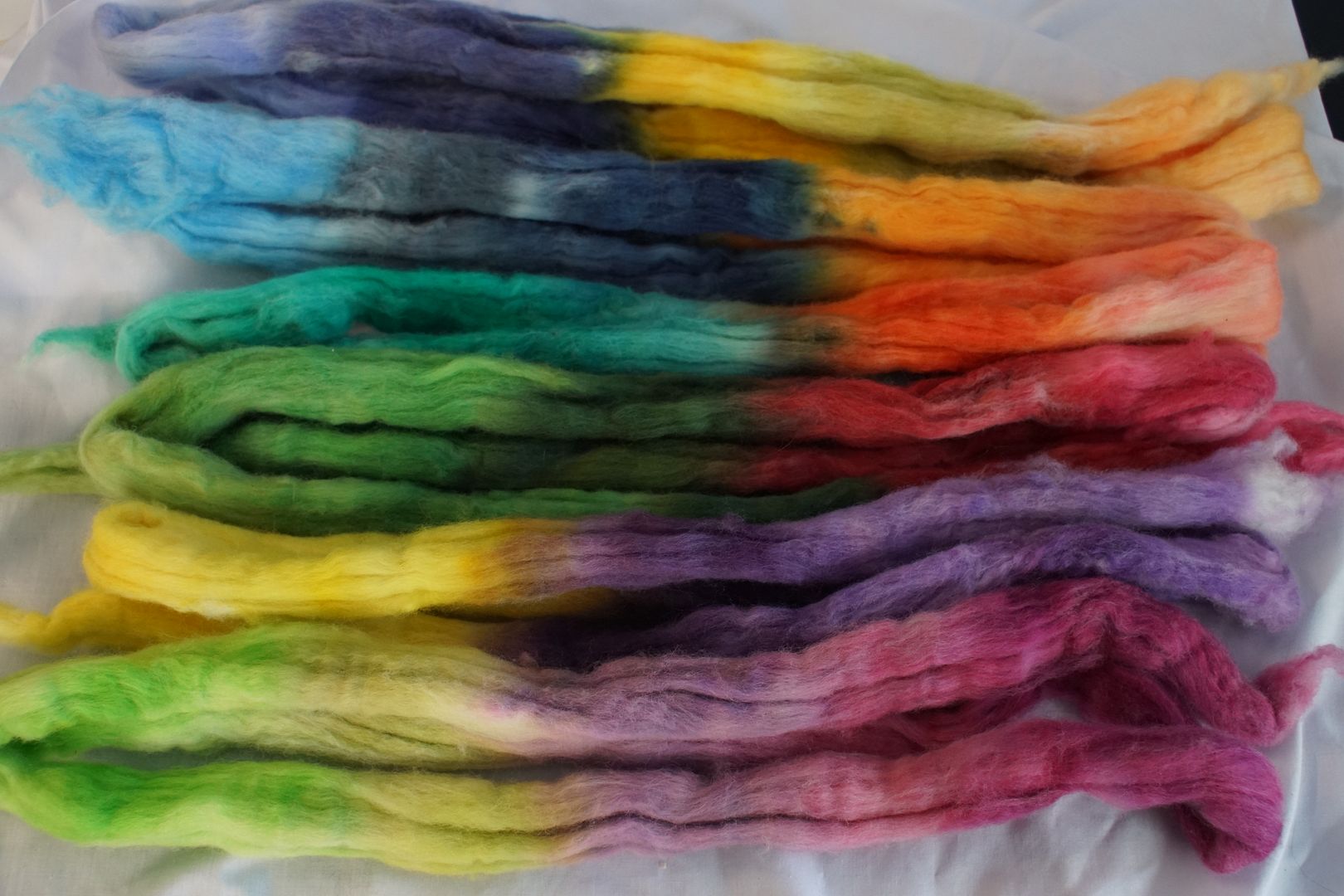
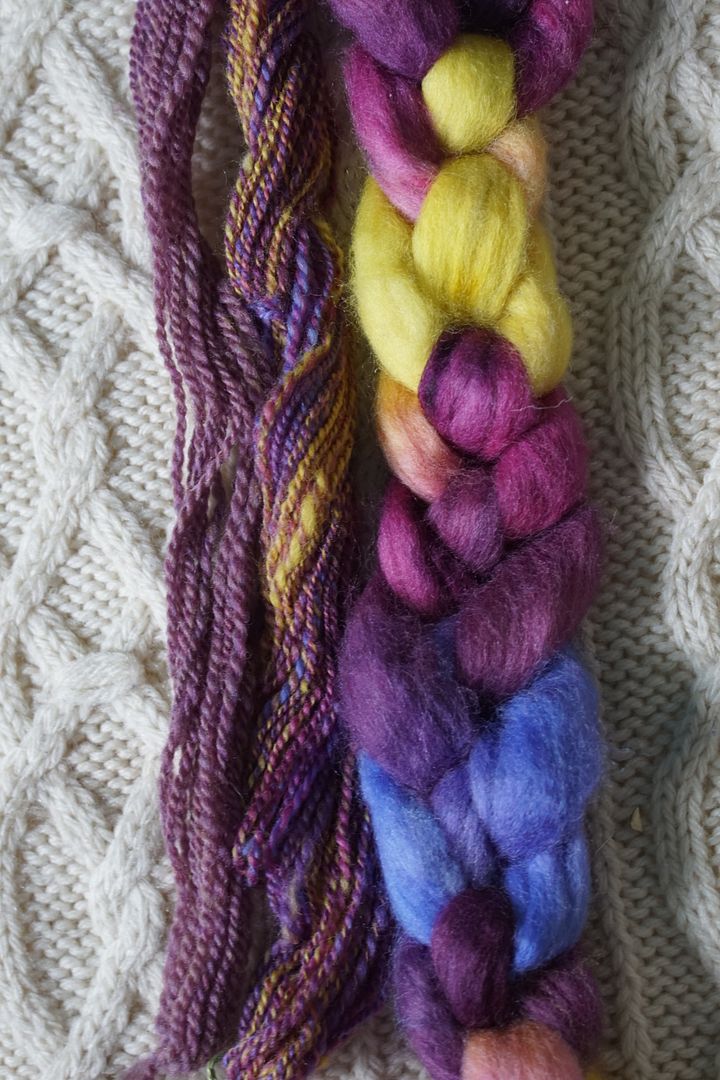
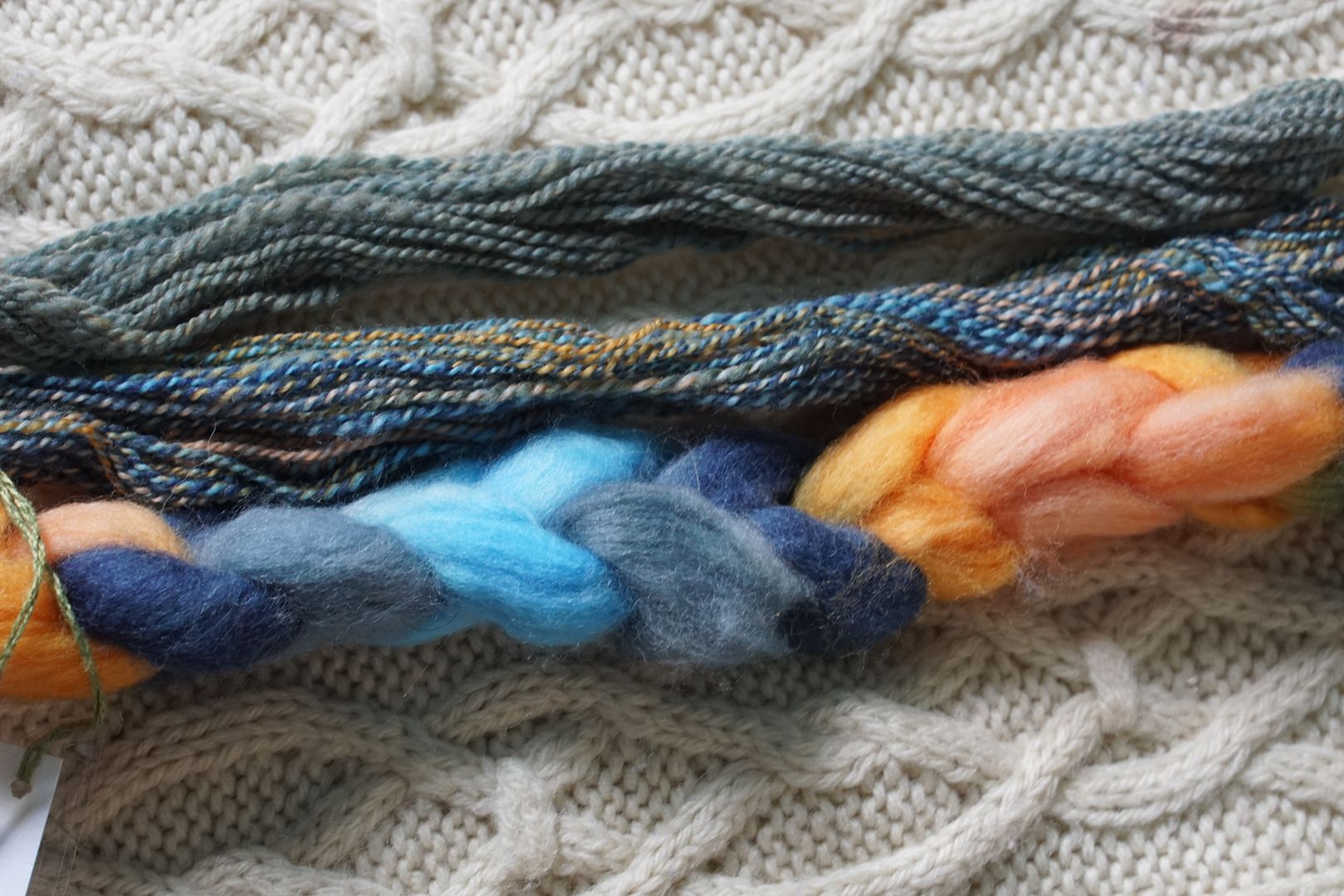
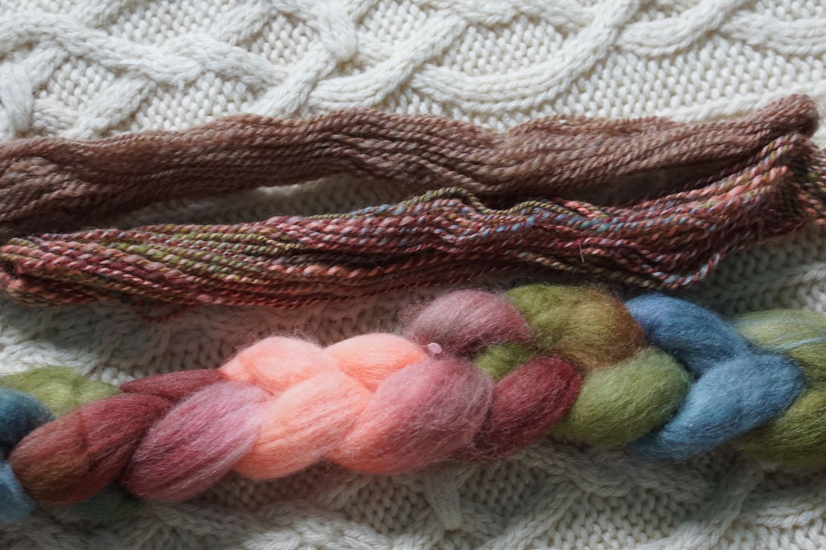
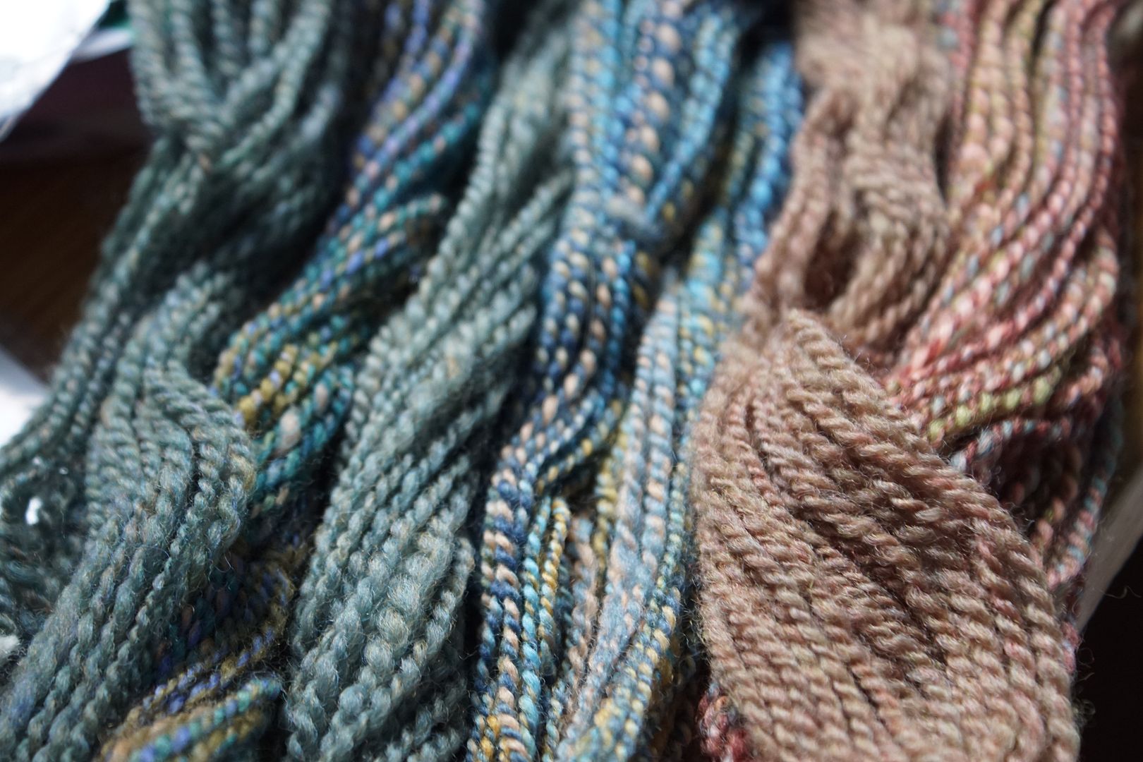
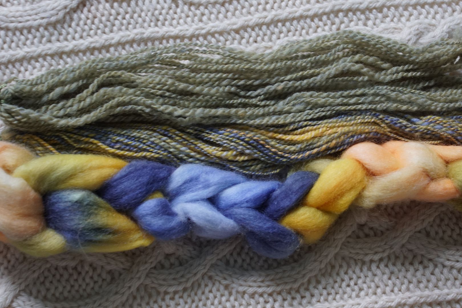
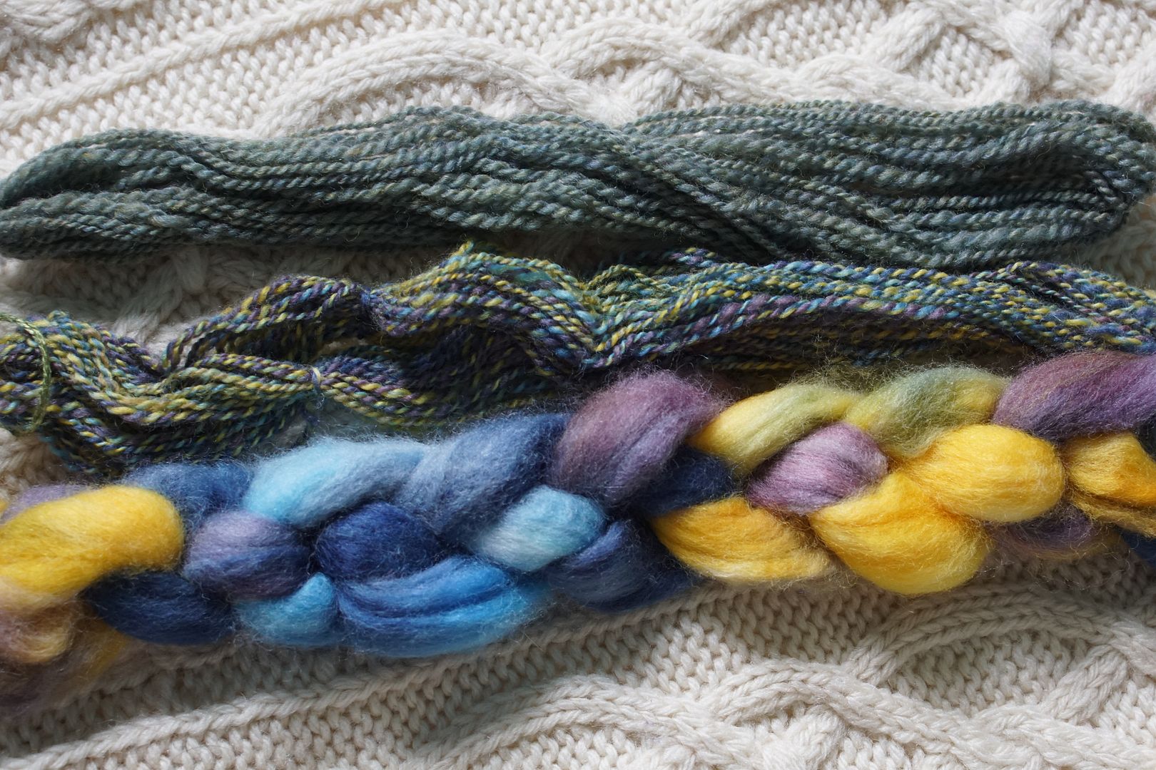
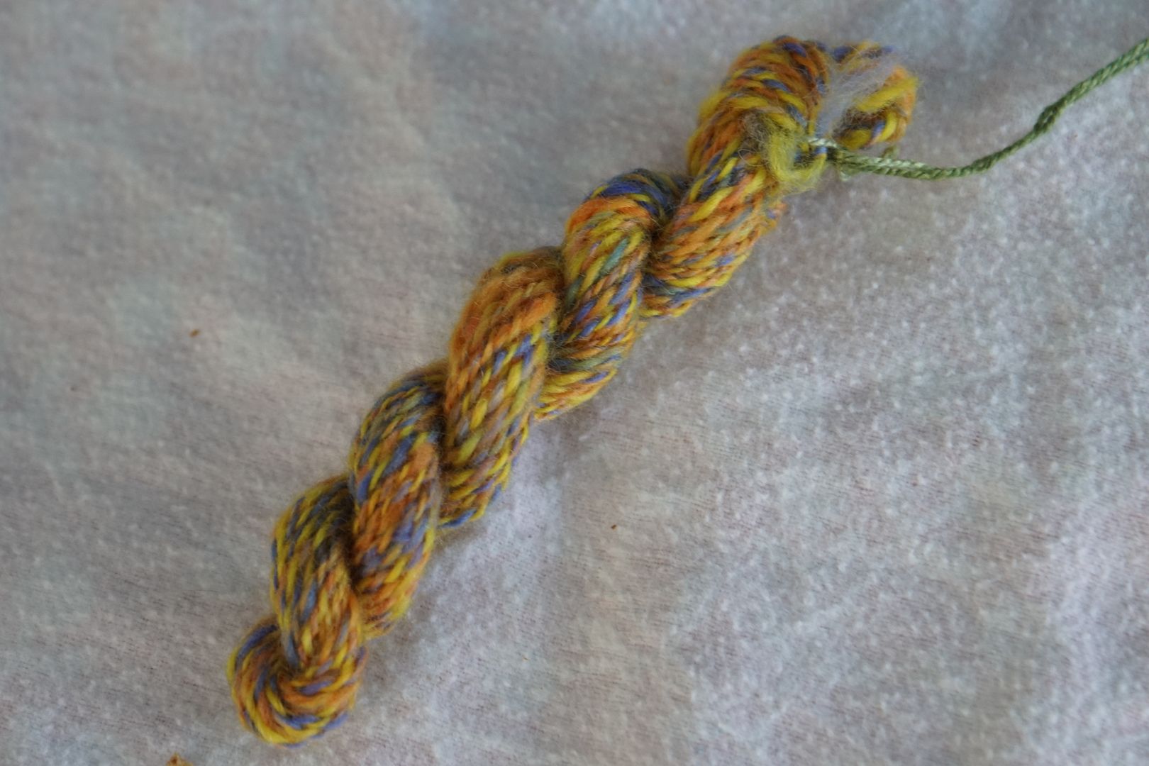
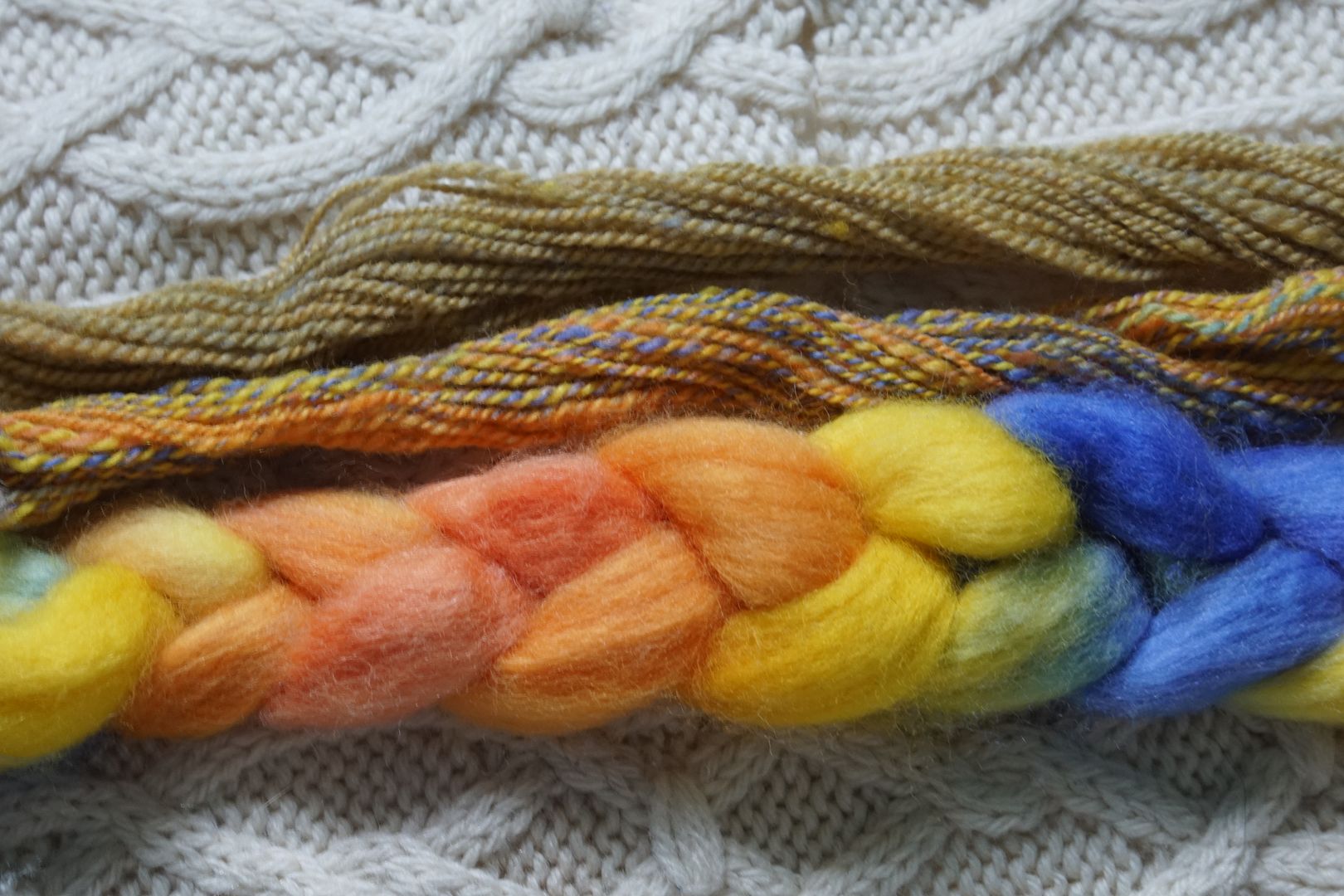
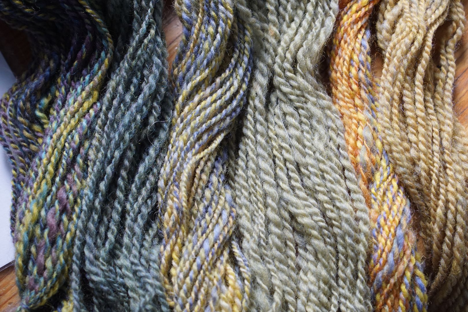
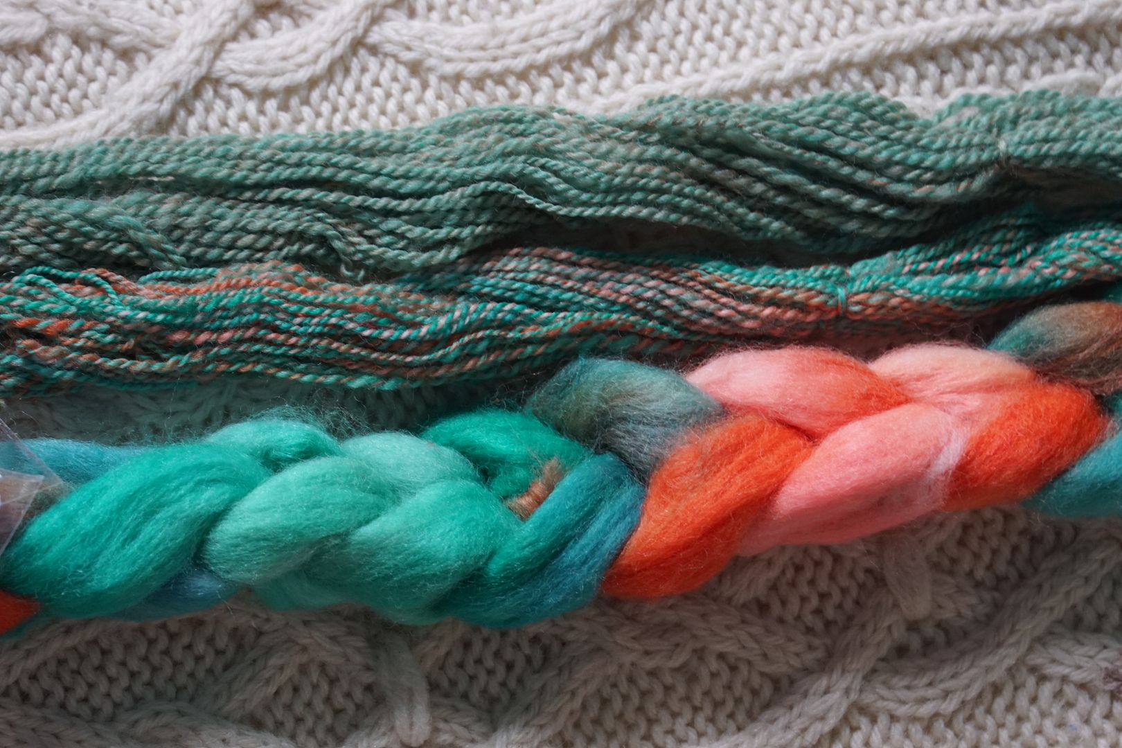
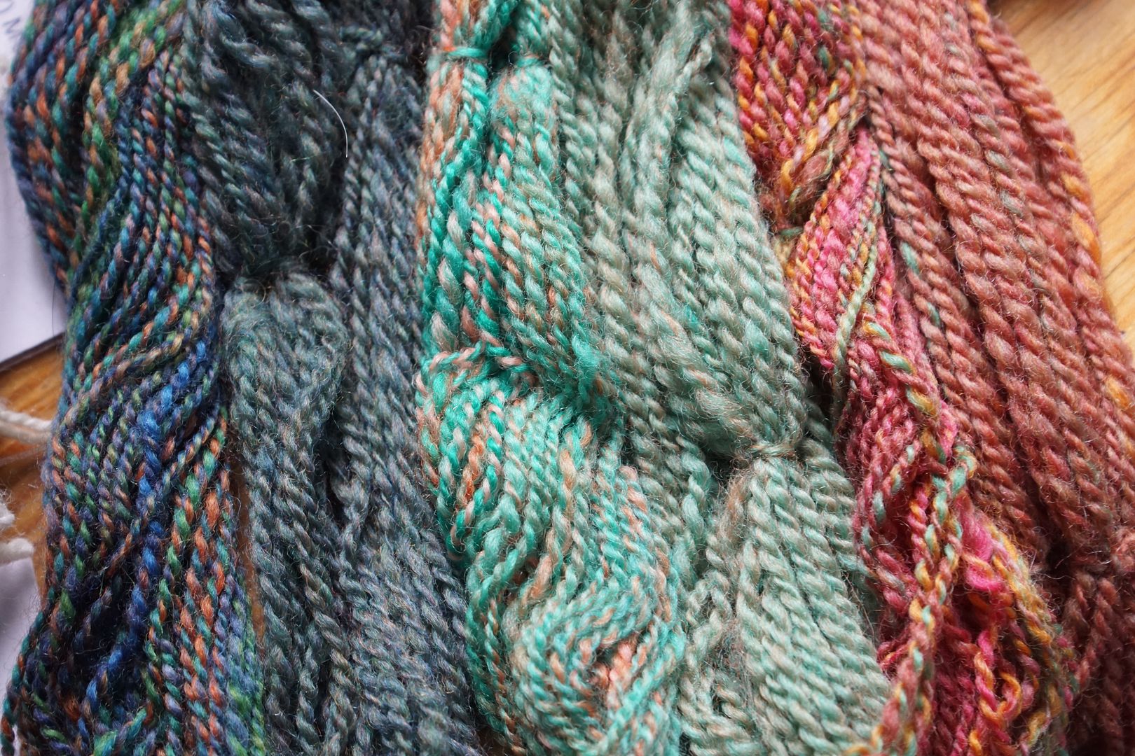
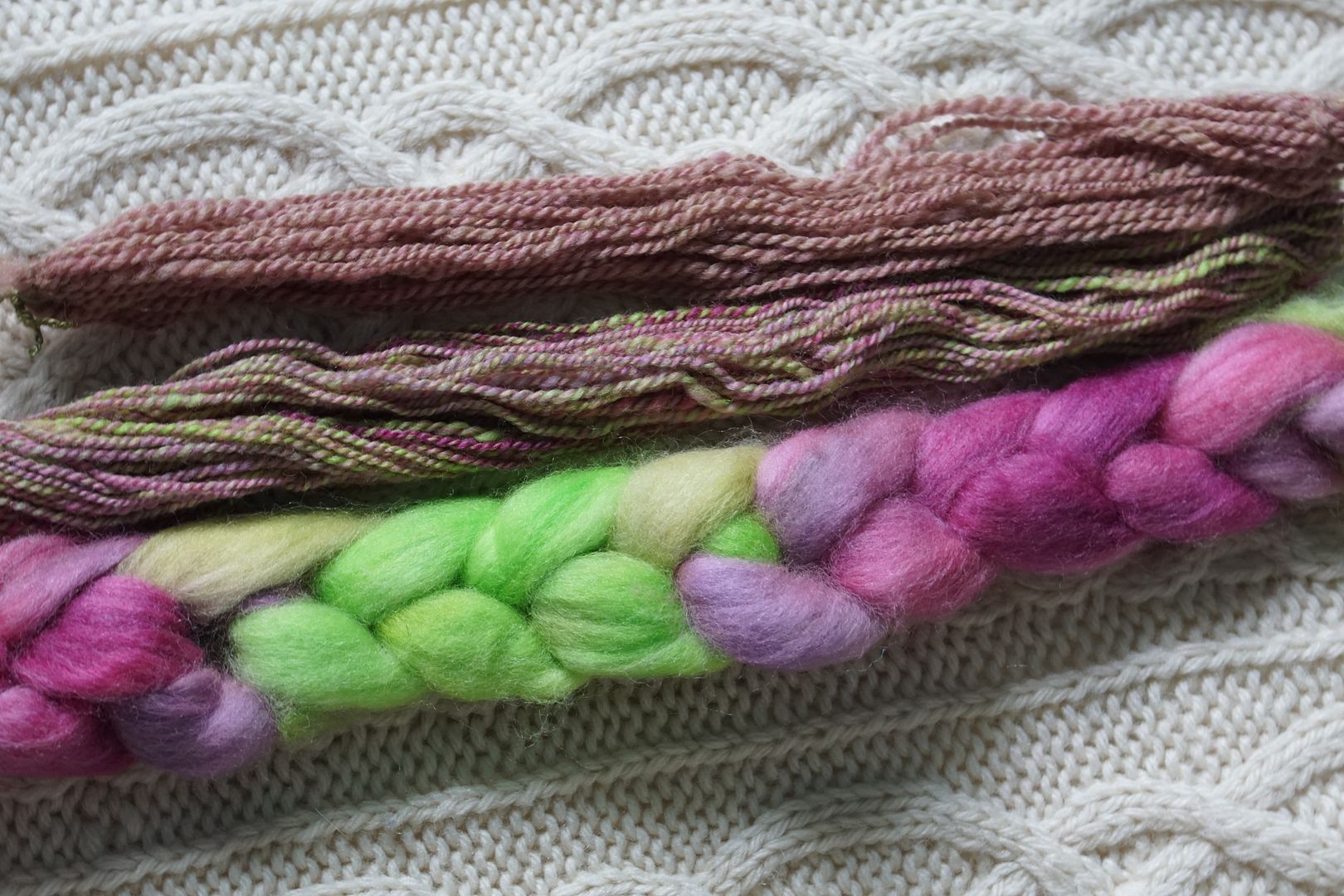
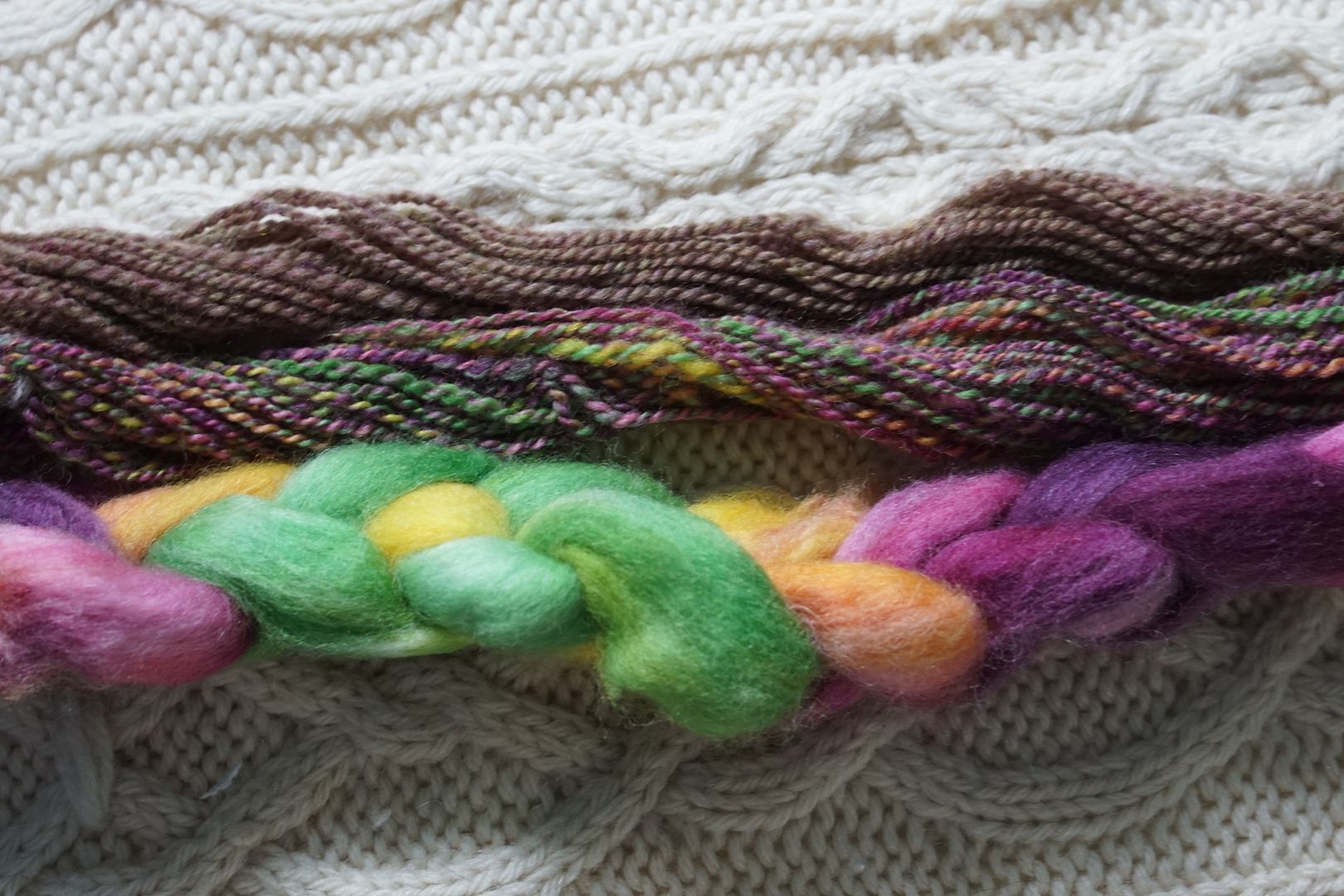
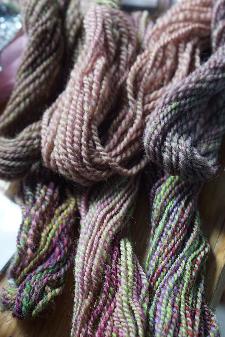
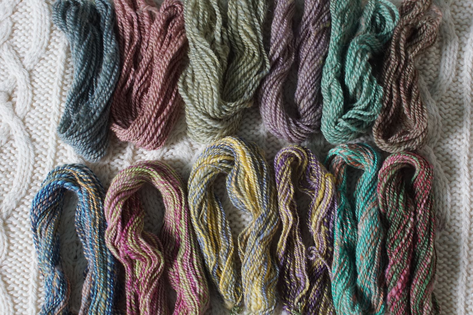
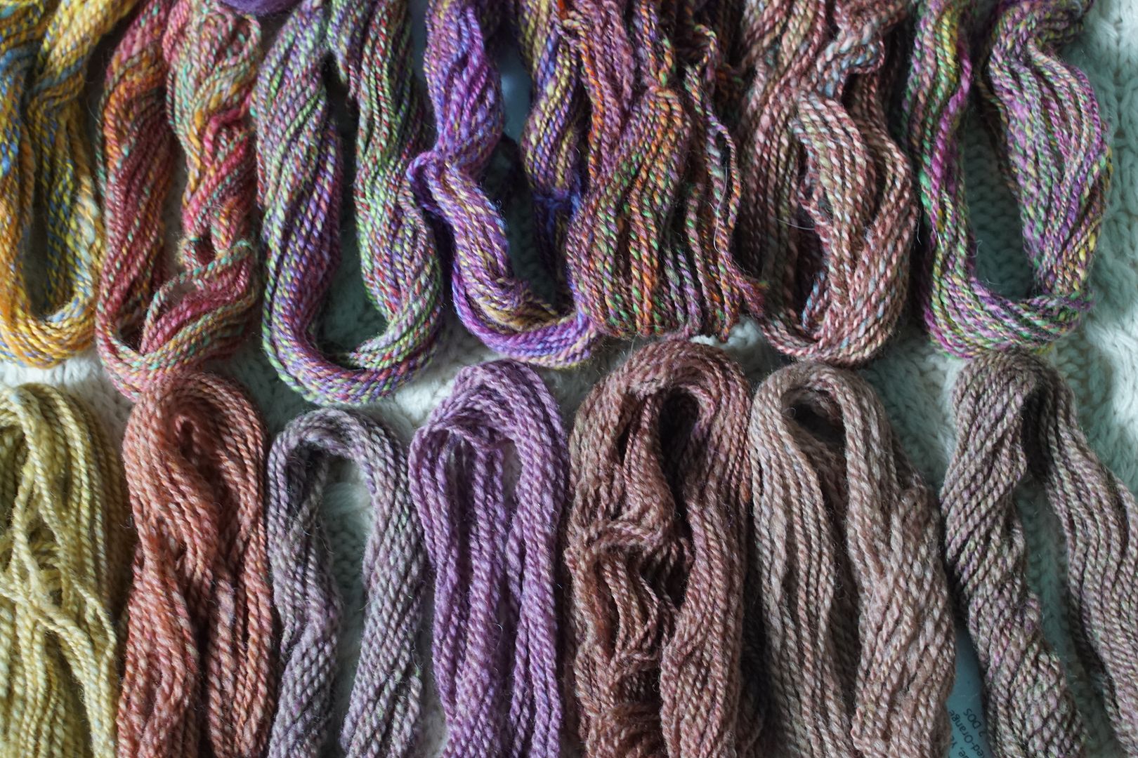
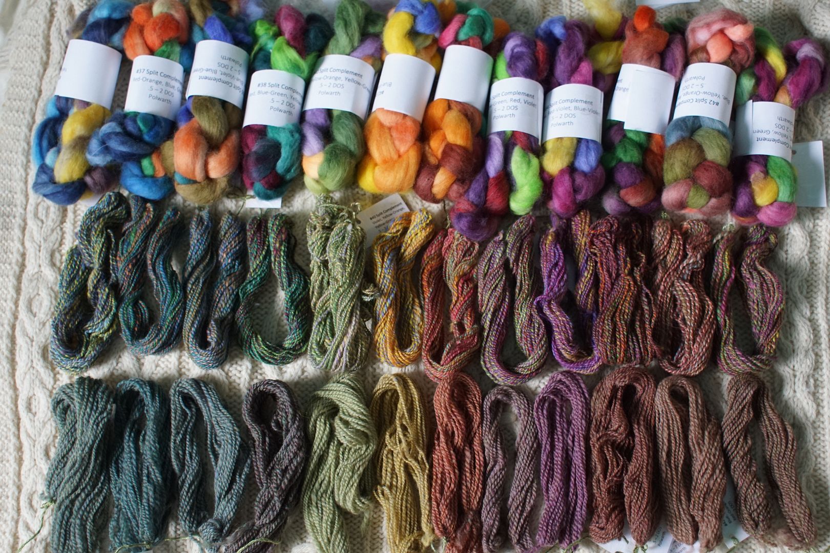
Finally, I also spun two samples from each colourway. As I’ve been doing, I took one strip off, doubled it back on itself, and combo-drafted it with itself, then plied from a center-pull ball. However, I wanted to take it all the way, and see what it looked like when these colourways were completely blended together, so I took off another strip of each, and blended it on combs. I wanted to see every flavour of mud. And boy, do I love that mud!
OF NOTE: All colours were dyed at the following intensities: Pale .5% DOS, Dull 1% DOS, Intense 1.5% DOS, Dark 2% DOS. Note that Menz suggests dyeing “Intense” colourways at 2% DOS and “Dark” at 3% DOS, but at this point I wanted to conserve dye, and found the colours still quite deep. All dyed on 100% Polwarth wool.
Think that’s enough preamble? Here we go.
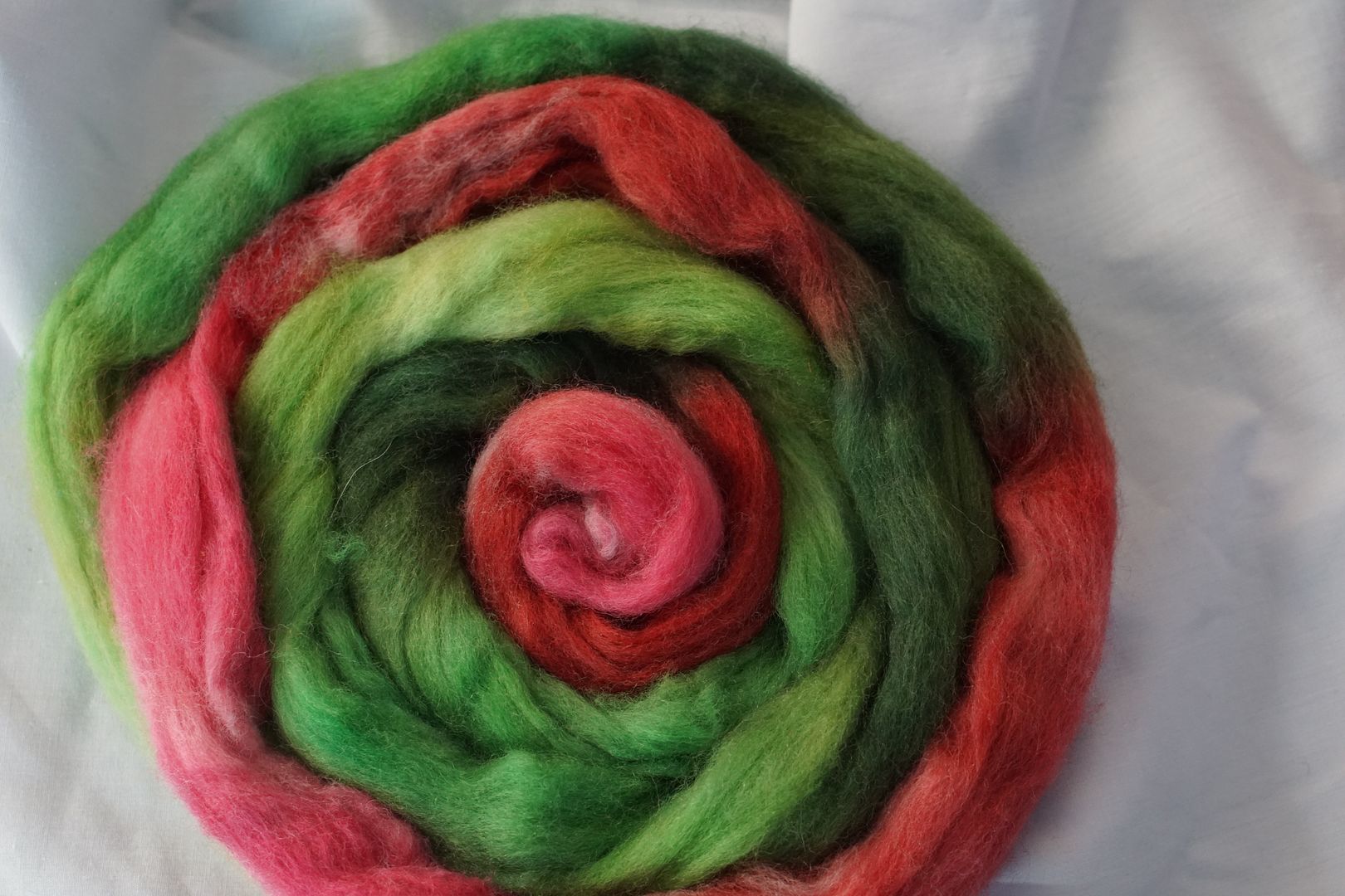
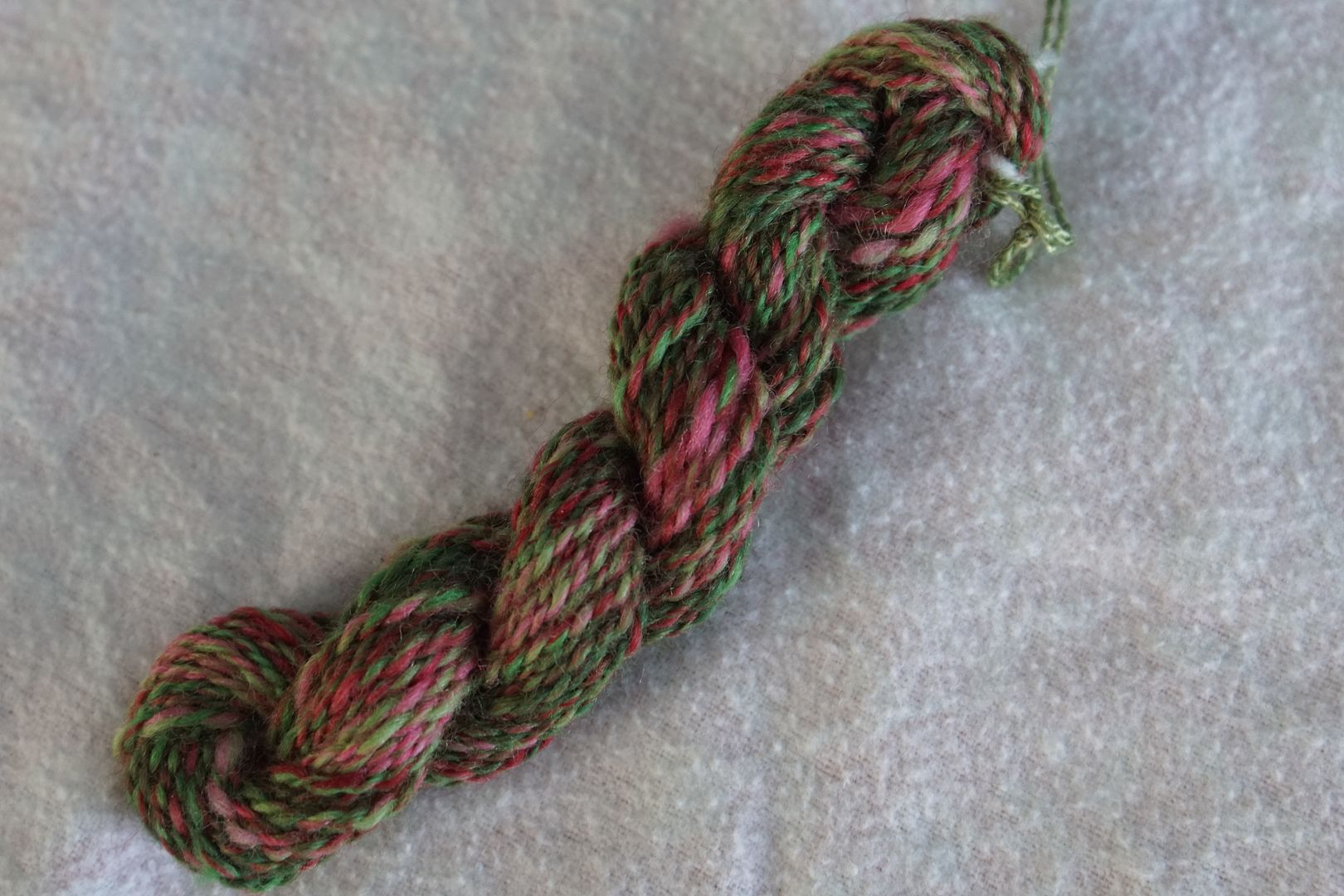
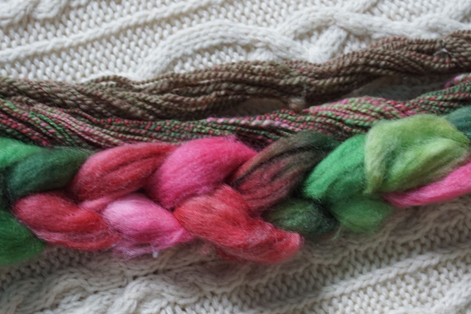
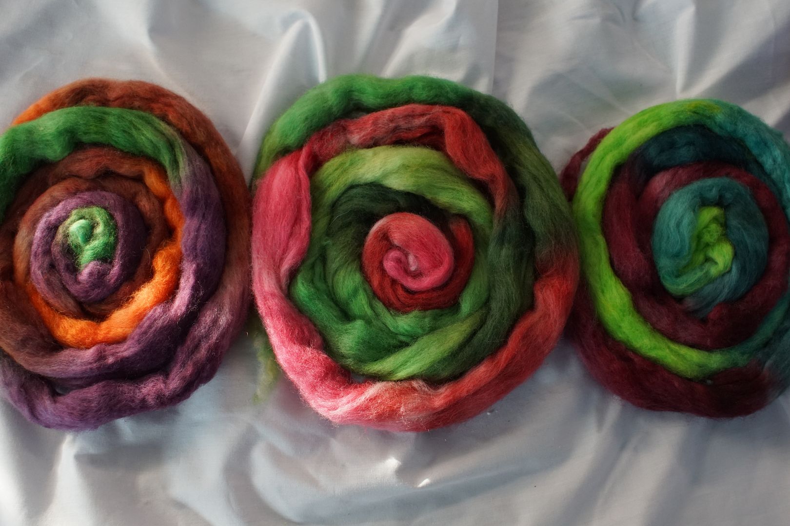
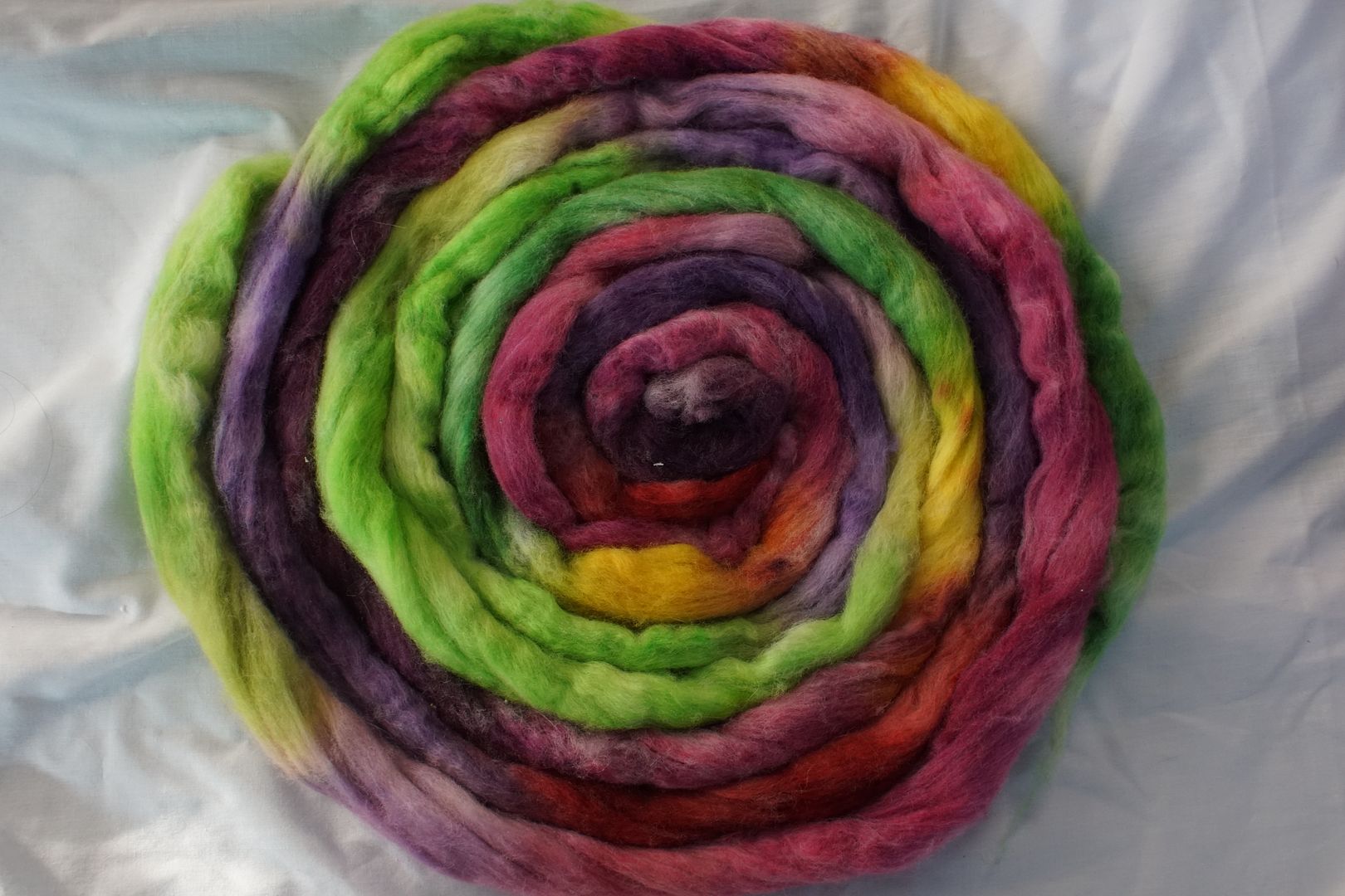
Red + Green
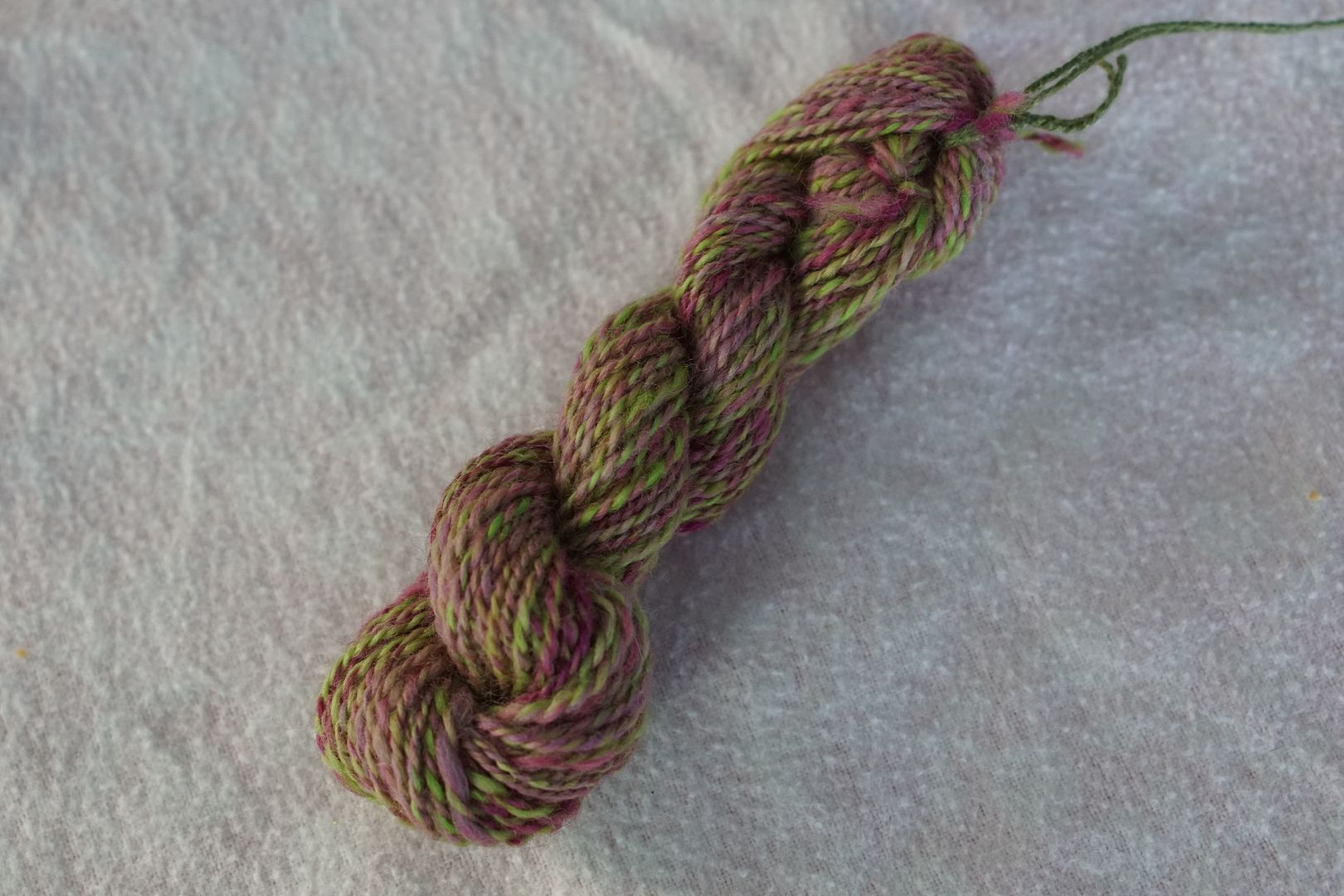
Red + Green: Intense Red, Pale Red, Dark Green, Intense Green, Pale Green. Because of the pink-ness of the reds and the warmth of the greens, this doesn’t come across as that Christmassy, more rose-garden-y.
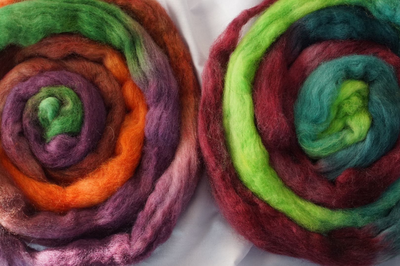
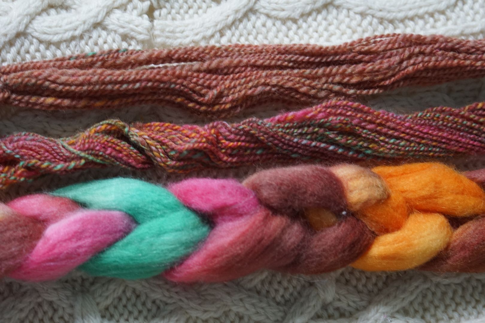
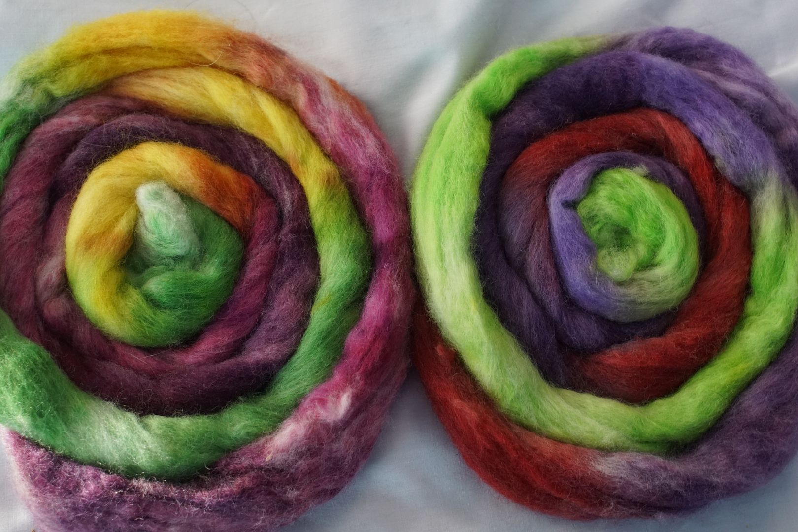
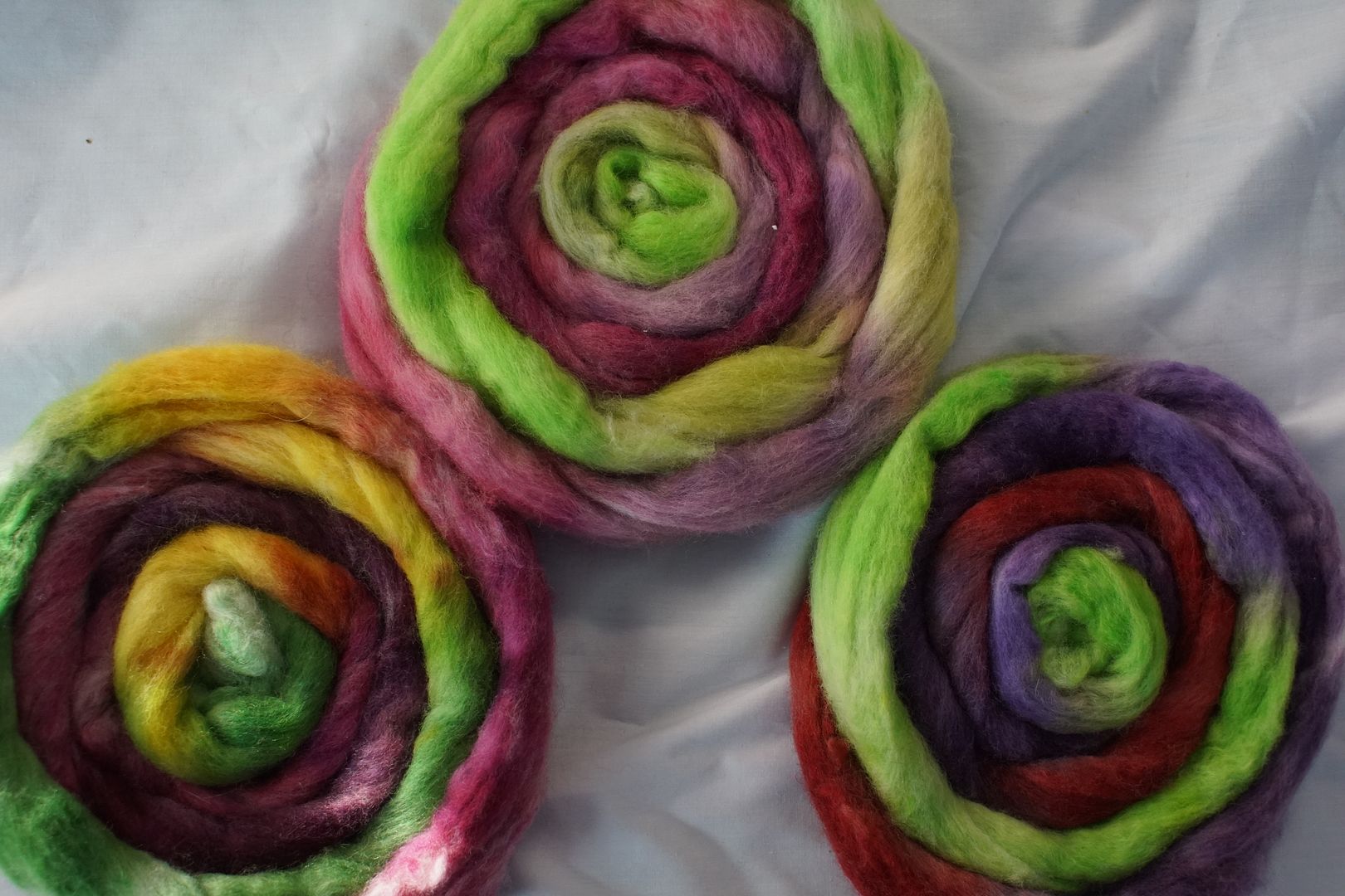
Green + Red-Orange + Red-Violet: Intense Green, Dark Red-Violet, Dull Red-Orange, Intense Red-Orange. (My notes say Pale R-O and not Dull, but looking at it again I must have used dull.) This is interesting. The word that comes to mind is “witchy.” It really looks more like a triad, and has a subversive quality to it.
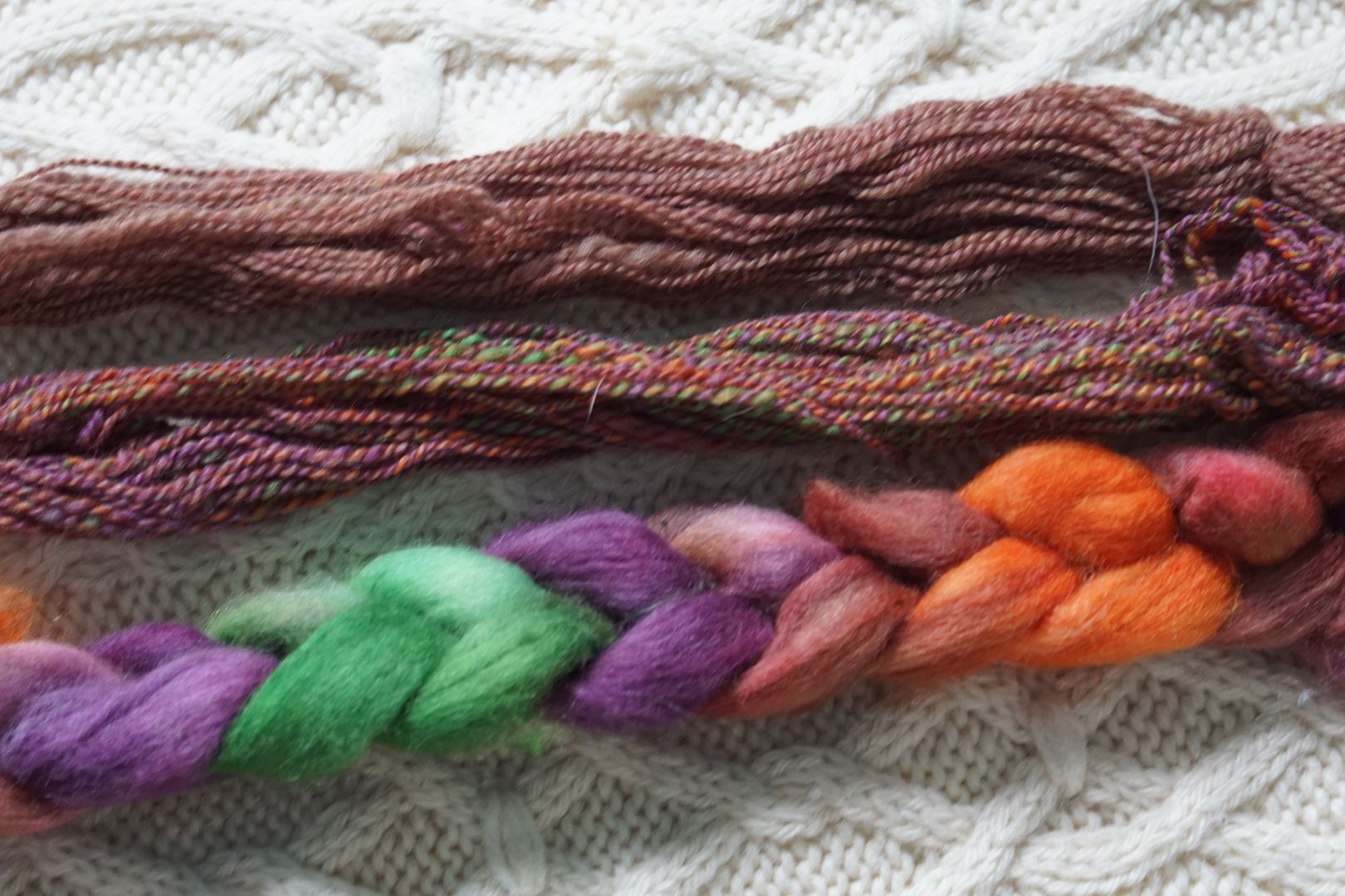
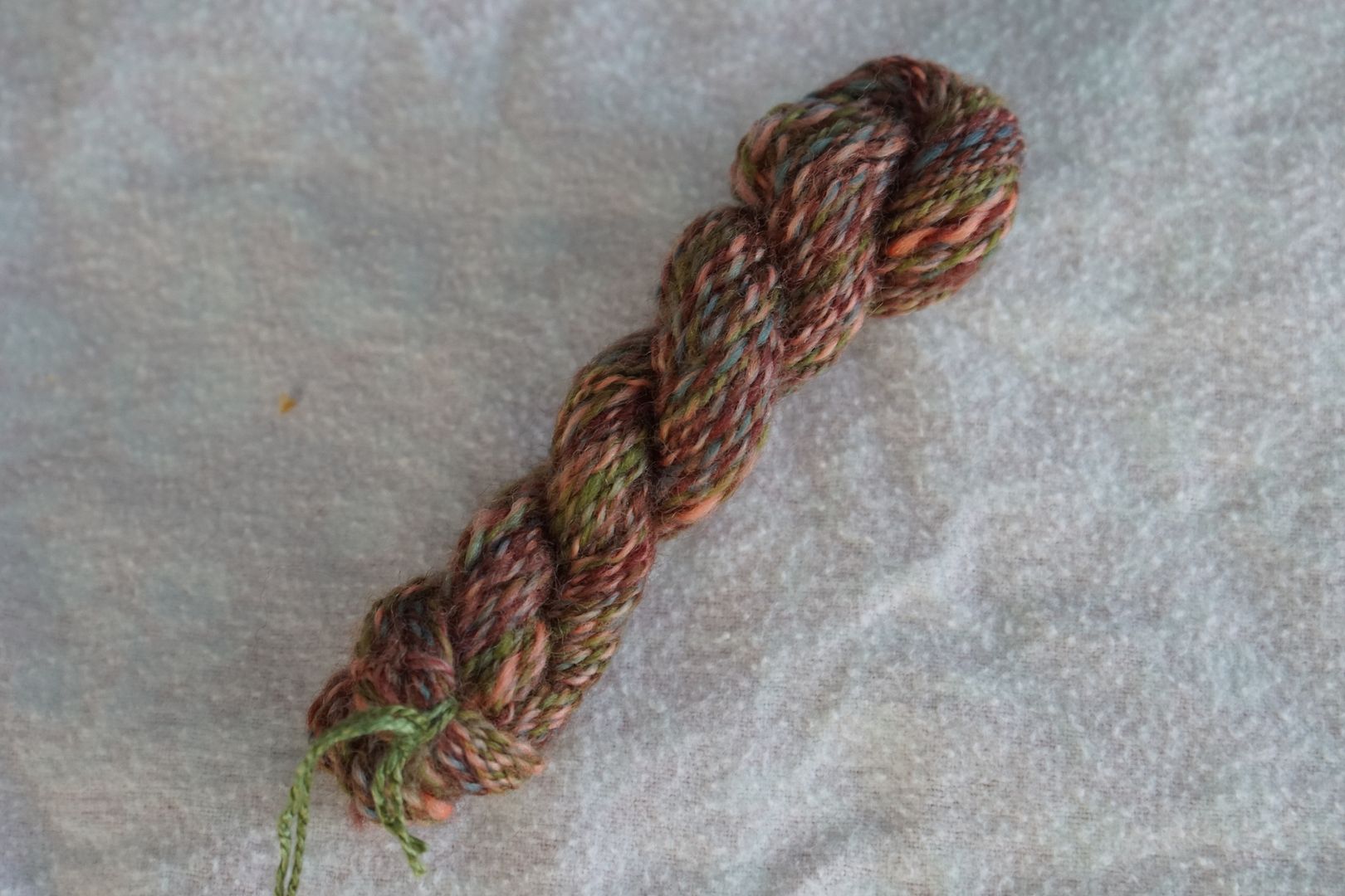
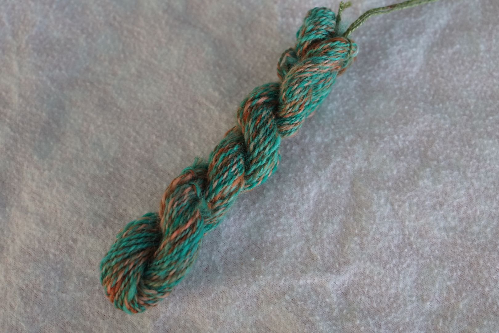
Red + Yellow-Green + Blue-Green: Dark Red, Intense Yellow-Green, Dull Blue-Green, Dark Blue-Green. The value differences here are really shocking. The Yellow-green just takes over, though there is a lot of blue-green as well. This defies association for me.
Lime green is one of those powerful colours where a little bit makes a big impression. The pops of lime green don’t totally overwhelm the yarn, though they combine powers with the blue-green to make a definitely overall green feel to the yarn. With the pops of burgundy, it just looks really odd to me. The burgundy shows its strength more in the combed blend, where it makes the brown much more purple-grey where I would have expected it to be green.
These three colourways are very different from each other!
Perhaps the learning from this trio is that red is very powerful. It has much more influence on the final colour than its proportions would suggest.
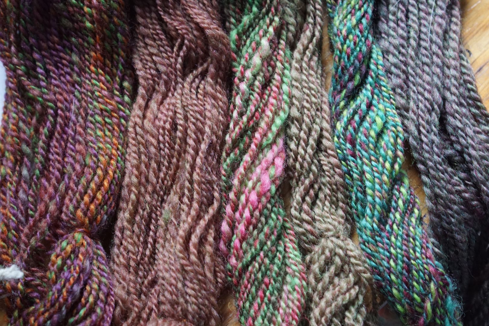
Twisting them together brings the garden association back for me. It’s warm and autumnal, with that blue-green to keep it grounded. Every time I wind up three colourways in this post, a complement with its two neighboring split complements, it brings together six colours across the colour wheel from each other. It will be interesting to see how that complexity plays out.
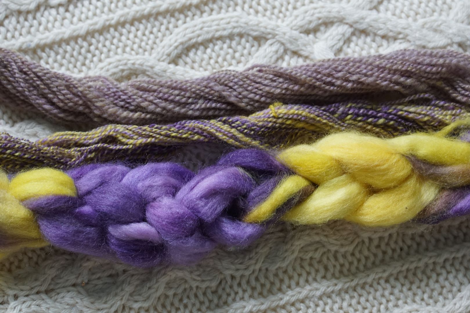
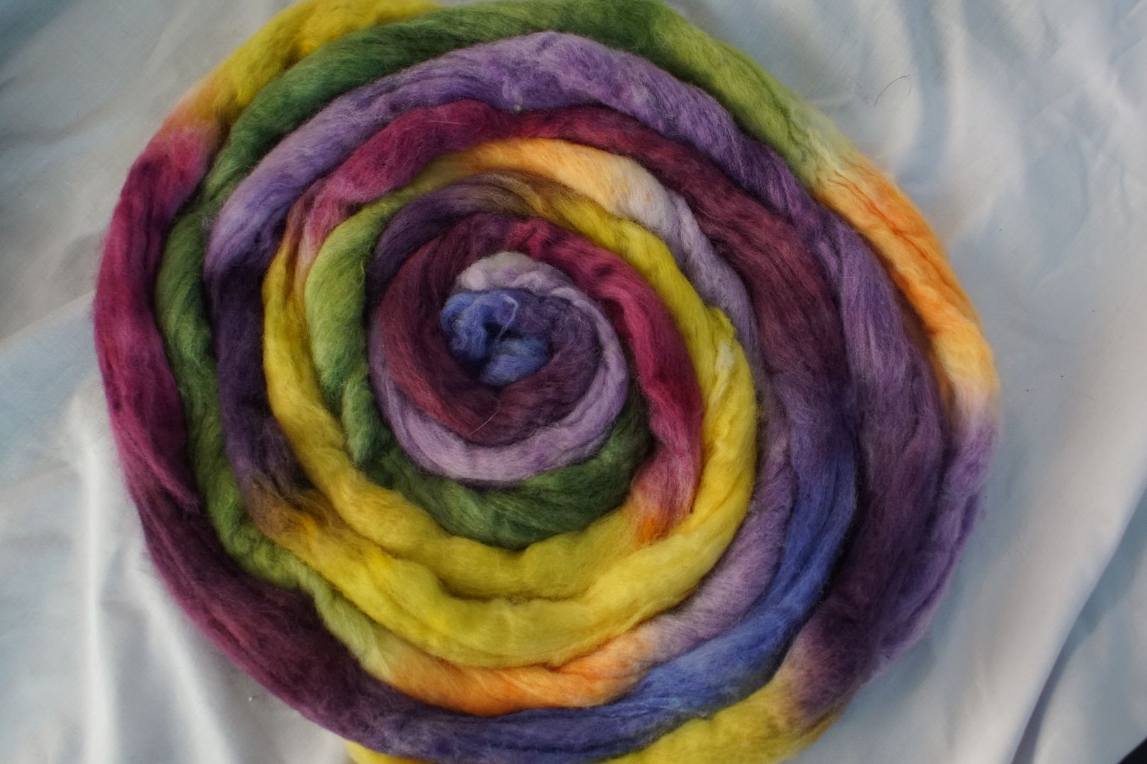
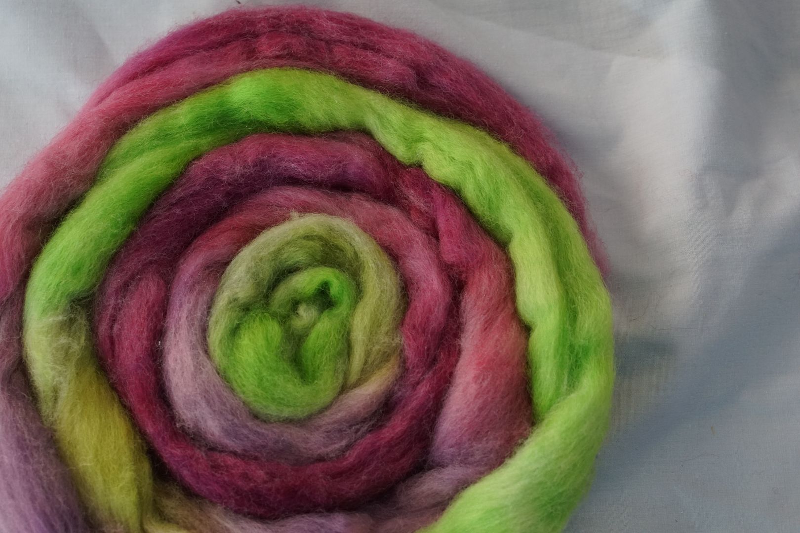
Violet + Yellow
Violet + Yellow: Pale Yellow, Dull Yellow, Pale Violet, Intense Violet, Dark Violet. This colour came out looking rather simplistic. I do not love these colours together, at all.
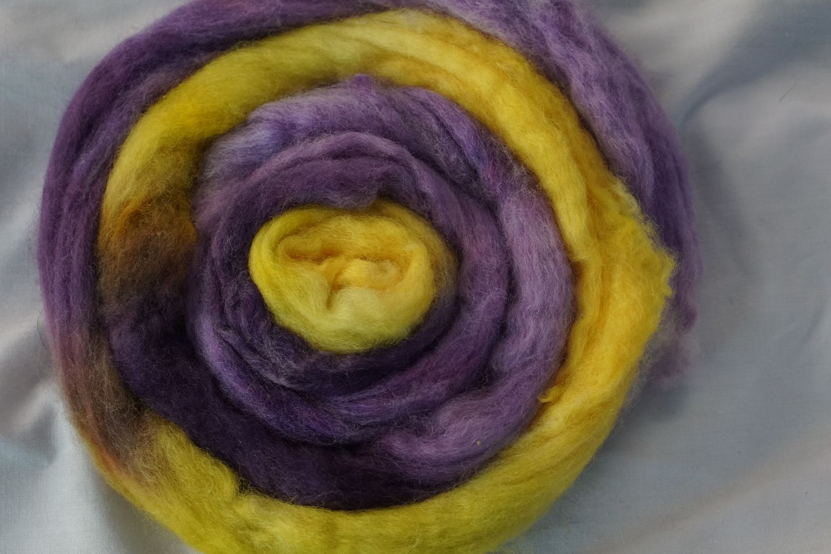
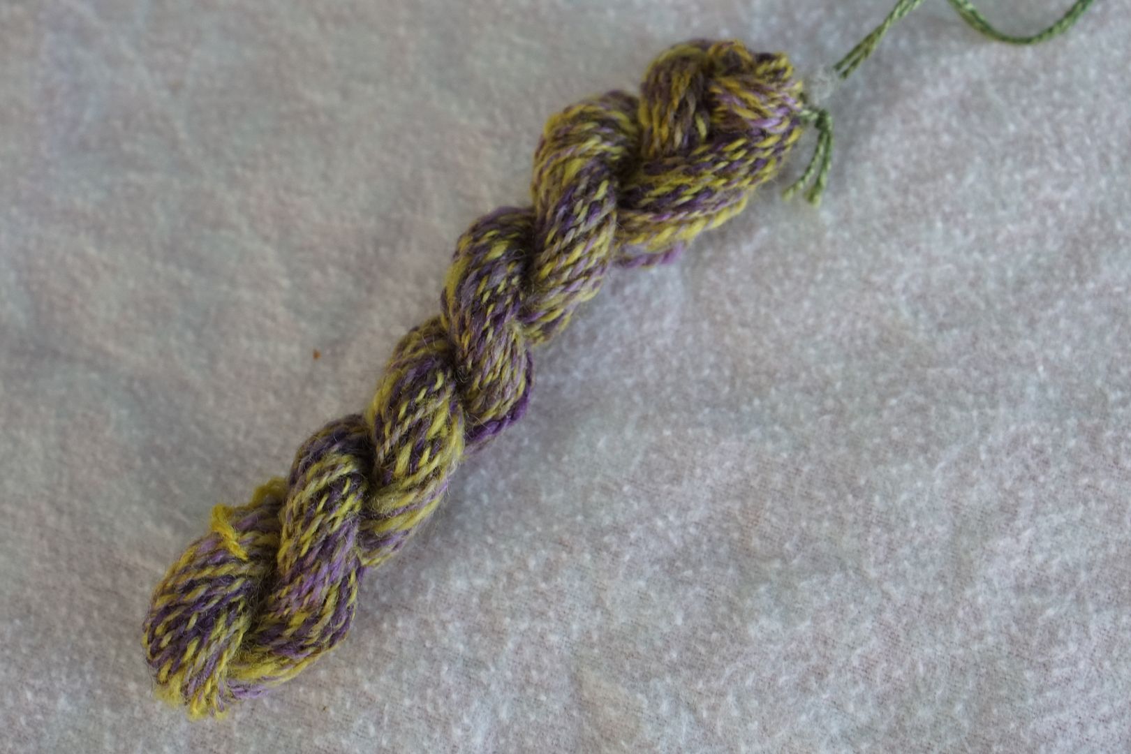
There was much more purple than yellow in this colourway. When allowed to remain as large blips of colour as in the sample above, they are very loud, and take the colourway hostage. However, when combed together, they serve to lighten and mute the purple, which dominates overall by virtue of quantity and coolness.
Yellow + Blue-Violet + Red-Violet: Dull Yellow, Intense Blue-Violet, Dark Red-Violet, Intense Red-Violet. Splitting the violet into Red-Violet and Blue-violet makes this a lot more palatable for me. The yellow is also duller, and takes up a smaller percentage of the colourway, so it’s more like a pop in a complex Violet colourway.
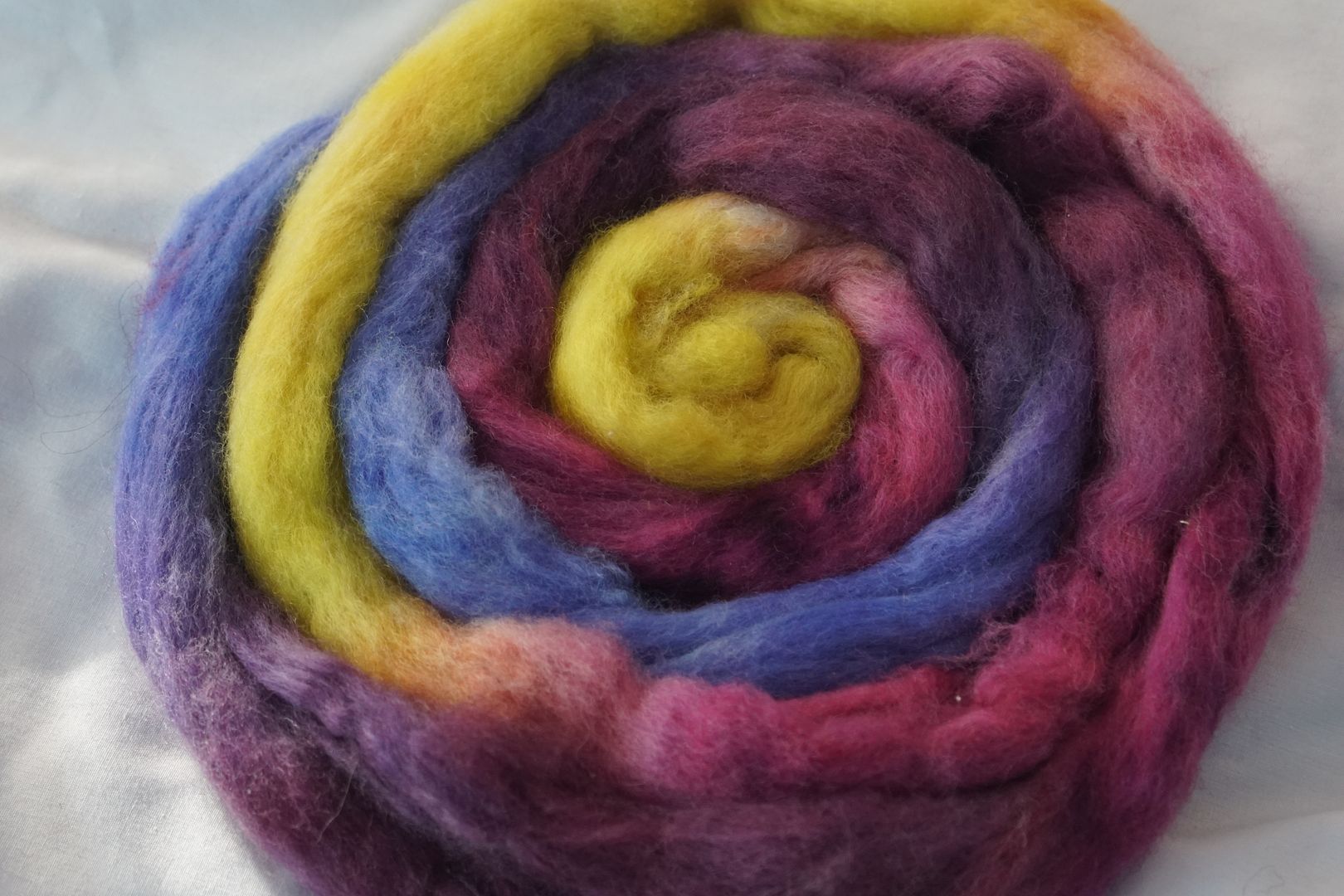
Having 1/4 of the above yarn be yellow is about the max, I think, to having it still be pleasing (as opposed to 2/5 in the yarn before). These colours are so bright as to look like a sports team, and I can’t decide if I like the blue-purple pops in there or not. When combed together, a delicious purple results.
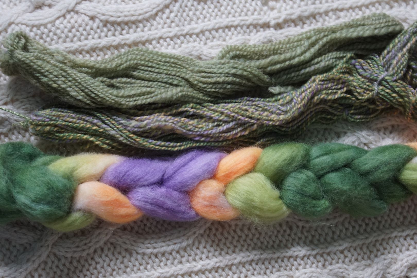
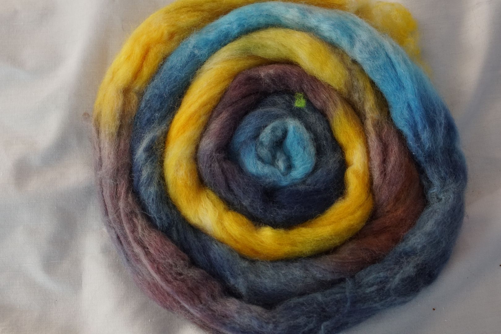
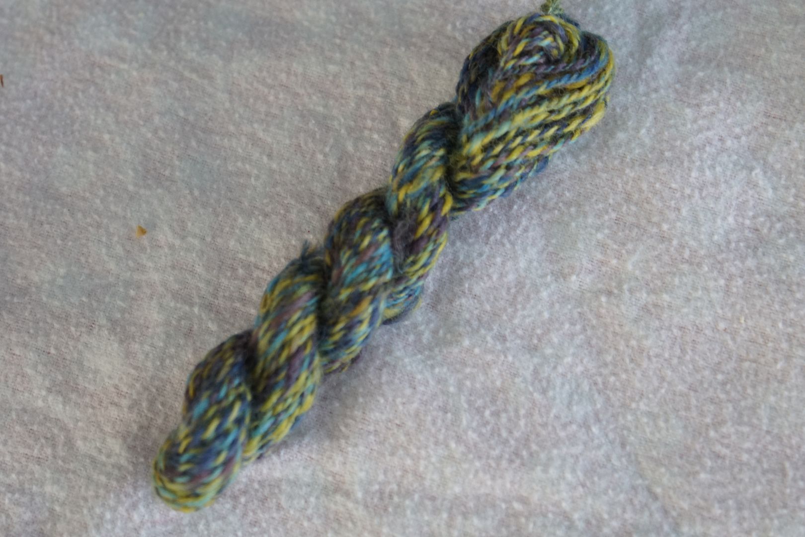
Violet + Yellow-Green + Yellow-Orange: Pale Violet, Pale Yellow-Orange, Pale Yellow-Green, Dark Yellow-Green. Now we’re talking. The Yellow-Greens take up half the colourway, with a pop from the analogous Yellow-orange, and the gentle addition of a little pale violet.
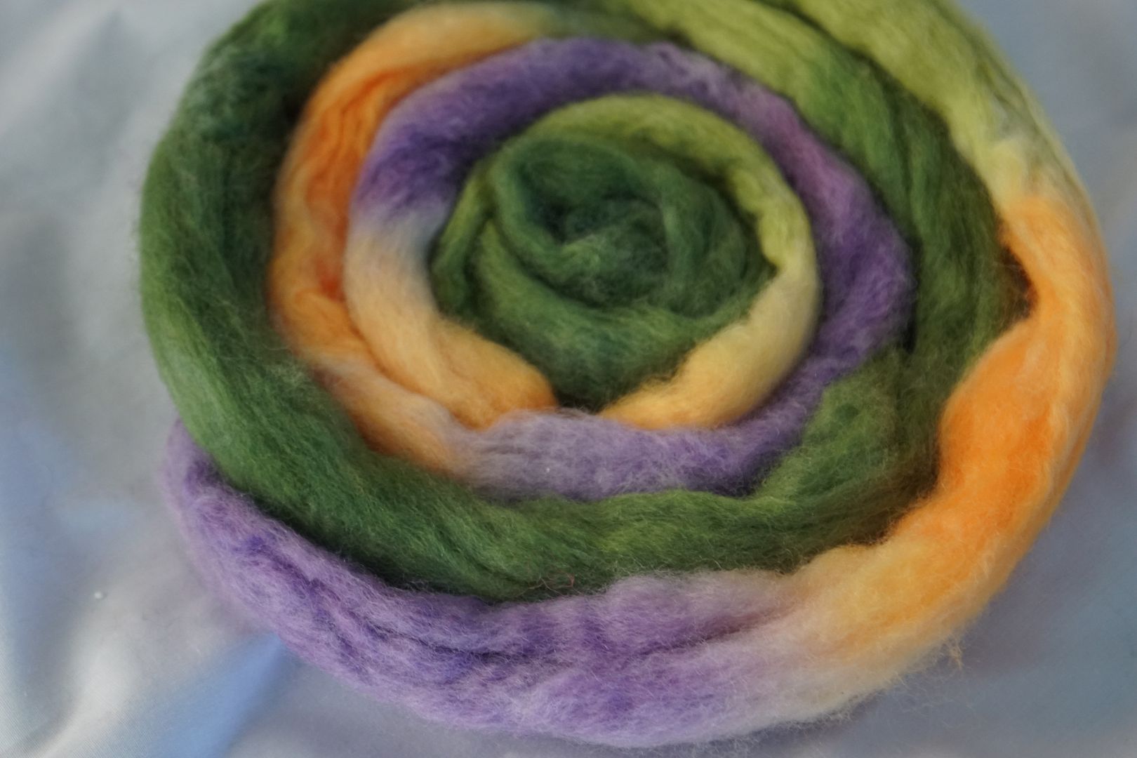
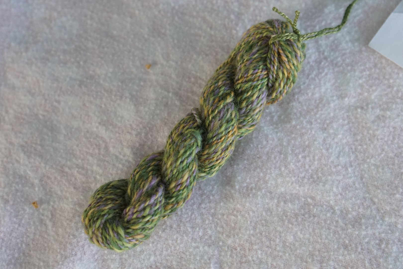
I love both of these yarns. Yeah, OK, I have a thing for green, and this colourway has lots of it. But perhaps what works best about this is that all the undertones are cool, even the yellow-orange. Beatrix Potter is the association that comes to mind. A greyish, pastel green comes from combing this colourway together.
The violet gives both of these colourways a “floral” feel, but at a completely different register.
These colourways are all very different from each other, though the split complement on the left is closer to the complement than either is to the split complement on the right. Put them altogether and there’s a fairly chaotic garden effect. There’s a lot of value variation, with the risk of the yellow taking over. There’s also a lot of warm and a lot of cool going on, which I don’t always love. I prefer for one to be dominant.
Blue + Orange
Blue + Orange: Pale Orange, Intense Orange, Pale Blue, Intense Blue, Dull Blue. This is probably the hardest for me. I rather despise blue and orange together. The dull blue does help ground things a bit, but overall it does have a Sports Team feel.
The sample above is just ugh for me. At least the oranges are fairly cool oranges, if such a thing can be said to exist. They’re peachy, and not too saturated. But that makes it even more annoying when they punch their way to the forefront, and they’re not even very strong. Anyway, combed together they make a very toned blue.
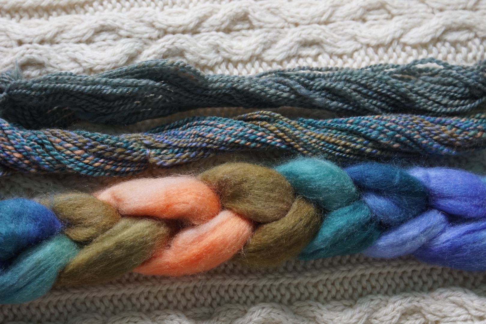
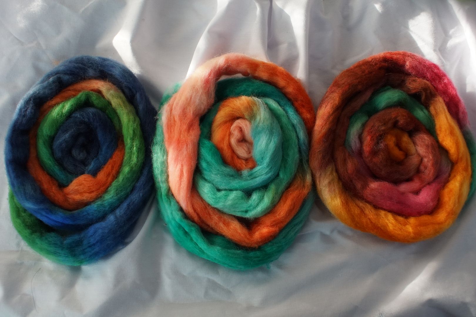
Orange + Blue-Green + Blue-Violet: Pale Orange, Dark Orange, Dark Blue-Green, Intense Blue-Violet. This is one of the rare times when the kids picked two of the four dyes on the singleton side of the split complement, rather than on the two-analogous-shades side. However, those two oranges are very different to each other. With the dark blue-green, it makes this colourway quite warm.
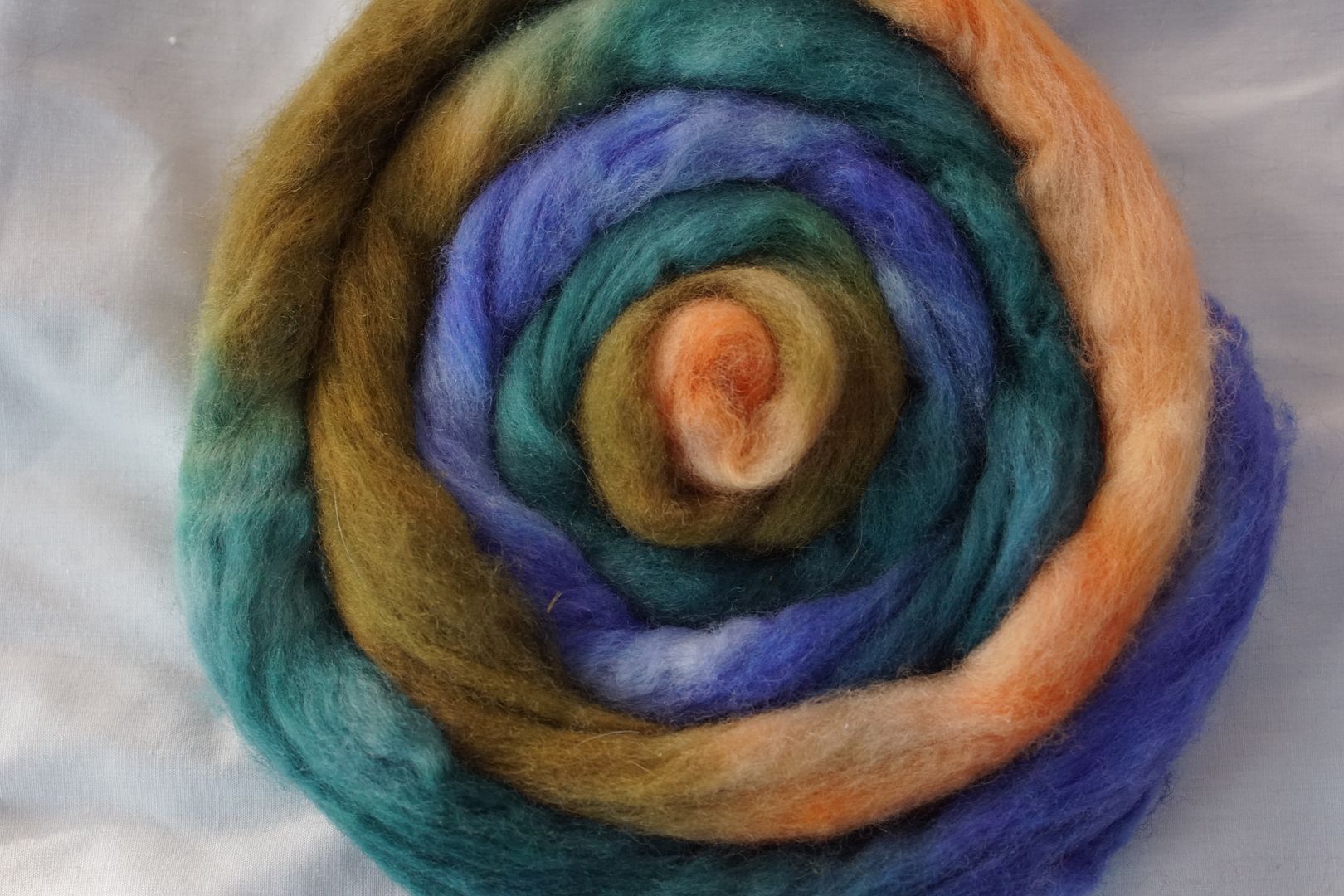
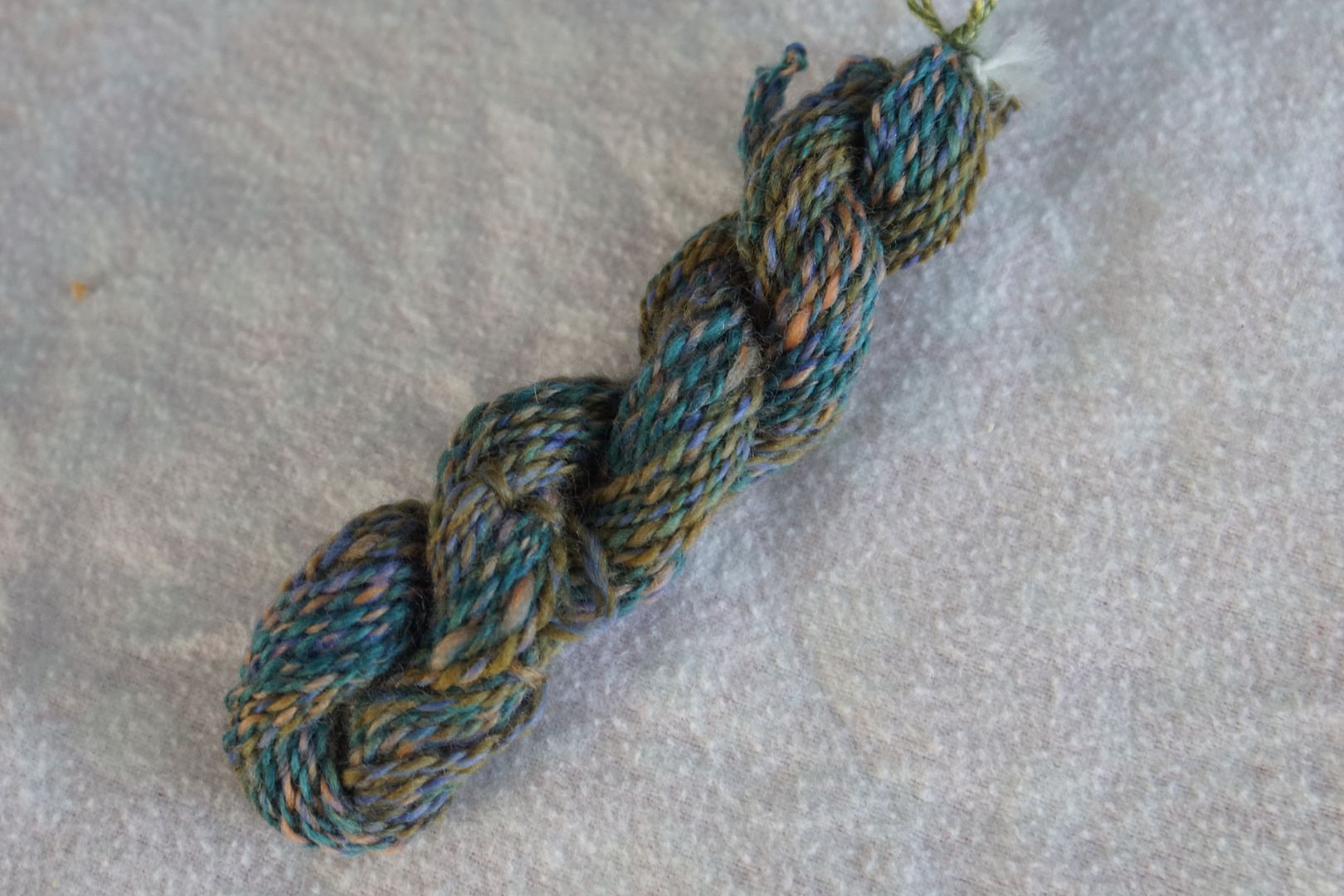
Overall, I think this is a beautifully balanced colourway. It has that spring-by-the-beach feel, where the land still looks gross but the water is beautiful, and you see a poignant beauty in it. Maybe I’m reaching. I like, almost like this sample. Combed up, it makes a complex, toned, slightly greenish-blue.
Blue + Red-Orange + Yellow-Orange: Dull Blue, Pale Red-Orange, Dark Red-Orange, Dark Yellow-Orange. The only cool in this is the dull blue, and it’s very grey in this context.
Now this is interesting. Both of these split-complements have a lot of dull in them. The colourways were not chosen at the same time; that’s not how I grouped my workflow. The kids just happened to choose a lot of dulls. The dark yellow-orange and the dark orange are very similar to one another and the the tops together, as do the coordinating pale orange-adjacent colours, and the hits of a dull colour.
The two split complements are more similar to each other than to the complement, for sure.
Put them all together and you have something downright pleasing. The orange becomes a pop colour, and the dull blue from the complementary ties it together with the others. Warmth and browns take over, with the blue as an undertone working opposite to all those pale oranges.
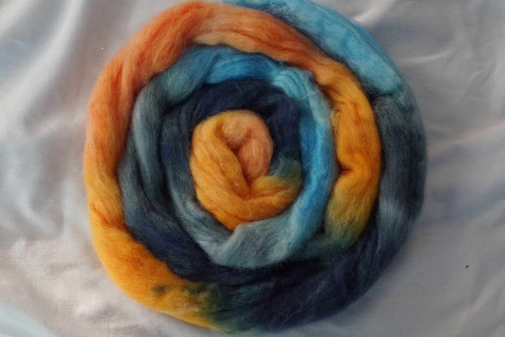
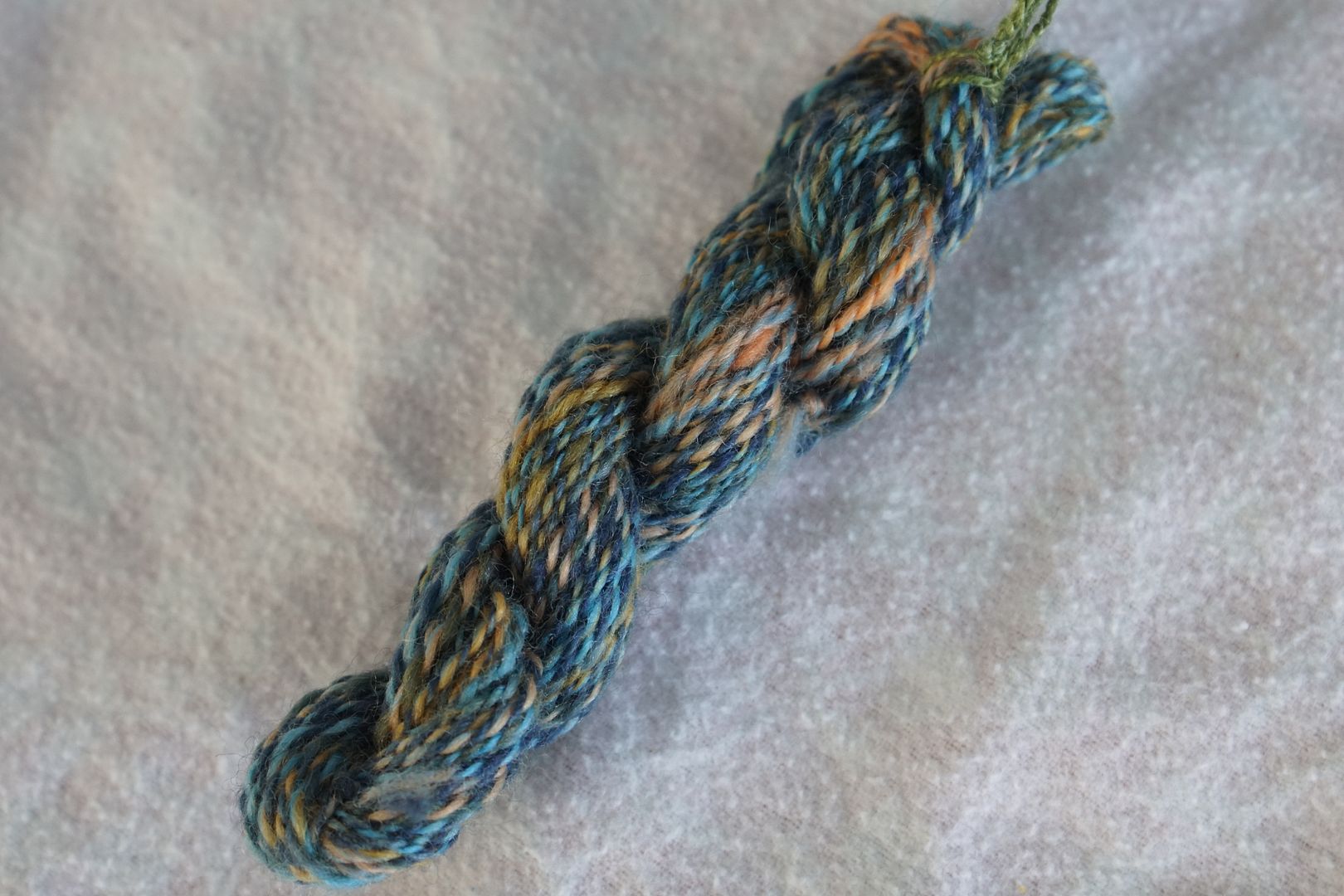
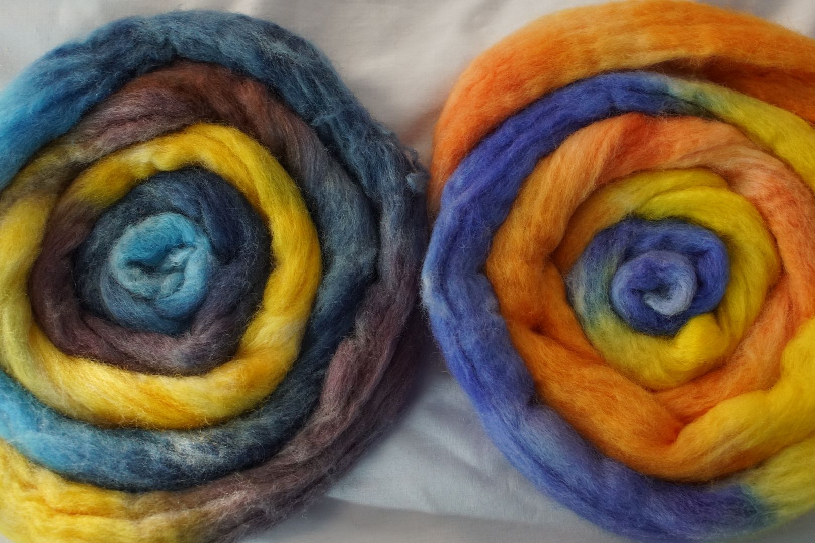
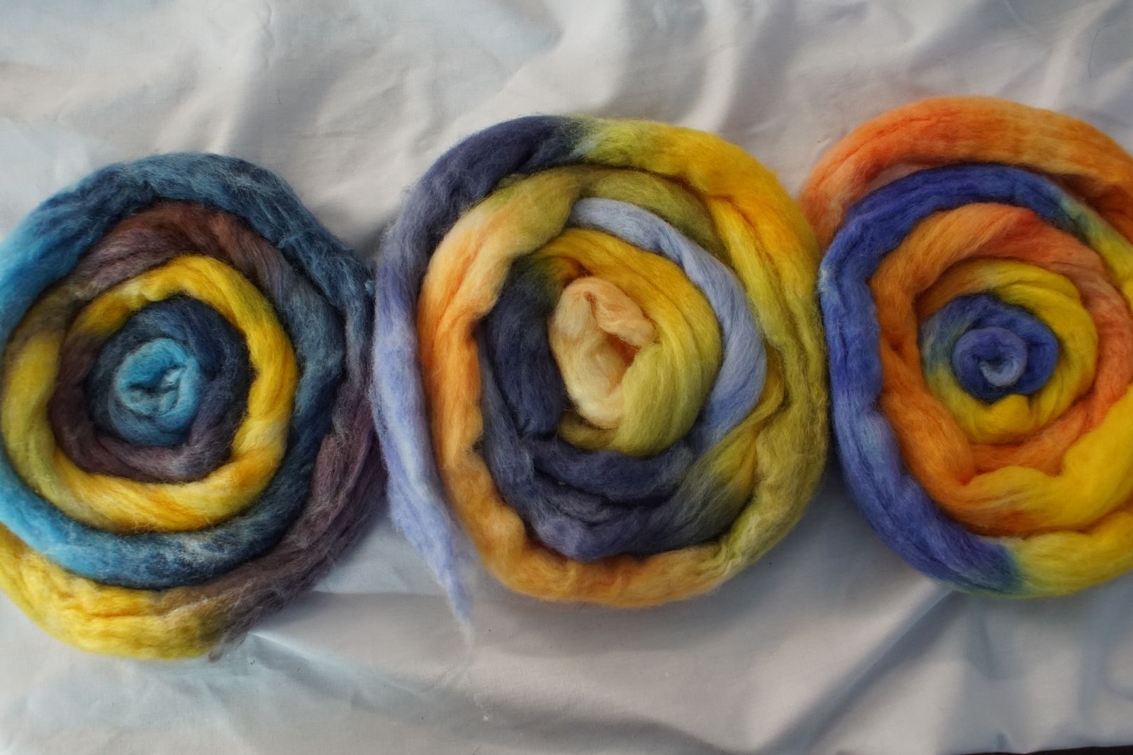
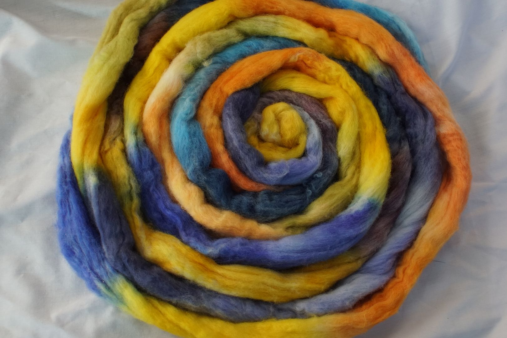
Yellow-Orange + Blue-Violet
You made it halfway through this freight train of a post! Above, the complements were all between primaries and secondaries. For this second half, the complements are all between tertiaries. That fact alone makes the complements more complex and tolerable. We’ll see what it does to the split complements.
Yellow-Orange + Blue-Violet: Pale Yellow-Orange, Dull Yellow-Orange, Intense Yellow Orange, Pale Blue-Violet, Dark Blue-Violet. This one also makes me wince, though it’s more complex and less offensive than the yellow+violet and orange+blue above. I like how the dark blue-violet looks very grey.
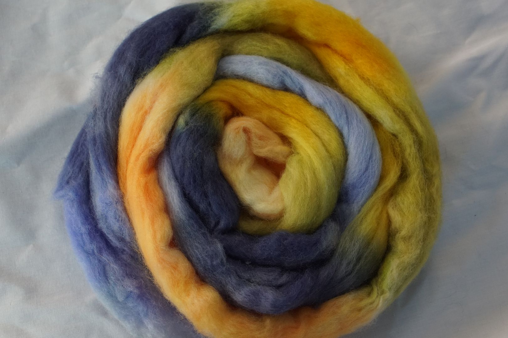
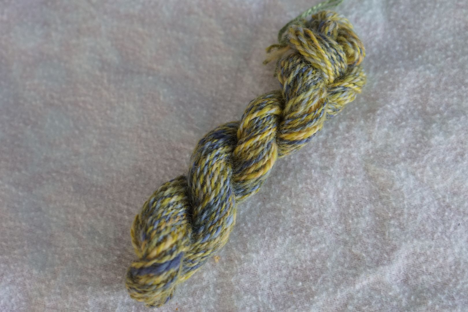
Here is something interesting. The yellow-orange is skewing yellow, and the blue-violet skews blue. And we all know that yellow and blue make green. You can see tones of green coming through even in the combo-drafted yarn above, and the combed yarn is definitely a tone of green. Having more yellow-orange than blue-violet in the braid also means that they are quite balanced in the combed blend.
Yellow-Orange + Blue + Violet: Intense Yellow-Orange, Pale Blue, Dark Blue, Dull Violet. Only a quarter of this colourway is yellow, so the blues take over. I love that they picked dull violet, as it increases the sense of desaturation that tones the yellow way down.
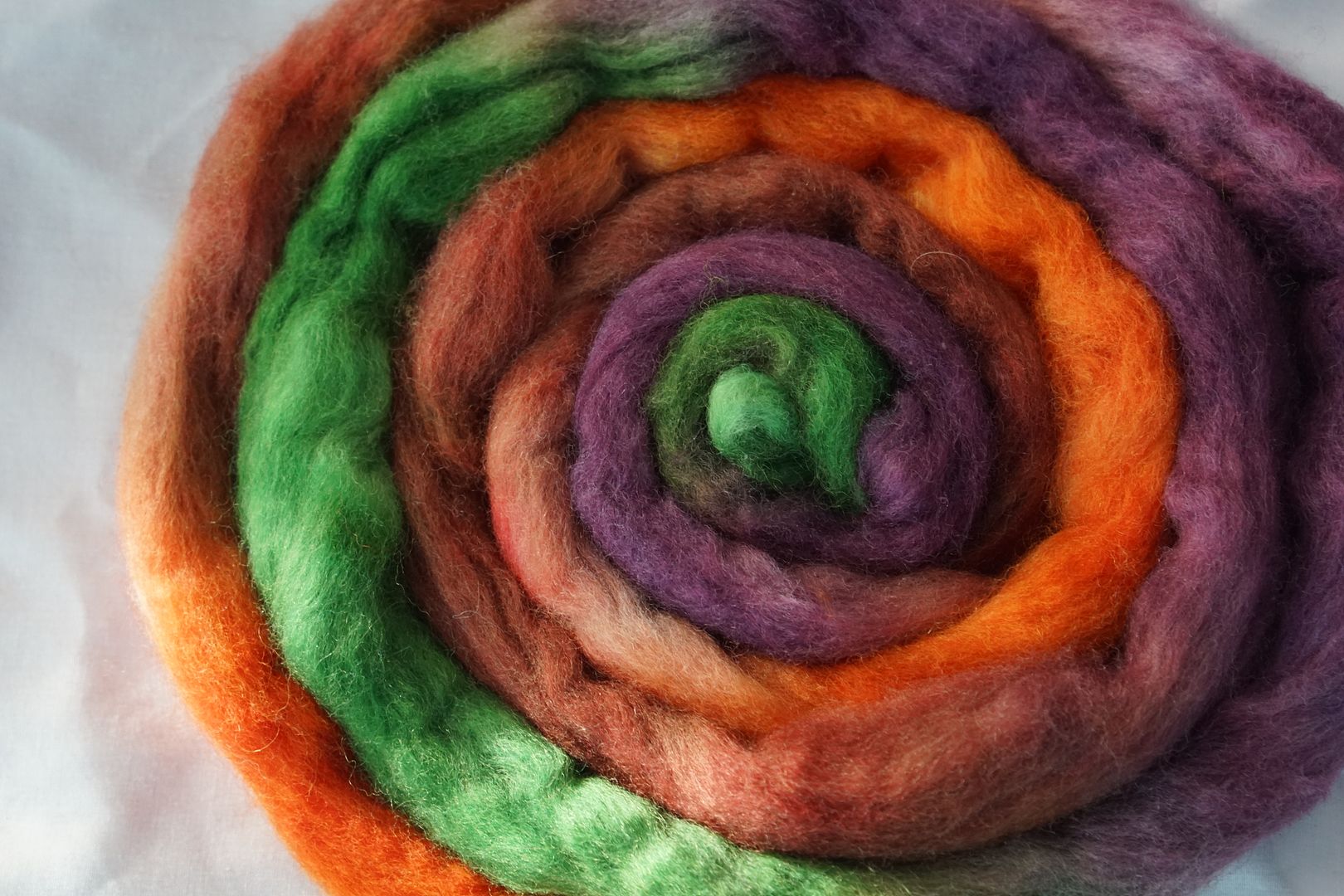
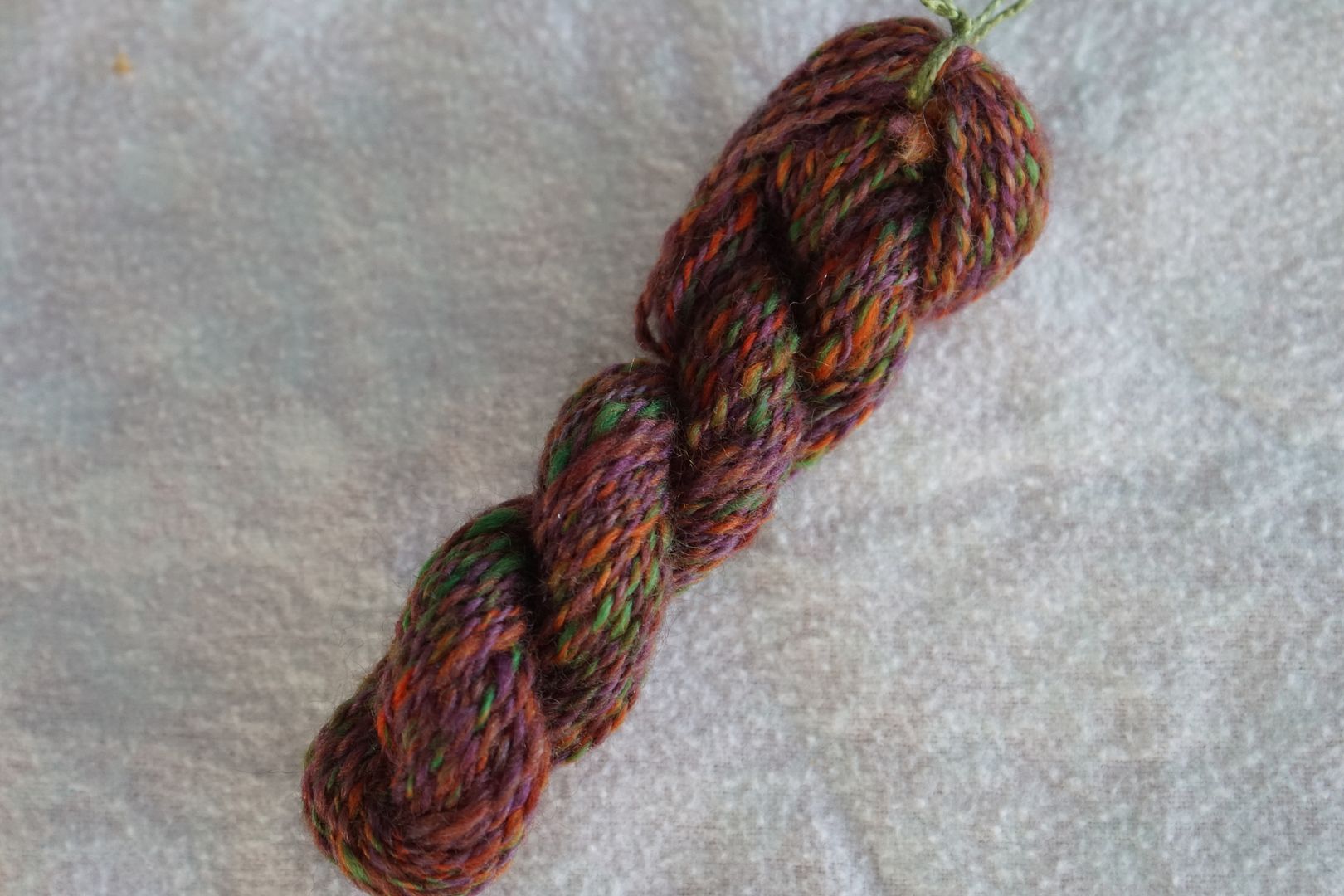
Blue-Violet + Yellow + Orange: Intense Blue-Violet, Intense Orange, Pale Orange, Intense Yellow. This one is the complete opposite! They went entirely for intense colours here. The blue-violet is the pop colour now, and it looks very blue. All of the blue-violets look just blue to me, unless they are put next to the more turquoise blues. Anyway, this is very sports-team, though the two-toned yellow and orange surprisingly helps it for me.
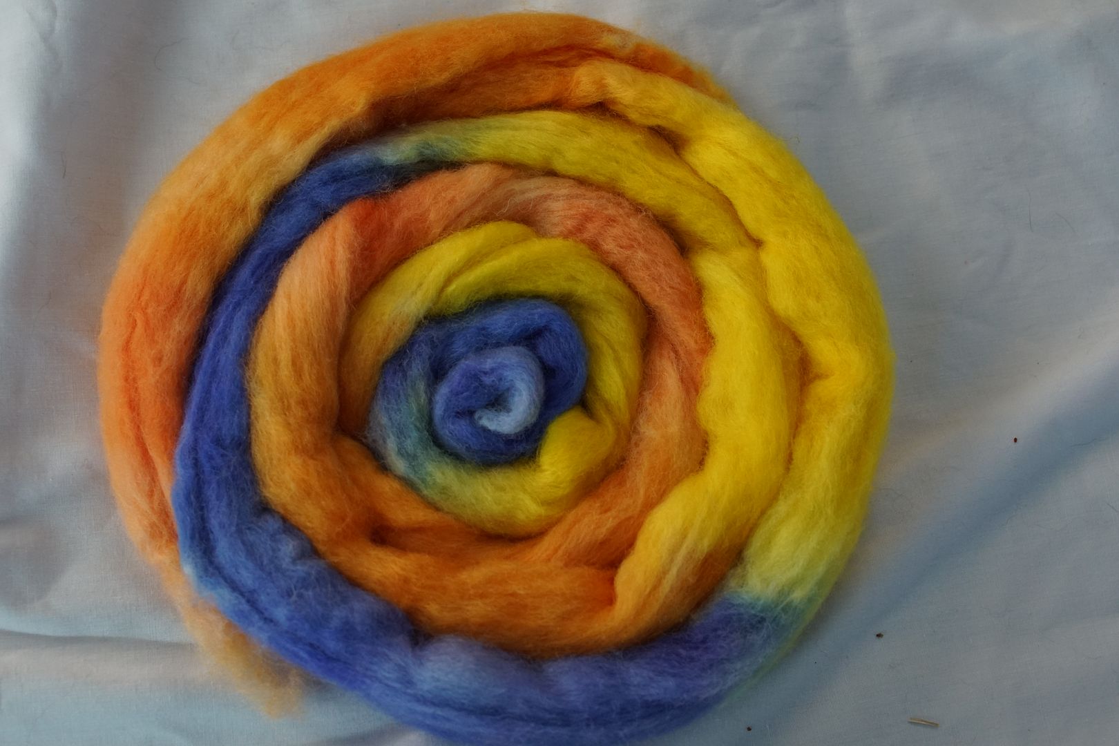
Finally, a colour with enough yellow and orange in it that it stays dominant in both blends. While I might not actually like the spun yarns on their own, their presence brings a real cohesiveness to the whole set of twelve split-complements when I put them together at the end of this post.
I don’t think you could choose a pair of split-complements that are more different in feel!
I would put the complement straight in between these two in terms of feel, with more closeness between the complement and the split complement on the left.
Below, these colours are a great illustration of what happens when you have different proportions of yellows and oranges to blues. On the left, 1/4 just makes the dominant blue more complex. In the middle, 3/5 balances the blues enough to make green. On the right, 3/4 allows the final yarn to actually look like a complex yellow-orange.
All of these colourways have massive value variations, and when you put them all together, they’re quite balanced between the yellow/oranges and the blue-violets. It’s… a lot.
Blue-Green + Red-Orange
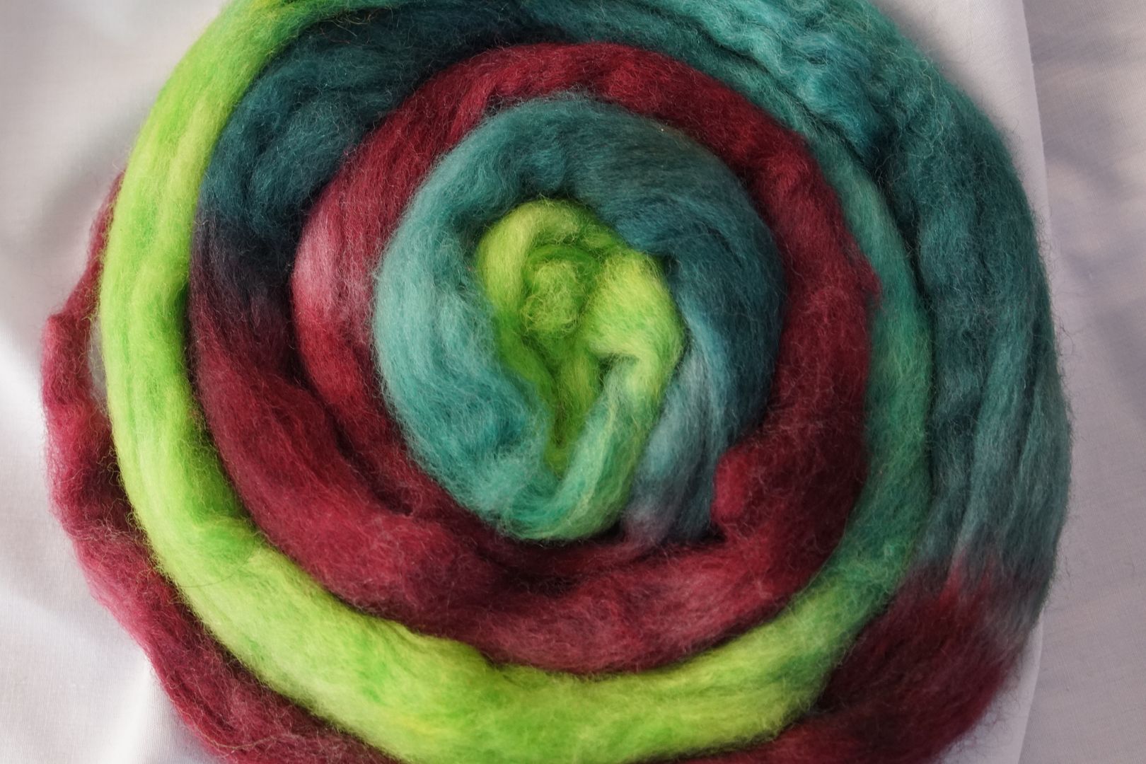
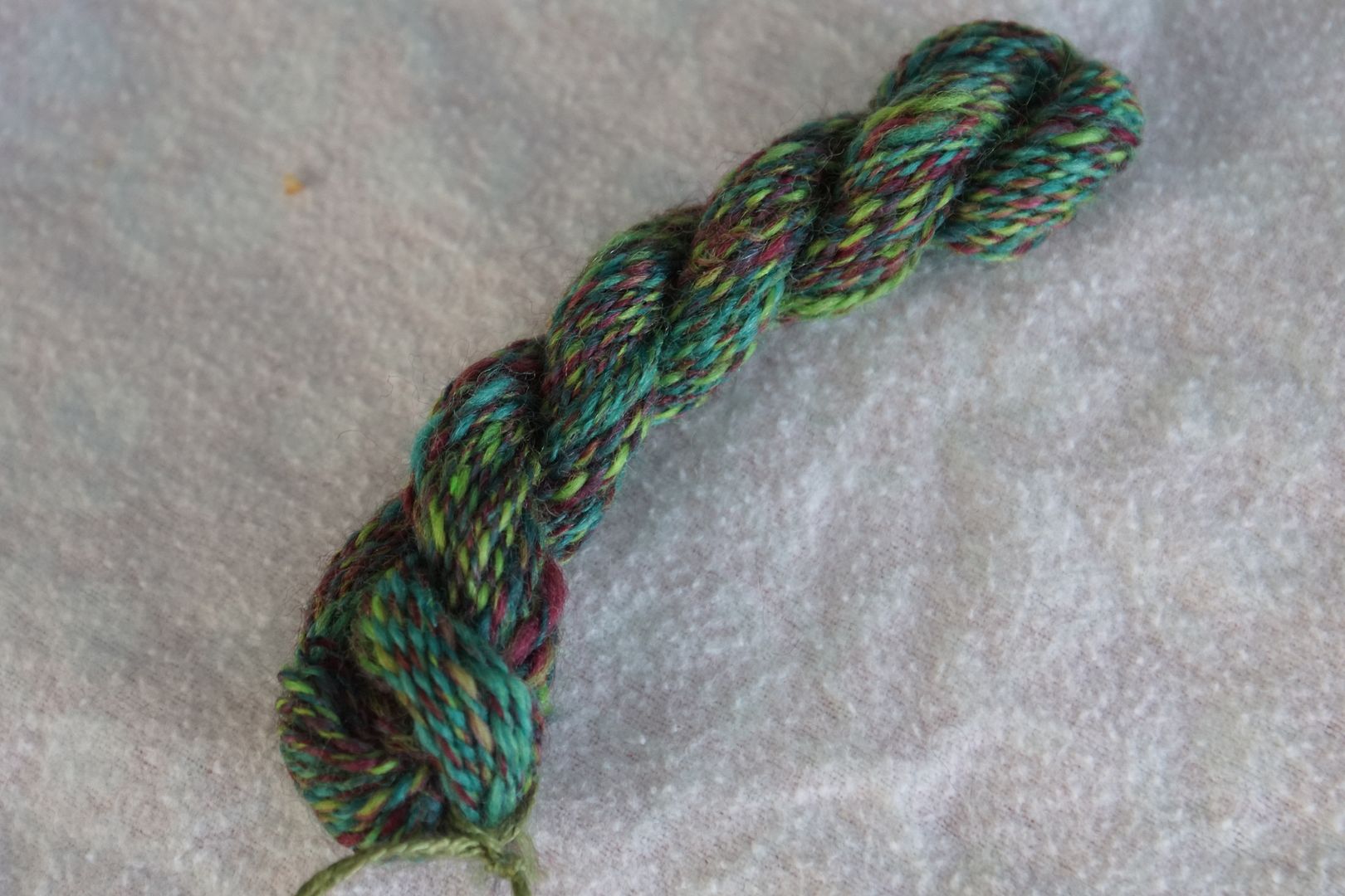
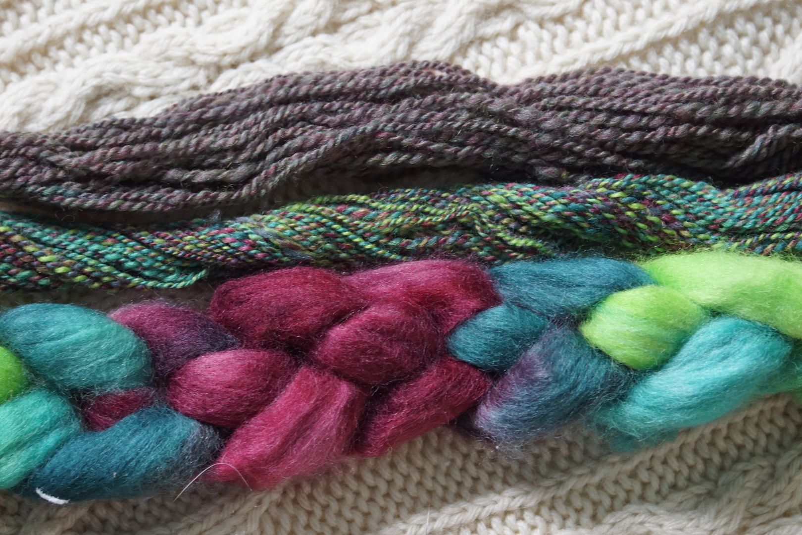
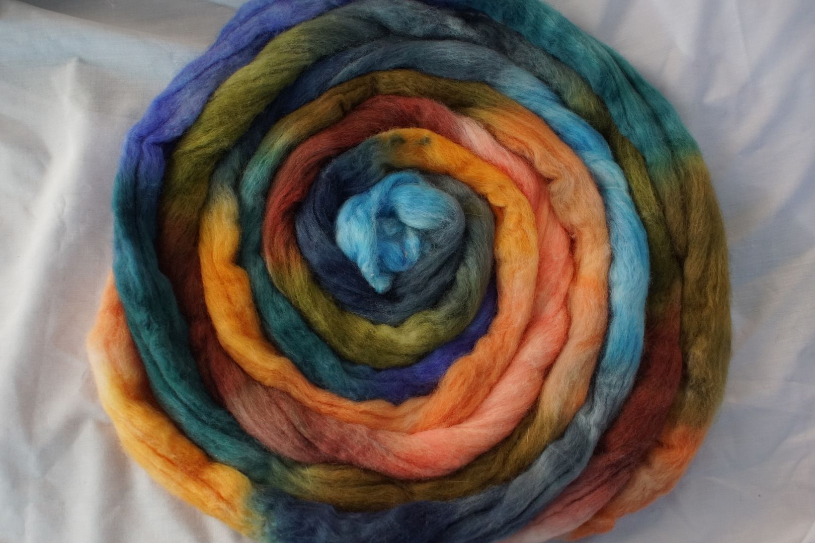
Blue-Green + Red-Orange: Pale Red-Orange, Intense Red Orange, Pale Blue-Green, Intense Blue-Green, Dull Blue-Green. The blue-green dyes all came out quite similar. Later I added a bit more black to the dark blue-green. But overall, it meant that this complementary colourway came out very two-toned. These are striking colours together, vaguely tropical.
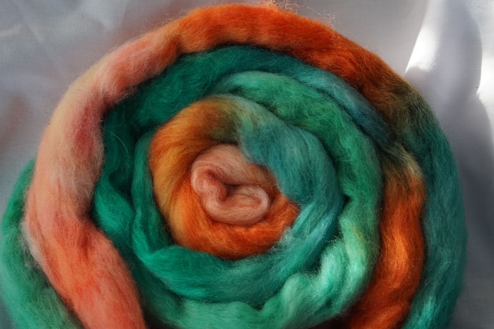
With 3/5of that bright blue-green, a colour that is already more dominant of the two, it completly takes over both the combo-drafted and the combed colourways. The red-orange sits on top of the blue-green, and hints of it are even discernable in the combed blend.
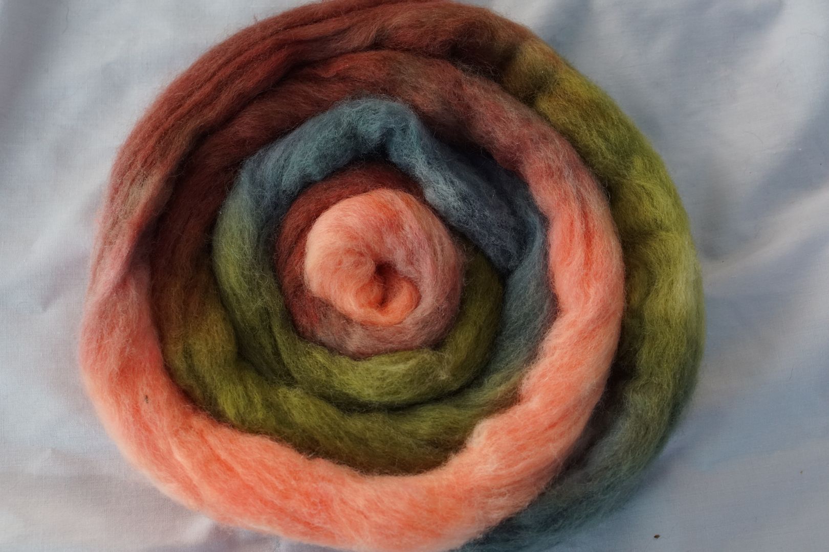
Blue Green + Orange + Red: Pale Blue-Green, Pale Red, Dark Red, Intense Orange. This colourway shifts everything in a very warm, earthy red direction. It feels like another subversive “witchy” triad, though there’s not that much blue in it. The dark red is made to look rather brown by all those brights. It’s like… spring flowers, but there’s still a lot of dirt.
The terra-cotta colour really dominates in the spun yarn, with the orange and pale green coming through as pops. I do not love how the blue-green clashes with the rest of them, and the competition of warm and cool undertones throughout. However, they combed together into lovely, light, warm brown. It’s a similar idea to the second yarn above, but I like that one better.
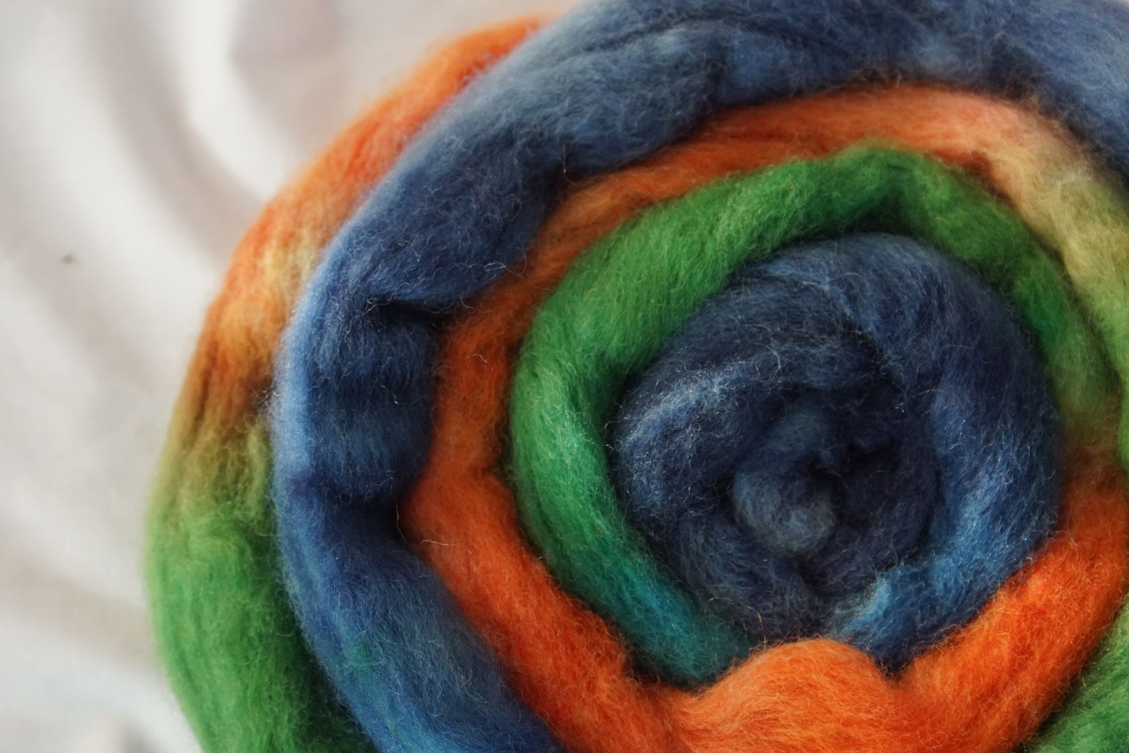
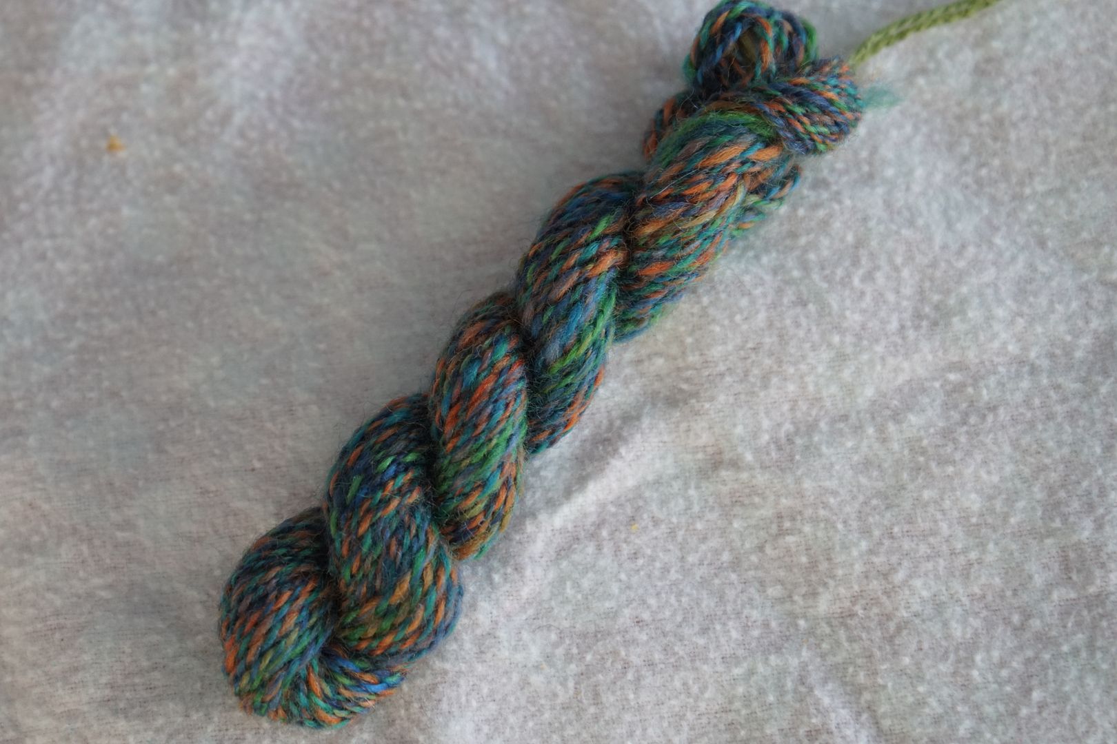
Red Orange + Blue + Green: Intense Red-Orange, Intense Green, Intense Blue, Dark Blue. That red-orange is made to look very orange by the cool blues and greens. This is a good simultaneous contrast example, the coolness of the blues and greens making the red-orange look warmer. I don’t love this, but it has a sort of classic boy-kid brand feel I guess?
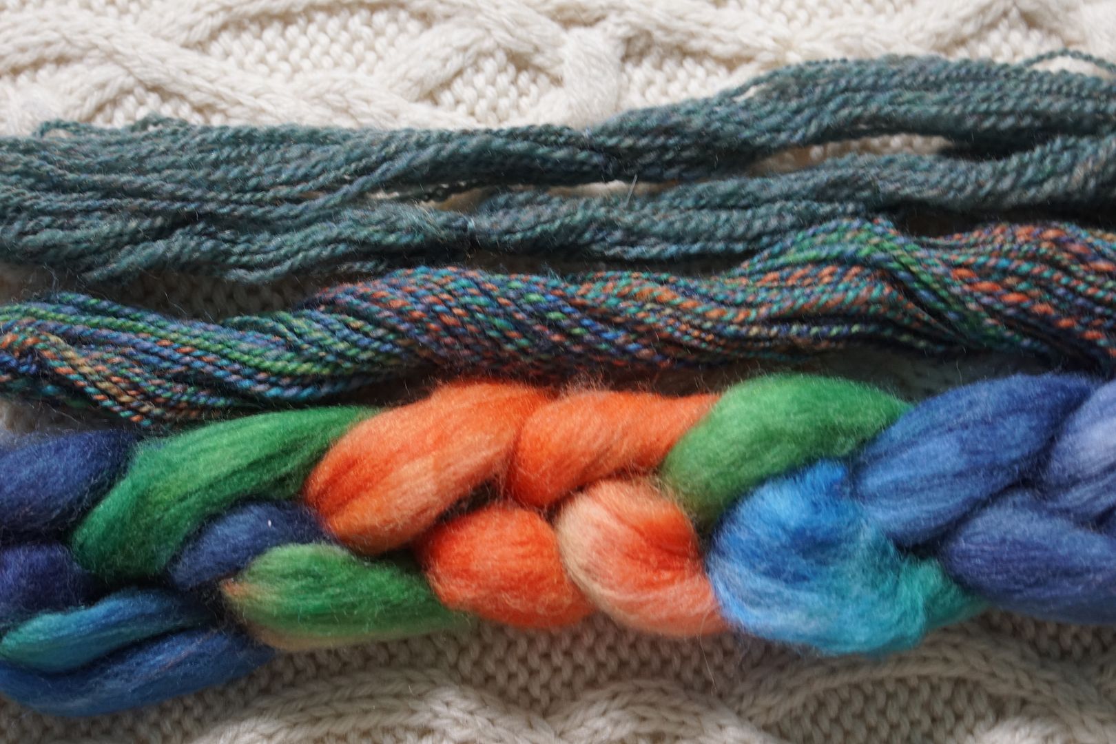
These three are all so different from each other! The choice in colours, and the difference in how the values work together, are very interesting. They are tied together by the orange, though it doesn’t overwhelm.
Red-Violet + Yellow-Green
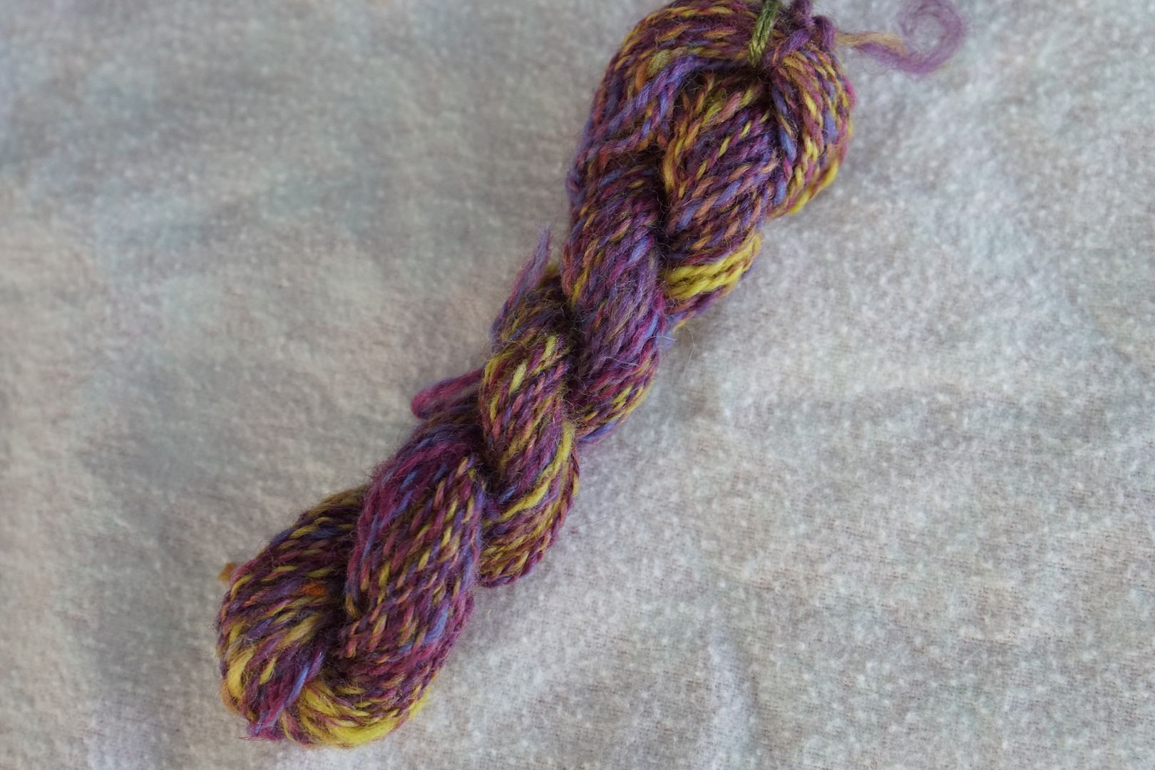
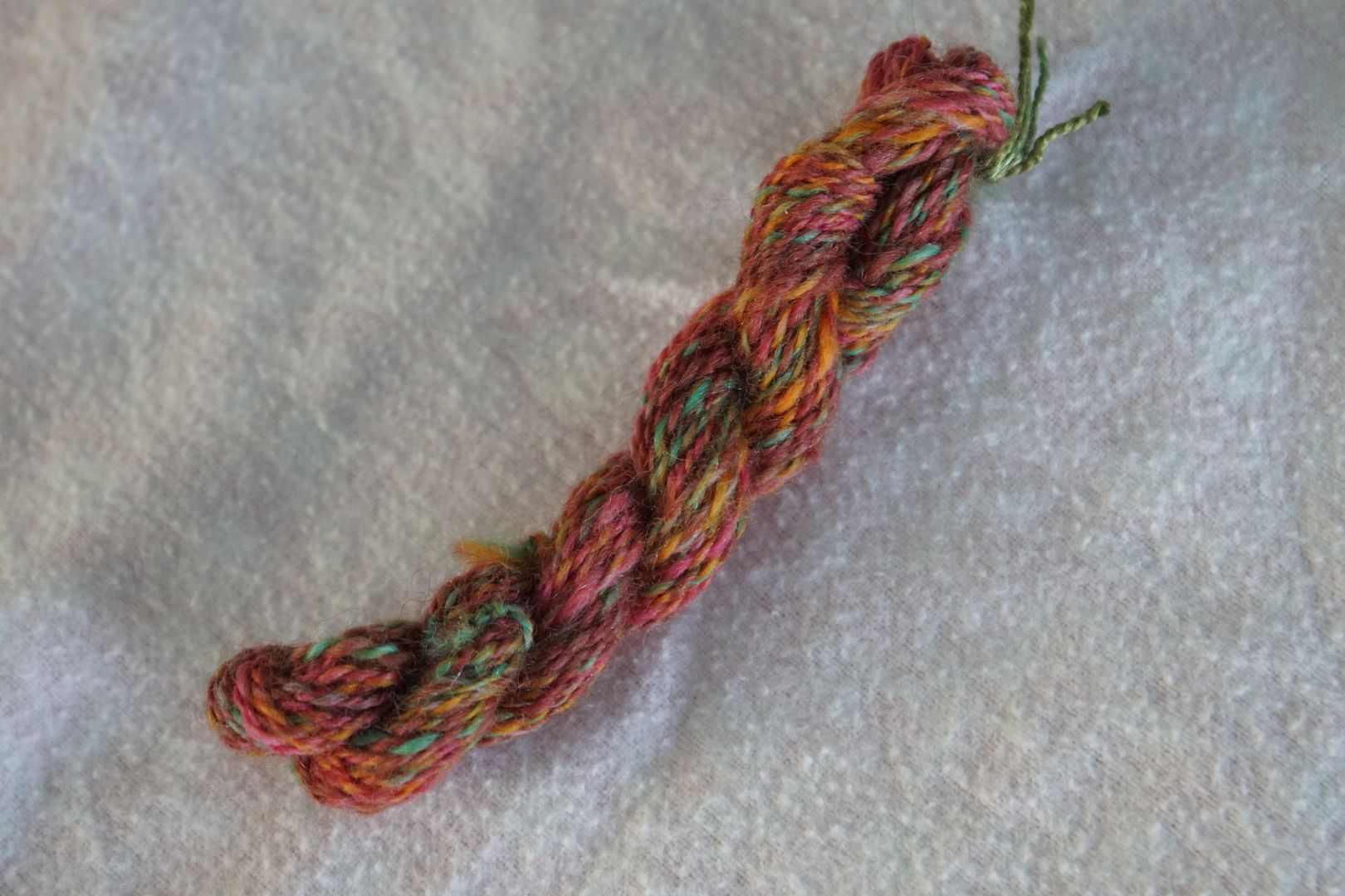
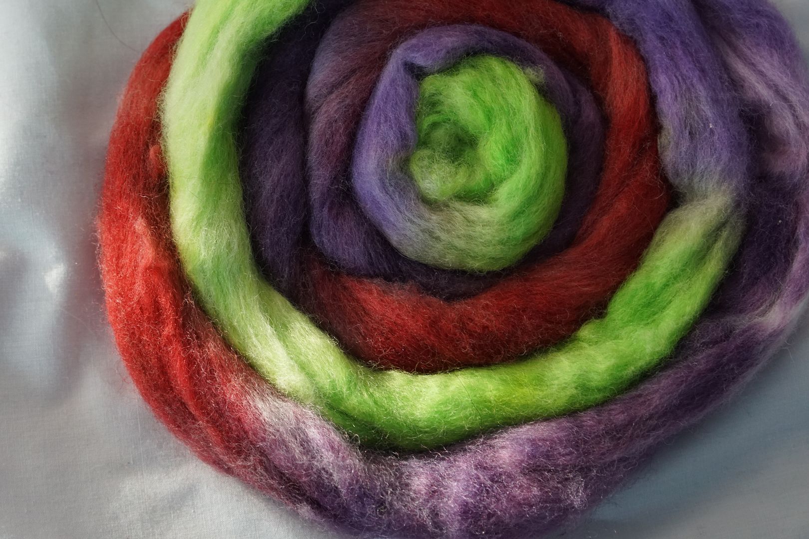
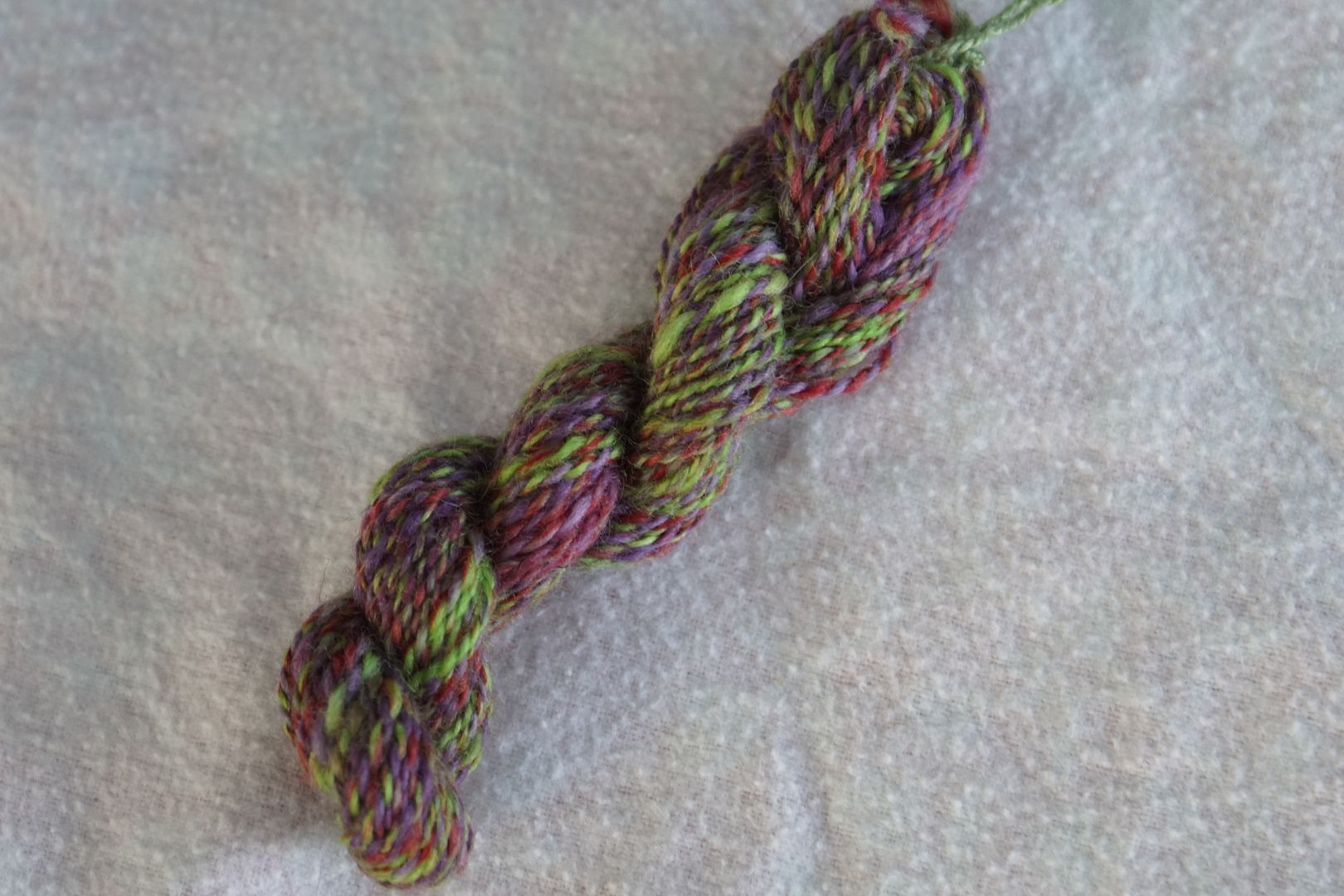
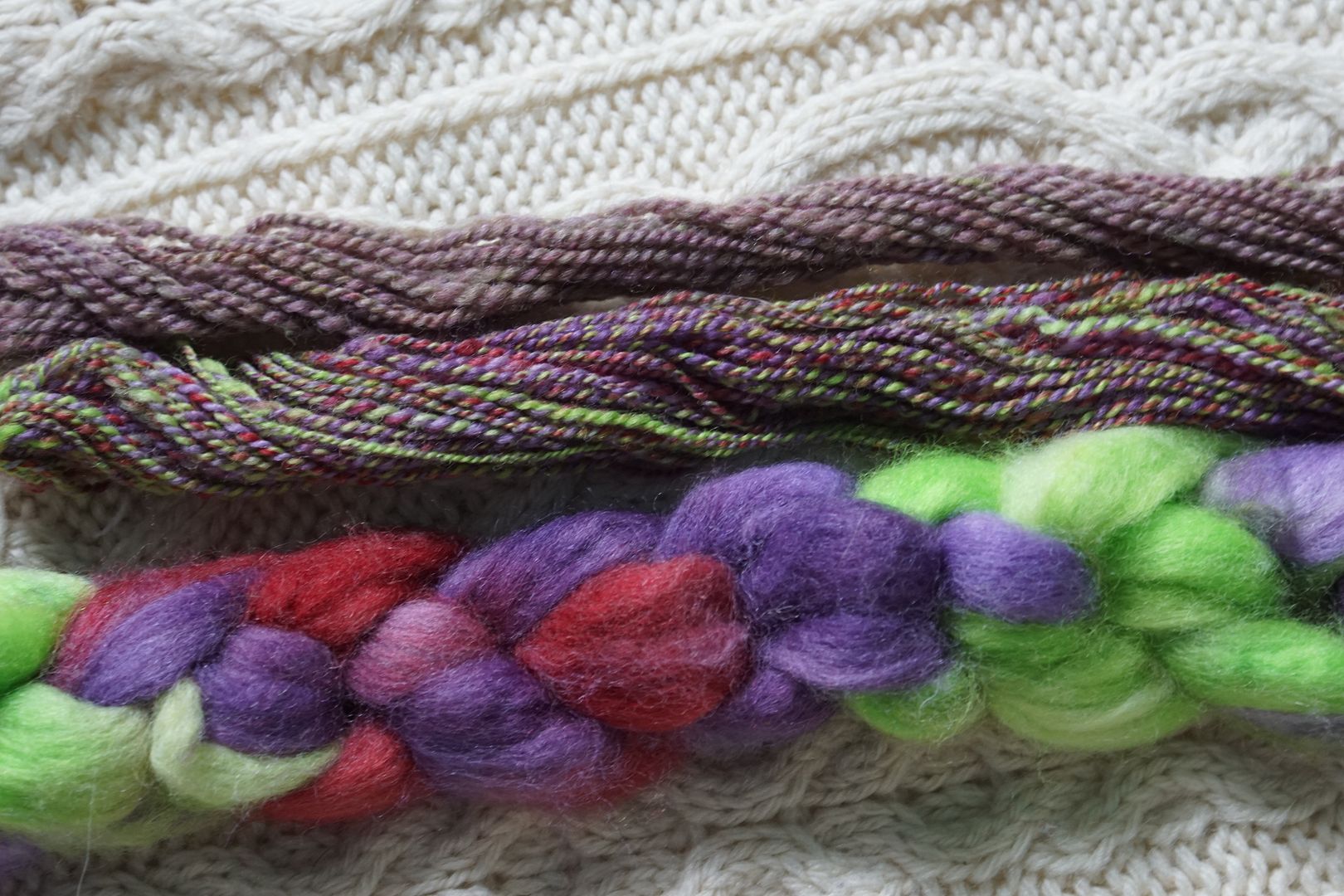
Red-Violet + Yellow-Green: Pale Red-Violet, Intense Red-Violet, Dull Red-Violet, Pale Yellow-Green, Intense Yellow-Green. This is easily my favorite complement. The kids picking colours liked the red-violets, and I did too! The dull red-violet grounds the colours, and there being a bit less of the yellow-green keeps it from totally taking over.
This is another colourway where the values are fairly close (though not as close as the red-green). The combo-drafted sample looks surprisingly blendy, and the lime green doesn’t take-over as much as I thought. The combed sample is very rose-brown, which I love.
Red Violet + Yellow + Green: Intense Red-Violet, Dark Red-Violet, Intense Yellow, Intense Green. This is a lot like the complement, but more complex. This was one of the few times the kids picked two colours from the singleton side of the split complement; they couldn’t resist the red-violets. It’s balanced, and for once, I like that, probably because there’s warmth in all the colours.
The combo-blended yarn looks like skittles. It’s being pulled in too many directions by how balanced it is, combed together, it looks quite brown, another testament to balance.
Yellow Green + Red + Violet: Intense Yellow-Green, Pale Violet, Dull Violet, Intense Red. This goes in a completely different direction! The coolness of the violet and red really intensifies the yellow-green to look downright neon. I like it, in a cyberpunk sort of way.
The split complement on the right really stands out in this trio, but with those bright greens tying them together, I think they are an interesting set.
In the braids, these all look warm overall, and bright and floral. But I think when we are talking about complements and split-complements, the lesson is that green-red complements are just more balanced than orange/yellow/blue/purple complements. When you actually blend them up, they make more brown colours. Isn’t that interesting?
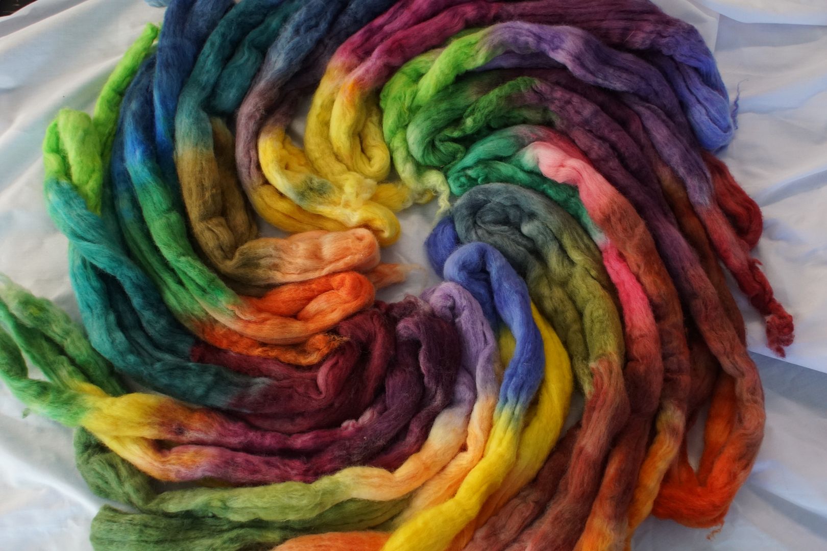
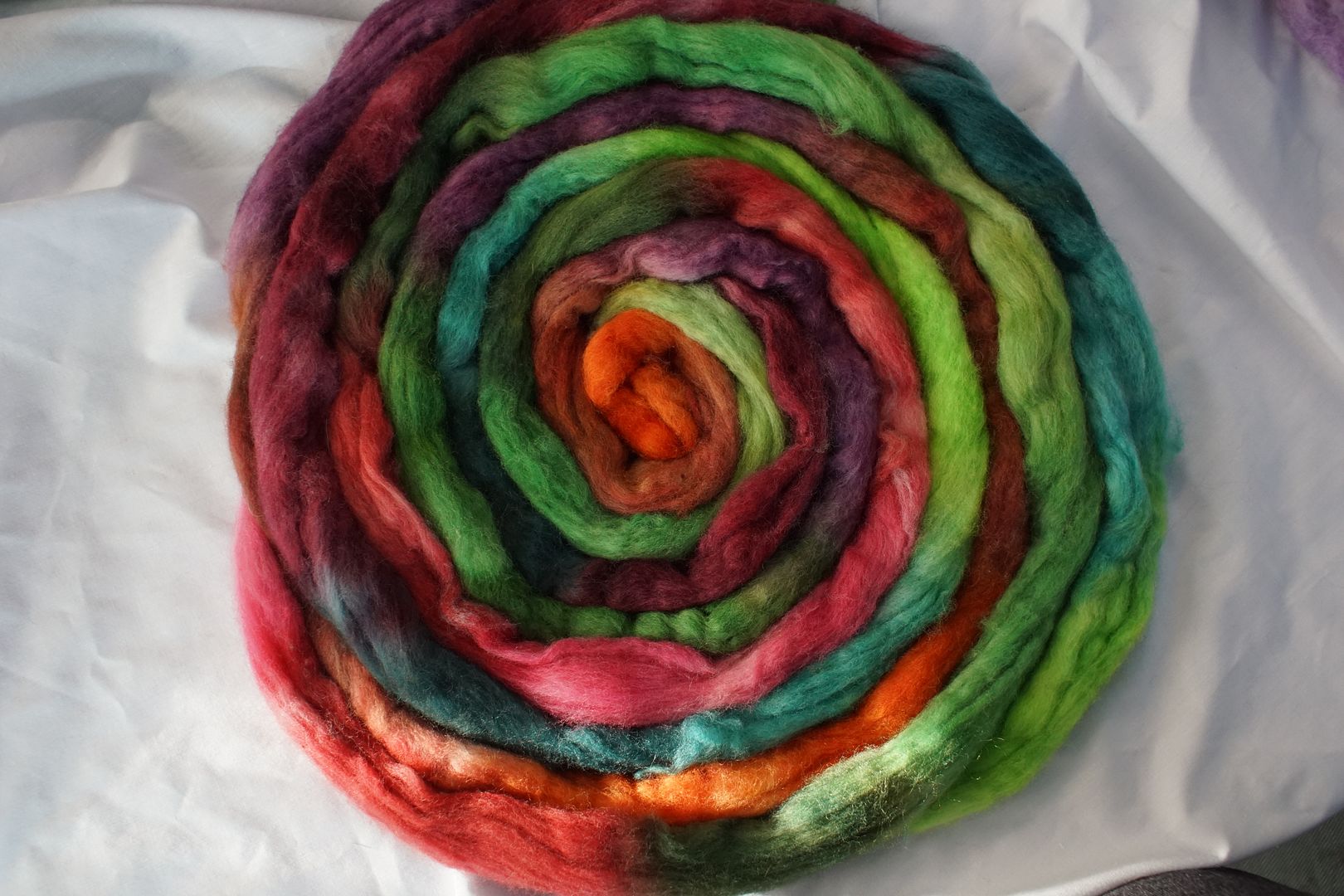
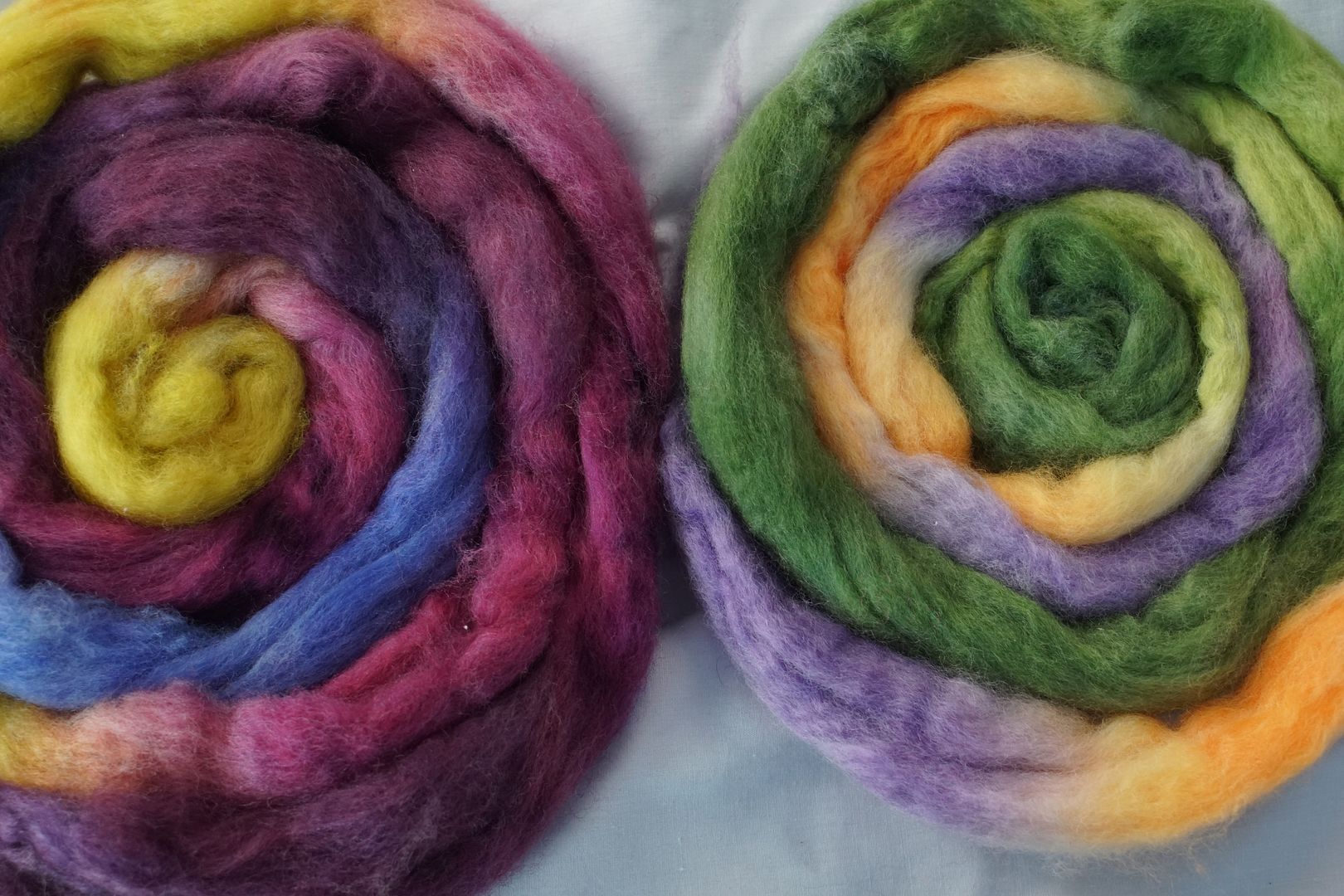
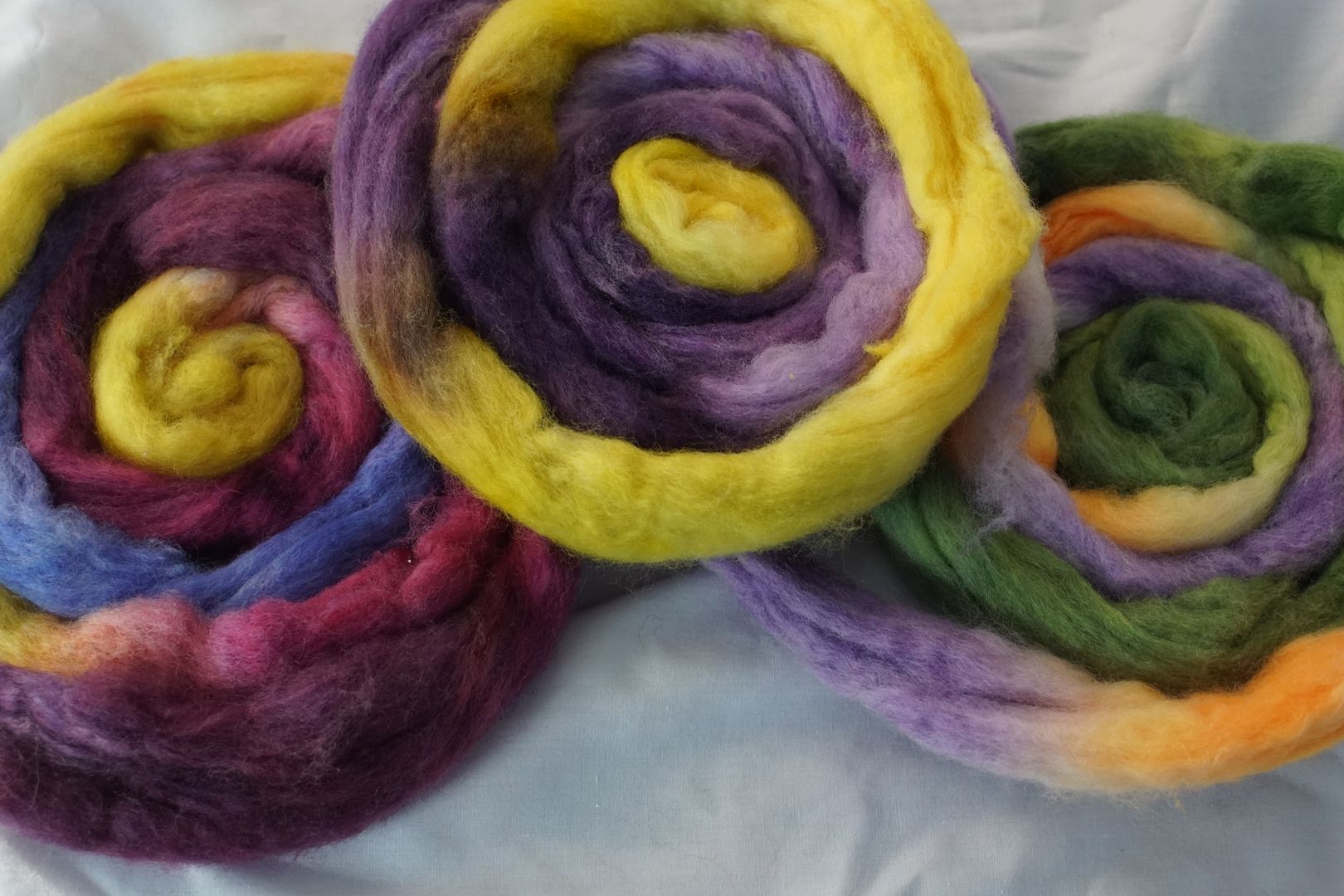
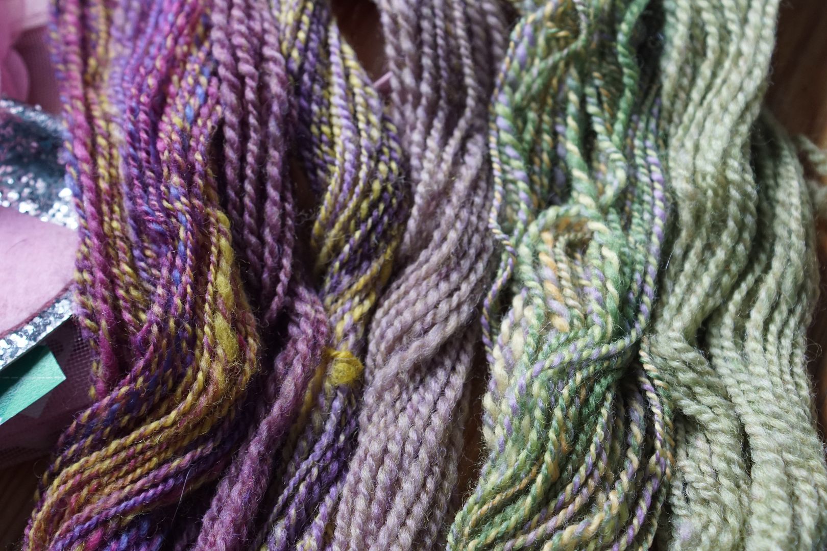
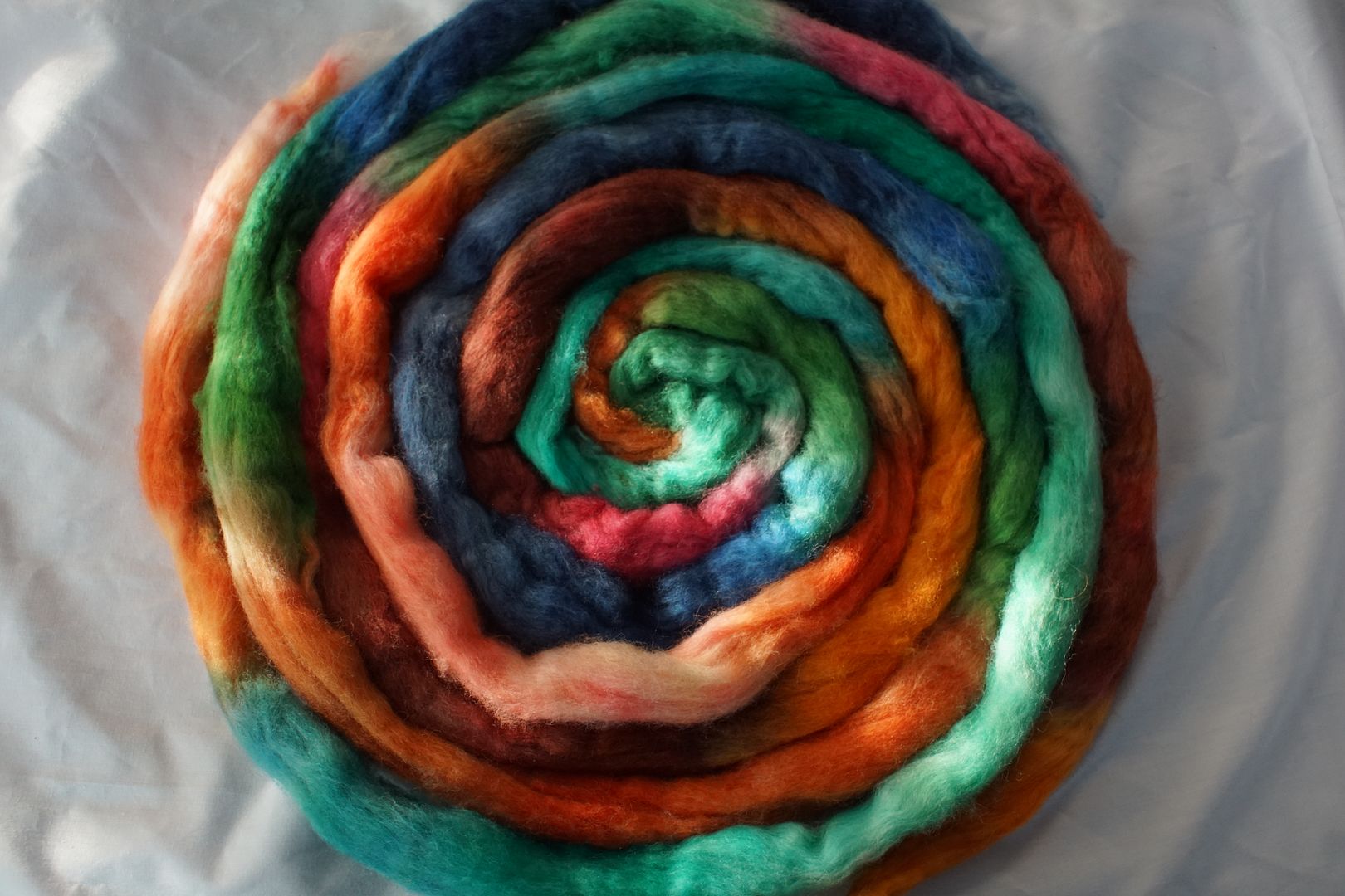
I hope you enjoyed that deep dive into the complex, somewhat chaotic world of complements and split complements! Here’s a little photo album of all the braids with both of their samples, and some side-by-side comparisons. I could see a Marie Wallin sweater made with some of these hues!
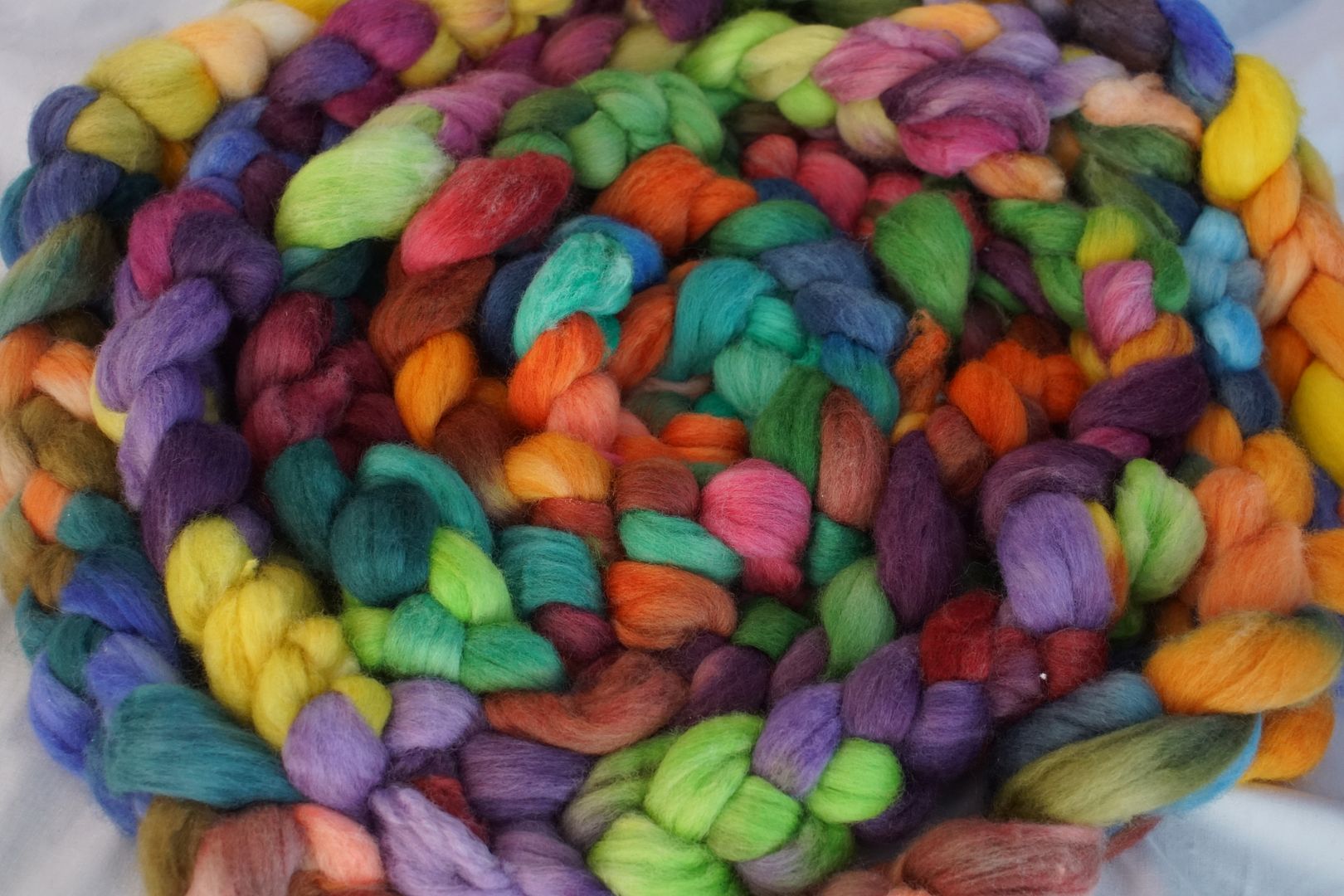

Marie Wallin combo spin — I hope that gets me a sticker or a cookie or something haha!
LikeLike
For getting through that post? Yes! 🍪 for you!
LikeLike