Previous posts in this series:
Part 1: DOS Testing
Part 2: Carded Approximations of Dye Formulas
Part 3: Dye Formulas
Part 4: Monochrome colourways
Part 5: Analogous colourways
Addendum: Knitted samples
I had initially skipped some of those analogous colourway experiments from chapter 3, because I ran out of Corriedale top! I ordered Polwarth from YarnCanada because it was what I could get most quickly, and I was gratified when it arrived in the mail so fast that I still had the momentum to do the next experiments.
The question of what colourways are analogous is always a little bit sticky. I’ve heard it described as any 1/3 of the colour wheel – so, four colours on a twelve-hue wheel. That’s what you saw yesterday. However, that’s not the only definition. I’ve also heard it defined that an analogous colourway is any colourway with only two of the three primaries in it. By that definition, a set of colours with primaries on either end could have up to five hues on a 12-hue wheel. Or, a set of three colours with a primary in the middle might already be more-than-analogous.
It’s sticky, and frankly, it’s not all that important. But, after the broader analogous colourways I showed you yesterday, I thought it made sense to make some tighter analogous colourways to show the difference.
These three colourways were dyed at the following intensities: Pale .5% DOS, Dull 1% DOS, Intense 1.5% DOS, Dark 1.5% DOS. Note that Menz suggests dyeing “Intense” colourways at 2% DOS and “Dark” at 3% DOS, and the “Dark” below is the lightest attempted in these series. I think these lighter saturations made the darks a little boring, and made the colourways as a whole come out a little flat. Again, they are all on Polwarth.
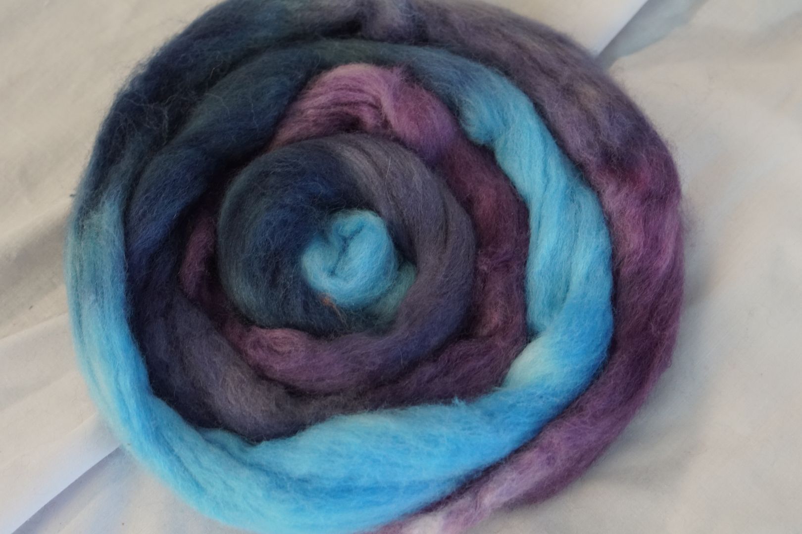
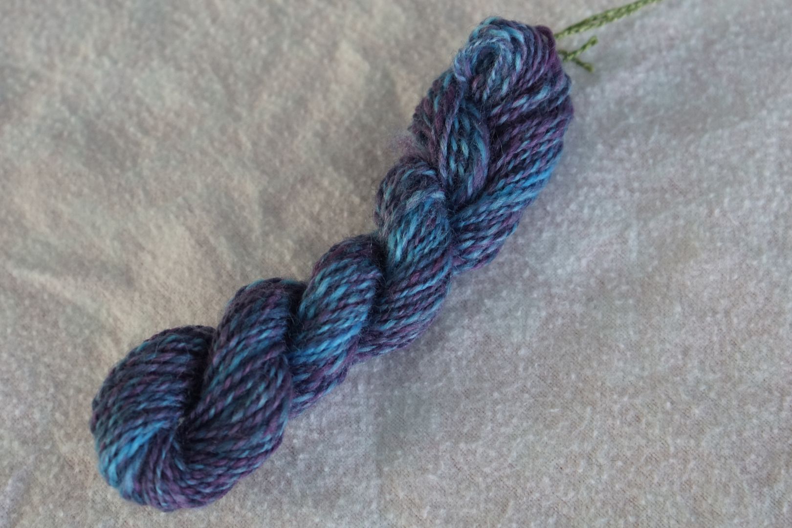
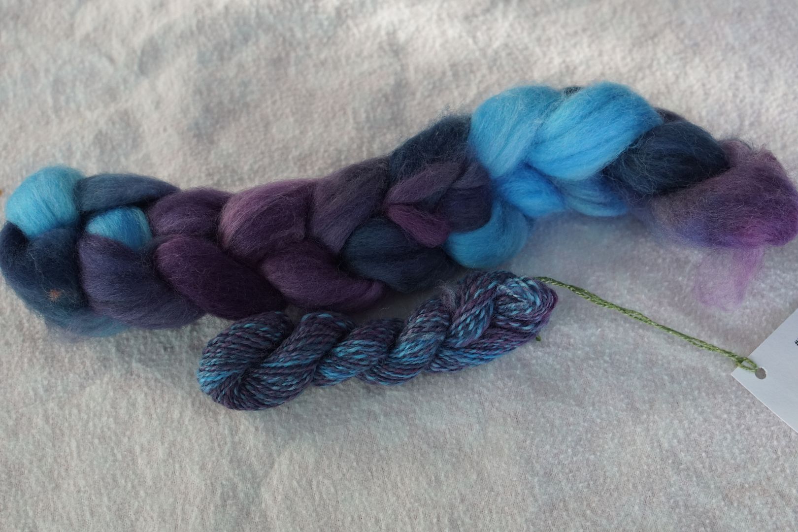
Blue to Violet
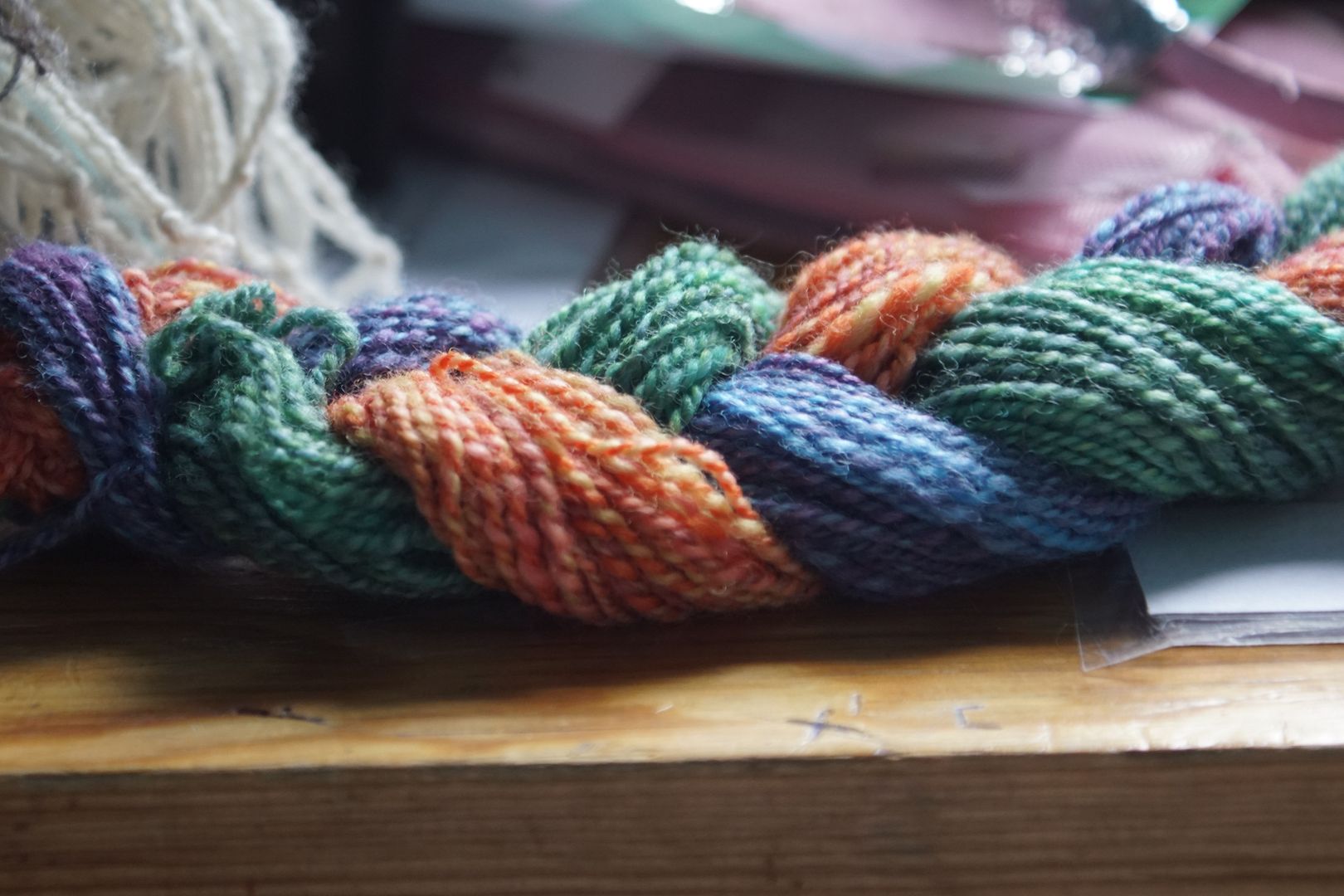
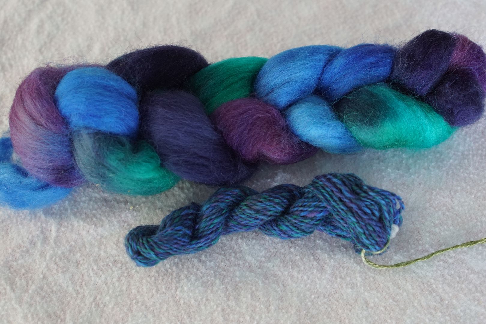
Dyes used: Dark Violet, Dark Blue-violet, Dark Blue, and Pale Blue. This is a classically limited colourway. The darks are all a bit desaturated, with the interesting contrast of the bright pale blue.
I like that the finished yarn looks kind of toned (grey-added), even though there are no dull colours or complementary colours present.
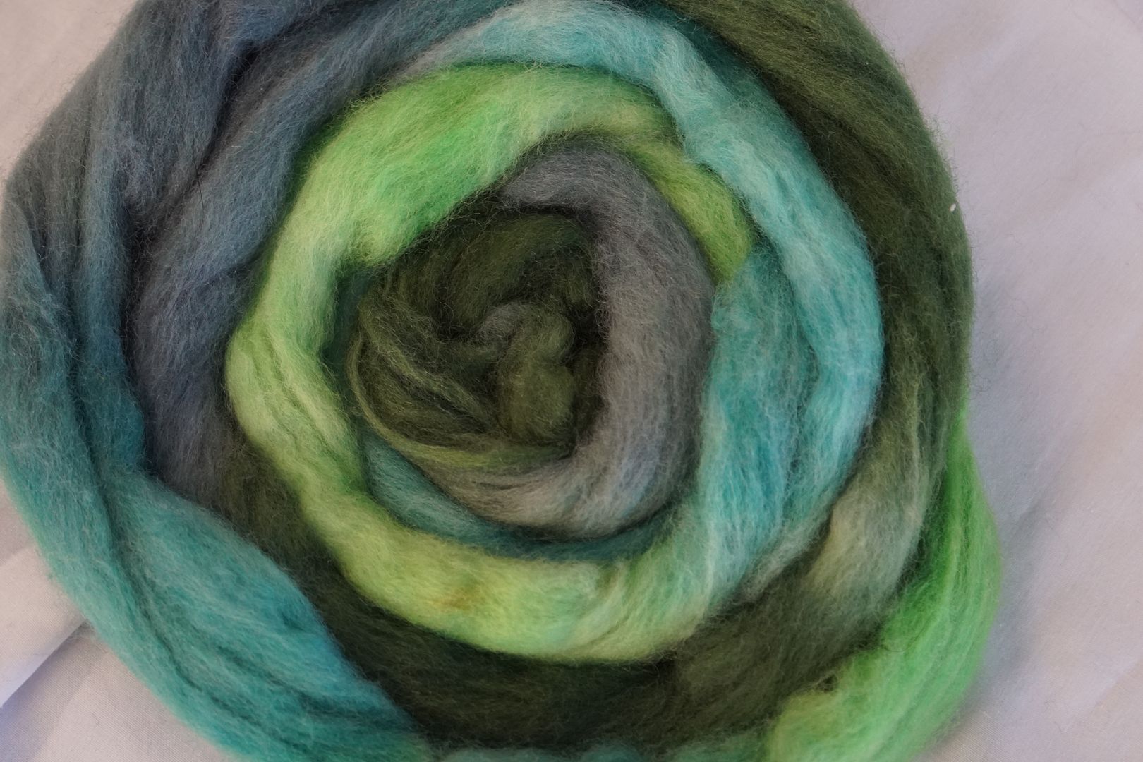
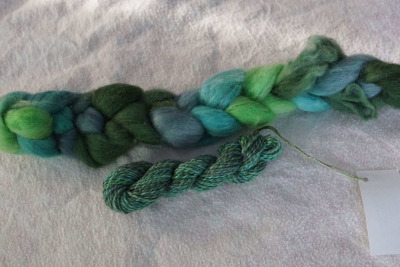
Blue to Green
Dyes used: Pale Green, Dull Blue-Green, Dull Blue, Dark Green. This is interesting. The dirt-stick-leaf look is there, but instead of being brown-ish, it’s greyish. I like it. Sort of forest-by-the-lake.
The teal colours keep it fresh and cool. Again, not as much zing as some of the other analogous colours, but pleasant.
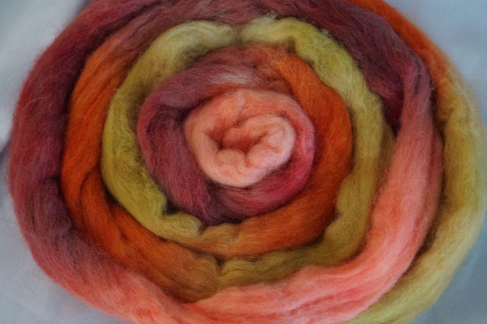
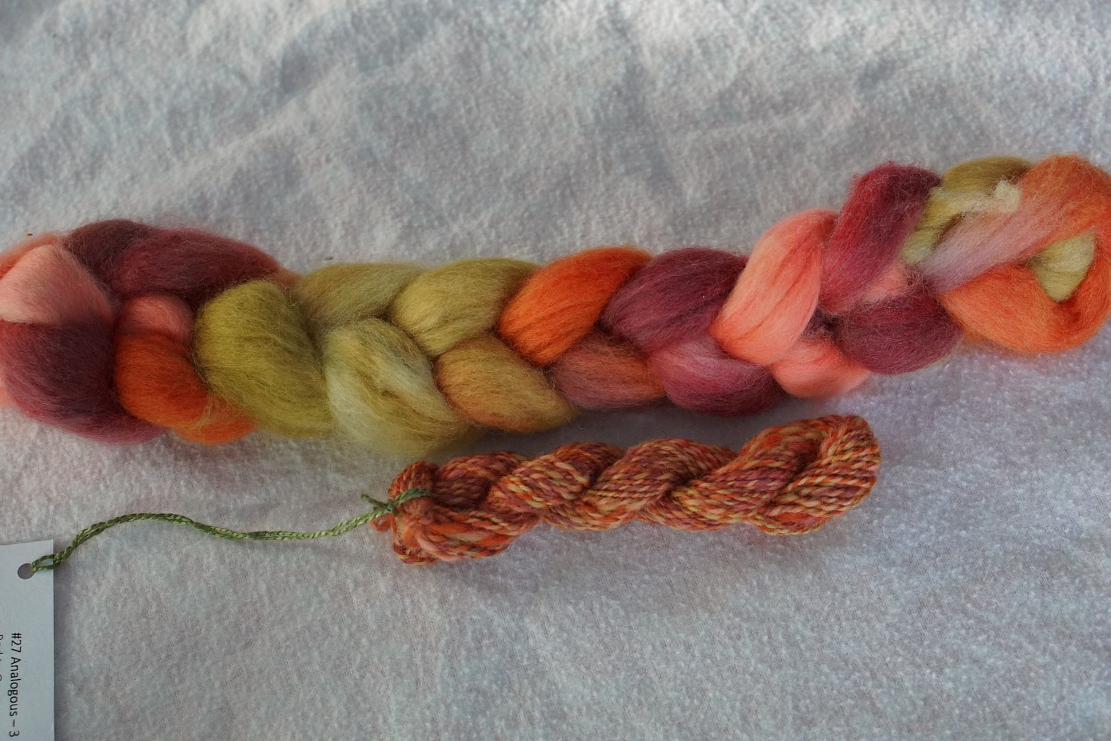
Red to Orange
Colours used: Pale Red-Orange, Dull Red, Intense Red-Orange, Dull Orange. The dull orange in this mix looks a bit greenish, though I’ve amended it enough that it doesn’t look super green. It looks kind of golden in this context, which is outside the scope of red-to-orange, but brings an interesting antique aspect to the otherwise very red-orange colours.
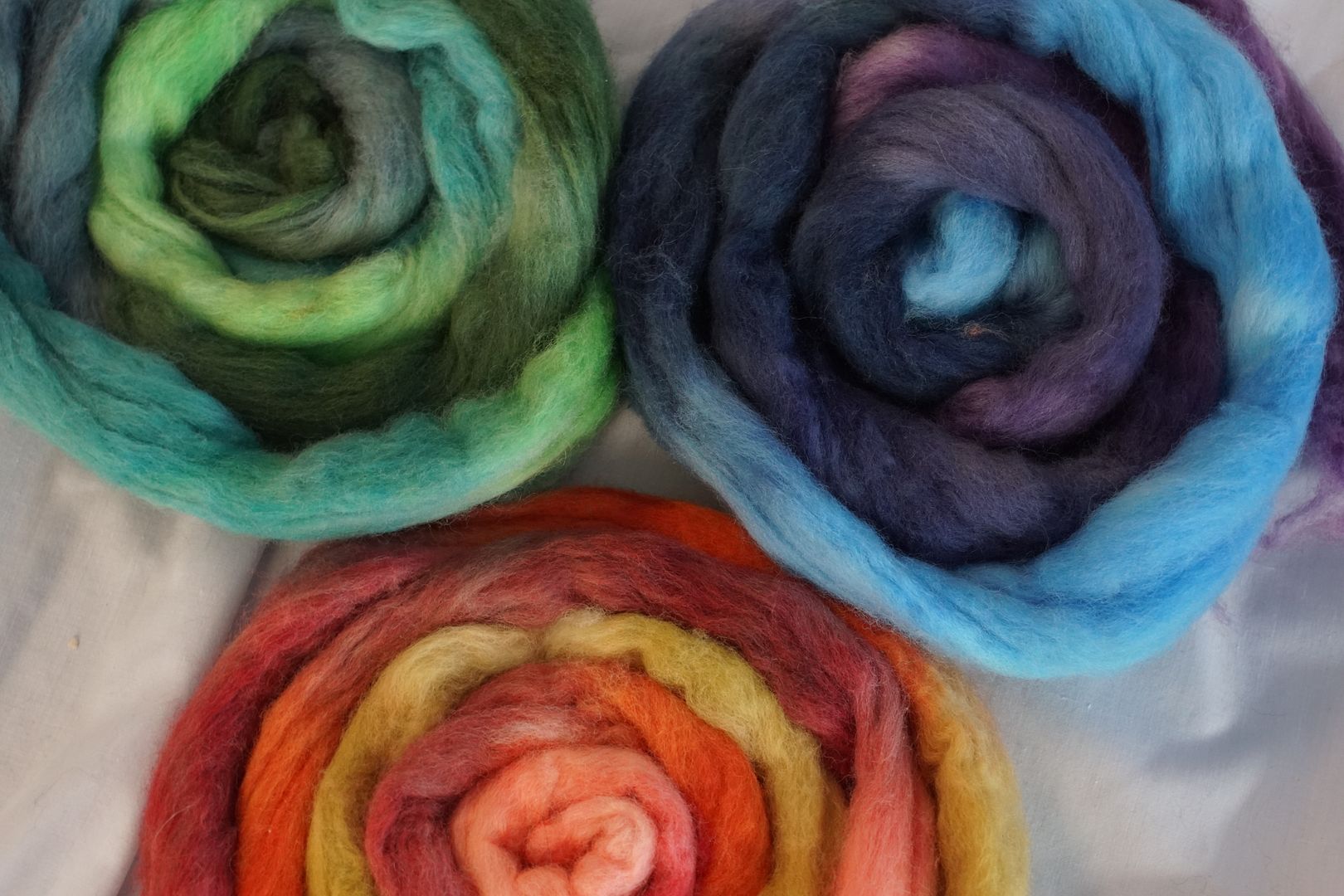
You can see how all of these colourways are, well… simpler. Because I dyed them at lighter depths of shade, even where there are dark colours next to light colours, the differences are not all that striking. They are unified by their limitations.
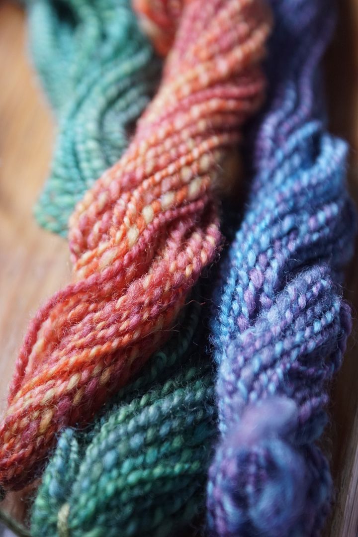
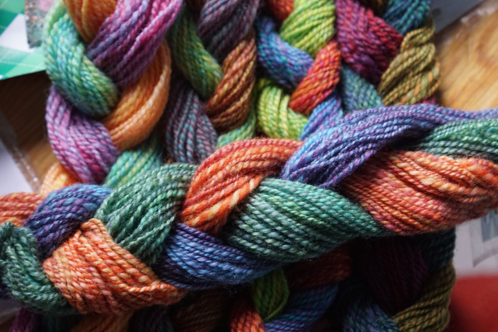
Put them together, and they’re sort of… pedestrian? Suburban? At least when compared to the other trios.
Yesterday I compared them to seasons, but my first thought looking at them as sets was to compare them to biomes. From left to right, tropical, desert, jungle, mountain lodge. And this new set, compared to those, is like… temperate zone. Know what I mean?
Compare the analogous sets to this next experiment, which is similar in scope, but with a little more freedom.
Warm and Cool
I’m going to skip ahead in the chapter a bit, to exercise #7. By this time, I had finished all the complements, split complements, and triads I’m going to show you in the next days, and I was no longer concerned about running out of dyes. So I went back to using the dye formulas a the intensities Deb Menz had recommended in her book: “Pale” at .5%, “dull” at 1%, “intense” at 2%, and “dark” at 3%. There’s a big difference, I think. These were also on Corriedale, which was not quite as bright white as the Polworth above.
Cool #1
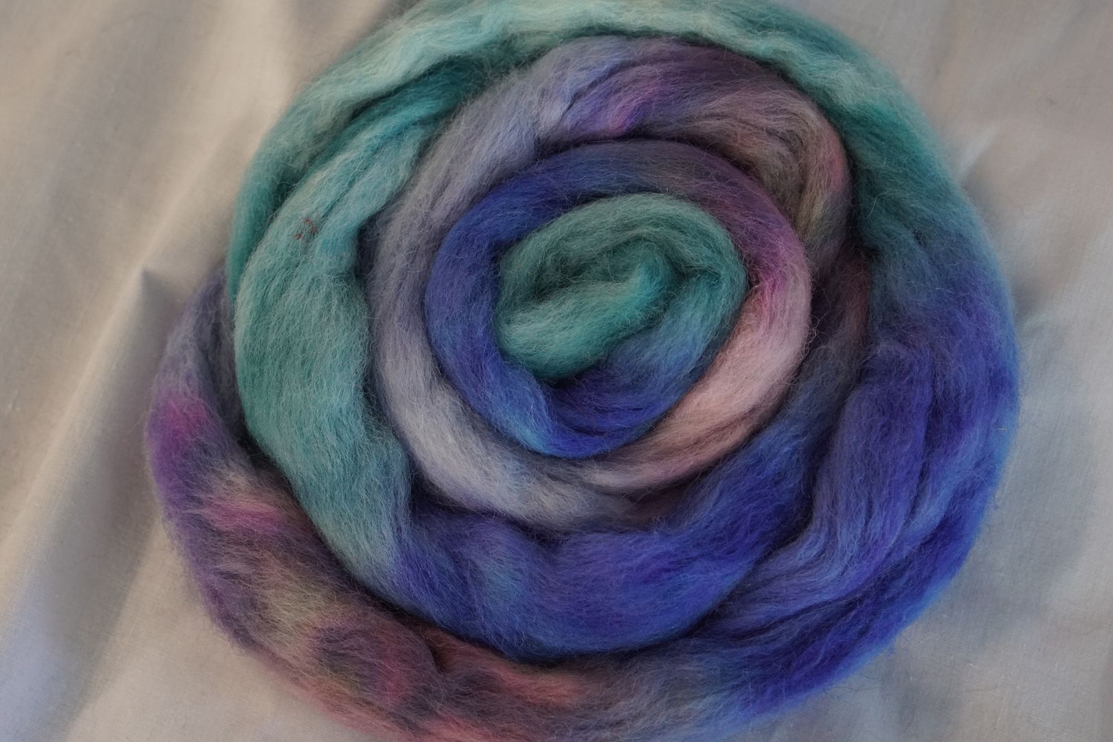
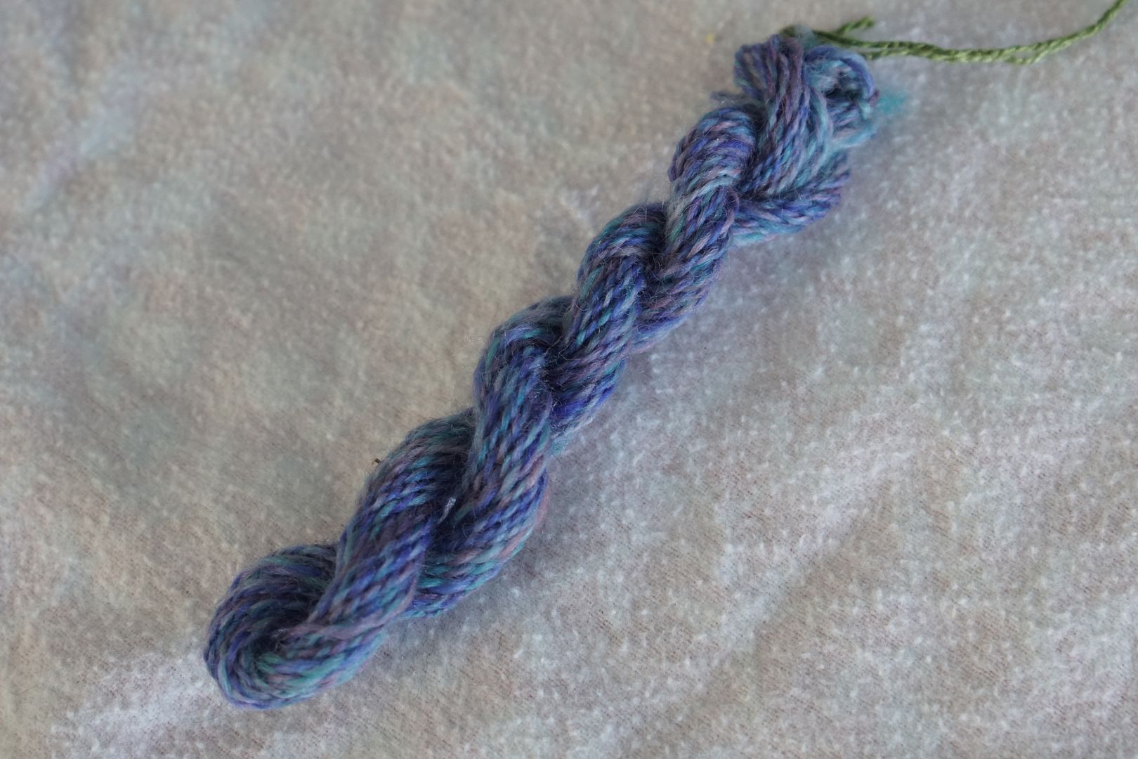
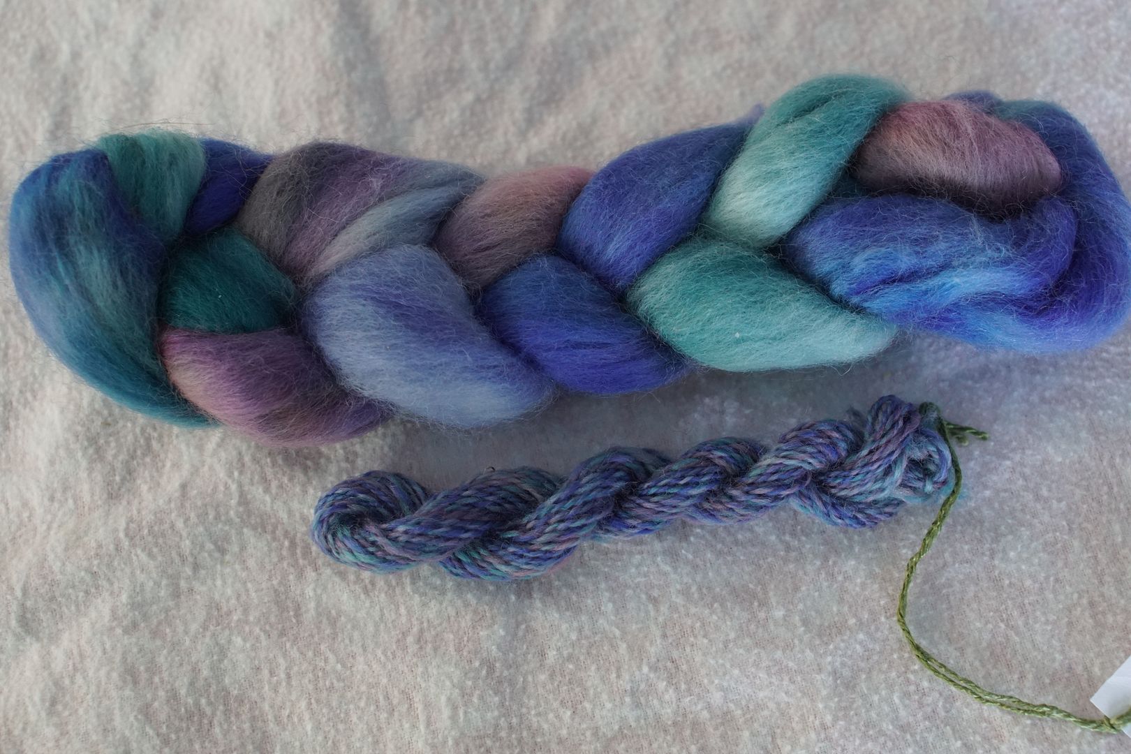
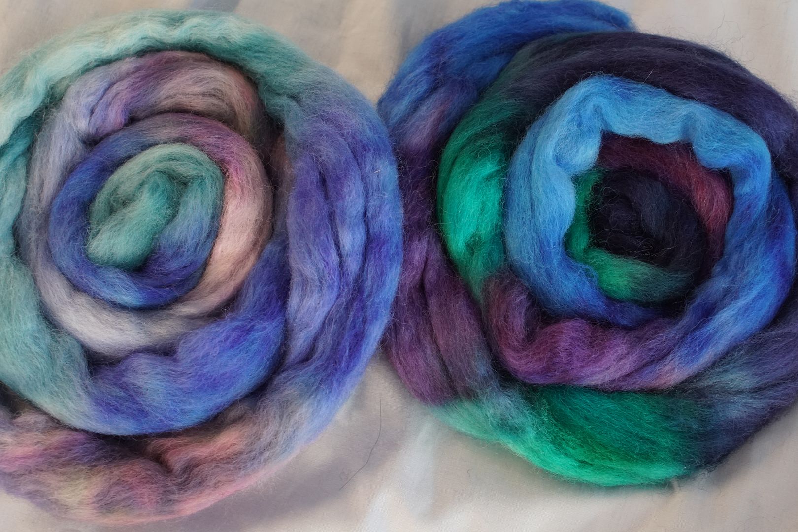
Colours used: Dull Blue-Violet, Intense Blue-Violet, Dull Red-Violet, Pale Blue-Violet. Of course, these aren’t very dark, since they are almost all dull. That dull red-violet mix broke rather magnificently. Overall, I think it looks like seaglass.
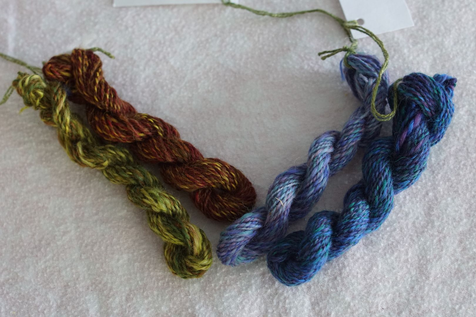
The seaglass impression persists when the yarn is spun up. The blue tone dominates, but the lavender and teal still pop.
Cool #2:
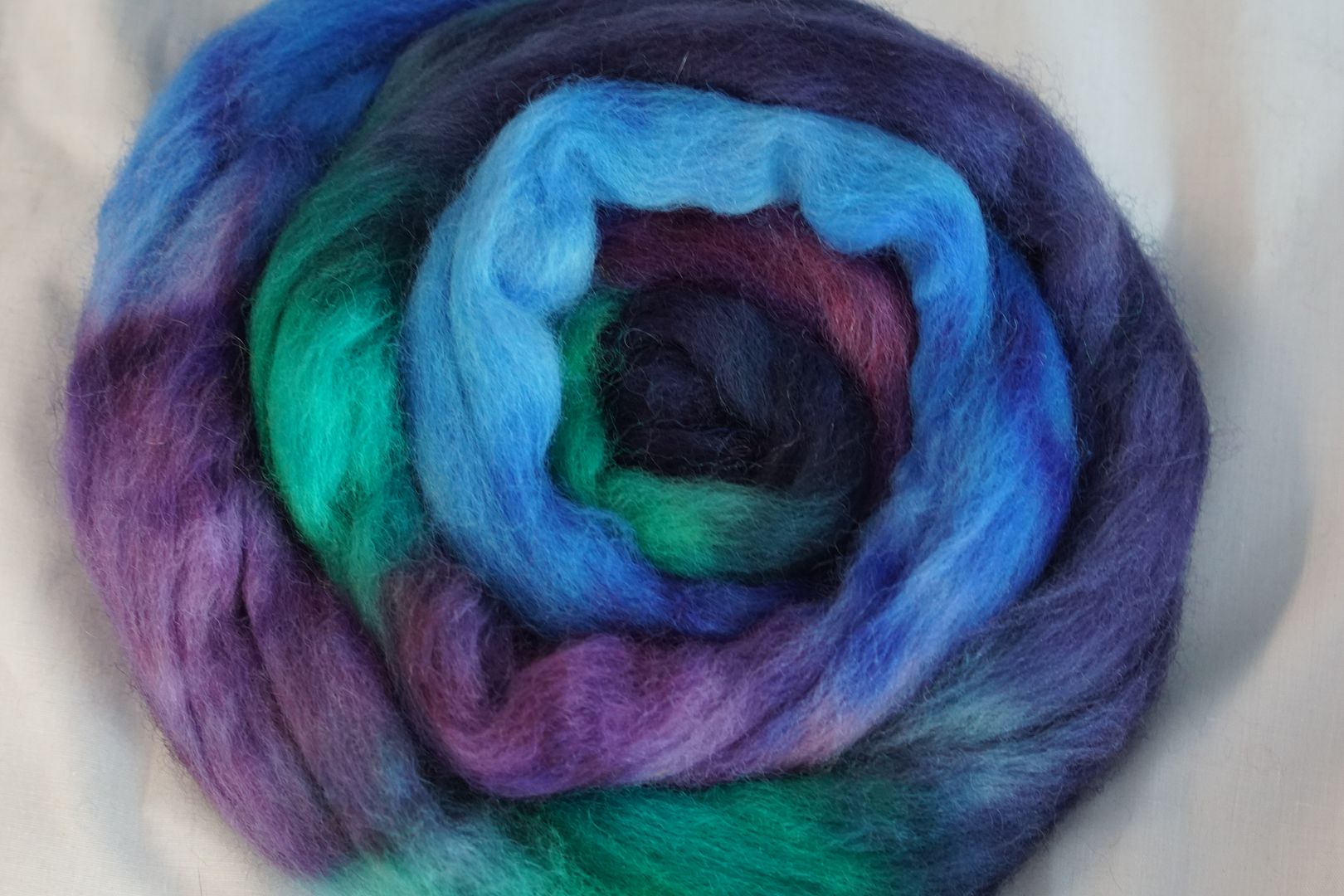
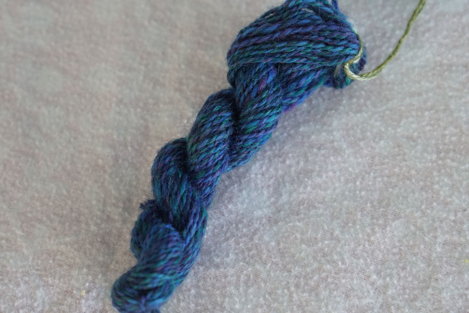
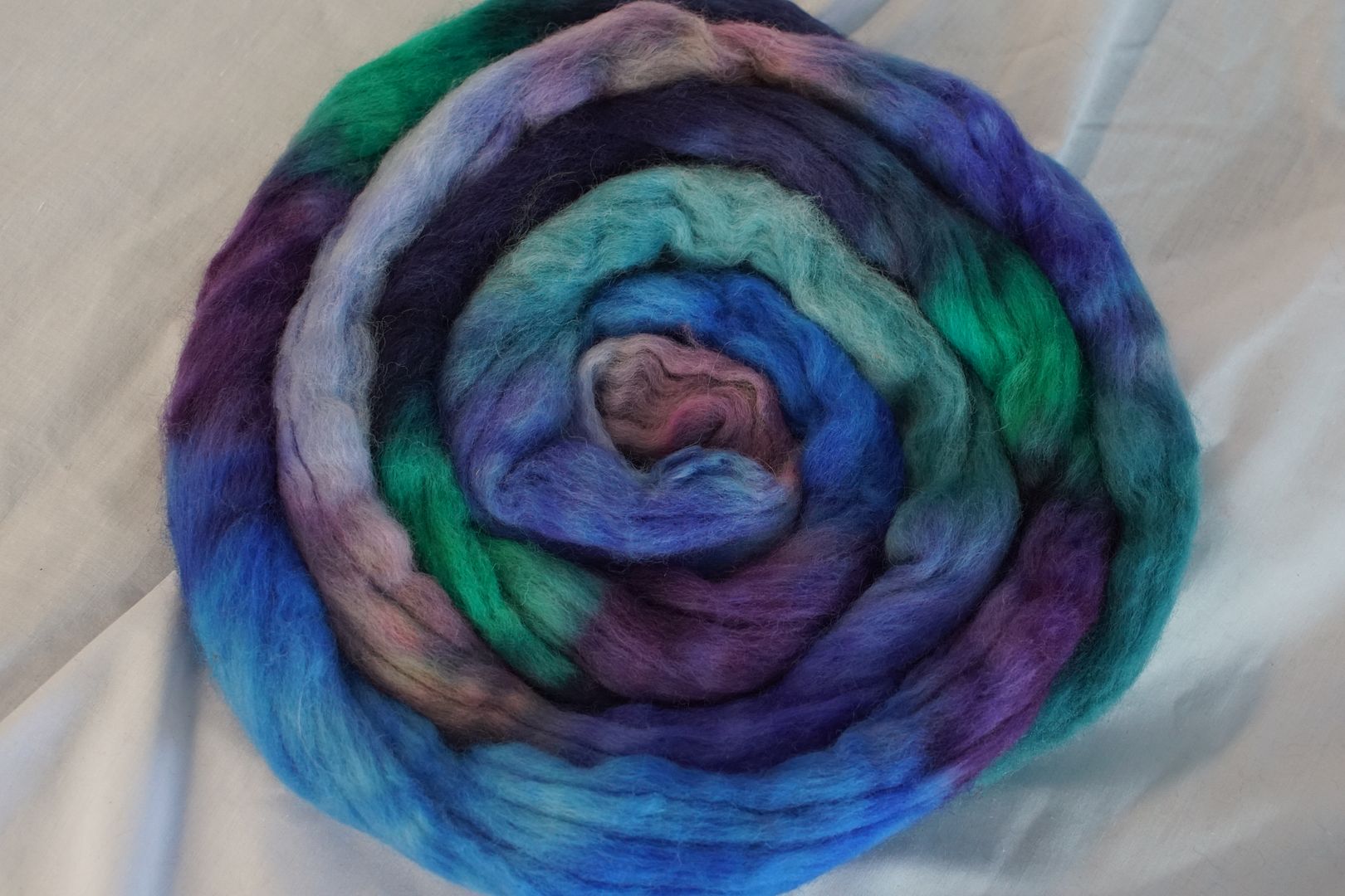
Dark Blue-Violet, Intense Blue-Green, Intense Violet, Intense Blue. By contrast, here are lots of intense and dark colours. It was interesting choosing “cool” colours, because I felt very limited. Blue and colours very adjacent to it are the only really cool colours, and even the intense blue-green is a warm point. But overall, the colours are cool.
Both of these colours are what I would call analogous, for some definition thereof.
They are also analogous even when you put both colourways together.
Warm #1
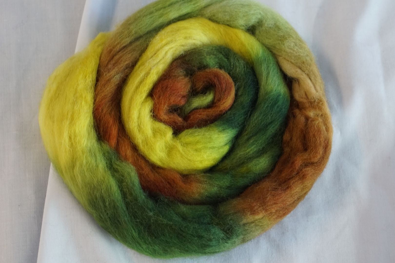
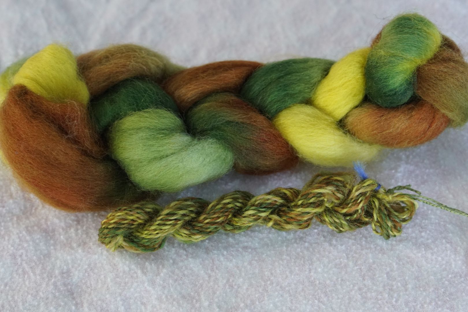
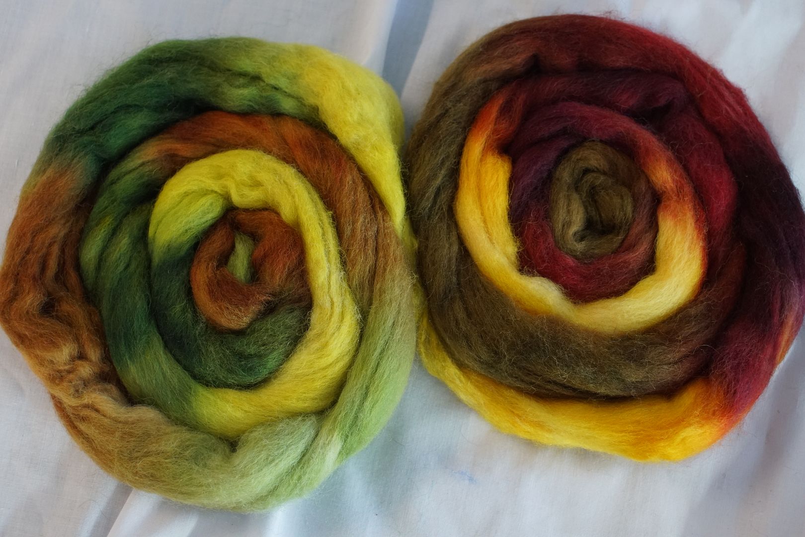
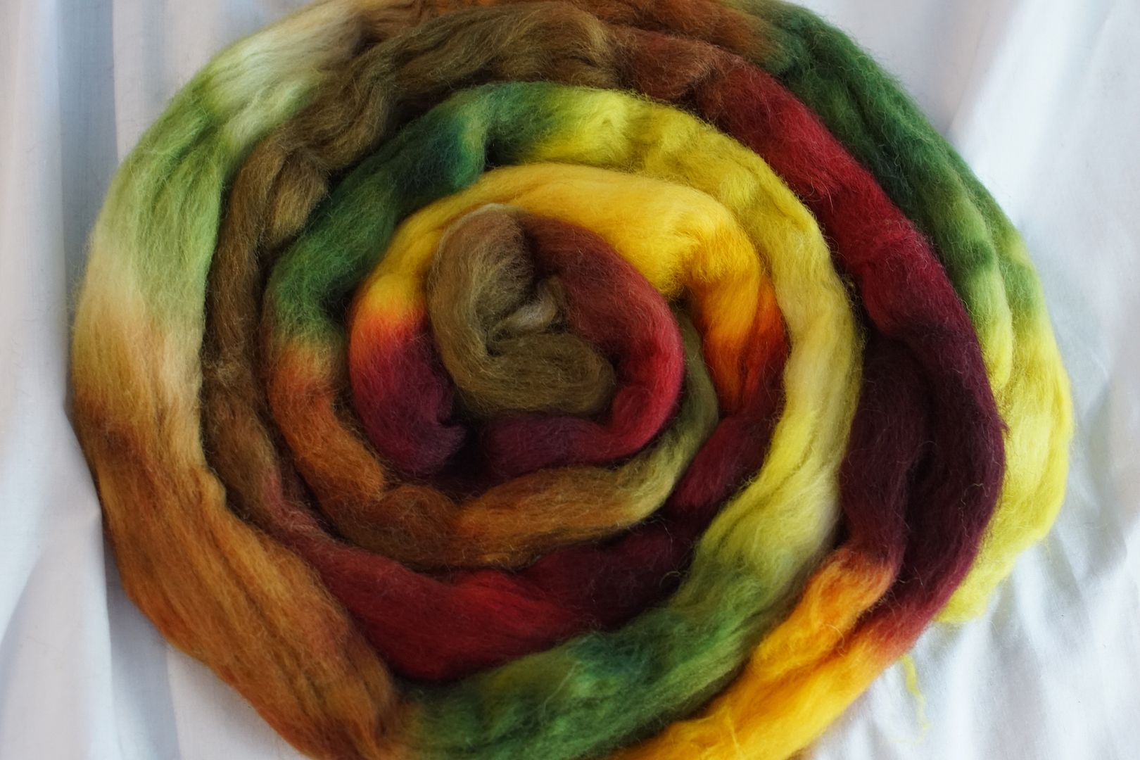
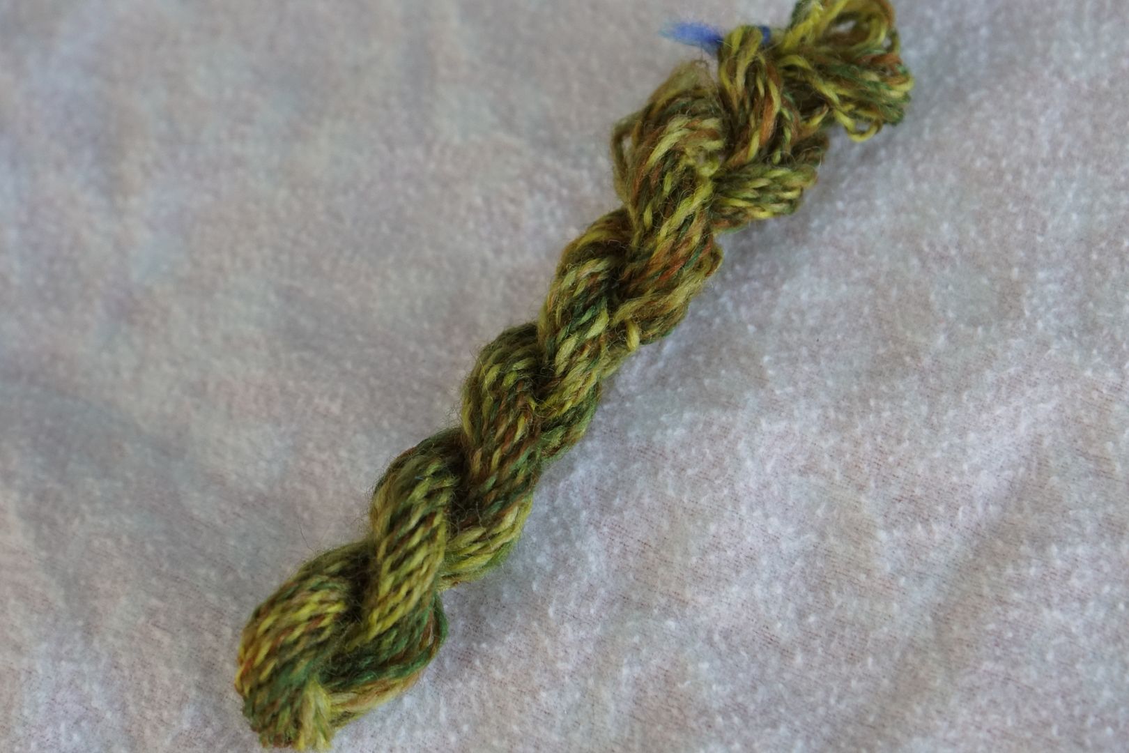
Colours used: Pale Yellow-Green, Dark Orange, Dark Yellow-Green, Dull Yellow. This is another earthy colourway, but with more brightness, it’s a bit wilder. (The Yellow-green is a good bit brighter; my camera can’t always pick it up well.) When choosing warm colours, I felt more free to choose colours all the way from red through green. Maybe because my mixes came out on the warm side, or because I tend to see the warm in greens, and even reds.
There’s a huge amount of value variation in this colourway, which comes through strongly in the yarn. The bright yellow just takes over. Kind of a camo look in the end, which I didn’t see before.
Warm #2
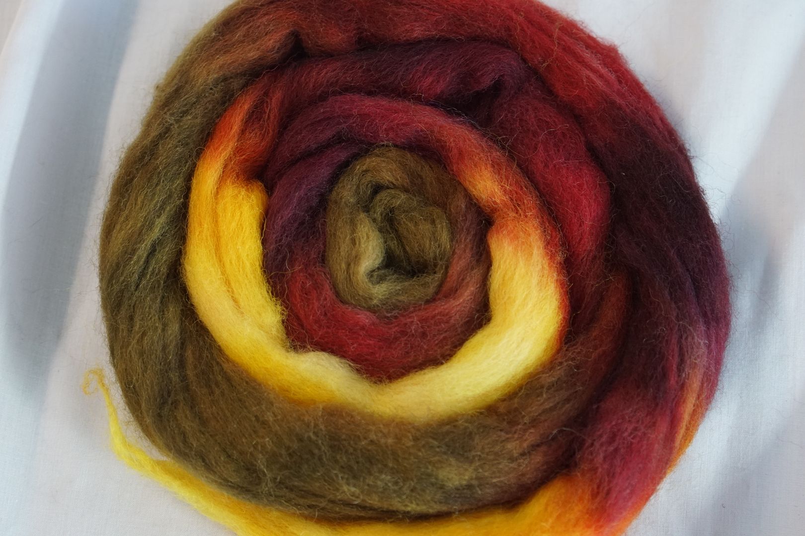
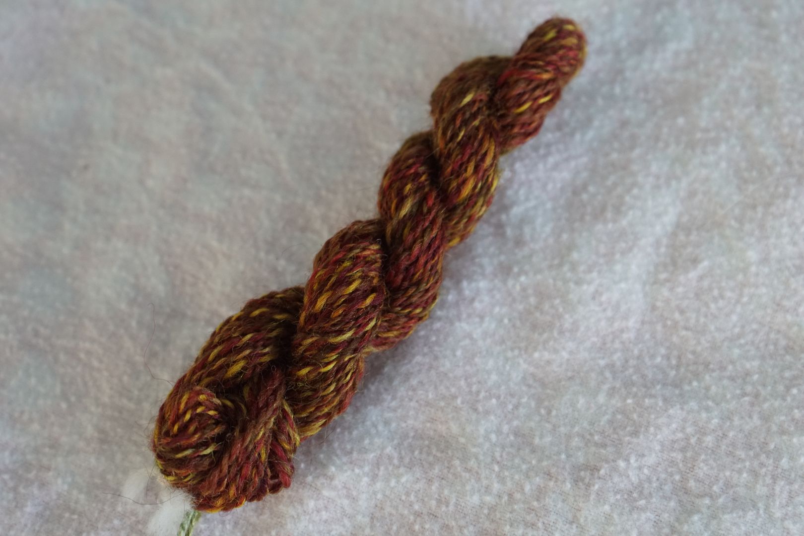
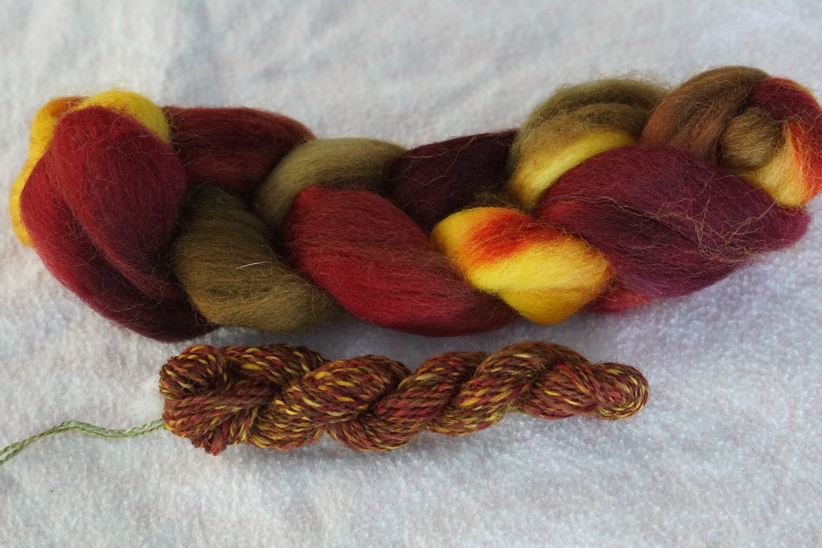
Colours used: Dark Yellow, Intense Red, Dark Red, Intense Yellow The intense and dark red really take over this colourway. I don’t know why I didn’t pull in any orange, but it works.
This is a better ratio of yellow to red to get a balanced-looking finished yarn, with pops of yellow that don’t take over.
I would call these both warm, but they include red and green – complements!
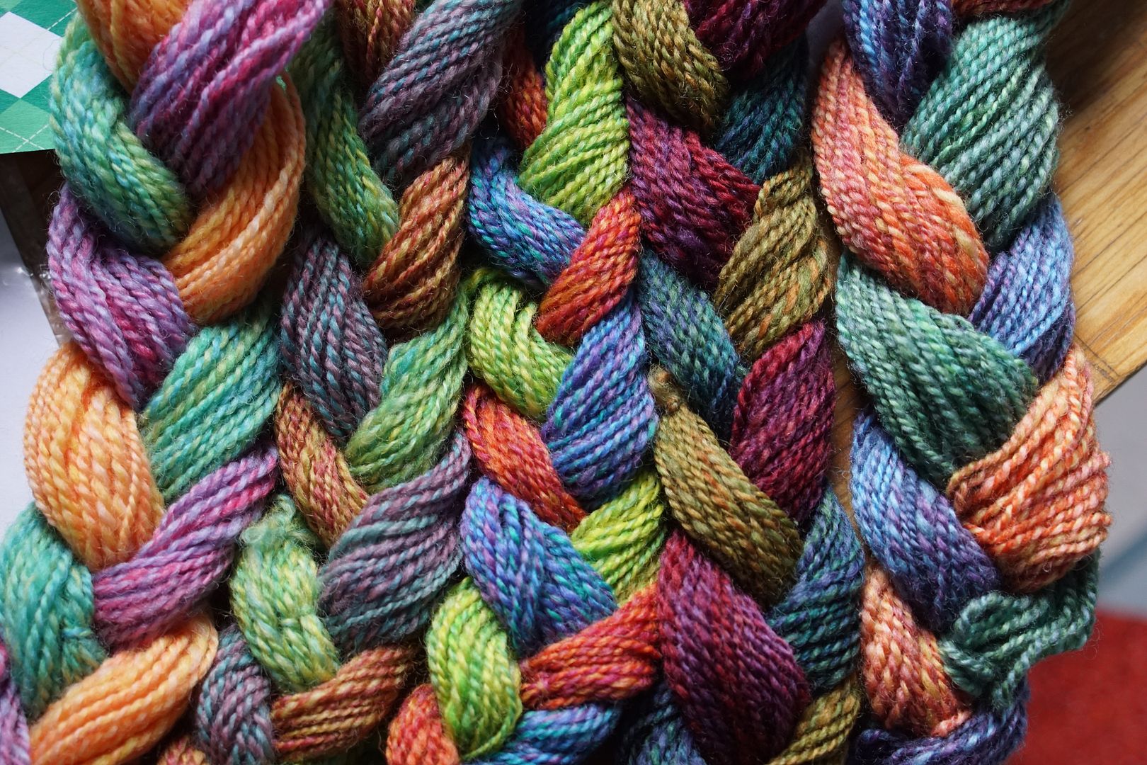
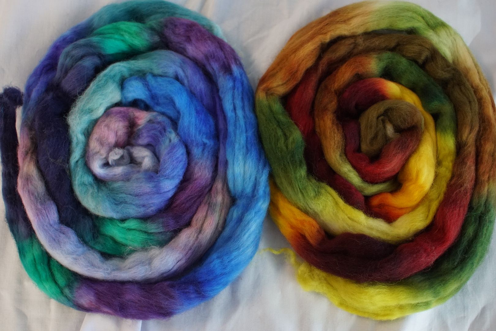
Put them together and you get all the colours of arctic fall. I love these. I would dye this exact colourway, with all of these colours, and explore different ways to spin it, because it captures so well a palette that I’ve always loved and wanted to see on fiber. Serendipity!
From this exercise, I learned that my definition of “warm” is broader than my definition of “cool.” And that I really like both, but usually not together.
