Previous posts in this series:
Part 1: DOS Testing
Part 2: Carded Approximations of Dye Formulas
Part 3: Dye Formulas
Part 4: Monochrome colourways
Addendum: Knitted samples
The handpainting experiments continue with series 2 of Deb Menz’s experiments from chapter 3 of Color in Spinning.
“Series 2 – Analogous colors. Choose four colors to paint on each roving. Do fifteen rovings, one for each of the following ranges:
- yellow to red-orange
- yellow-orange to red
- orange to red-violet
- red-orange to violet
- red to blue-violet
- red-violet to blue
- violet to blue-green
- blue-violet to green
- blue-green to yellow
- blue to yellow-green
- violet to blue
- blue to green
- green to yellow-orange
- yellow-green to orange
- orange to red” (Menz, 109).
At first, I elected to just do the set of twelve from this exercise, because I had some concerns about running out of dyestock. I’ll come back to the three-hue colourways tomorrow. The remaining twelve colourways are four hues each.
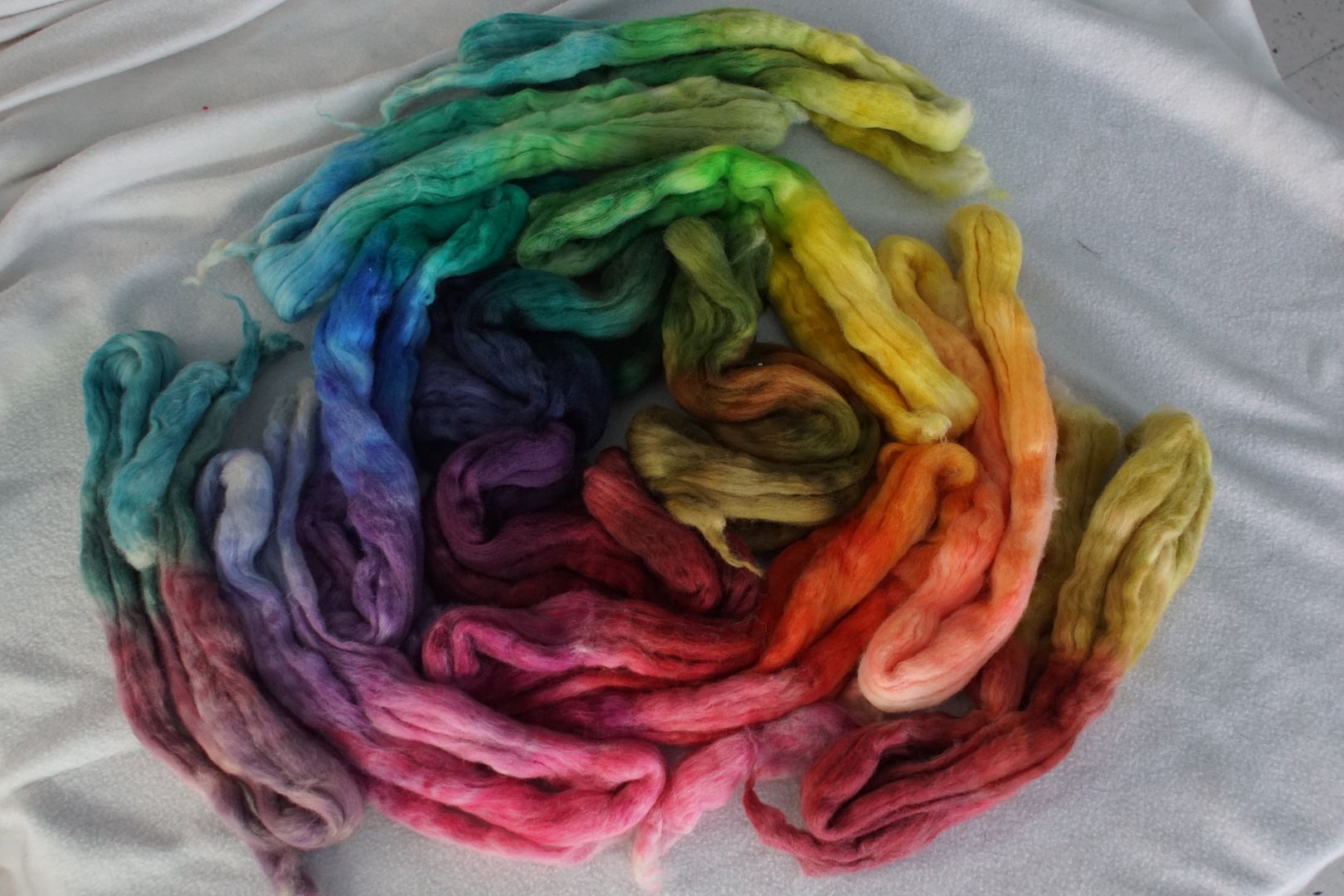
As you will have noticed from the posts so far, each of my hue families has four members: pale, dull, intense, and dark. For this experiment, I decided to put the same members of different families together, just for some order. This yielded some very interesting results. I’ve scrambled them up from the order in which they were dyed to put them in rainbow order, but I’ve put them back together at the end.
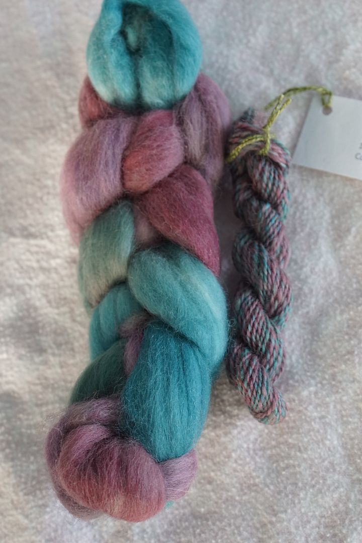
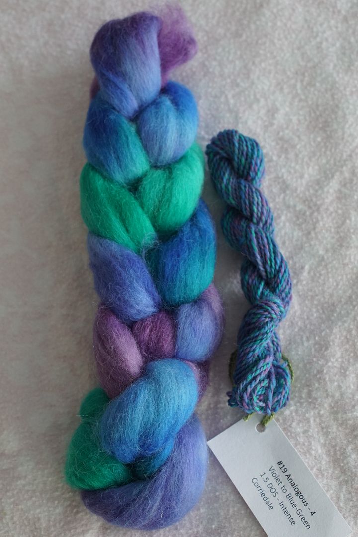
All colours were dyed at the following intensities: Pale .5% DOS, Dull 1% DOS, Intense 1.5% DOS, Dark 2% DOS. Note that Menz suggests dyeing “Intense” colourways at 2% DOS and “Dark” at 3% DOS, but at this point I wanted to conserve dye, and found the colours still quite deep. All dyed on 100% Corriedale wool.
Yellow to Red-Orange (Pale)
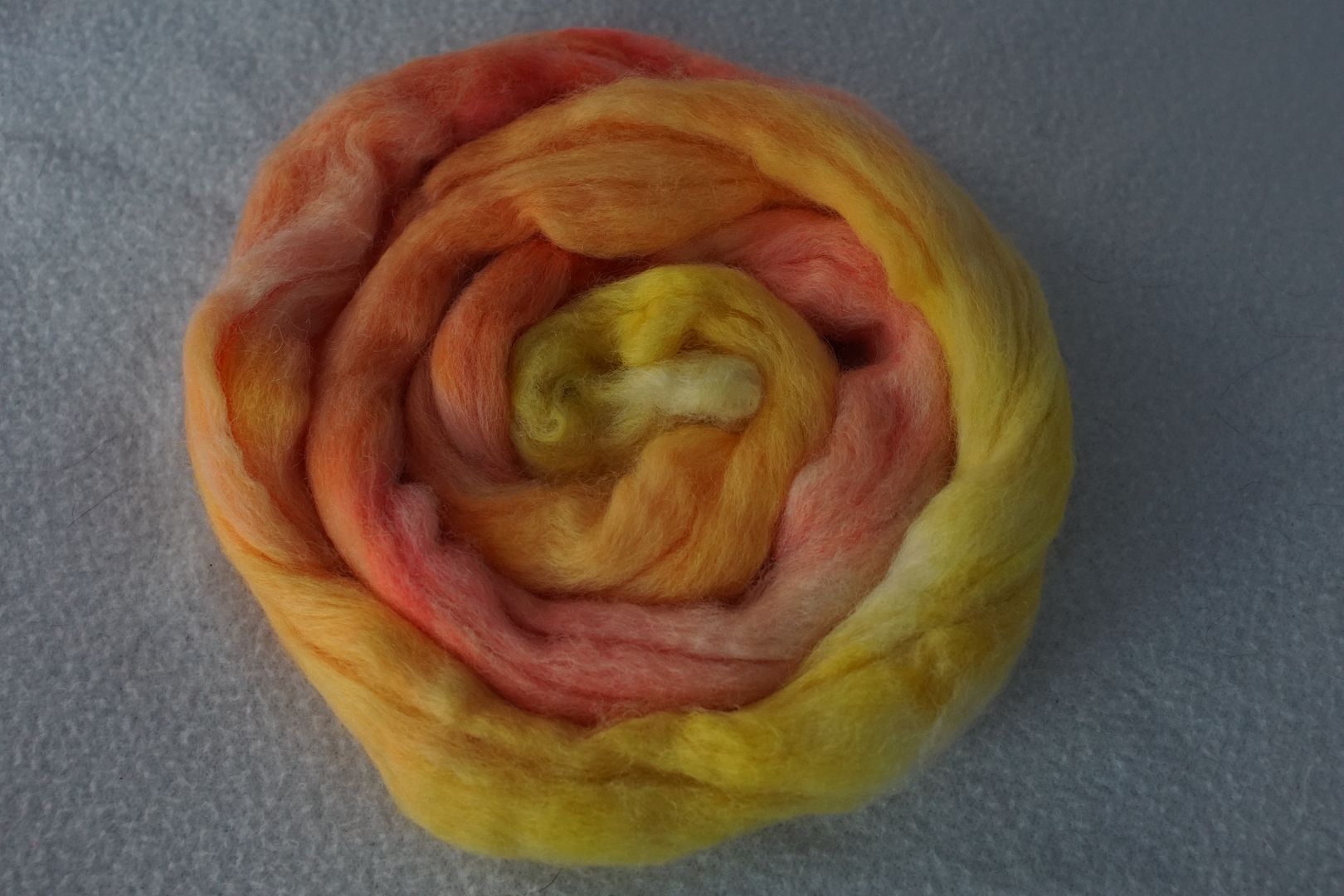
Doing this analogous colourway in the lighter colours really looks citrusy. It’s all the warm colours of lemon, orange, and grapefruit. Just need a touch of lime in there to get the full set, but that would add coolness from blue. This is so warm, with the tiniest bit of coolness from the red-orange.
Yellow-Orange to Red (Dull)
This is the first colourway I’ve dyed that I really don’t like. It’s Iron Man colours, without being shiny. The missing orange really makes itself felt here. The dull colours were always the hardest to get right, and the yellows the hardest of all, but being with other family members gave them purpose, a balancing effect. Putting just these problem children together isn’t very nice.
Orange to Red-Violet (Intense)
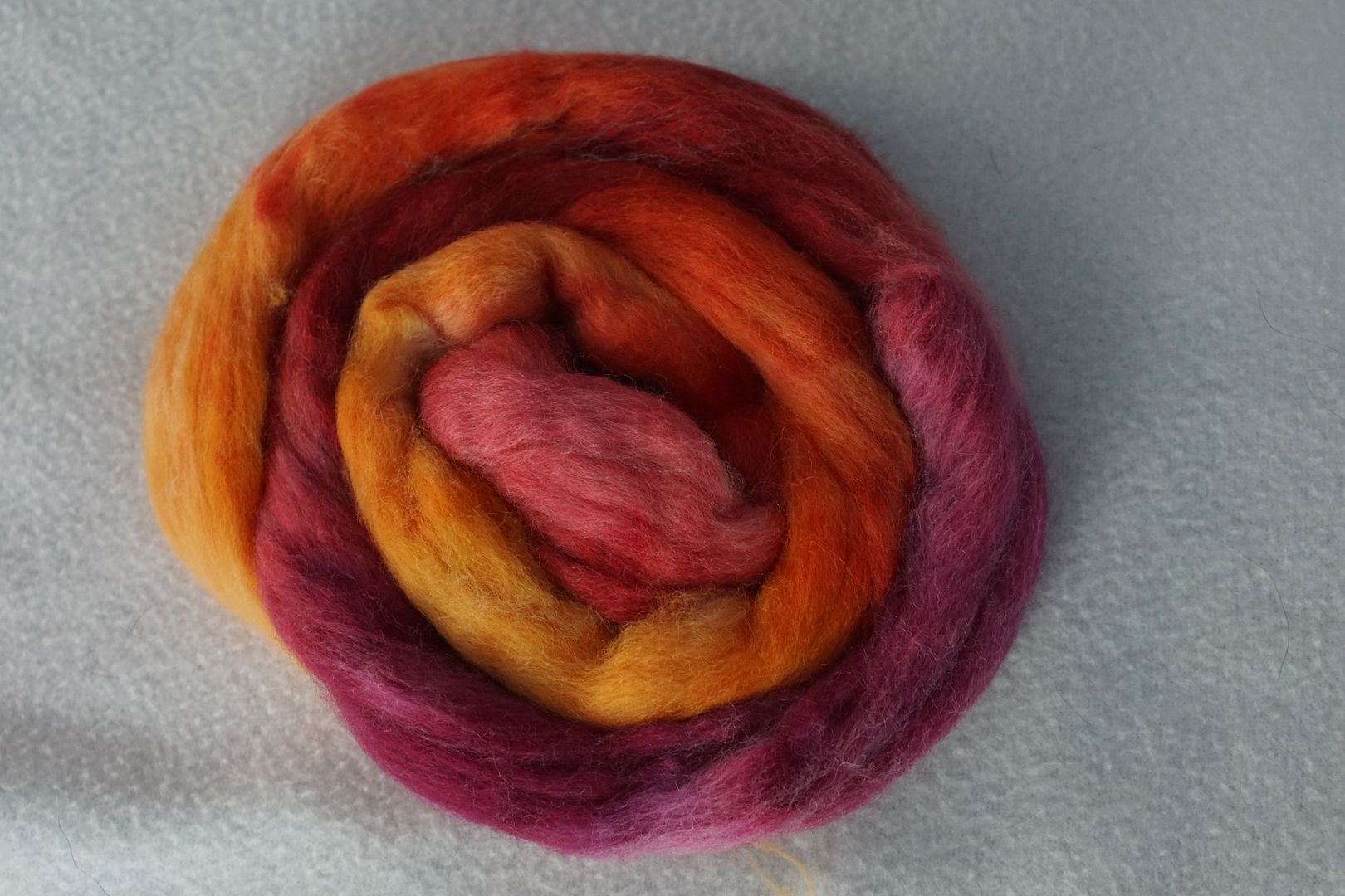
This one reminds me of a classic Sweet Georgia colourway, though not as broad or clean. I love how the red-violet just starts to bring in a little coolness.
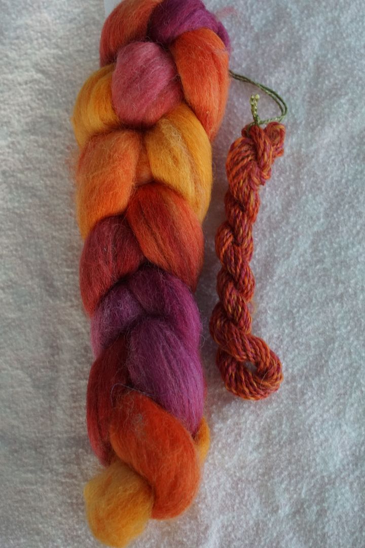
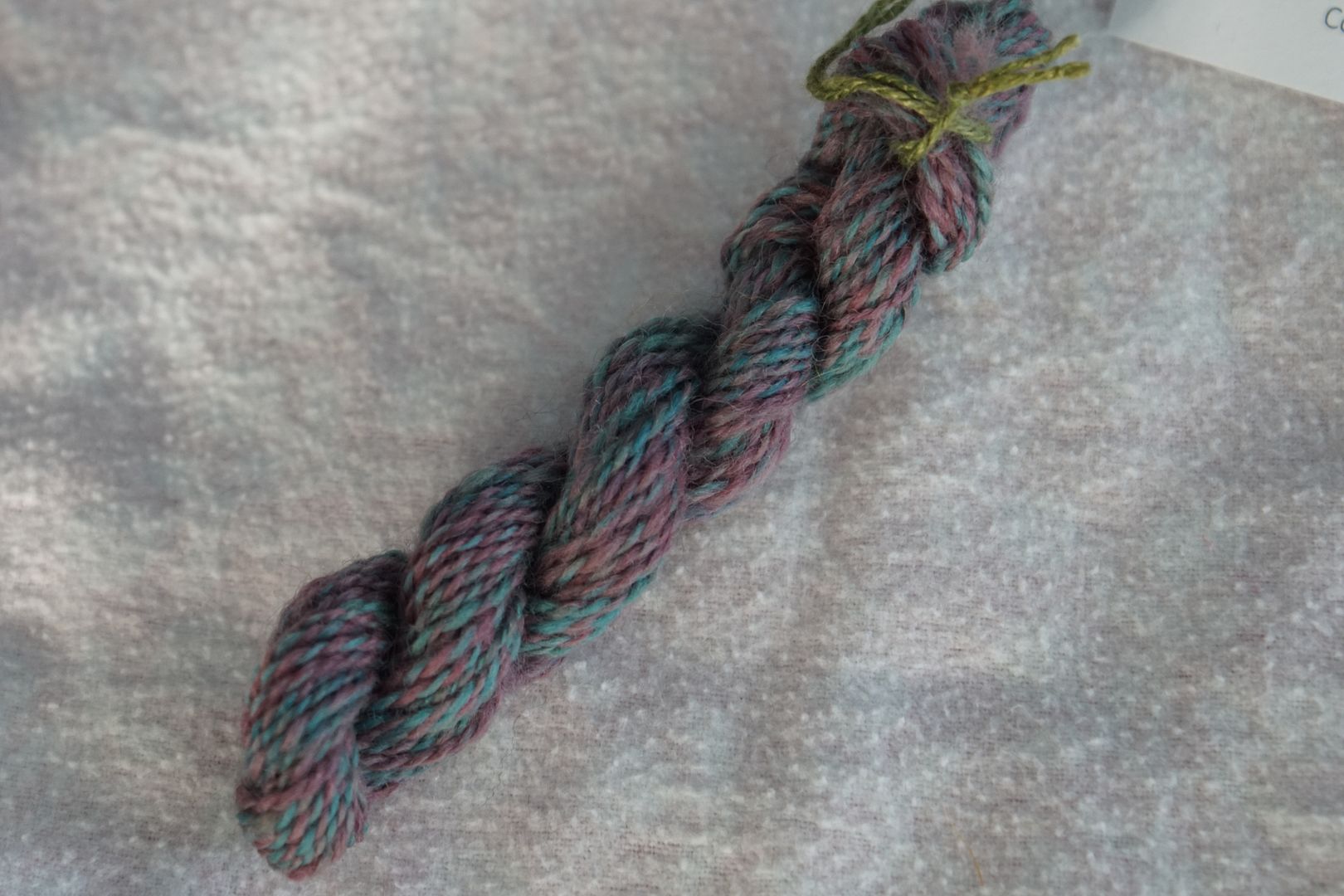
Red-Orange to Violet (Dark)
This colour seems pretty balanced between warms and cools to me, without any obvious appearance of yellow or blue. Very rich. The value is fairly uniform.
Red to Blue-Violet (Pale)
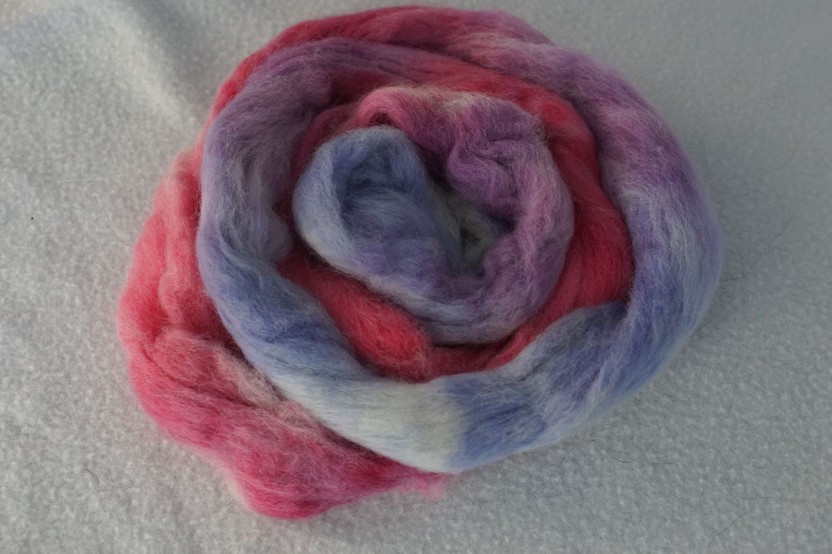
This is interesting. I’m not sure what words to use to describe it except “floral,” or like all the stereotypical baby shower colours were thrown in together. Most pastel.
Red-Violet to Blue (Dull)
These dull colours go together well, looking rather antiqued together. I did add more colour to the dull red-violet premix, so it isn’t as grey as it was in the monochromatic colourway. I think that’s my only dye amendment that did anything! It’s good that the dull blue and dull blue-violet are here together; separated, the greenness of the dull blue-violet would have thrown things off more. A nice bit of value variation.
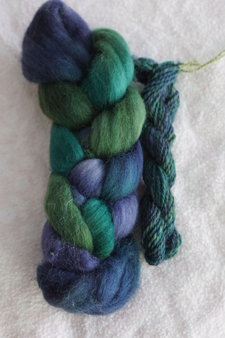
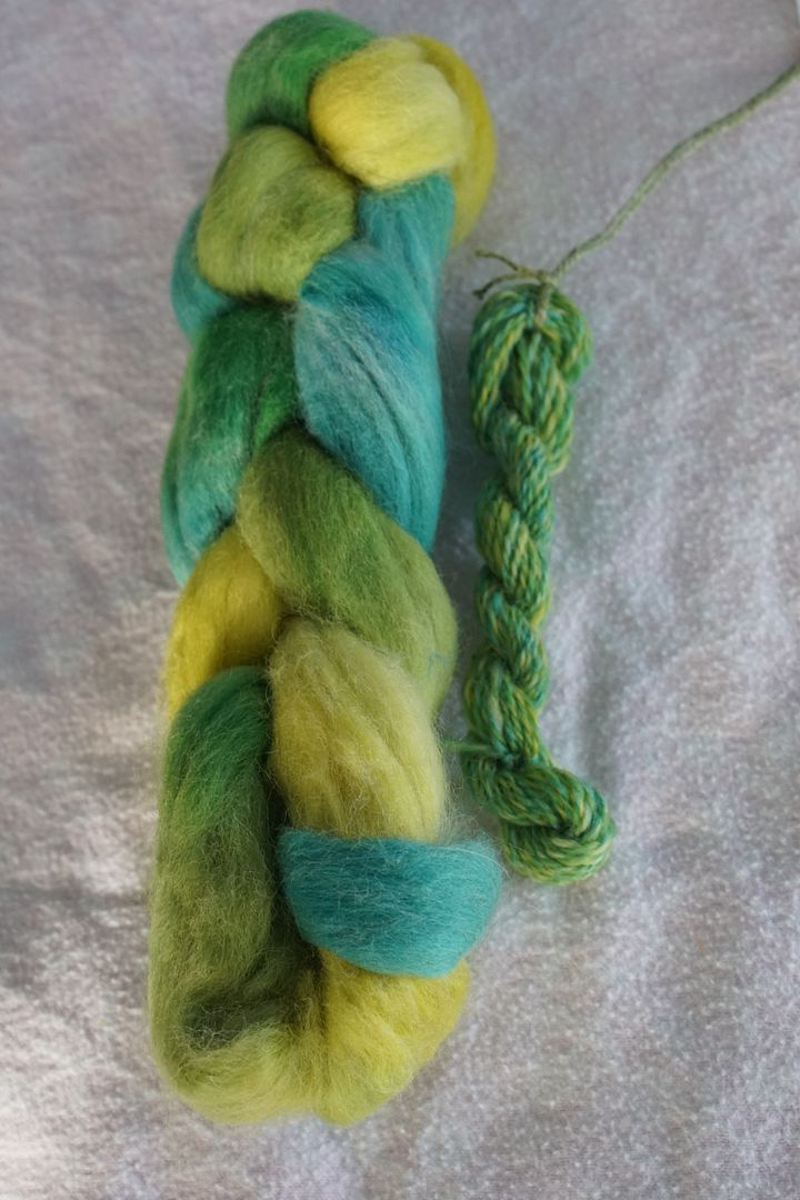
Violet to Blue-Green (Intense)
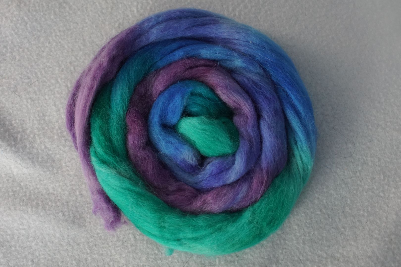
I switched the Dark and Intense blue-green dyes, and you can see just how intense the blue-green is! It’s a very different flavor of oceanesque to the two skeins below. The ocean surface as seen from underwater.
It does evoke the 80s leotard or diner colour scheme, which wouldn’t be my first choice. Blending the colours together doesn’t make that go away, since the brights still pop.
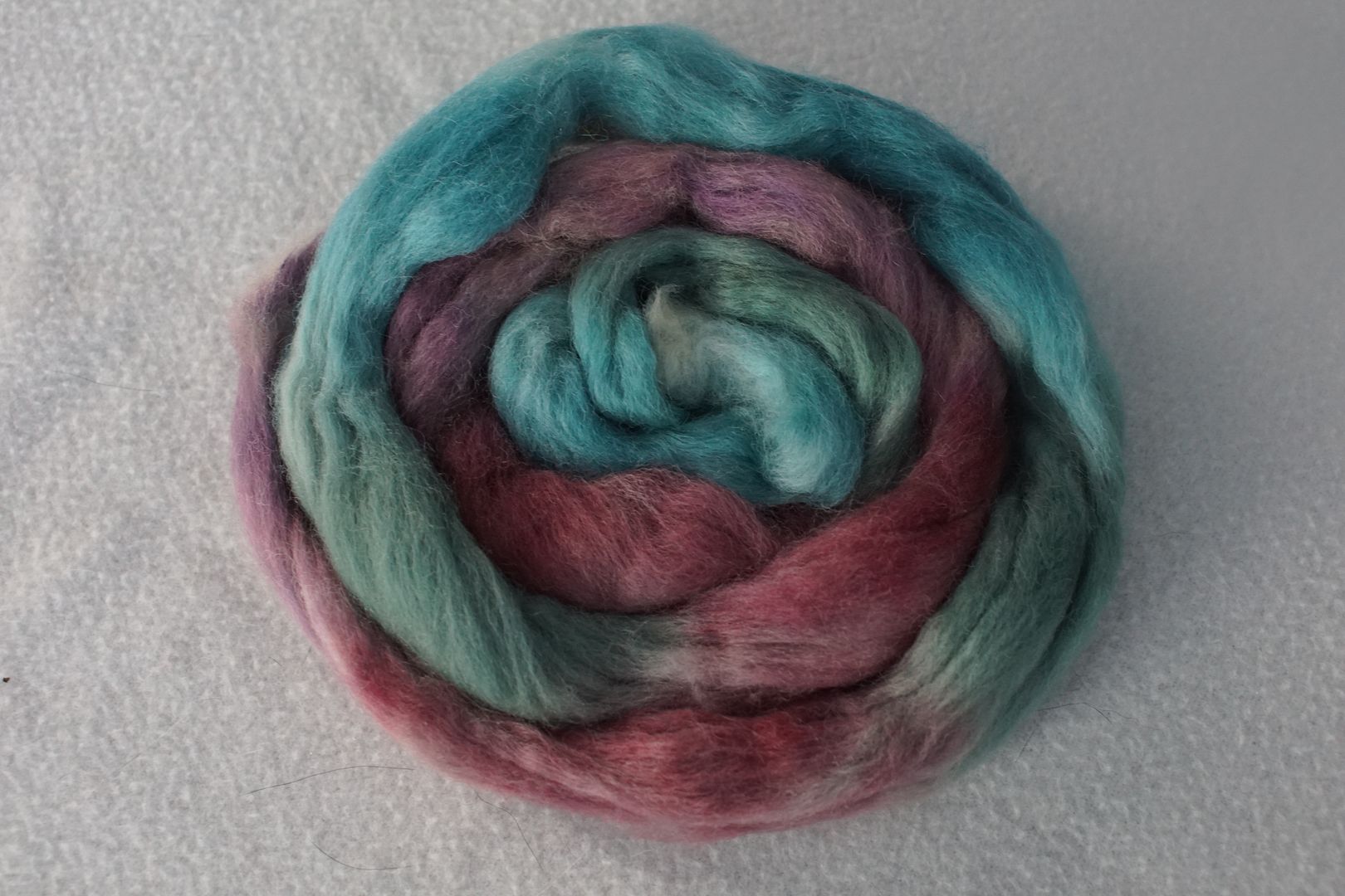
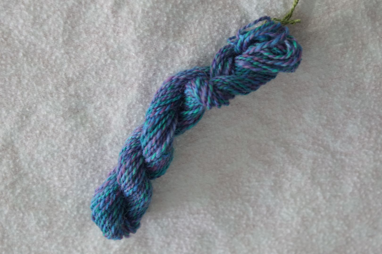
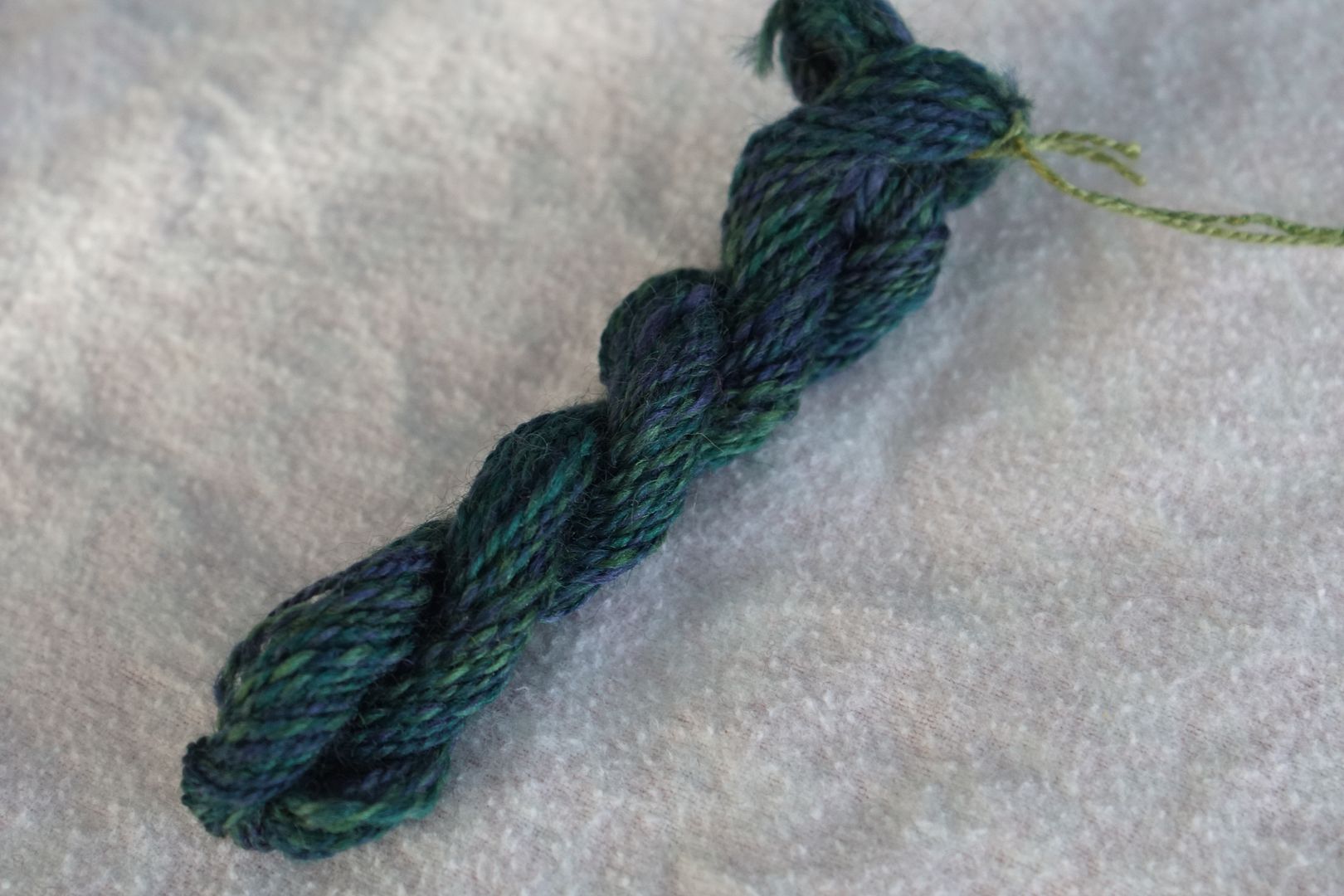
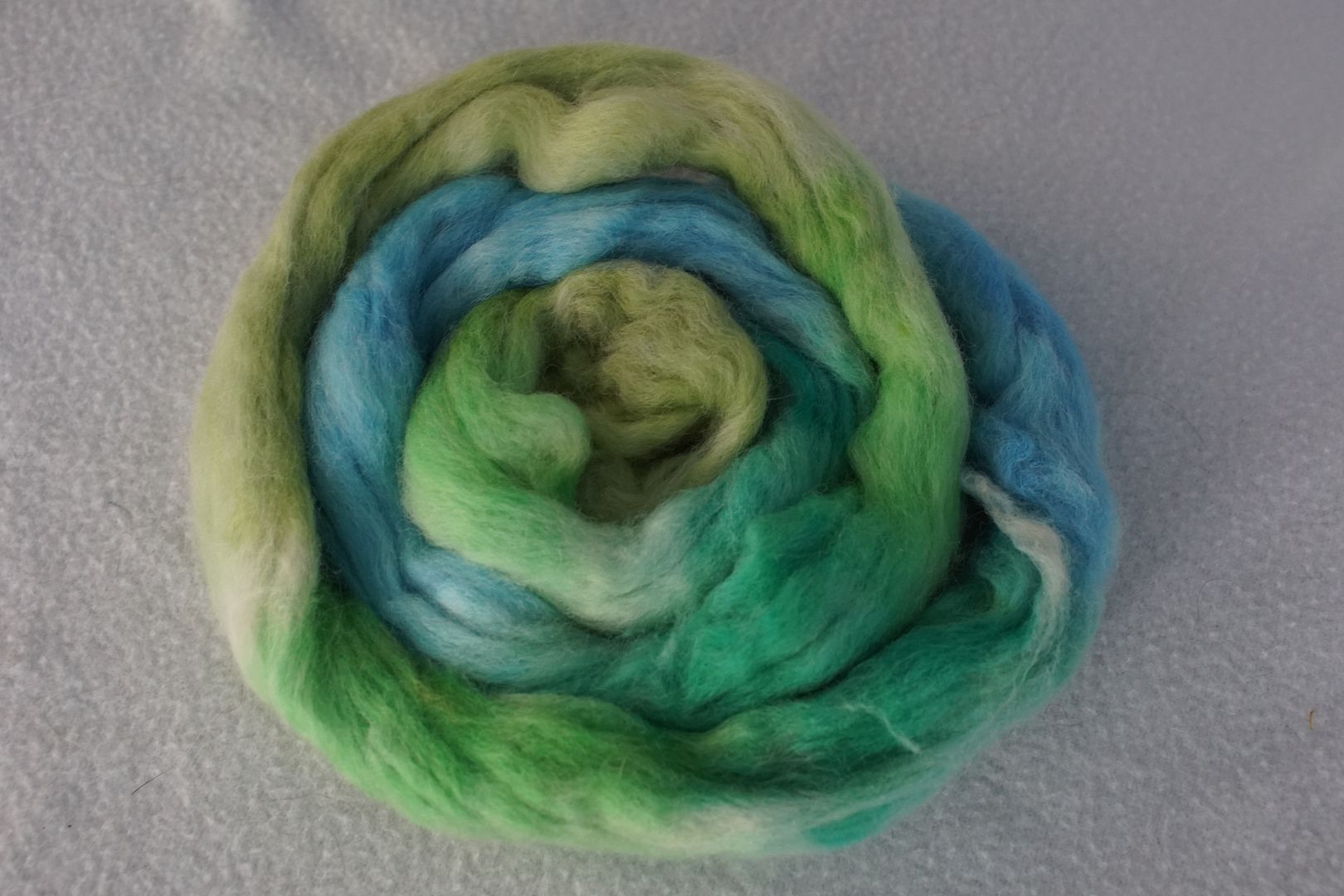
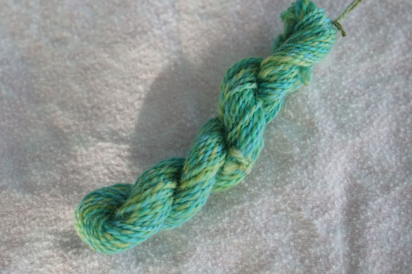
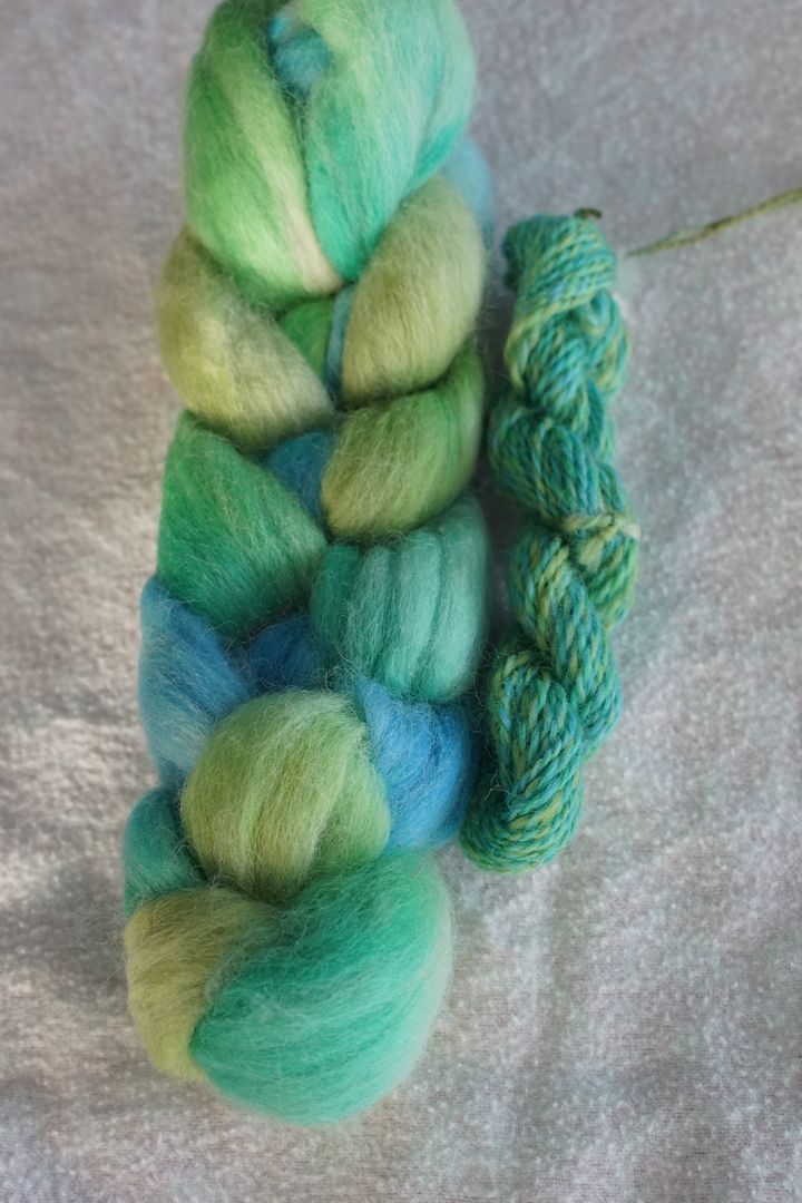
Violet-Blue to Green (Dark)
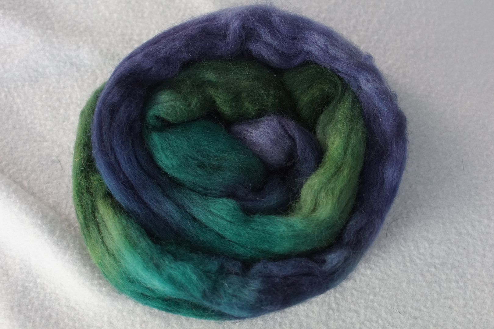
Nice moderate shift in value. Of these blue-dominated colourways, which all have watery associations for me, this is the seaweed growing on the ocean floor.
Blue to Yellow-Green (Pale)
This looks to me to be the least analogous of the pale trio, with the yellow-green being quite warm, and the blue being the coolest. (My camera doesn’t like the pale yellow-green; it’s brighter in person.) It has a seafoamy, tropical feel to it.
Blue-Green to Yellow (Dull)
This is certainly the least dull of the dull colourways, but you can see how relatively they’re a bit desaturated. I love how they’re still vibrant, even shifted in an indefinably “off” direction.
The finished sample is actually quite hard to tell apart from the intense colourway below. The dull blue-green is almost entirely swallowed up by those bright yellows and greens.
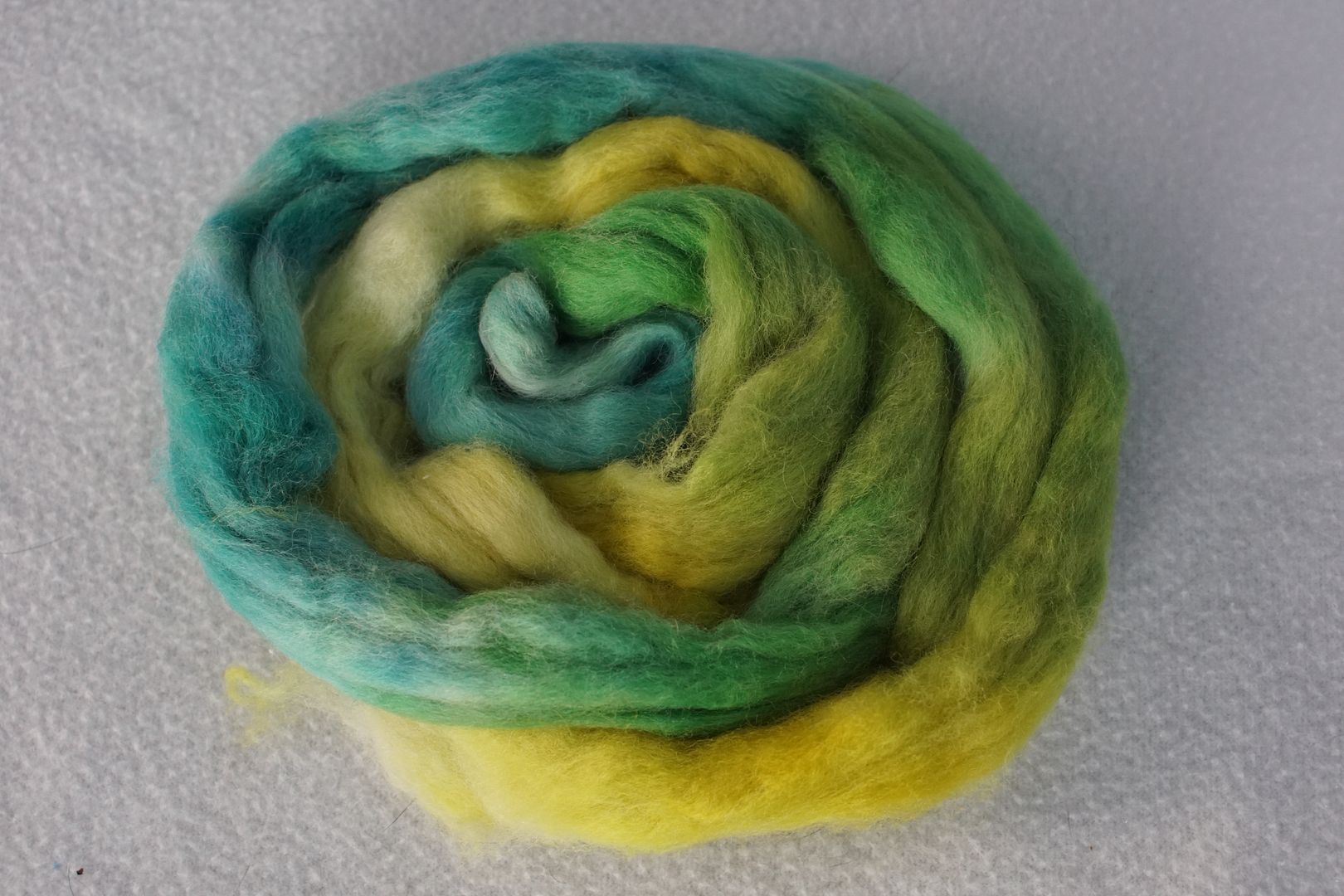
Green to Yellow-Orange (Intense)
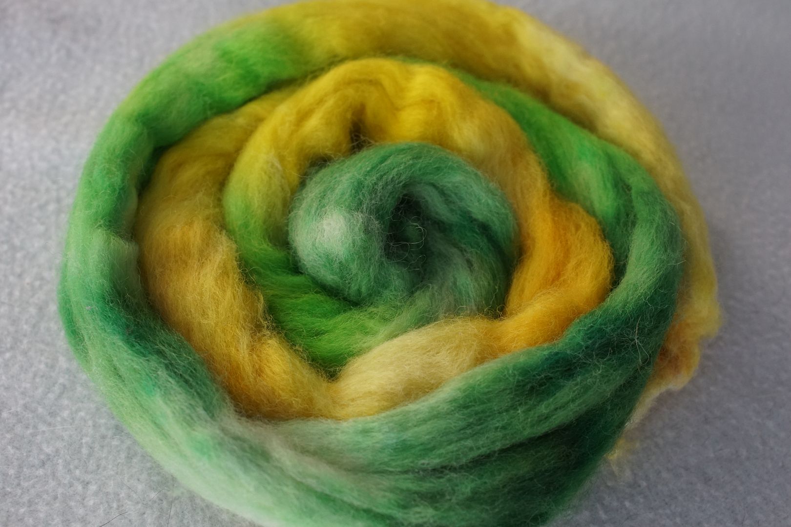
Taking more blue out of the equation shifts the impression from sea to land quite decidedly. The yellow-orange could use a splash more red; the impression is more of warm yellow than yellow-orange. I also had trouble spreading the green dye around, hence more white spots, but that’s my mistake.
Even brighter than the previous sample, it really gives the impression of being just green and yellow.
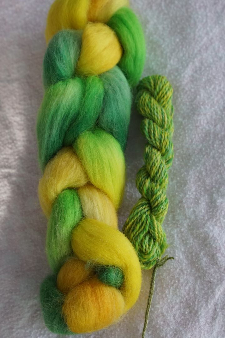
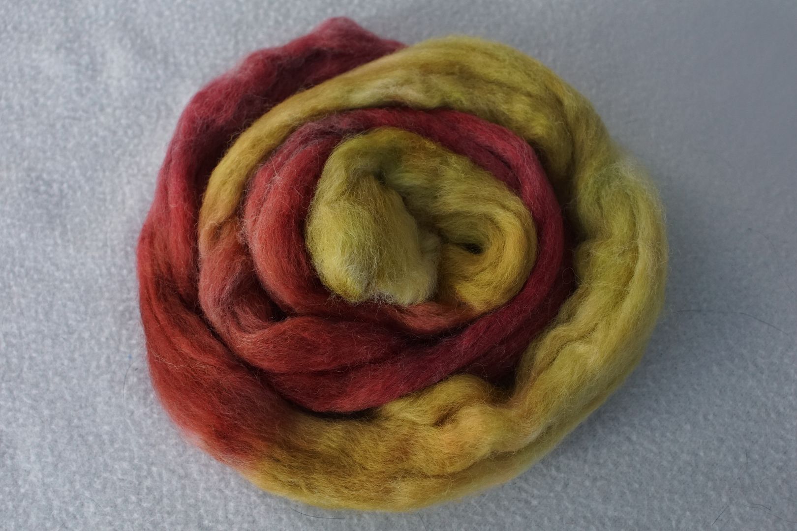
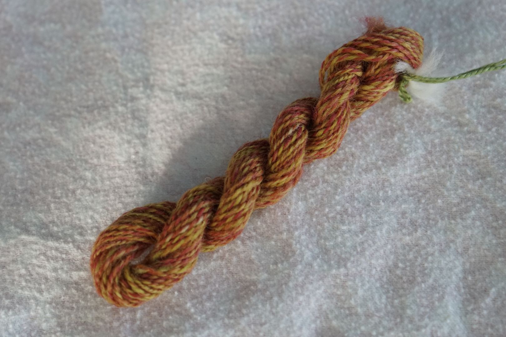
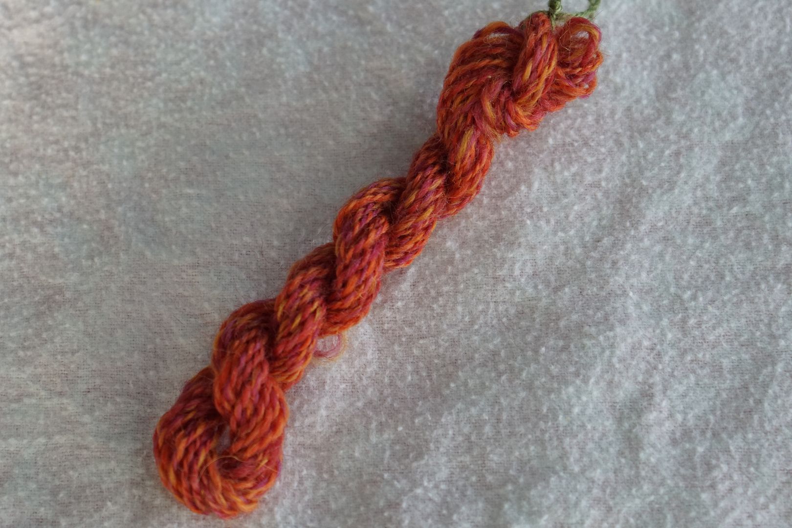
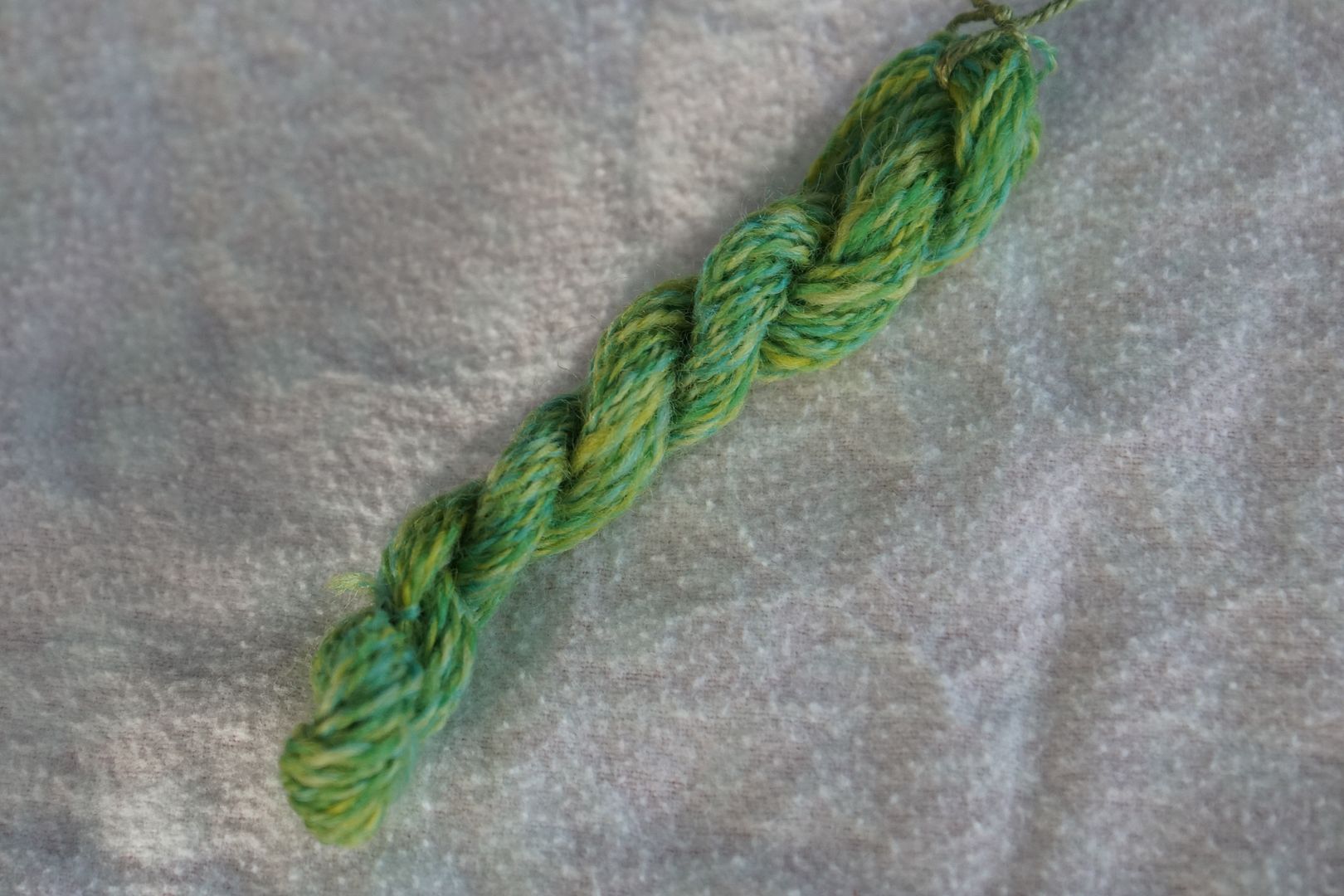
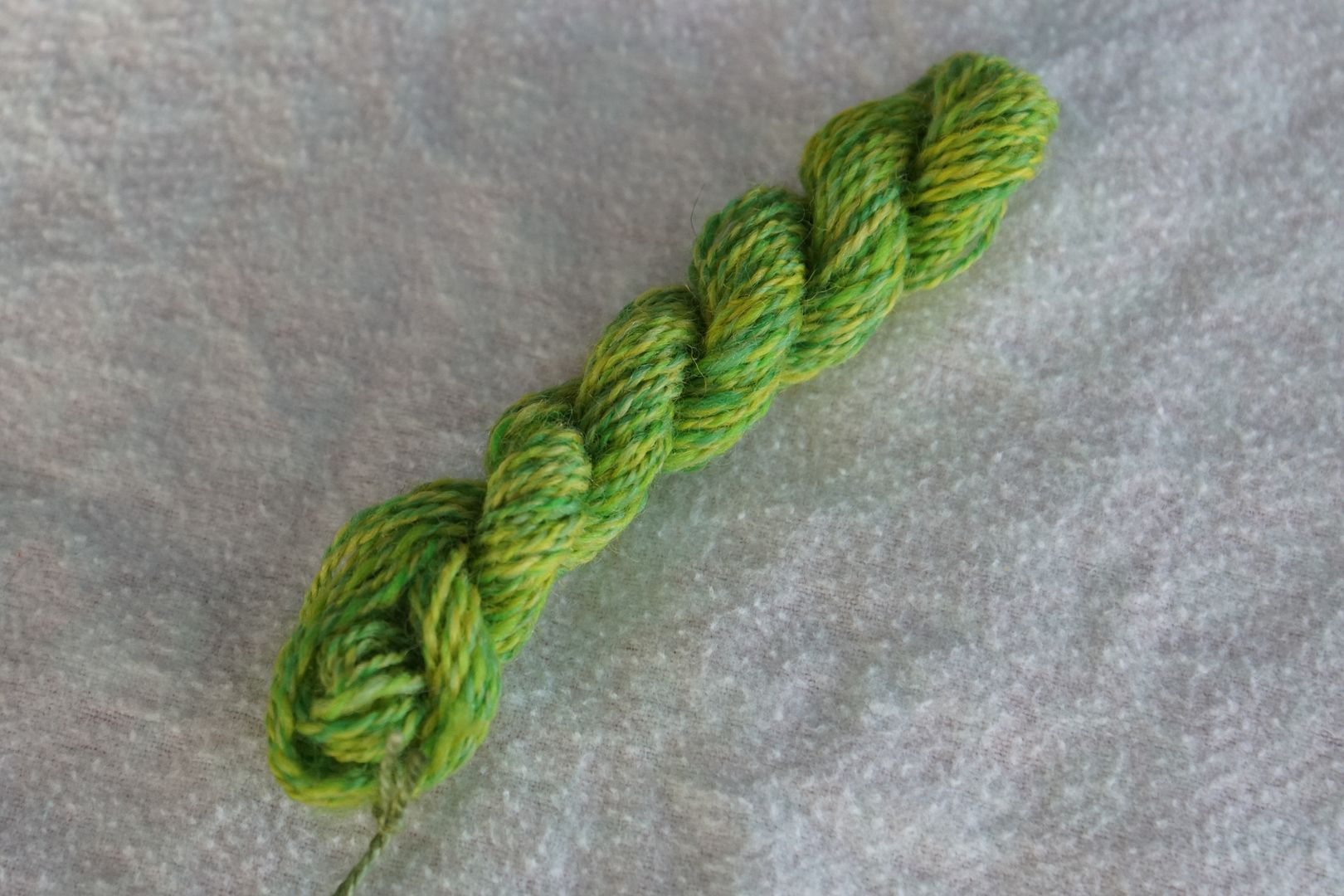
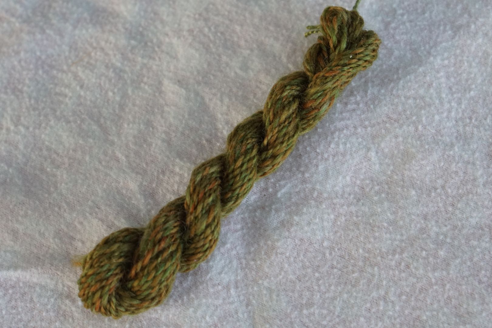
Yellow-Green to Orange (Dark)
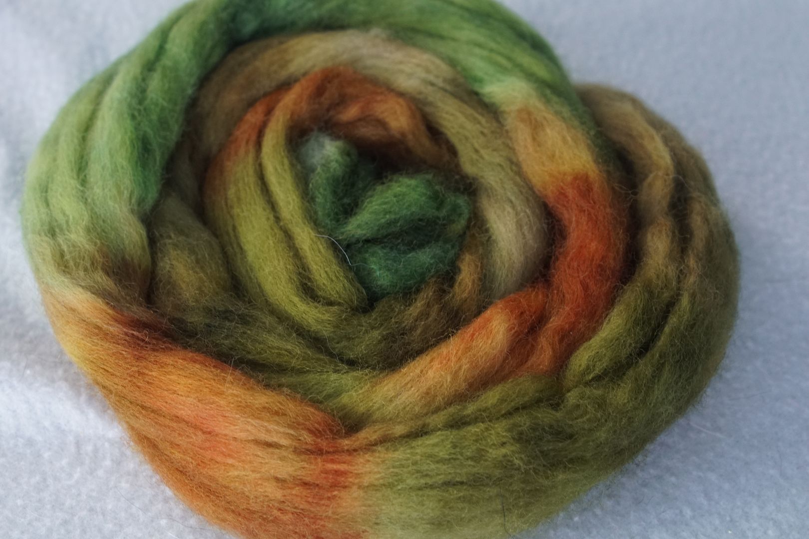
This is fabulous. Grouping all of those troublesome dark colourways together from the yellow area, it doesn’t matter which one is which. They go together in an excellent earthy fashion. These are all my favorite dirt-stick-leaf colour, with the more vibrant dark green in there to anchor things.

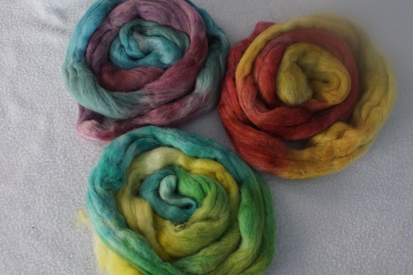
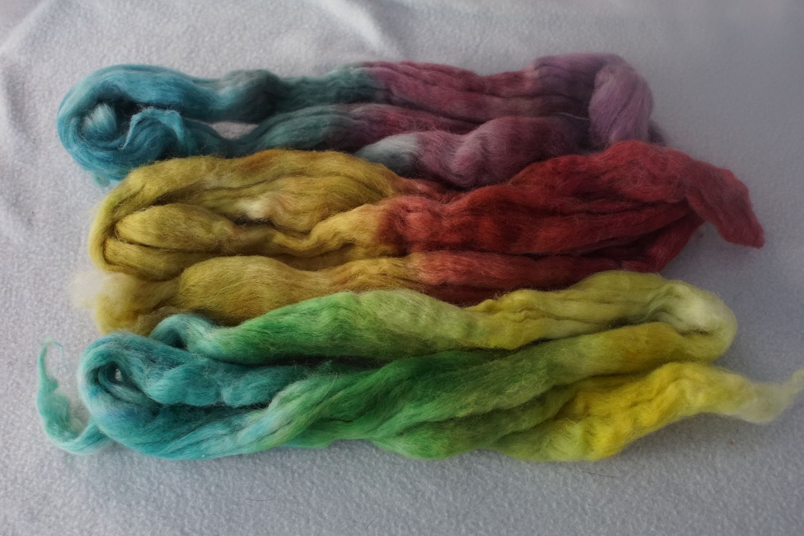
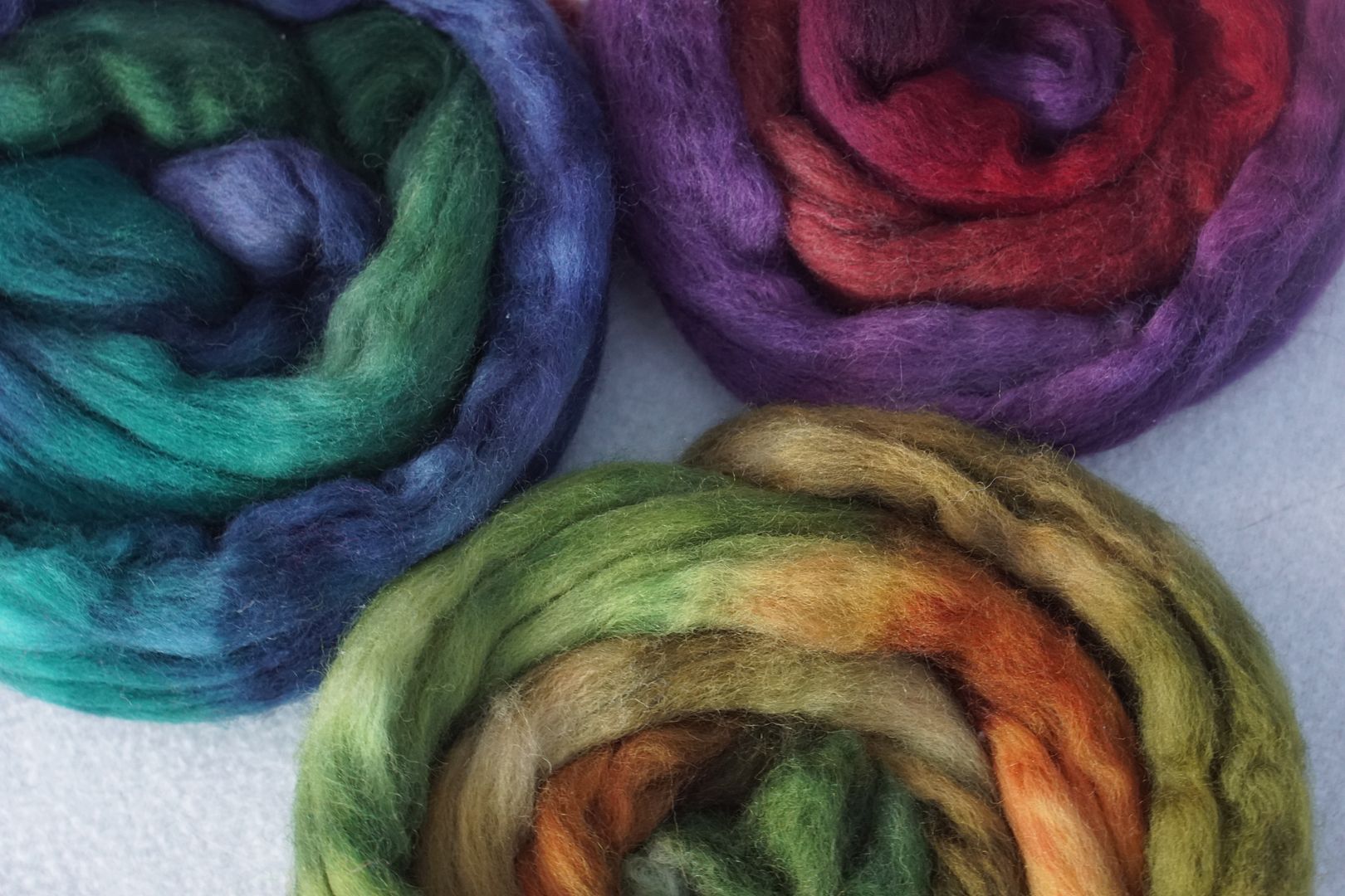
Family Member Groups
If in the last post, we put hue families together, today we are putting all the sisters in one group, the brothers, the mums, and the dads. (You can decide which is which.) Since I can, I want to take a moment to look at how they play together.
Pale
An intentional side effect of dyeing this way was getting a more fleshed-out colour wheel with each of the family members together. So, arranged as they were dyed, here is the pale colour wheel.
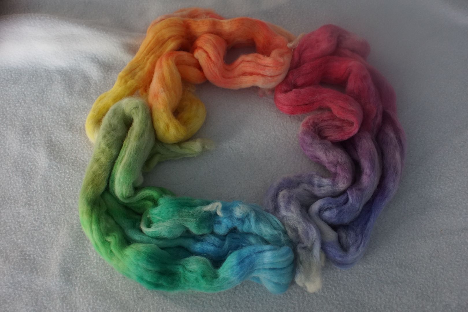
These all feel very bright, sunny, and successfully analogous. They were all dyed at .5% DOS, and I think I had gotten better at distributing that tiny amount of dye on the top at this point. They might well lighten further and look pastel when spun. This colour wheel feels the most complete.
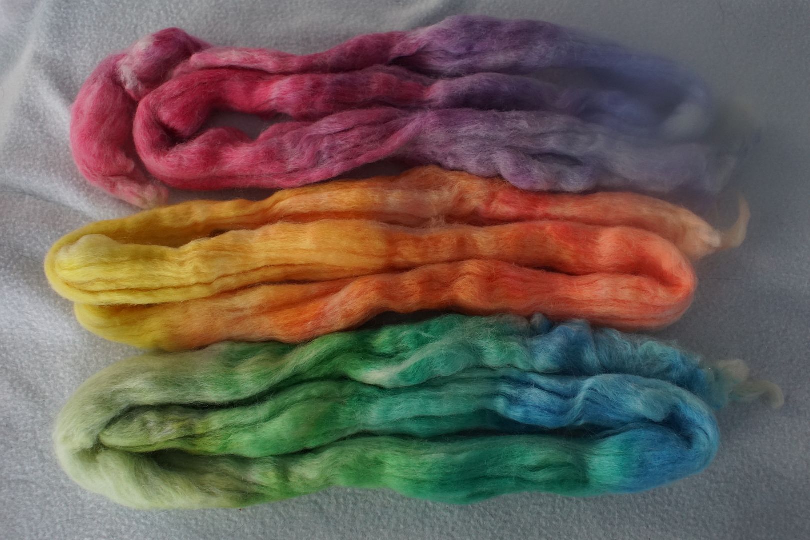
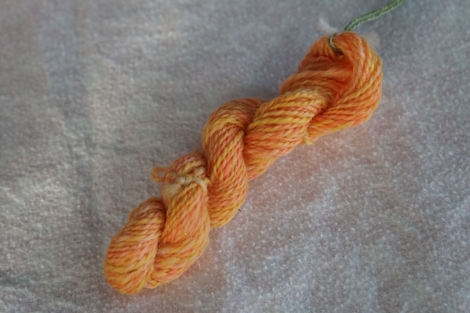
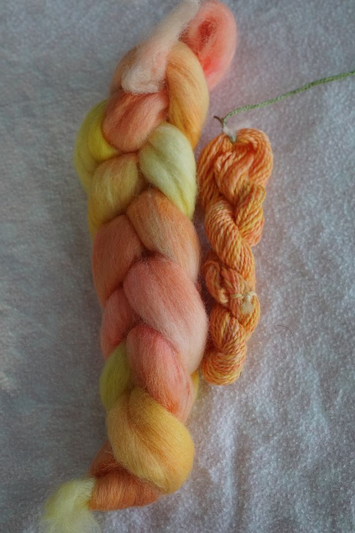
Spun up, they make a sort of tropical set of bright, joyful tints.
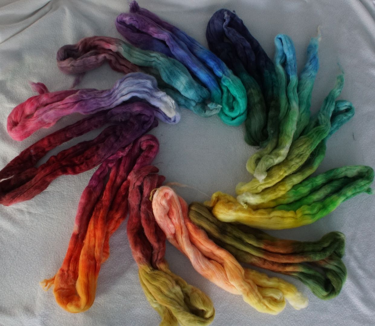
Dull
The dull color wheel looks beautiful this way. Arranged as dyed, the yellow-orange is more orange looking, and isn’t so swallowed up by the primaries. There’s probably almost no way of preserving it in spinning, though. That’s high on my list of dyes to fix next.
The red-yellow colourway still makes me cringe when it’s in frame at all. It just looks so bisected. The other two have a lot going for them, being sort of sedate and mature.
Spun up, I’m not sure if these colours really play well together. They have different levels of desaturation, and their undertones are all different. I think they would each pop nicely against a different undyed natural colour.
Intense
This colour wheel is also very complete, and looks more like I would expect a classic colour wheel to look. I dyed them all at 1.5% DOS. Deb Menz called for 2% DOS for these colours, but I wanted to see if I could stretch my dyes a little bit.
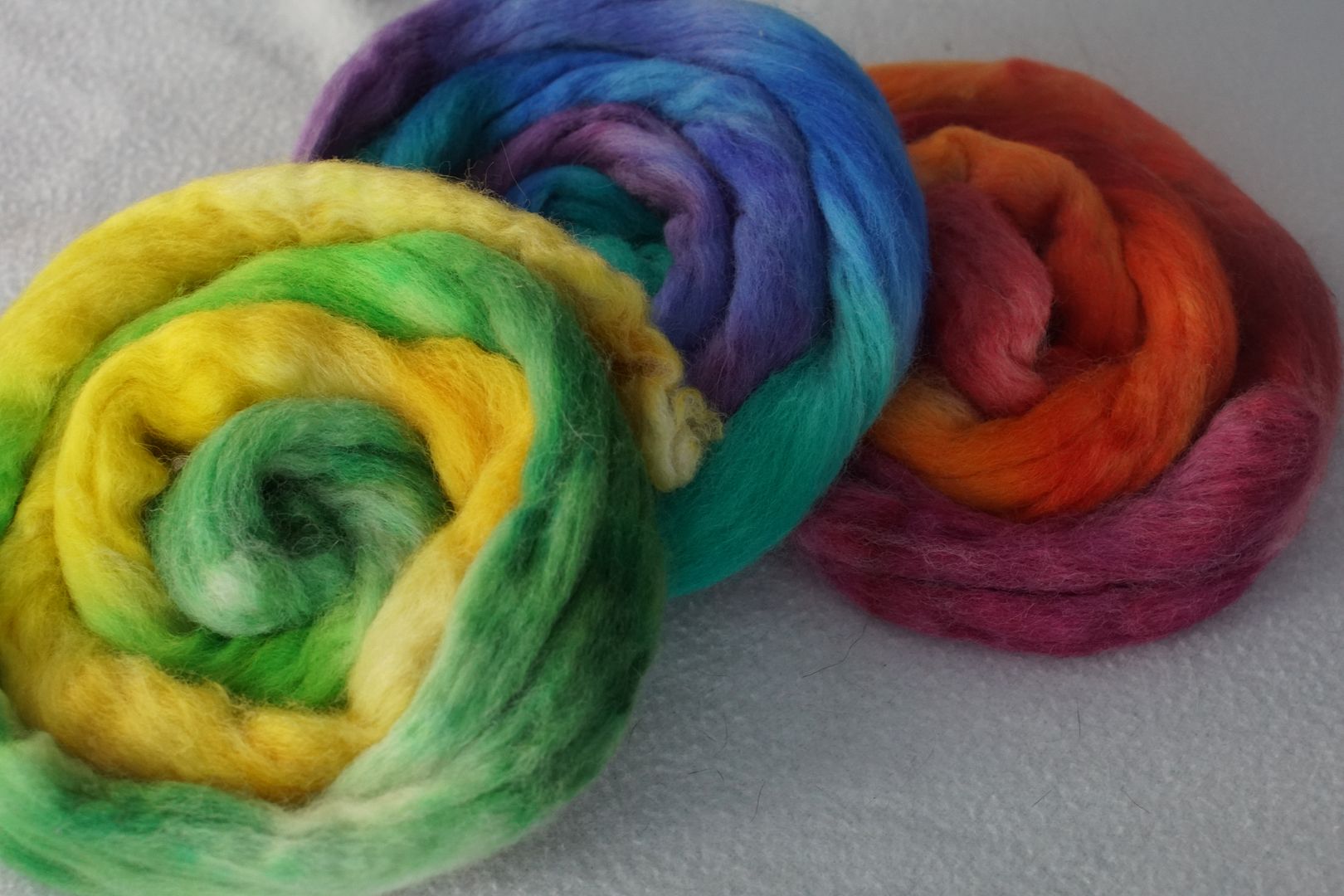
Spun up, this set is aggressively bright together.
Dark
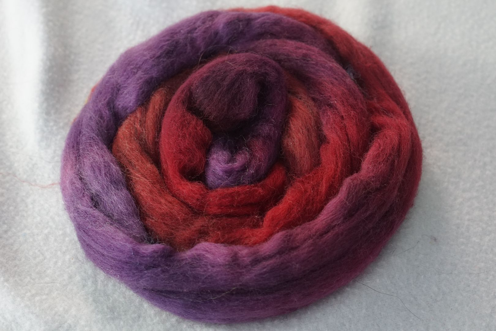
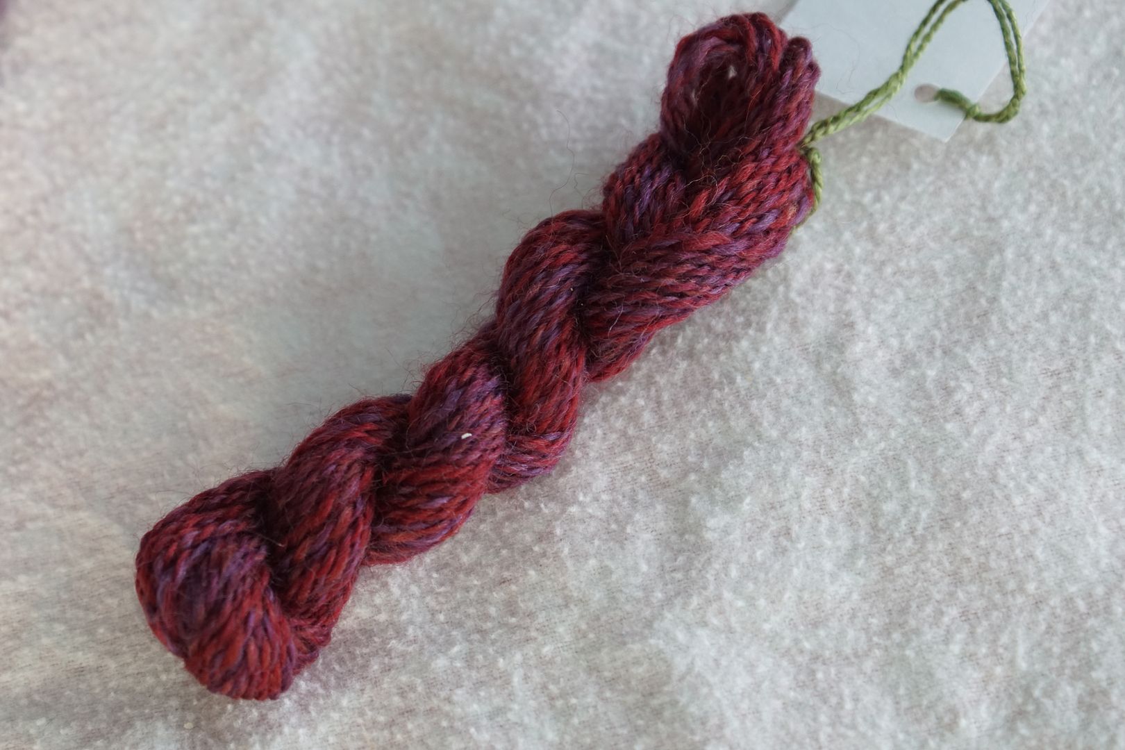
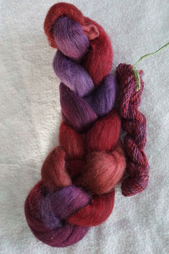
Dyeing this at 2% DOS made these colourways a bit more desaturated than they could have been, but also probably easier to deal with! The red/purple one doesn’t quite work for me, but I like the other two very much.
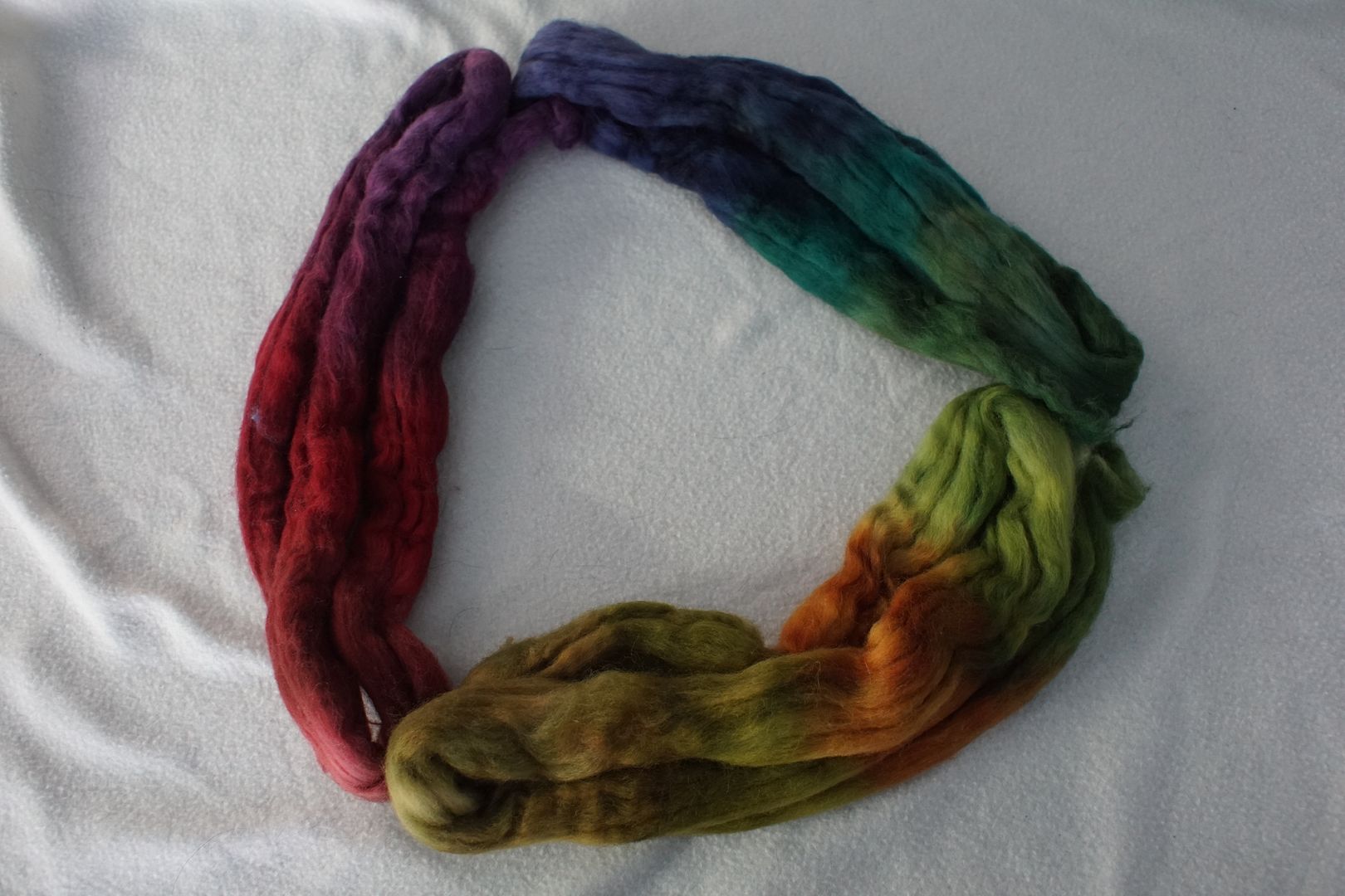
The light is kind of odd in this picture, making the finished yarns look lighter than they are. They have an earthy, wintery feel to them which I quite like.
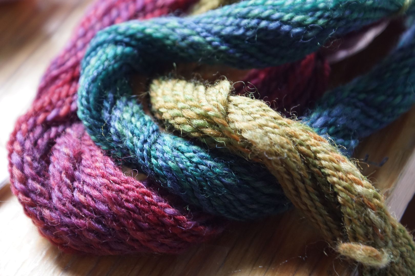
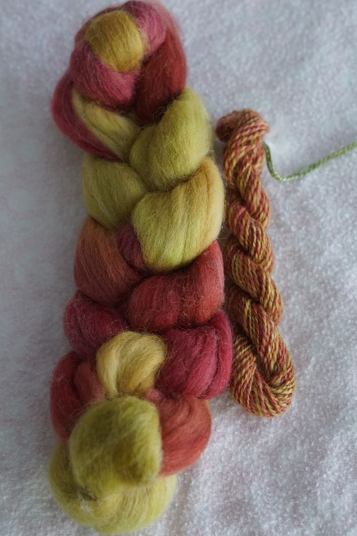
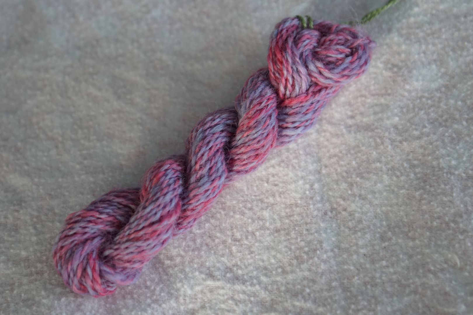
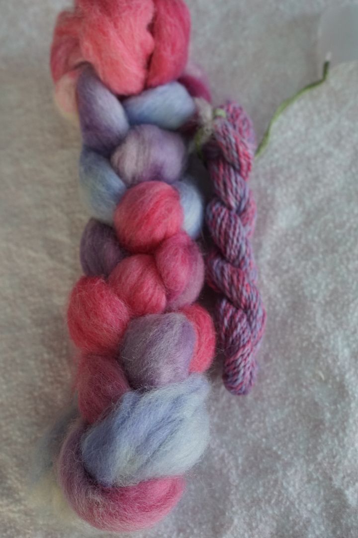
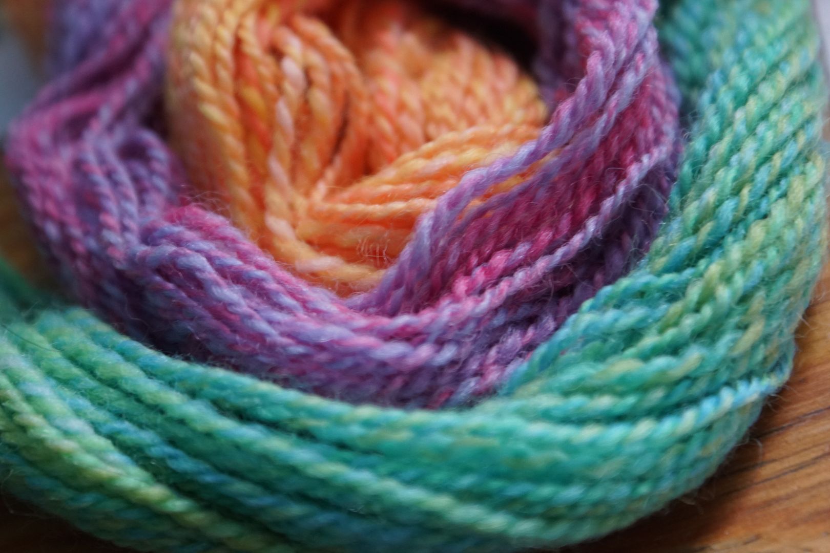
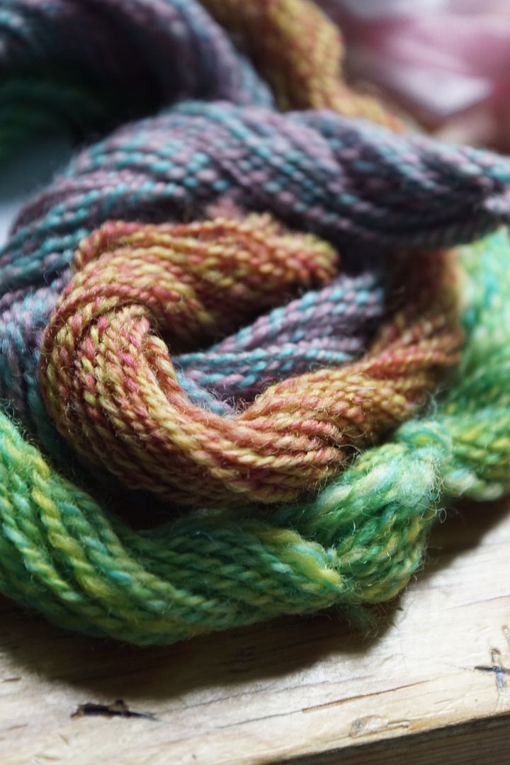
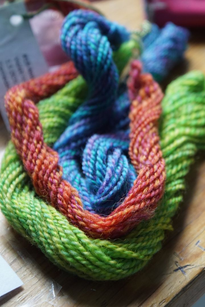
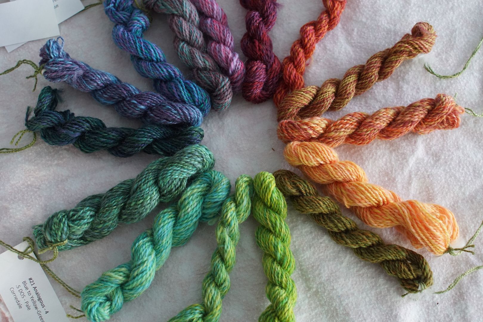
Oh a whim, I braided the sets up so you could sort of see them as they might look knit up together. Because each trio contains the whole colour wheel, they are all similarly balanced within themselves. Have you ever seen photo series of the same spot in four seasons? This feels like that. Spring, Fall, Summer, and Winter, from left to right below.
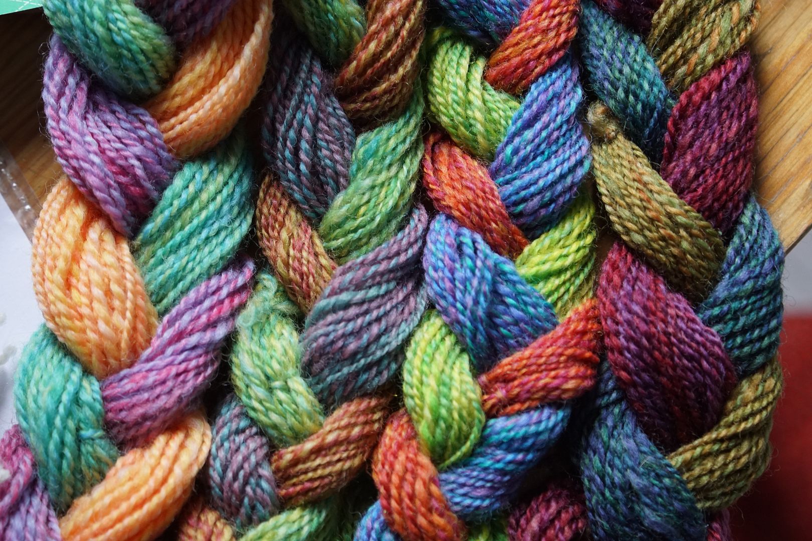
All Together Now
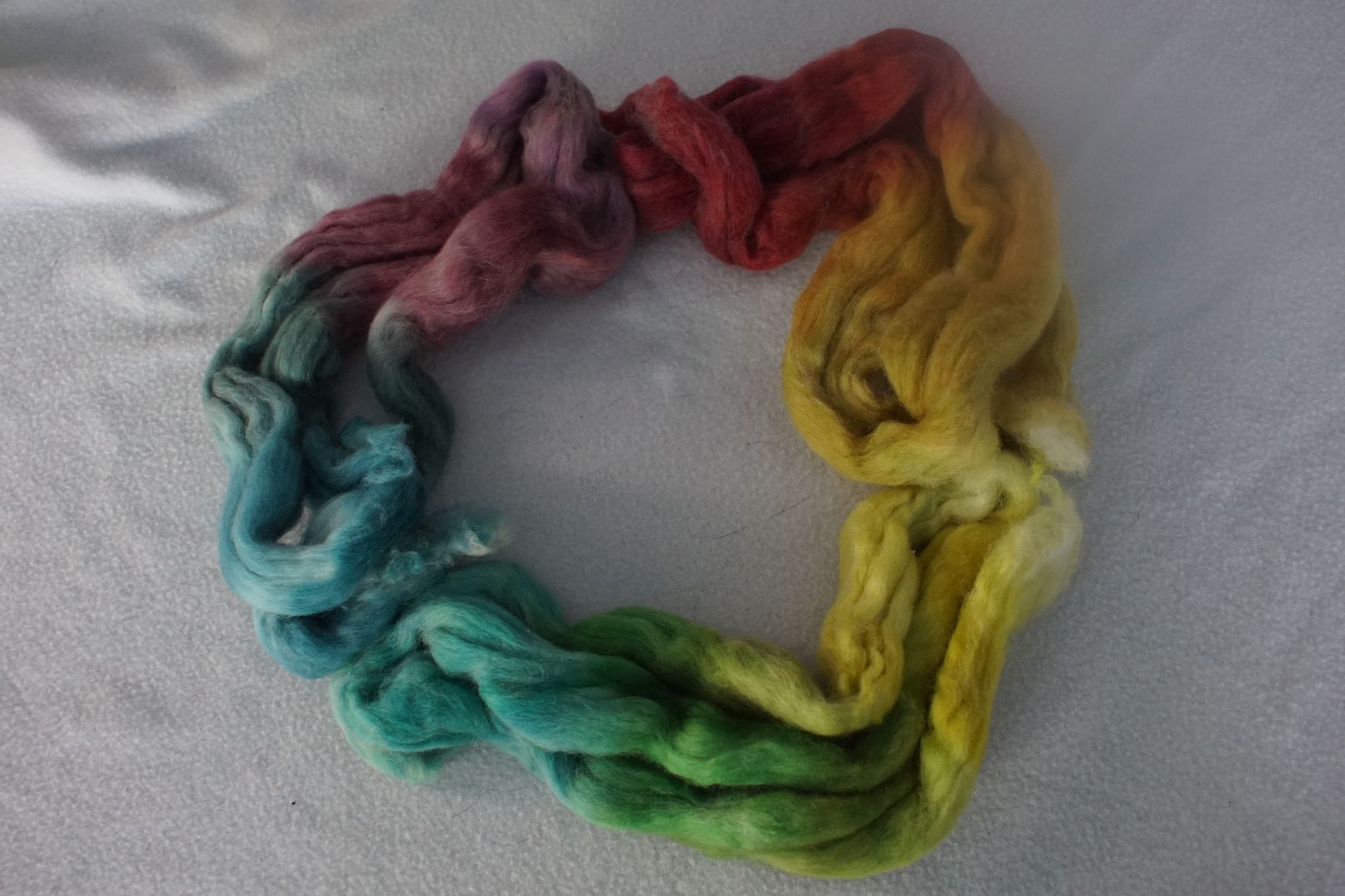
I’m obsessed with colour wheels, so I tried arranging them all together in some different colour-wheely ways.
And here are the finished samples, arranged in a vaguely colour-wheel fashion. (Including a few more samples I haven’t shown you yet; never mind that.) Their level of saturation and brightness is greatly varied, but their complexity is fairly consistent. The balance of complexity and brightness in this set of samples makes it my absolute favorite of everything you’ll see. And that’s saying something!
If you made it this far, great job! Tune in tomorrow for a few more analogous colourways, this time with a slightly different emphasis.
