Previous posts in this series:
Part 1: DOS Testing
Part 2: Carded Approximations of Dye Formulas
Part 3: Dye Formulas
Addendum: Knitted samples
Welcome back to my personal record of the dyeing adventure I started back in January! I’ve now recorded a look at my learning process on the Wool Circle, which included a high-flying look at the 53 colourways I made. This week, I’ll share the in-depth critical reflections I made for each of these colourways, including spinning small samples of each one. It was a ton of work, but it was so much fun that it flew by. Hang in there – I don’t often feel the urge to apologize for too much content, but this is a lot. It’s kind of a book. If you enjoy in-depth nerding out about what colours do when spun from handpainted top into yarn, a la Rachel & Katrina’s book Unbraided, then you are in for a treat.
Today, in the first part, I’ll share the first series of handpainting exercises that I followed, from chapter 3 of Color in Spinning by Deb Menz.
“Series 1 – Monochromatic colors. Choose four colors to paint on each roving. Do twelve rovings, one for each of the following hue families: yellow, yellow orange, orange, red-orange, red, red-violet, violet, blue-violet, blue, blue-green, green, yellow-green” (Menz, 109).
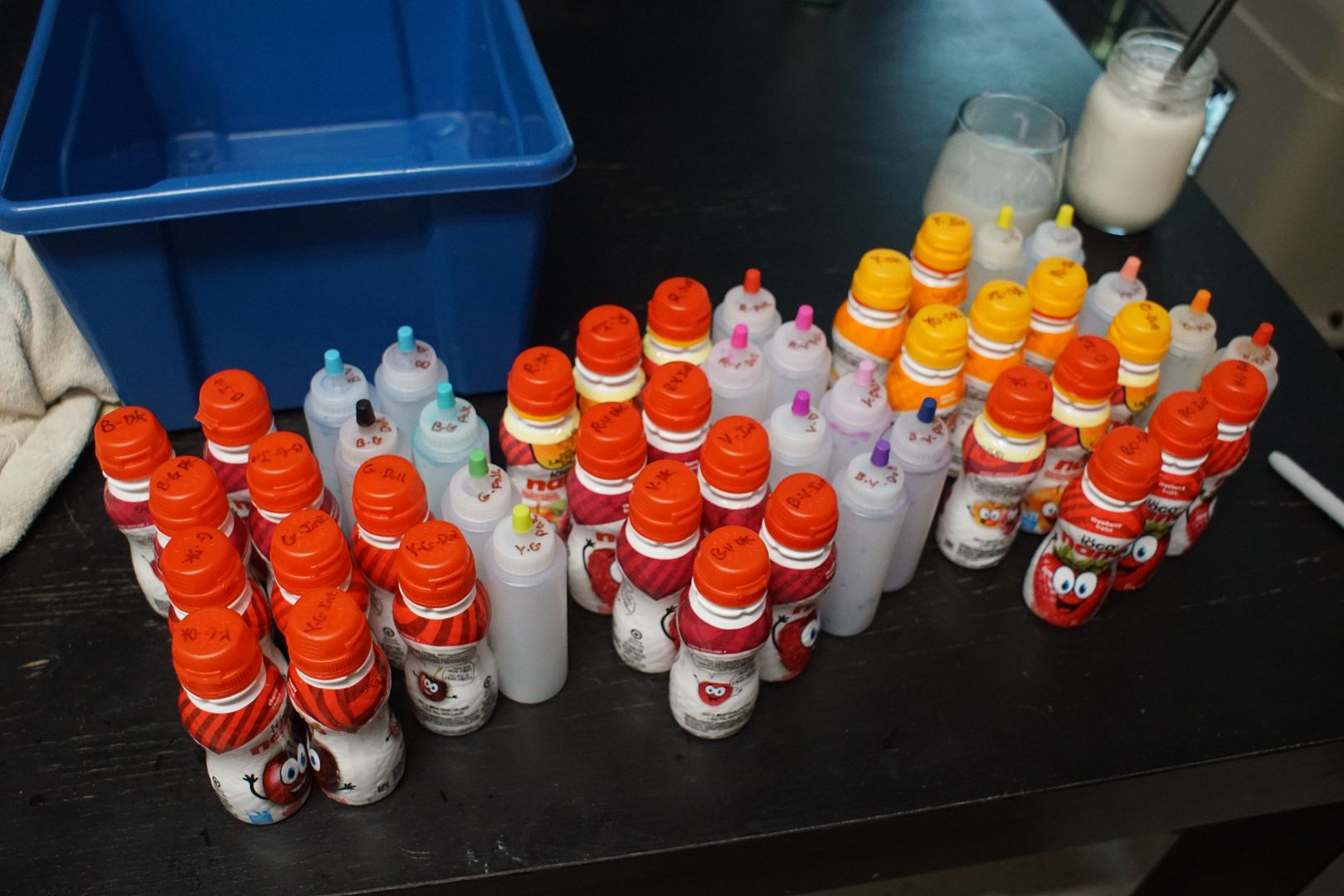
This exercise is pretty straightforward. I don’t want to go into too much detail, but after some trial and error, I used syringes to apply dye to 1 oz of fiber at a time, folded in thirds. I put them in the following order on each top: dull, dark, intense, pale. This seemed like it would connect the four shades most smoothly. Here’s what I got:
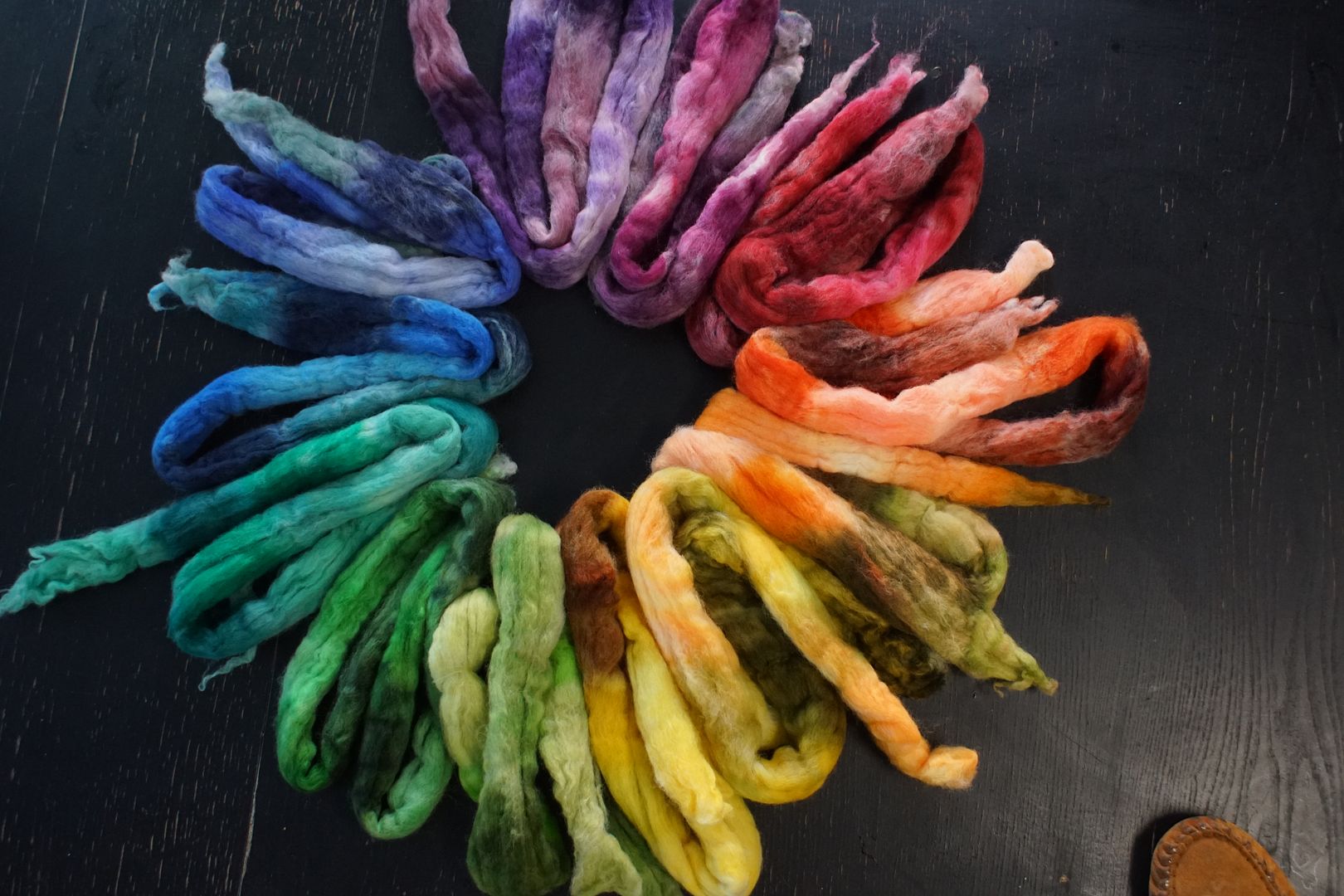
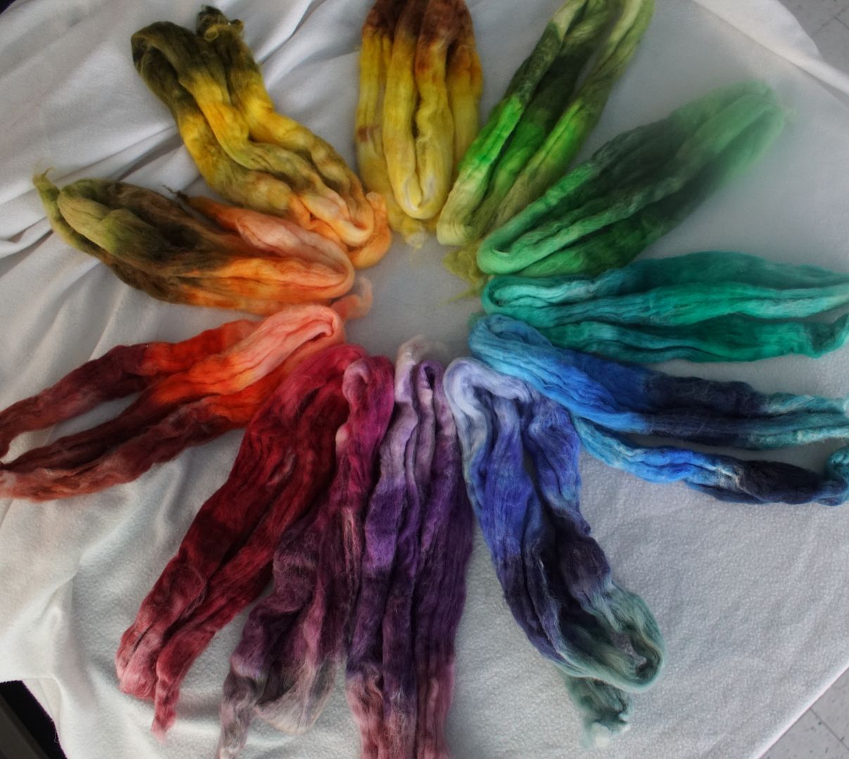
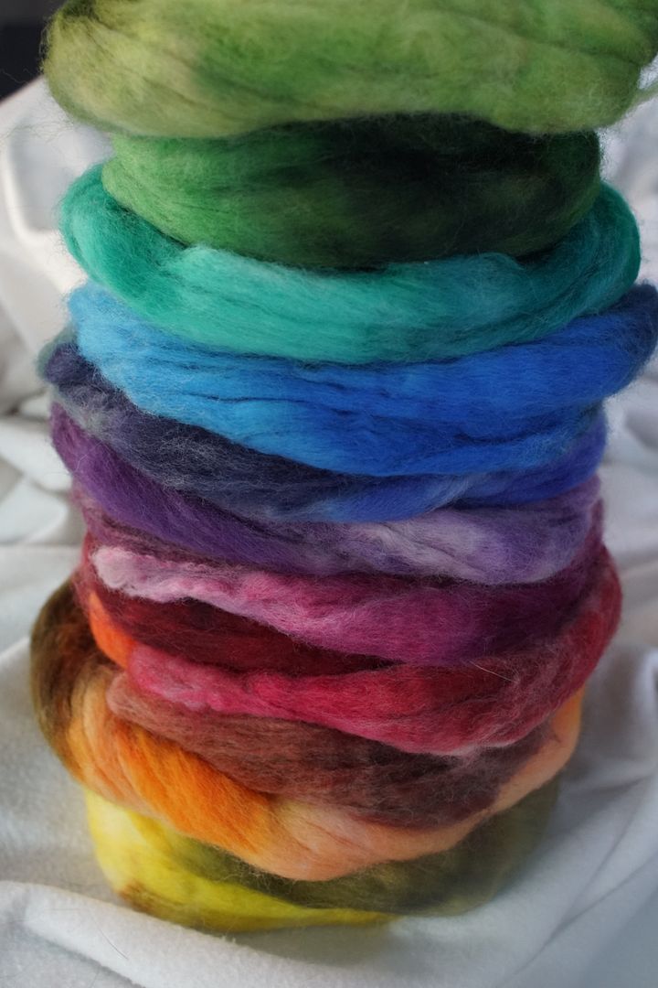
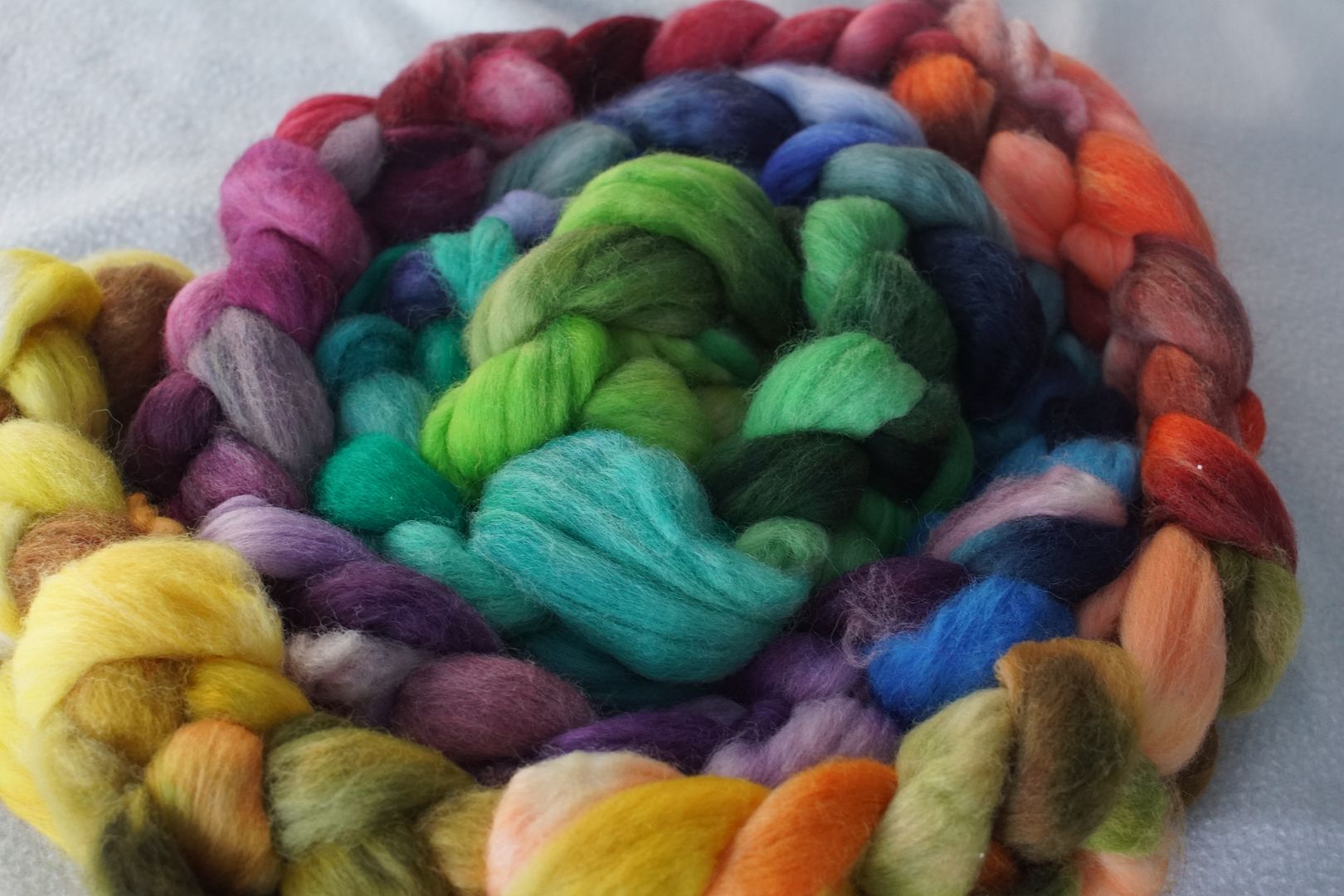
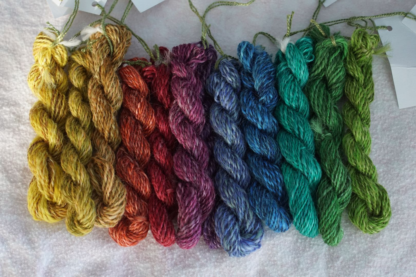
Let’s look at these colourways one at a time. A lot of this will be repetitive, since these are the same unedited dyes I reviewed in my last dye post, in the same arrangements. But this time, I’m evaluating them as colourways.
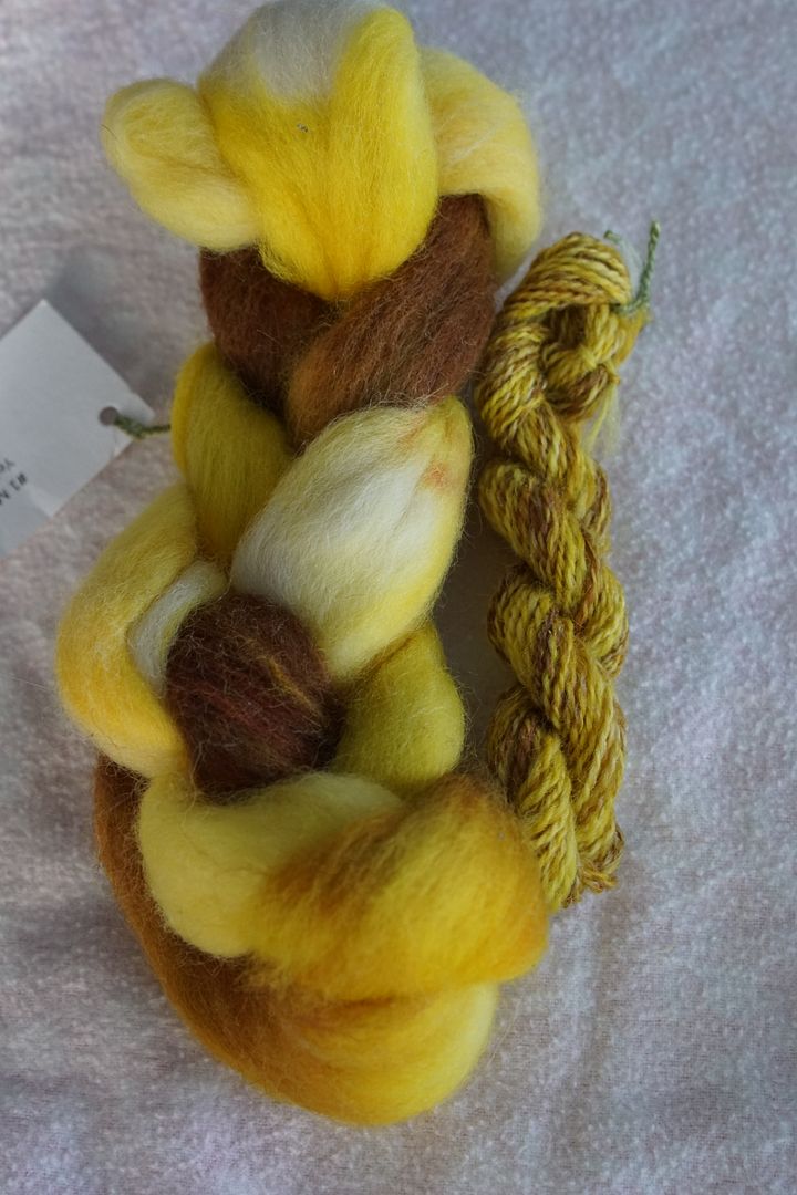
Yellow
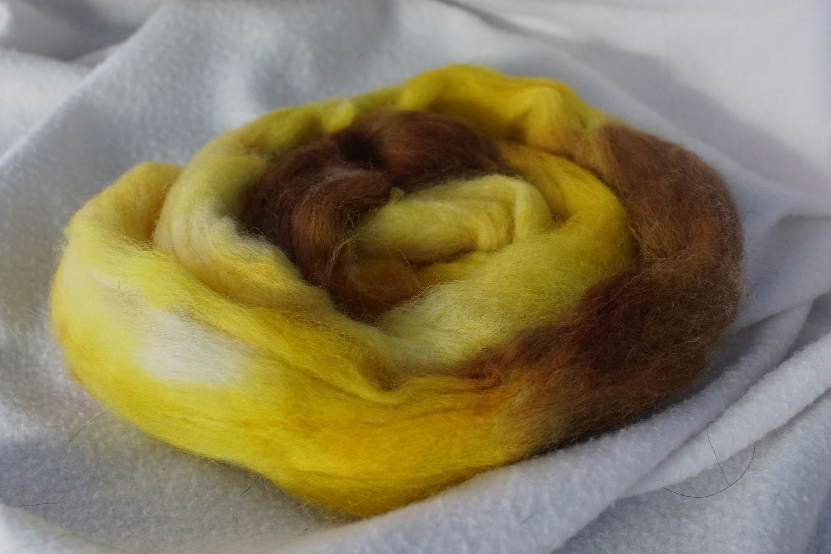
The yellow was the first one I did. I was still figuring out technique, and you can see there are some very light spots. Intriguingly, the dark yellow came out very brown. The rest of the colours are pretty straightforward, and the effect is warm and pleasing.
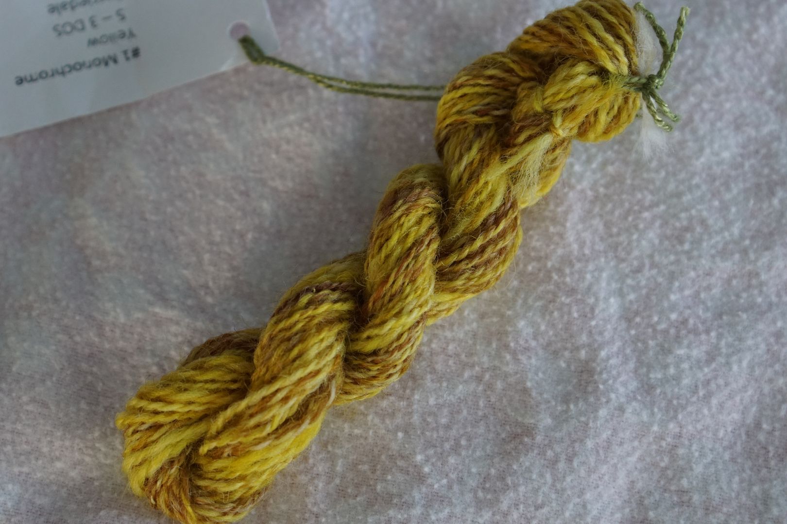
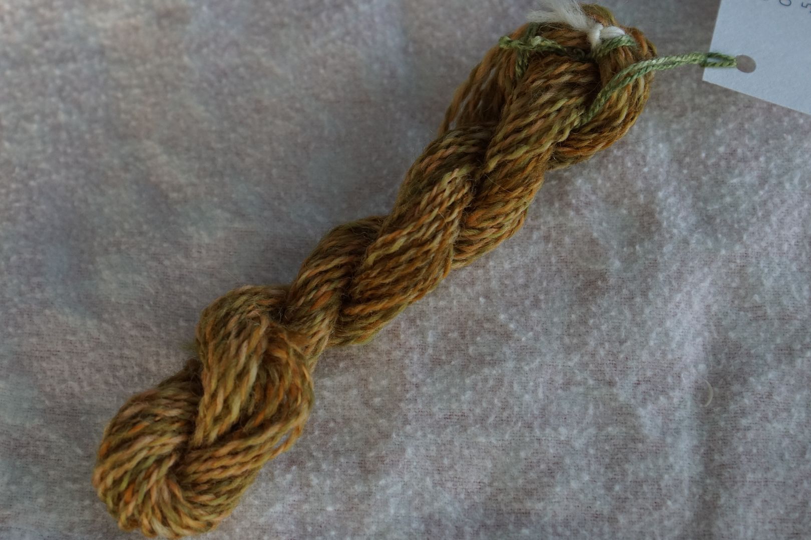
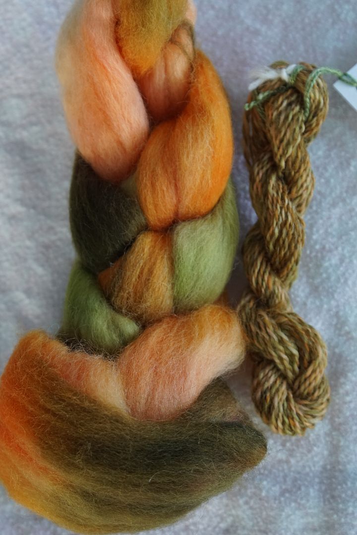
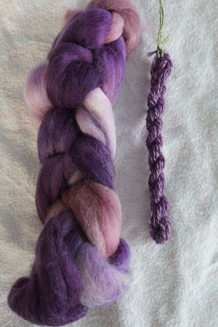
Each spun sample was made by taking a small strip from the whole top, folding it in half, combo-drafting it with itself, and then doing a 2-ply from a center-pull ball. This mixed the colours up a moderate amount.
In this spun sample, the value differences stand out, with the brown providing a warm background for the lighter yellows. Finished yarn definitely skews warm.
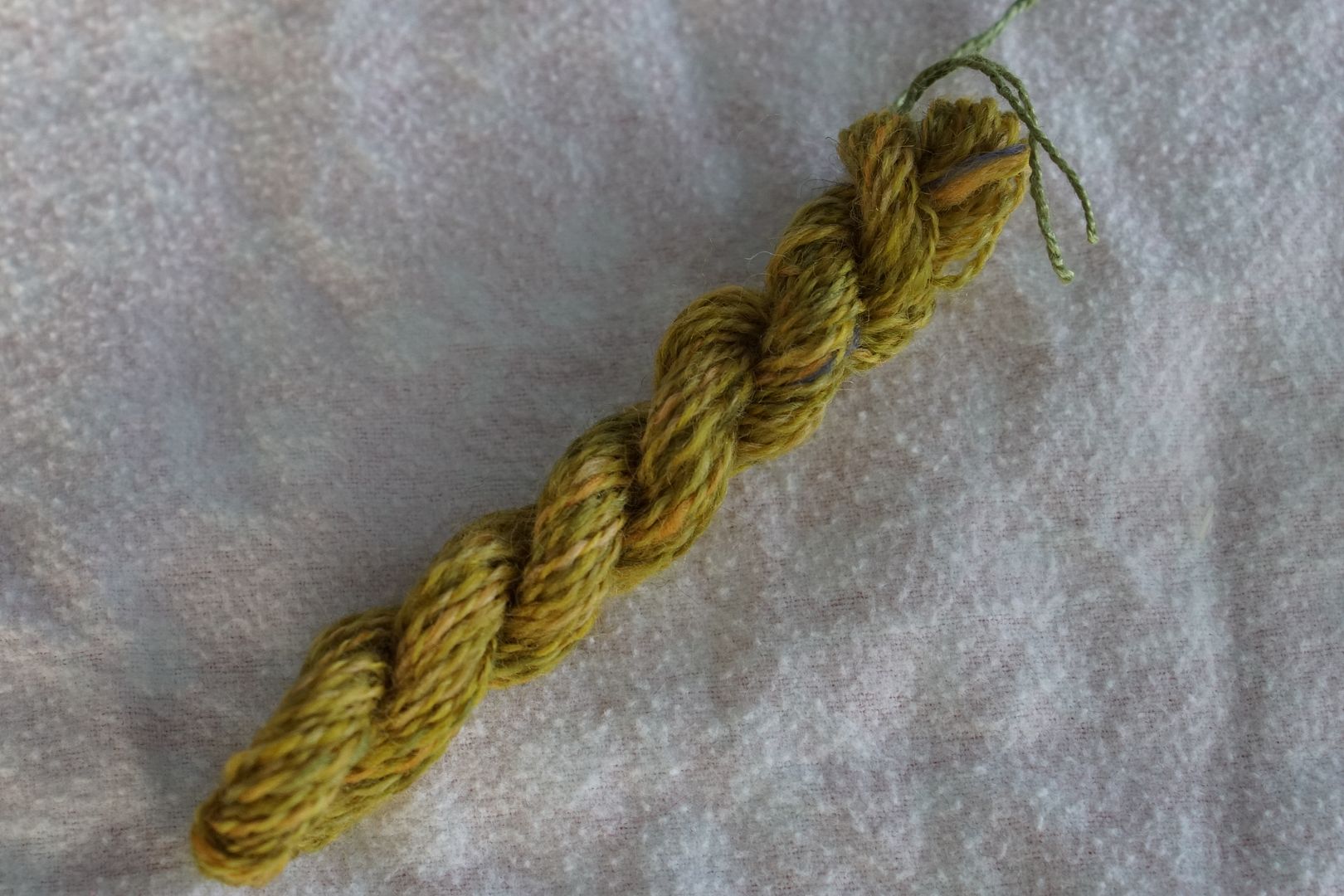
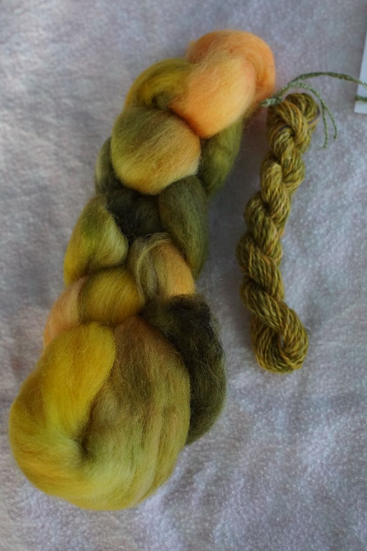
Yellow-Orange
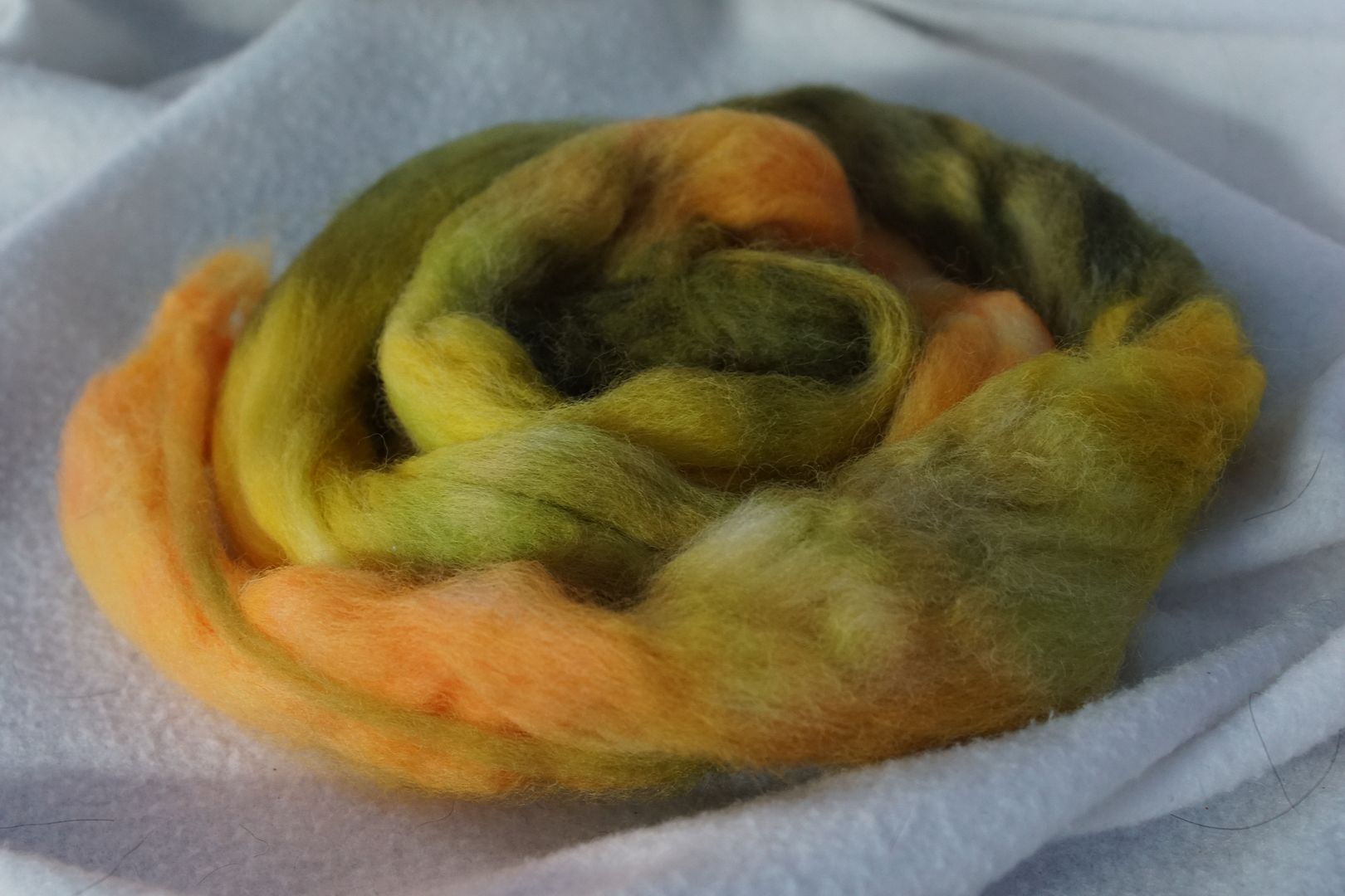
This colourway, and the orange one below, were really the least successful at being monochromatic. However, I do love all of those olive greens. It could be that they look so green because of the contrast of the brighter peachy oranges. I would be curious about what would happen if I tried this colourway again, but swapped the dark yellow-orange for the dark yellow recipe above, and added just a titch more red to the dull yellow-orange. Would that make a more monochromatic look?
Orange
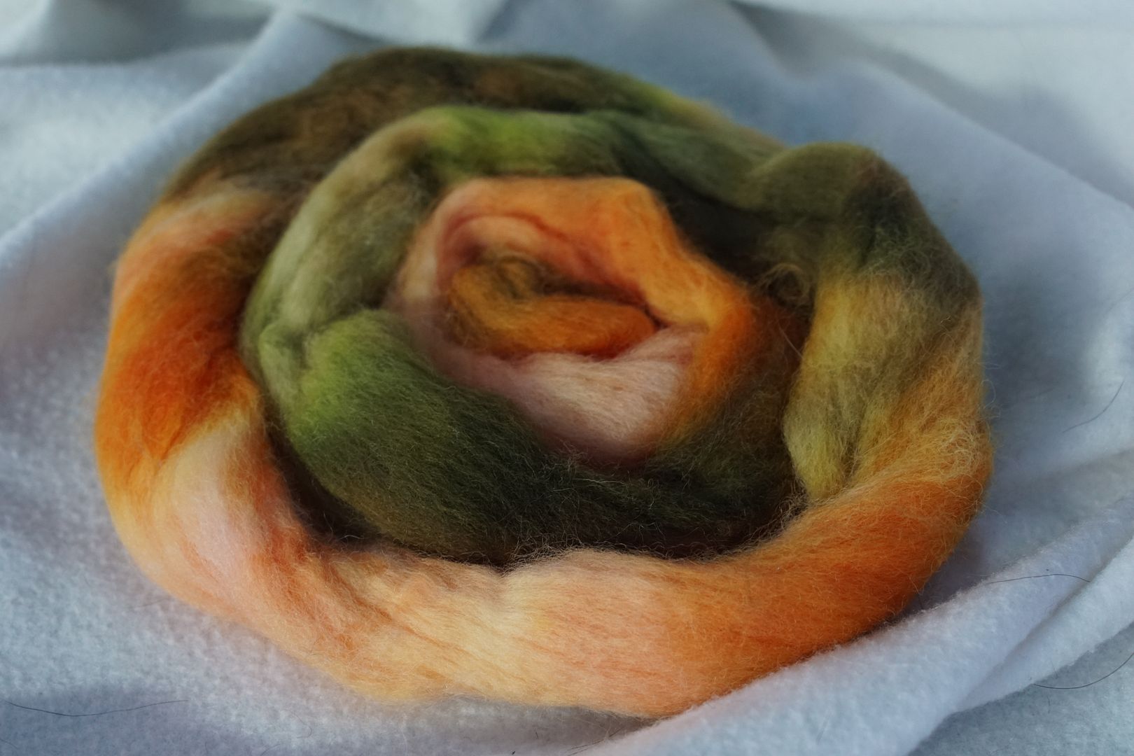
Really identical notes to the above. Would like to try again with the dark yellow replacing the dark orange, and more red in the dull orange.
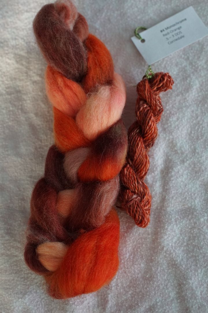
Red-Orange
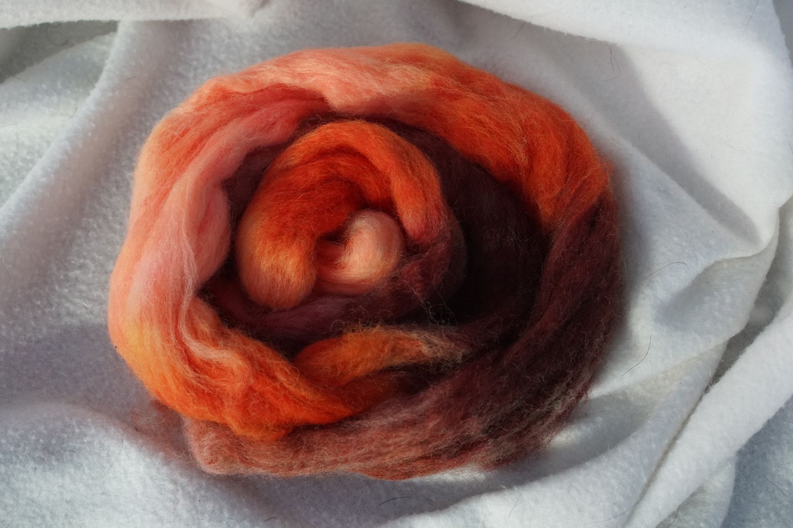
After that rough start, finally some actual monochromatic colourways. This red-orange is very tomato-y. Lots of value contrast, and the different dyes cohere nicely into a red-orange impression.
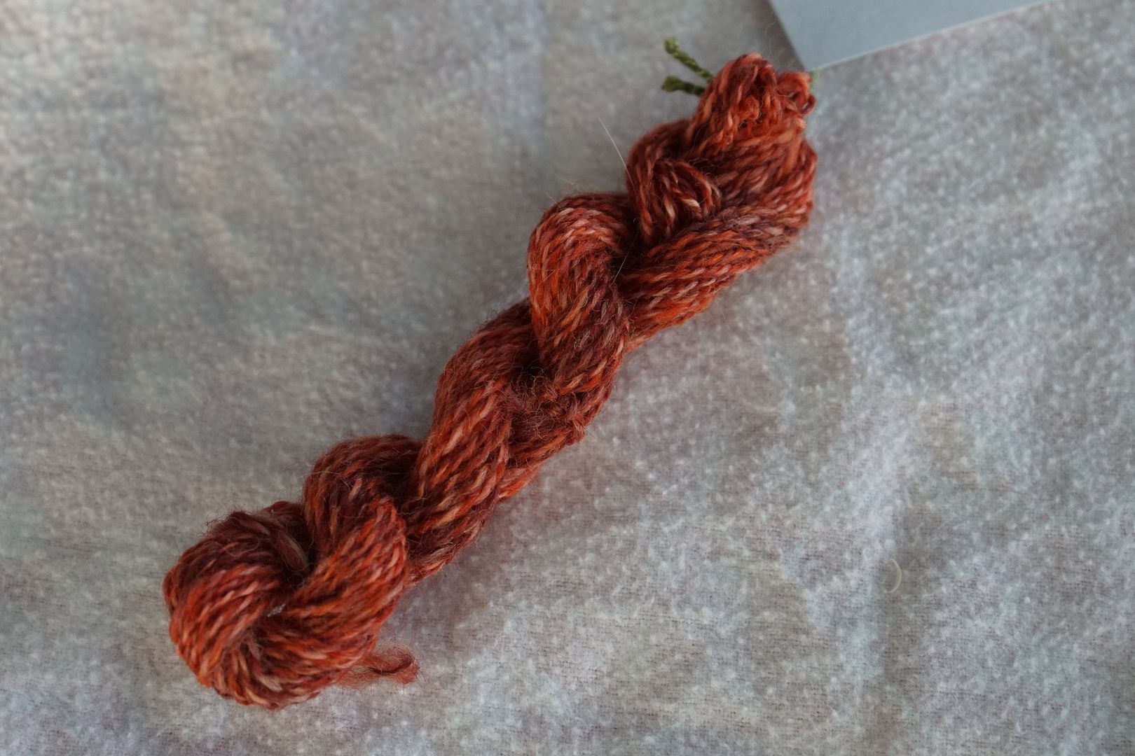
Value contrast stands out in barber poling in the final yarn, as it ranges between salmon through tomato to terra-cotta. Quite earthy still.
Red
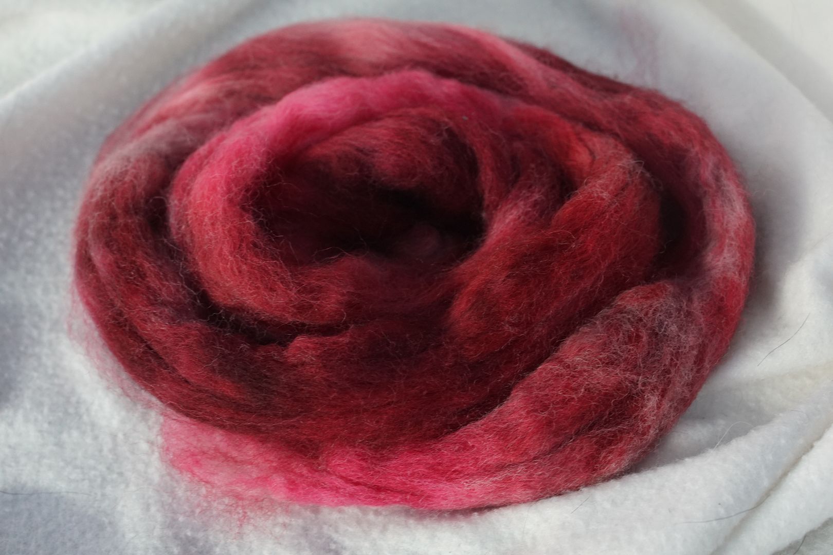
This came out very rosey to my eye, on the cool side of red I guess that would be? I was surprised that even the intense red looked rosey. I tried amending it with a little more yellow, but it just made it look dull. Should have left it as is; this is very pleasant.
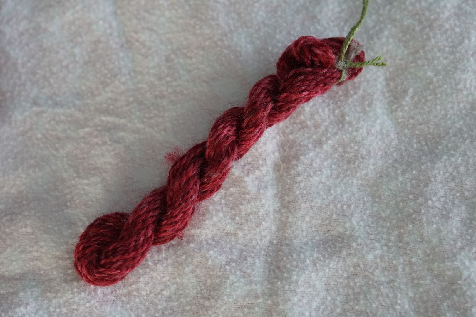
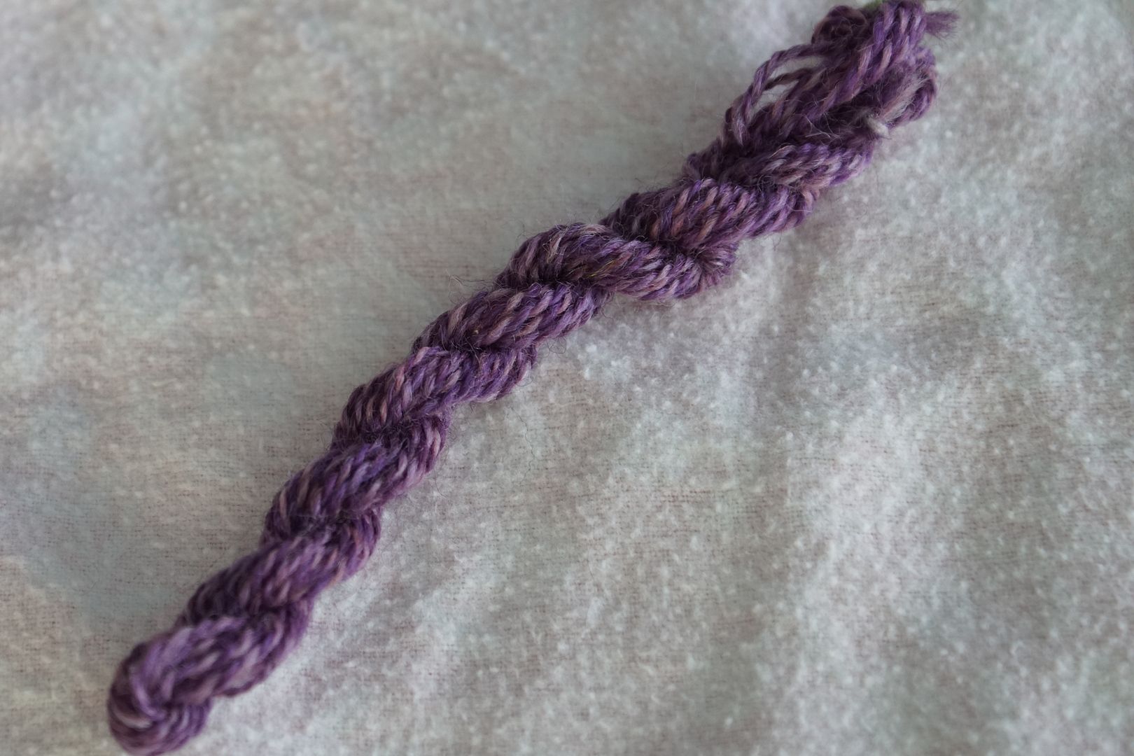
Less value variance than the Red-orange. Very rich and cool overall.
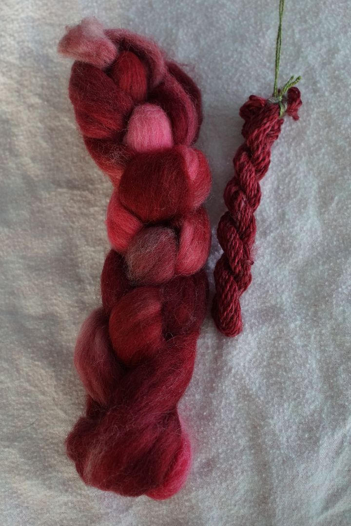
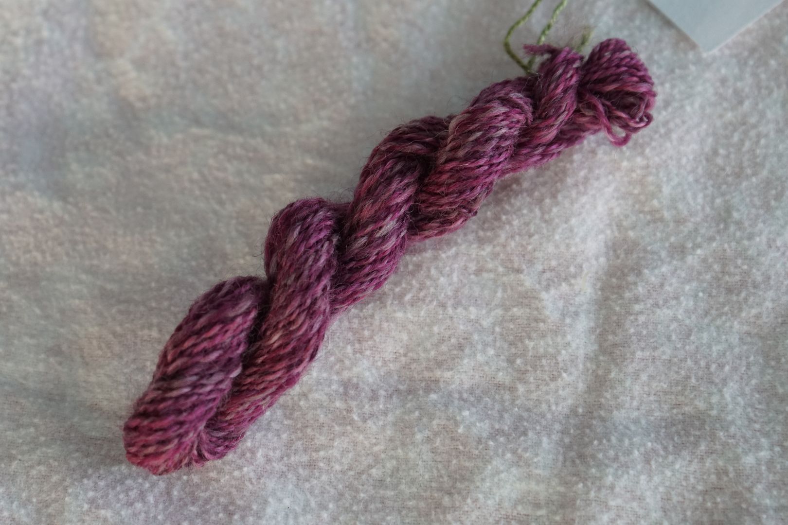
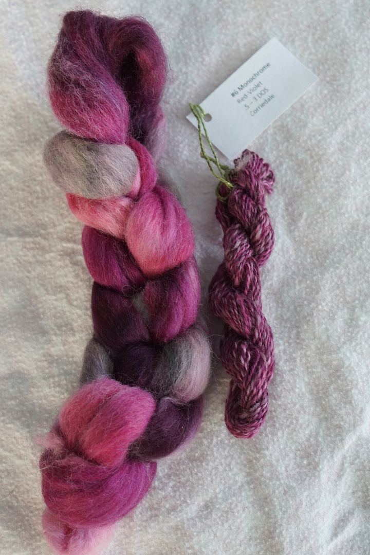
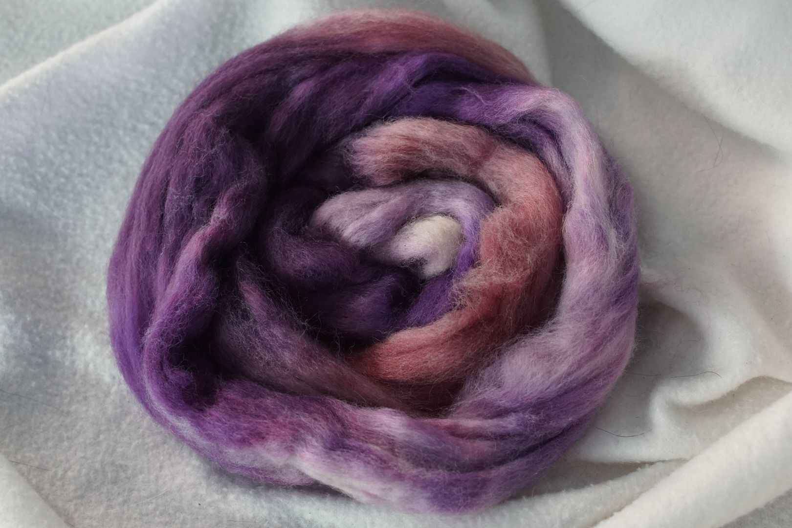
Red-Violet
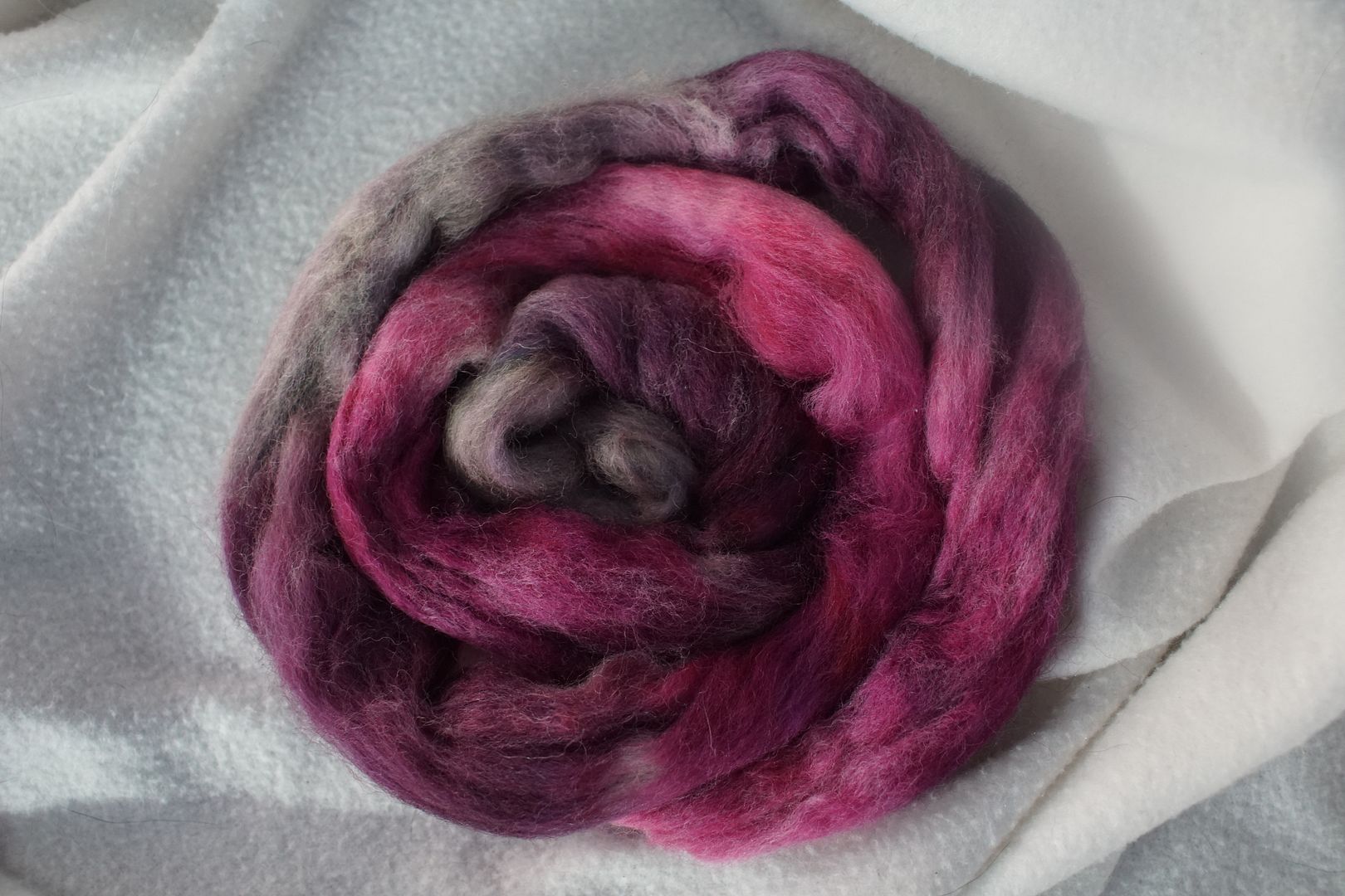
I really love each of the colours on this red-violet colourway, and I love them together. I love how the dull red-violet looks so grey, and though it might take this colourway out of the monochromatic zone, I love the effect it has on the colourway.
Violet
These look very classy together. Again, I love how that dull violet warms up and complicates the colourway, even if it takes it out of the strictly monochromatic, by adding just a hint of a hint of a complement.
Accidentally took too small of a strip from this top; spun sample is too small. Overall impression is of value-driven barber-poling; distinctions between dull and pale violets are lost. Not my favourite.
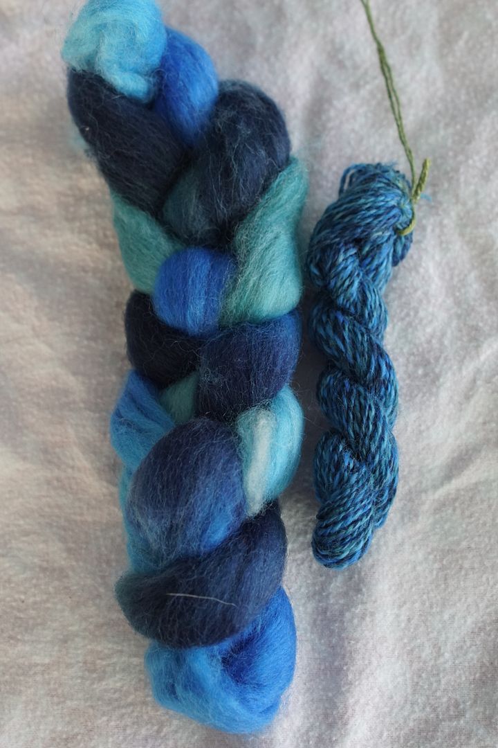
Blue-Violet
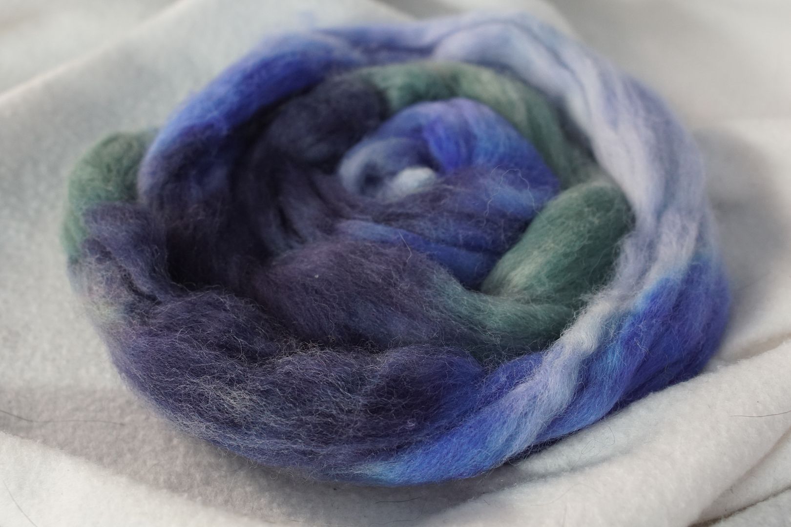
As seems to be my pattern, this blue-violet colourway so hits all my ideas of “blue” that it is only next to the blue colourway below that I can see the violet in it. The value contrast is nice, although the dull colourway is quite green in this context. I like it a lot on its own, though.
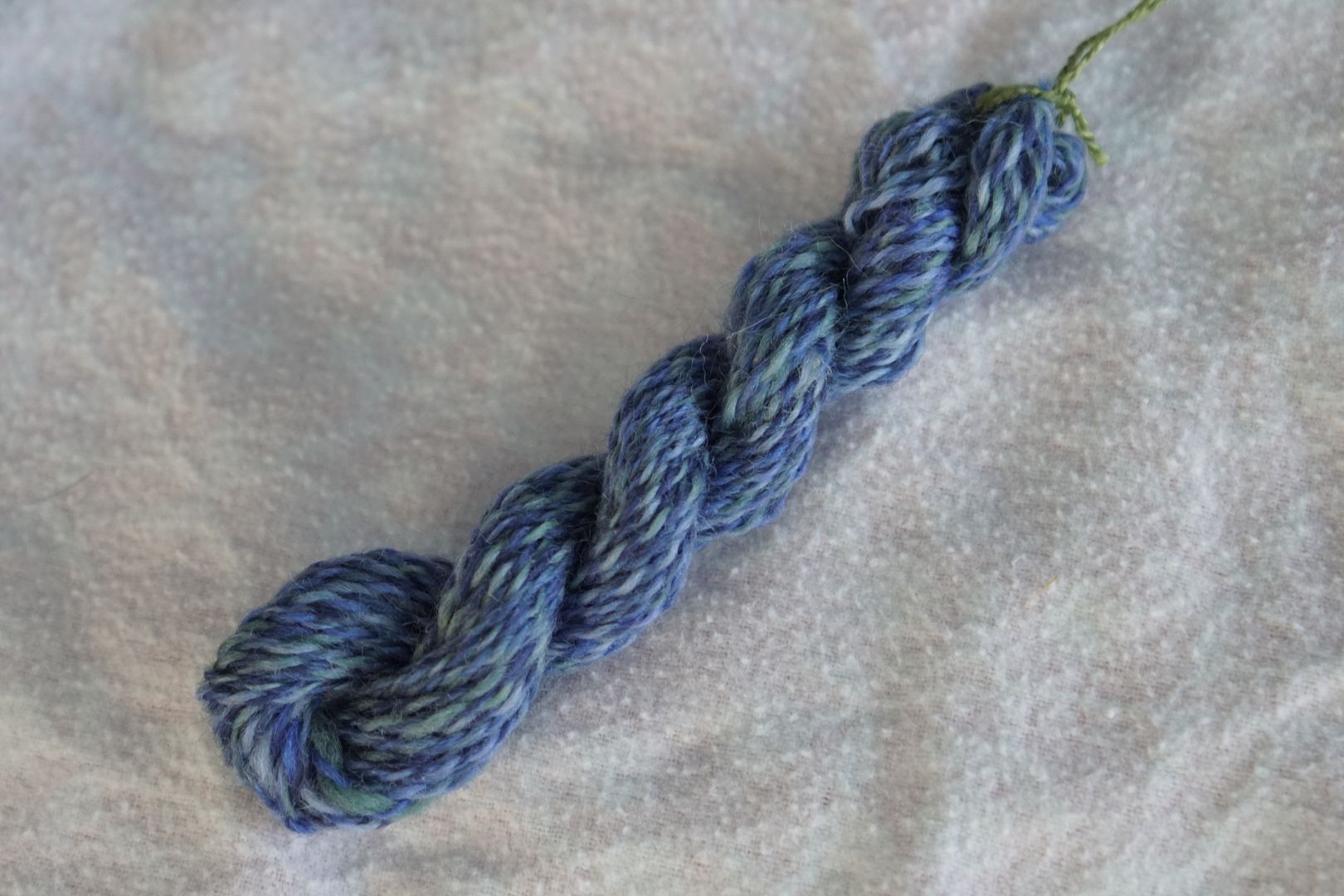
In the spun sample, value contrast took over again, and desaturated a bit. Barber poling quite evident.
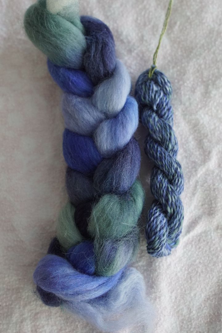
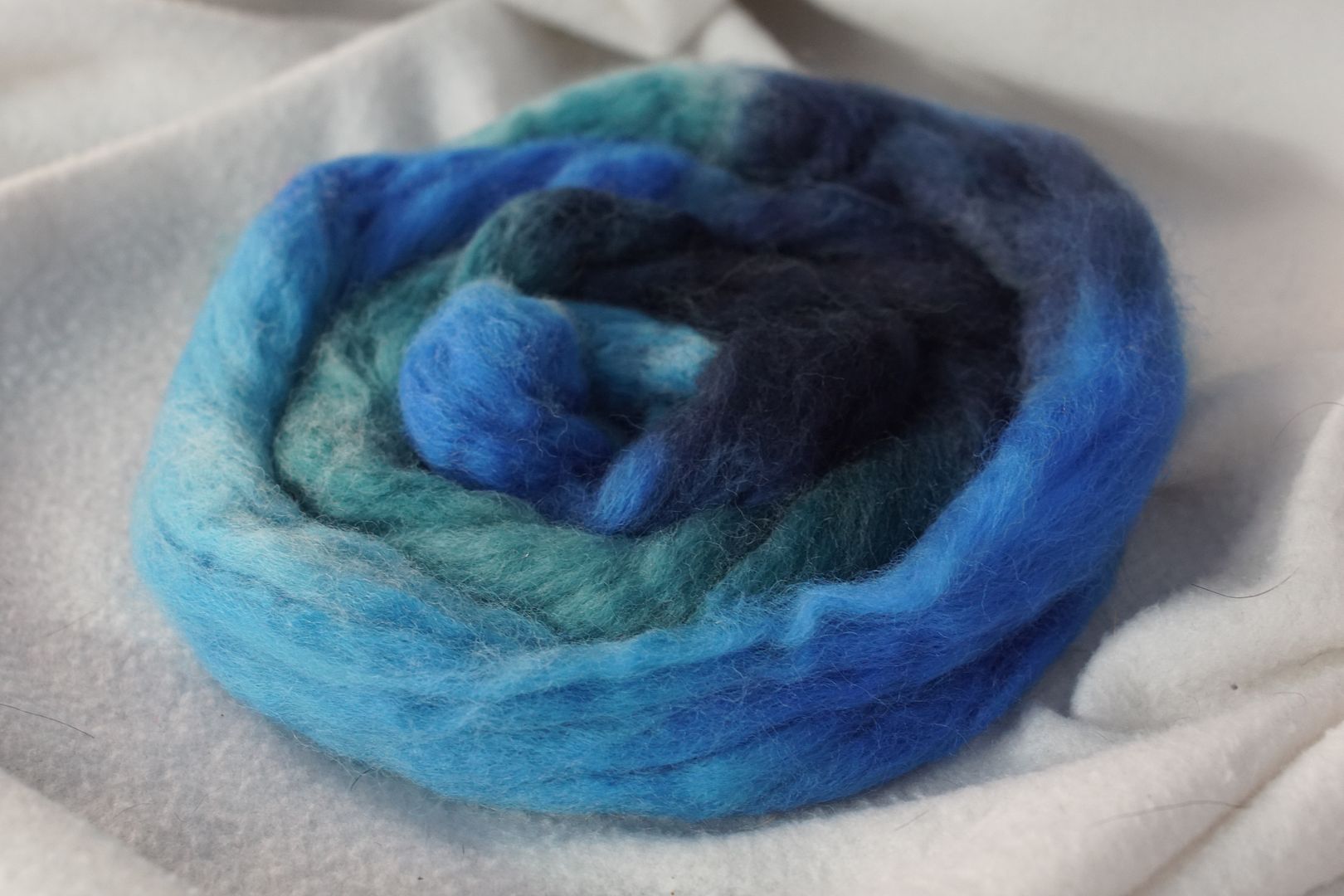
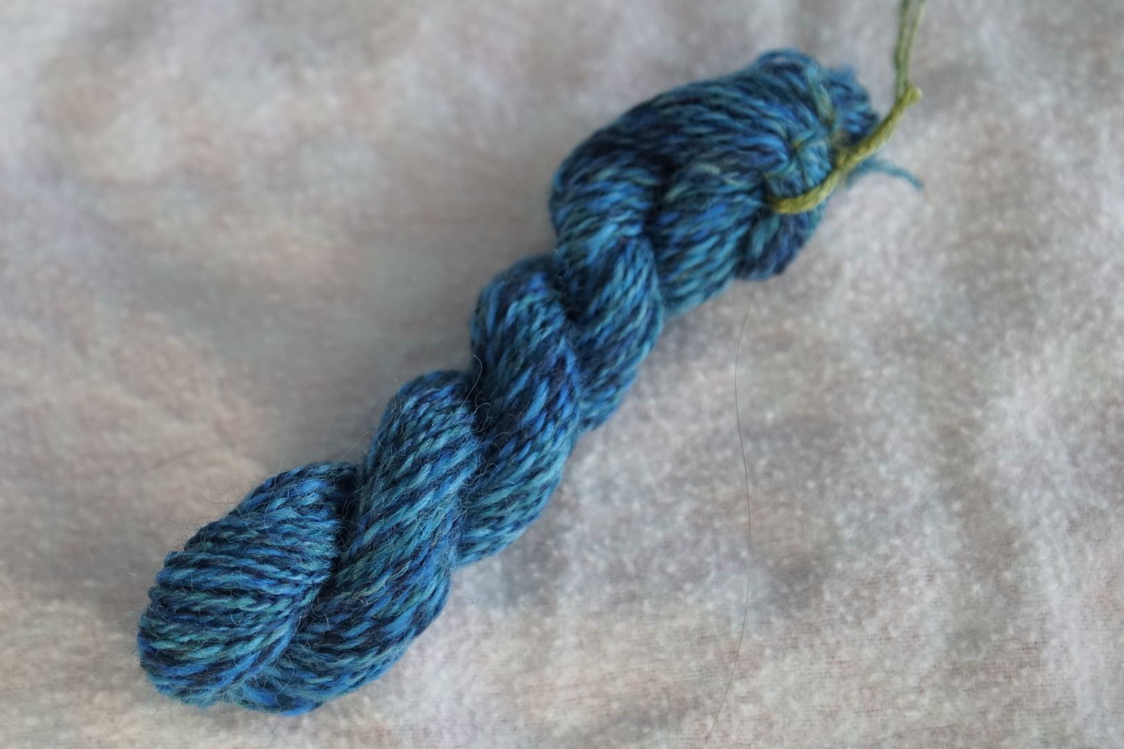
Blue
Definitely warmer than the blue-violet above. The dull blue is more blue than the also, blue-violet, so I think this colourway coheres together better than the blue-violet one. I wonder what would happen if I switched the dull dyes in these two?
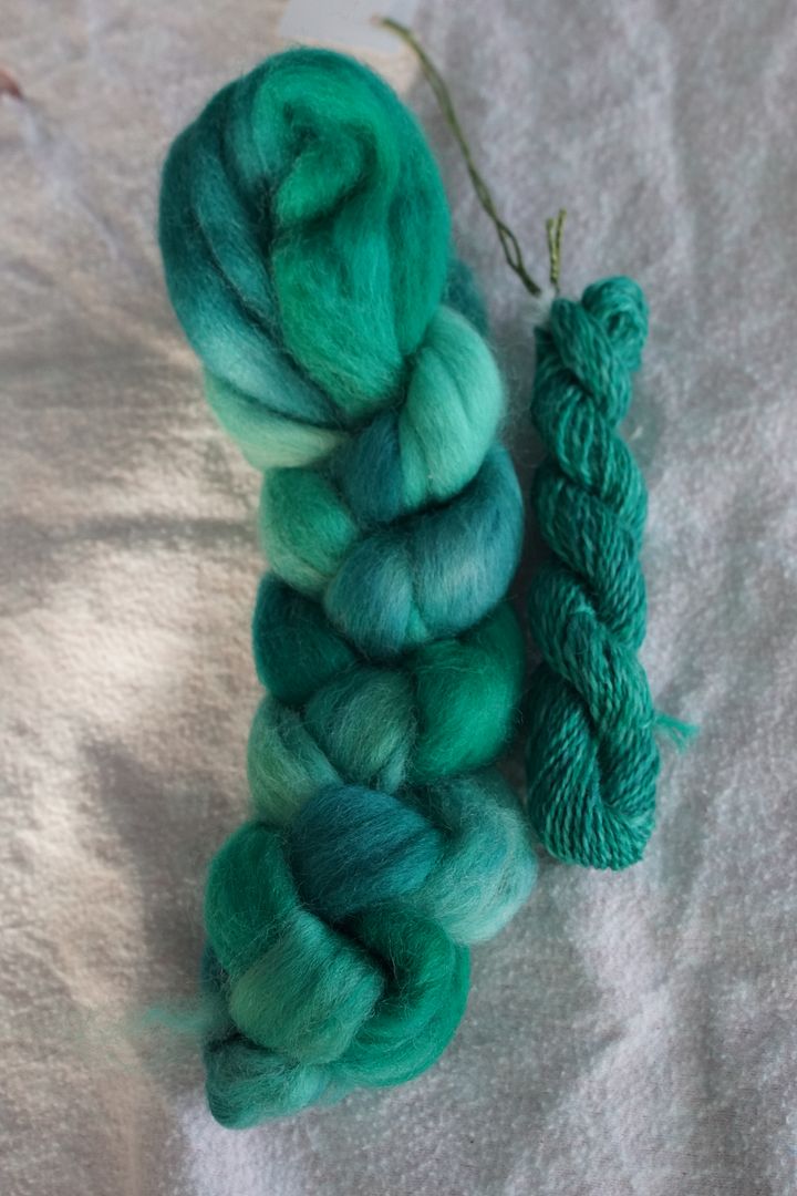
Blue-Green

This was the most uniform, by far. The dark didn’t call for any black or navy, the pale wasn’t that pale, and the dull wasn’t that dull. It’s possible that the turquoise I mixed was over-strong? I’m not sure what happened. Anyway, this is much more subtle than all the other colourways in this series, but still very pleasing.
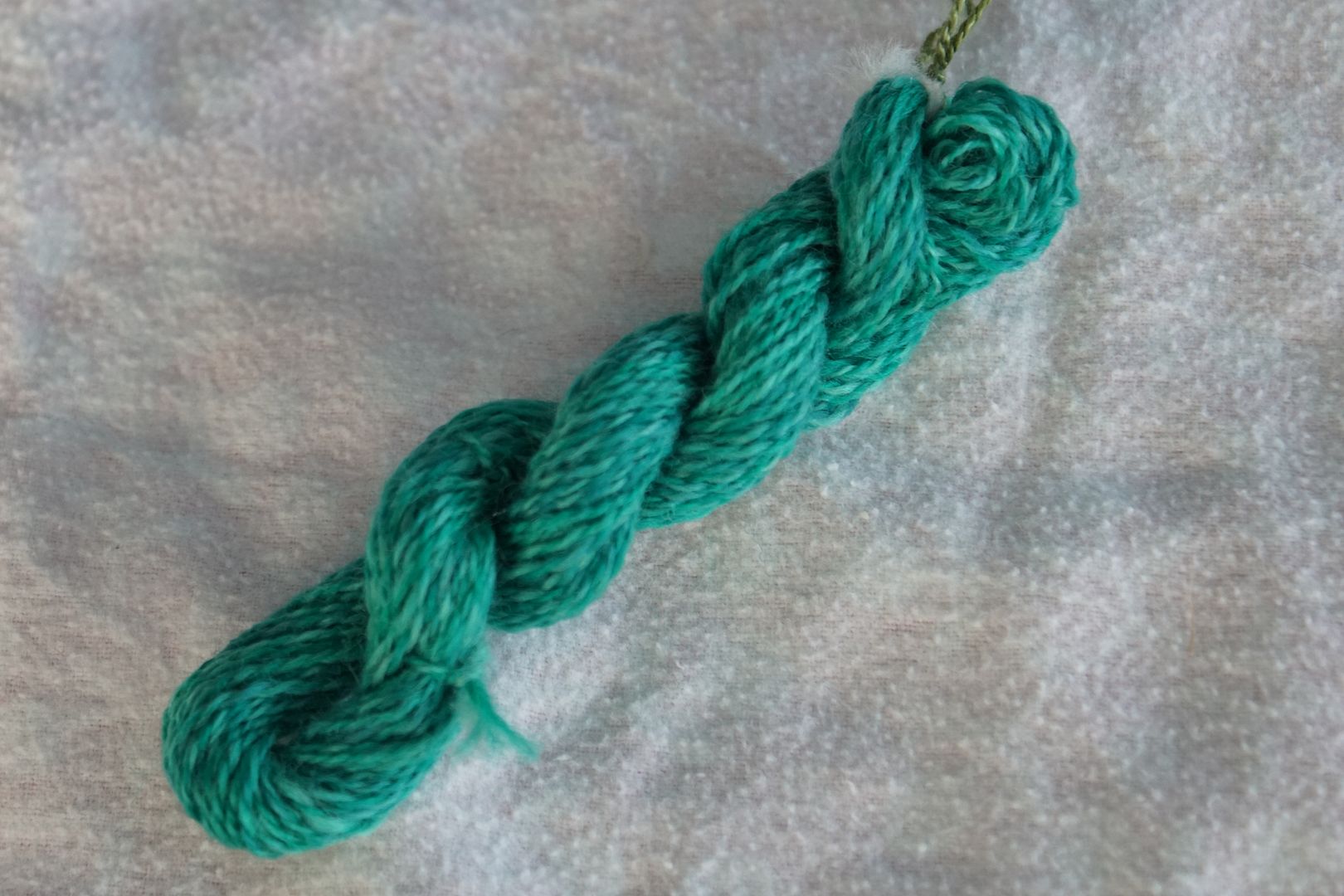
You couldn’t mistake this spun yarn for a solid, looking at it in person, but you’d be hard pressed to spot more than two dyes in it. Still has some life in it. Very bright, most saturated of these colourways.
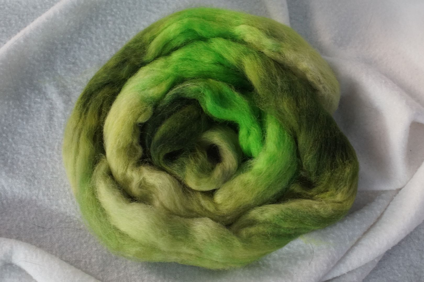
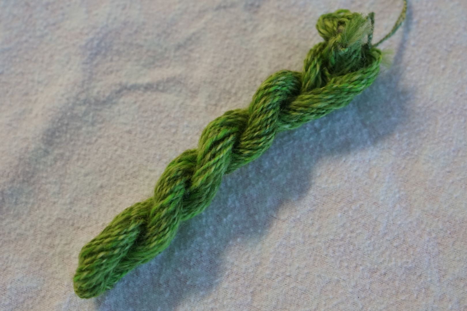
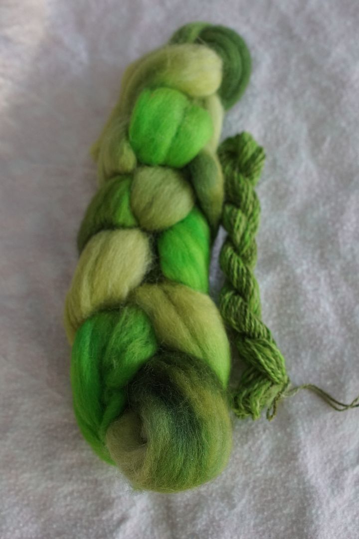
Green
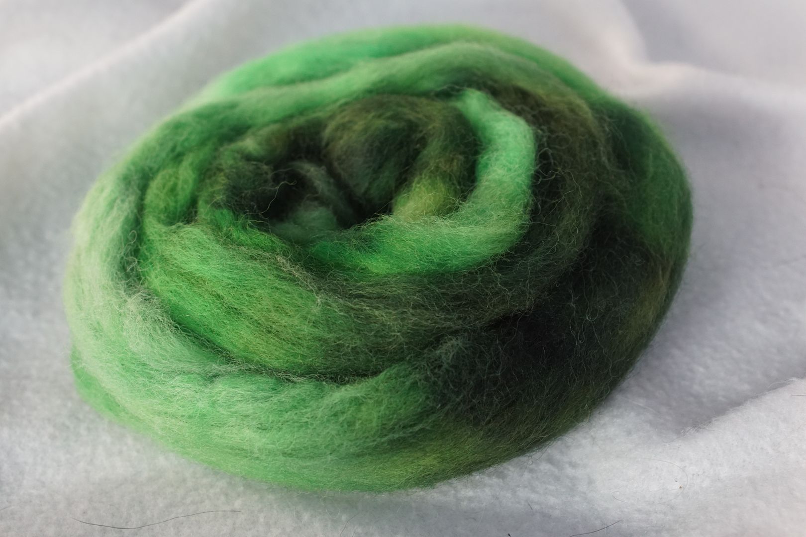
I am a sucker for green. This colourway is my favorite, except for maybe the red-violet. All the greens are very natural, they cohere together, and are still fairly different. The dull does not stand out much – I learned that I mixed it incorrectly; it should have had more red in it. Some value contrast, but not too much.
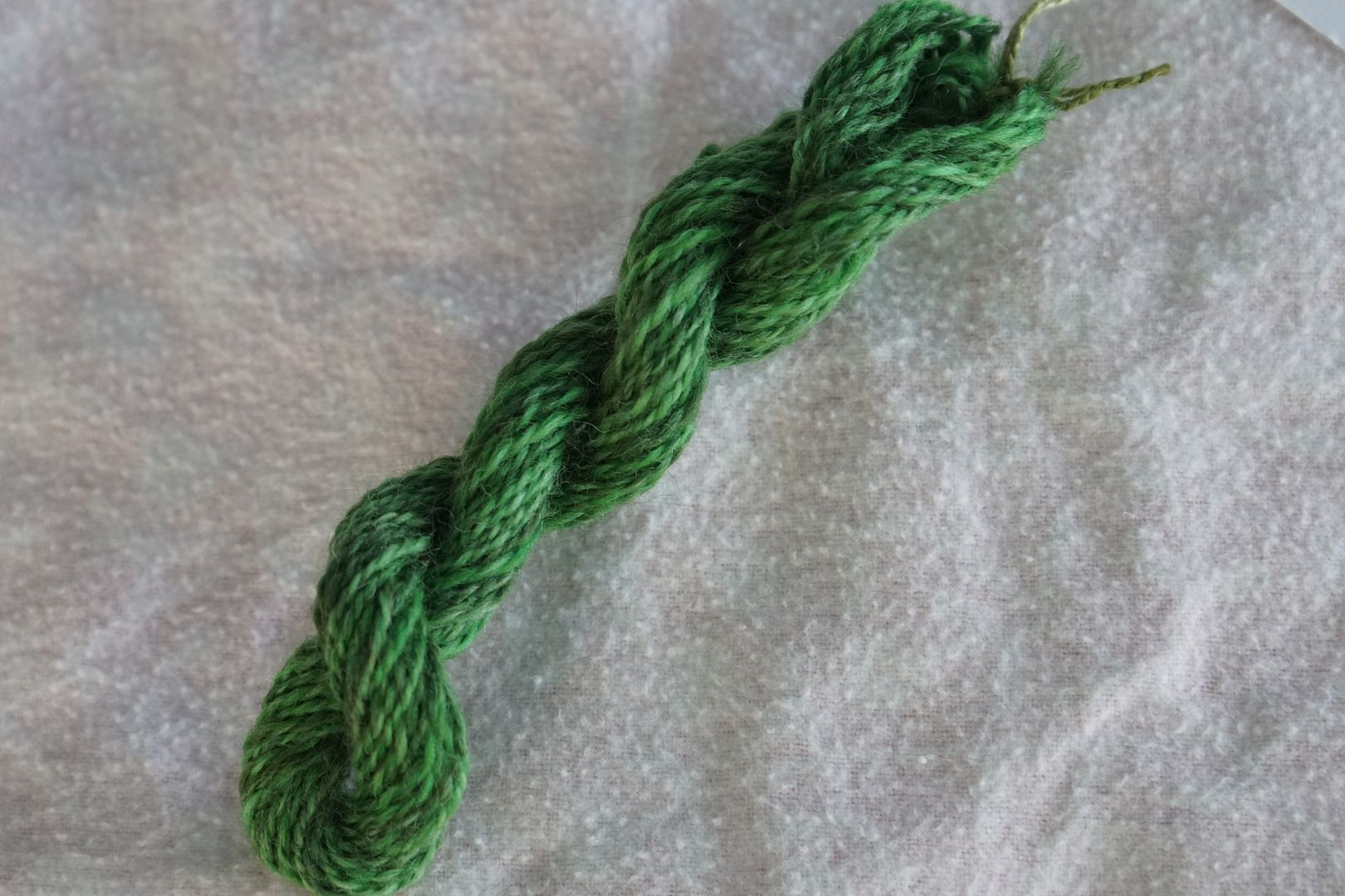
Very pleasing movement between values and hues; a green I could imagine finding in nature. Very warm.
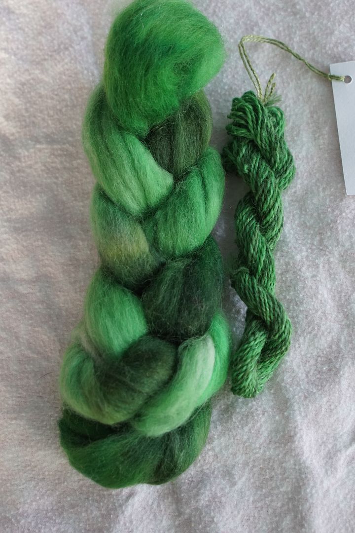
Yellow-Green
My camera really struggled to pick up the pale green, making it look identical to the dull green. It is, in fact, a bright and cheerful pale green, which pairs nicely with the intense yellow-green, making it look less garish and isolated. This is a wonderful colourway in person.
Spun sample is, again, very organic. The neon-bright intense green doesn’t take over; there’s plenty of yellow present.
Again, the colour wheel format helps one’s eye to fill in the missing pieces and glaze over the mistakes, if you choose to take it in as a whole. Or, it can help you spot where you might move things around or do them differently. These twelve colourways contrast nicely with each other, making individual look more monochrome. I’d be curious to have someone like Katrina evaluate these colourways, to see if she agreed with my assessments or not.
Regardless, I love them all, individually and together. Even with my rampant dyeing mistakes and all the white spots peeking through everywhere, I think that just adds character.
This was an excellent exercise in putting each hue family together and seeing how they interacted. 10/10 would recommend.
The finished samples are quite interesting. They’re mostly bright, and true to hue in their own way, but they mostly have a lot of value range, which desaturates them a bit. Some are also desaturated by the darks and dulls that make them more complex.
Next, what happens when, instead of putting families together, you take the same members of each family and arrange them side-by-side? That’s what we will look at next time, when I try analogous colourways.
