When Rachel and I started looking seriously at using Color in Spinning by Deb Menz as a guide and inspiration for our Year of Colour, I became obsessed with chapters 2 and 3. Chapter 2 is all about the basics of dyeing, and chapter 3 is all about handpainting tops (she calls them rovings) and combo-drafting them. Dyeing has always seemed out of reach for me, ever since my long-ago days of natural dyeing, before the kids were born. I’m a different person now, with a different approach to crafts.
When I saw the handpainting and combo-spinning experiments at the end of chapter 3 (pp. 109-110), all kinds of neurons started firing. Rachel and I love combo spinning, and combo-drafting in particular, for the complex and subtle colours that came out of them. But the results always seem a little random. Always delightful, but not well understood. Could this be an opportunity to study combo drafting more thoroughly?

So, combo drafting intrigued me. What about dyeing? Toward the end of chapter 2, Deb includes a list of fifty-six dye recipes, as a “good basic palette” (82-83). This “basic palette” seemed unbelievably complex, but as I studied it, I could see patterns begin to emerge.
Then, as I started googling the supplies, I realized that several small jars of Jaquard dyes and a few pounds of cheap commercial top would cost me about as much as an fairly expensive sweater quantity of yarn. That seemed well within my reach. Why not try?
The next several posts will take you through my process as I worked my way through the recipes and exercises in Deb’s book. There are many simpler ways to approach dyeing, but I was desperately curious whether the recipes from the nearly two-decades-old book would produce relevant results. And the exercises were simply irresistible. Some parts might seem fairly repetitive, but these sections are more for my learning records than to entertain you, so feel free to skip ahead to pretty pictures.
I also subscribed to the School of Sweet Georgia, and watched Felicia Lo’s two main dyeing classes to learn the basics of dyeing.

The dyes and wool arrived in the depths of winter, just before Christmas break. I patiently waited through half of January, and a variety of school closures, until a day came when all three of my children were in school. I dropped Dooner off at preschool, drove home, and ran up the stairs to mix dye powders.
Dye Choices
I could buy the exact dyes that Deb used, Sabraset dyes from ProChem. But they only came in 2 oz quantities, and I frankly wasn’t ready to commit to dyeing the amount of fiber that could cover. My preference was to buy a wider range of a smaller amount. So I spent half the money and got a quarter of the quantity, buying Jacquard dyes from Dharma Trading Company.

I did my best to choose Jacquard shades that would match the descriptions Deb gives on page 65. I knew this might be a fruitless effort, but I made the best choices I could with what I knew. I did know that some of my choices might not match, or might prove redundant. So the first thing I wanted to do was to get to know each of my dyes a little better. To see the full process, check out the Wool Circle episode 97. [add link] All you need to know is that I carefully measured 1g quantities of Corriedale top, and dyed them at the following depths of shade, or DOS: .25%, .5%, 1%, 1.5%, 2%, and 3%.
(Depth of Shade refers to the weight of dye used relative to the weight of fiber. A 1% dye solution, for example, would use 1g of dye for 100g of fiber. With dyes, it doesn’t matter how much water you use; water just affects how the dye moves around on the wool. The weight of dye is what determines the total overall concentration of colour.)
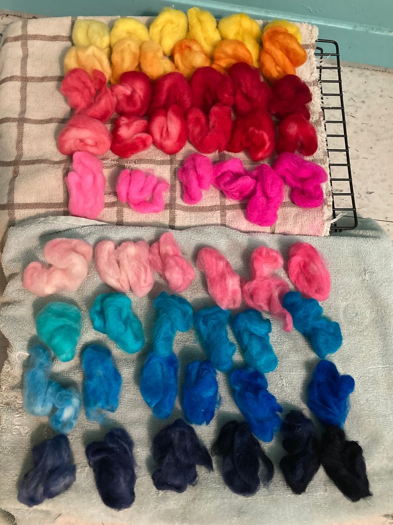
As you see, some of them came out rather blotchy. There was a resist effect from the way I had wound the little bits of fiber into nests. I loosened up later batches, which helped somewhat.
I pulled a staple length off of each of these tufts and installed them in a notebook. When the colours were blotchy, I carded them up a bit; hopefully this gave a good approximation of that DOS. Based on those results, here is how I decided to use these colours in replicating Deb’s dye recipes from Color in Spinning. (Yes, all the cards say “Dharma” when they should say “Jacquard.” Oops.)
Jacquard 601 Sun Yellow (Primary) – Sub for Sabraset 180 Sun Yellow. This seems like a great 1:1 substitution. I don’t know that I would call it a “cool yellow,” if there is such a thing, but it’s the least-red yellow available.

Jacquard 603 Golden Yellow – Sub for Sabraset 182 Mustard Yellow. I could have gone for the other Jacquard primary, which is 602 bright yellow, but I was concerned it would be too close to Sun Yellow to bother. This is definitely not a primary; I think you can see in my tufts above it broke into constituent primaries in the dyebath, but it was one of my first attempts to use it, so I didn’t worry too much. It’s a quite warm, orangey-yellow.

Jacquard 608 Pink – did not use. I ordered this because I was looking for a substitute for Sabraset 385 Magenta. Deb describes this as being pretty important for making certain purples. Comparing the online swatches of the two dye companies, Jacquard 611 Vermillion might have been a better choice, or gee, 643 Magenta. I think I didn’t consider them because they weren’t listed by Jacquard as primaries, while the Pink was. I now know better. To be honest, though, when I broke down the dye recipes to see how much each was used, the Sabraset Magenta was used very little. I didn’t miss it.

Jacquard 613 Cherry Red (Primary) – Sub for Sabraset 380 Scarlet. This lighter, brighter red seems pretty similar to my untrained eye to the fire red below, which I liked better. It does not come up often in the dye recipes, so I probably could have gone without one of these reds.

Jacquard 618 Fire Red (Primary) – Sub for Sabraset 383 Deep Red. I love how dark this red gets. I used it a lot.

Jacquard 614 Violet – Sub for Sabraset 880 Violet. Deb describes Violet as essential to get really pure, bright purples that cannot be achieved by mixing (p. 65). I decided to take her word on that, and I’m glad I did. The purples I’ve been getting are delightful, and there’s a good bit of it in the reds and blues as well. By itself it’s quite a cool purple.

Jacquard 620 Hot Fuschia (Flourescent) – Sub for WashFast 338 Acid Magenta. I’m not sure it’s as useful as Deb’s choice in getting a really bright, pure red. But it is definitely successfully hot fuschia, and serves as a good magenta primary for my CYM formulas.

Jacquard 623 Brilliant Blue (Primary) – Sub for Sabraset 483 Royal Blue. This is a classic sort of cool blue, an RYB blue, what I think of as royal blue. It seemed to need a high DOS though.

624 Turquoise (Primary) – Sub for Sabraset 480 Turquoise. A Good Cyan for CYM colour mixing; quite rich and aqua-looking.

626 Navy Blue – Sub for Sabraset 485 Navy. I hemmed and hawed about whether to bother with this one, as it’s probably the least used in Deb’s recipes. But I went for it in the end. It’s quite a dark blue, nearly black. It seems to function as a cool black in the few recipes where it is used, mostly to create dark and dull greens.

639 Jet Black – Sub for Sabraset 680 Jet Black. A good black, performs well at high DOS. Necessary for nearly all the dark recipes in Menz’s book.

I will leave you with this picture, which is very important.

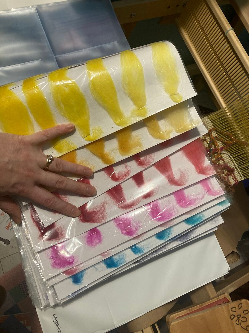
I pulled these swatches from the websites of ProChem and Jacquard. They are an important illustration of the limits of looking online at colour swatches. These little pictures gave me very little information about what to choose. The pink and hot fuscia Jacquard dyes, for example, have swatches that look nearly identical, but the colours act totally differently (see below). The “Acid Magenta” from ProChem looks pretty weak compared to other magenta primaries, but who knows how it acts in real life? (A) projected light from screens just acts differently from light reflecting off wool, and (B) Digital medium can only “see” a limited number of colours compared to our eyes, and (C) our monitors are all at different settings anyway. As an exercise, you may wish to compare the digital swatches above with my tests above. Yes, my pictures went through my lighting and my camera before they went to your eye, so there are even more additional factors changing the colours, but I’m sure you can tell how different things get. And I’m not even getting into PH, or altitude, or other factors I don’t even know about!
All that to say, I’m really glad that I chose to do the testing I did. Now, am I ready to jump straight into mixing dye formulas? I took one more intermediate step first. Come back next week to learn what it is!
